Natural Soap Branding
Fernanda Melo
Truman’s Natural – Soapbox Packaging Design
Project Overview
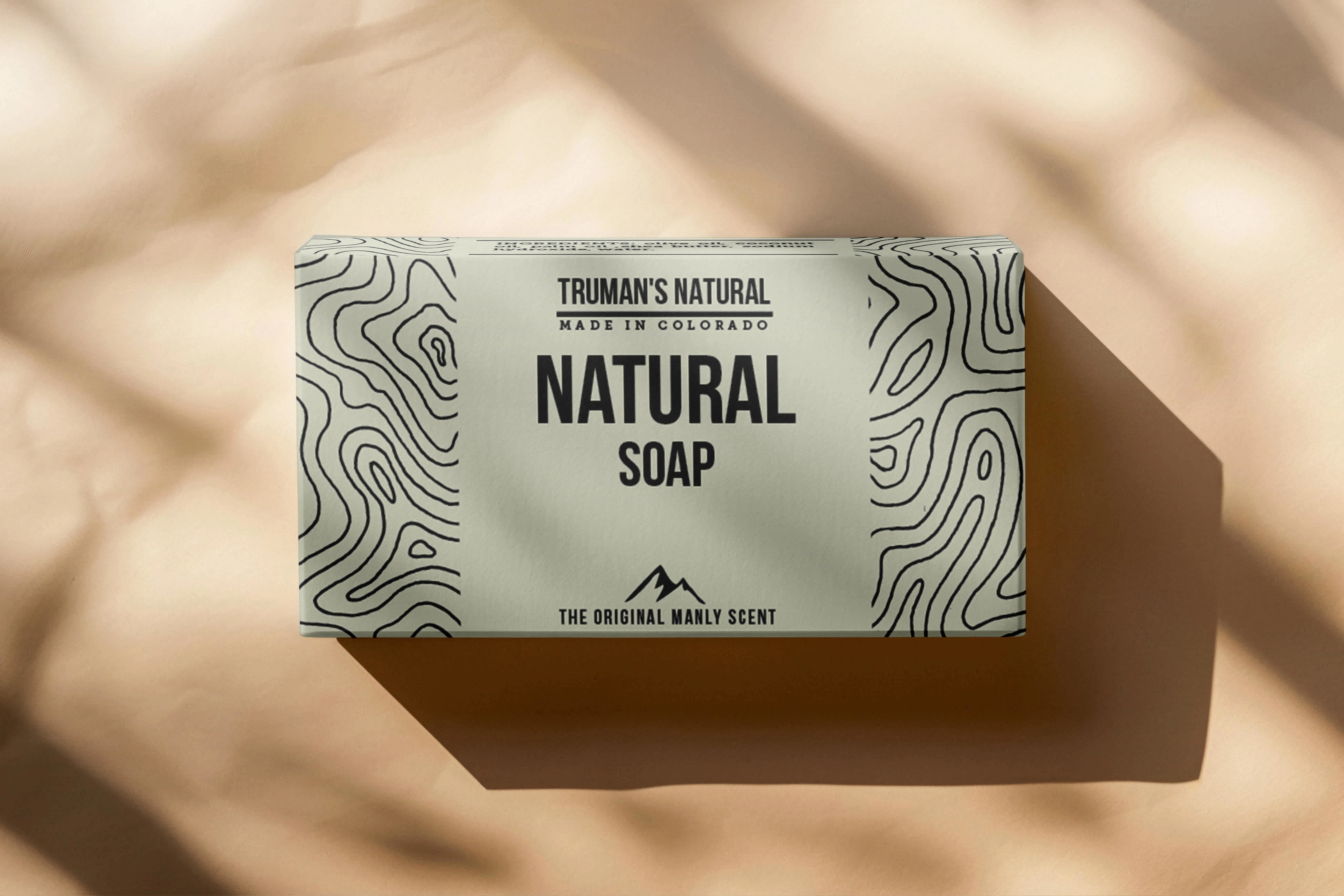
I designed the soap packaging for Truman’s Natural, a grooming brand crafted for men who love the outdoors. The goal was to create a clean, masculine, and nature-inspired aesthetic that reflects the brand’s rugged yet refined identity.
Design Concept
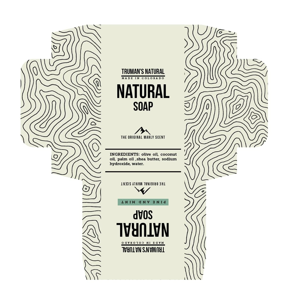
label die cut
The packaging features a handmade pattern inspired by natural textures, paired with a bold, masculine typeface to resonate with the brand’s target audience—outdoor-loving men. The overall layout is minimalist, allowing the product’s purpose and aesthetic to come through clearly and confidently.
Tools & Process
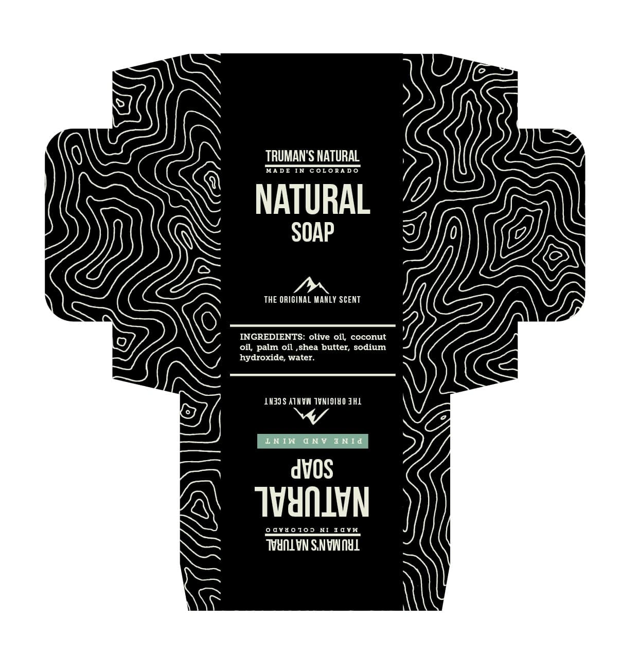
a black version
Pattern Design: Hand-drawn and digitized to give the box an authentic, earthy texture.
Typography & Layout: Created in Adobe Illustrator, with a strong, clean font to emphasize masculinity.
Packaging Design: Focused on minimalism and clarity, ensuring shelf presence without visual clutter.
Outcome
The final soapbox delivers a masculine, nature-forward look that aligns perfectly with Truman’s Natural brand values. Its minimalist design and handcrafted elements set it apart in the men's grooming market, appealing directly to the adventurous, style-conscious consu
Like this project
Posted Apr 2, 2025
Designed a bold, nature-inspired soap box for Trumas Natural—a men’s brand made for outdoor lovers who value strong design and clean, natural ingredients.
Likes
0
Views
5