Startup Brand Identity & Illustration System
Aavirash Mitra
Building a Brand Visual Identity through Design & Illustration
A brand identity project centred on developing a cohesive illustration system — from character design and expression sheets to full environment art and a unified colour palette. Every visual decision was made to carry the brand’s personality, ensuring consistency whether the output is a single spot icon or a full-scene composition.
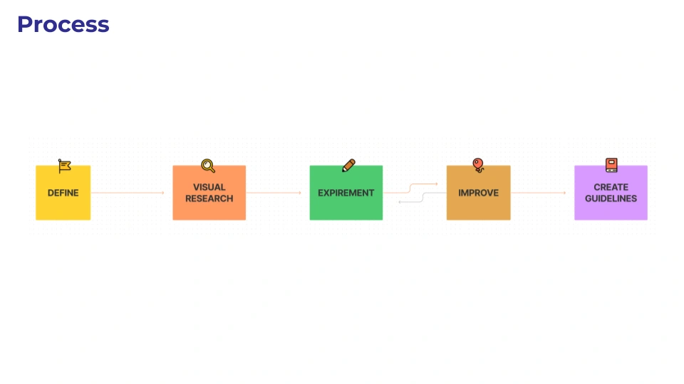
Define
Every project starts with alignment. This phase was about understanding the brand’s core — who they are, who they’re speaking to, and what feeling the visuals need to carry. I used this stage to lock in the creative direction before any drawing started: tone of voice translated into visual language, audience expectations mapped out, and a clear brief that every later decision could be measured against. Without this, illustration work drifts into decoration. With it, every asset has a job to do.
Visual Research
With the direction set, I went wide — pulling references across illustration styles, colour theory, character design traditions, and adjacent brand systems. The goal wasn’t to find one thing to copy, but to build a visual vocabulary: what works at small scale, what holds up in full scenes, what colour relationships carry warmth without losing clarity. This phase filled the gap between “we want it to feel approachable” and knowing exactly what approachable looks like in practice.
Experiment
This is where the pencil hits the page. I explored multiple directions for character anatomy, expression range, colour palettes, and background composition — testing what held up and what didn’t. Some ideas looked strong in isolation but fell apart as a system; others surprised me by working across more contexts than expected. The point of this phase was volume and honesty — producing enough variation to make real comparisons, not settling on the first thing that looked decent.
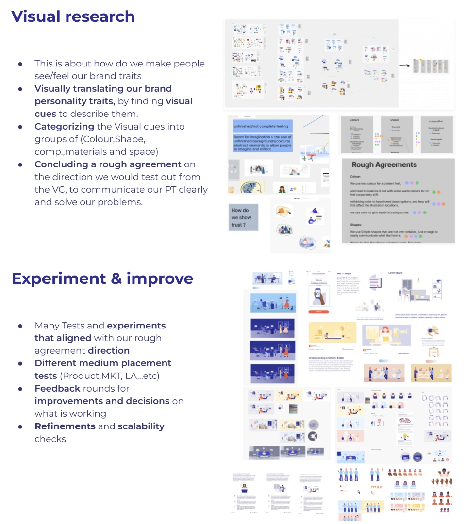
Improve
Experimentation surfaces the best directions. This phase was about refining them — tightening proportions, dialling in colour relationships, stress-testing characters across expressions and angles, and making sure spot illustrations shared the same DNA as full scenes. I also killed work that wasn’t earning its place. The difference between a good illustration and a brand system is consistency under pressure, and that only comes from iteration.
Create Guidelines
The final phase turned all of that refined work into something anyone can use. Character sheets, colour specs, typographic hierarchy, illustration rules, and usage examples — packaged so a team can extend the brand without needing me in the room. A system only works if someone else can pick it up and produce something that feels like it belongs. That was the benchmark.
The breakdown follows a natural creative arc — each phase depends on the one before it, and skipping any of them either produces shallow work or a system that can’t scale. Adjust the tone or detail level and I can tighten further.
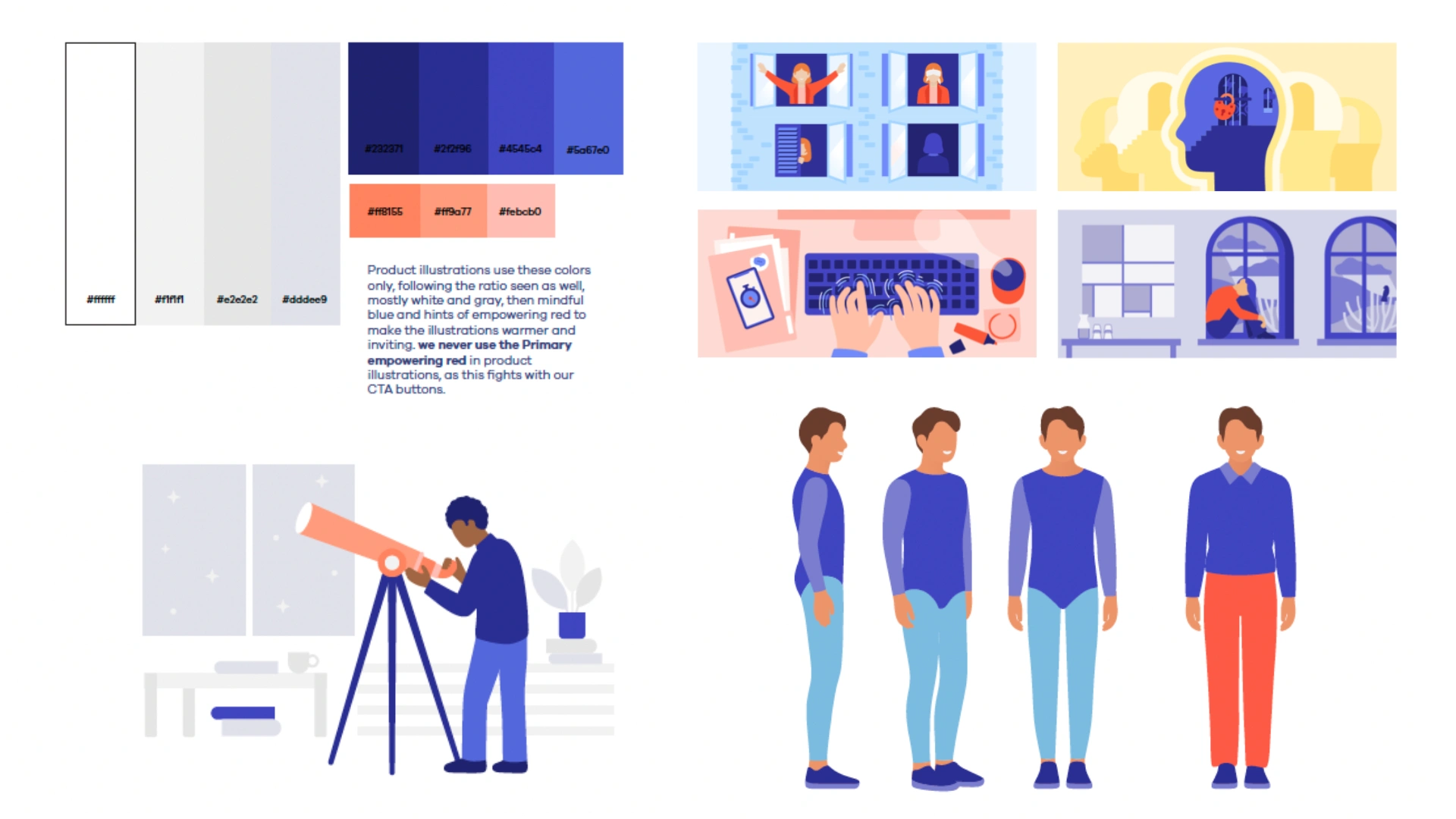
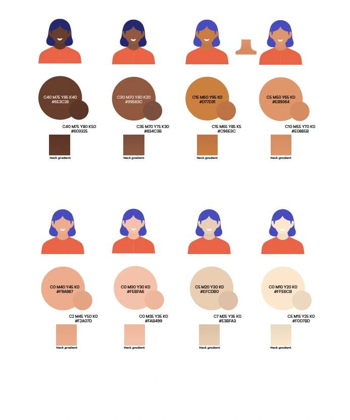
Deliverable 1: Color Palette & Typography
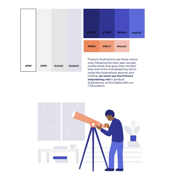
The system underneath the system.
The colour palette and type choices underpin everything above. Colour ranges were developed alongside the illustration work — skin tones, environment palettes, and UI accents all draw from the same source. Typography was selected to complement the illustrative style without competing with it.
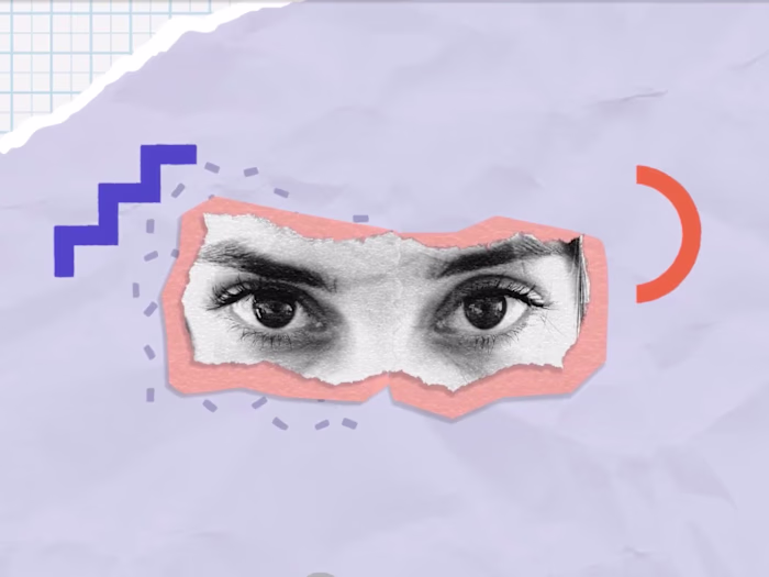
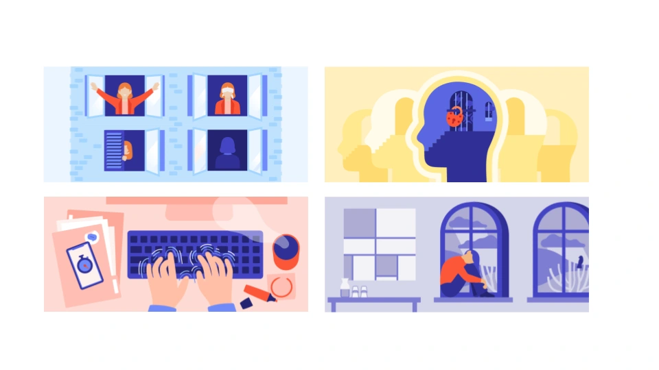
Deliverable 2: Sport Illustrations
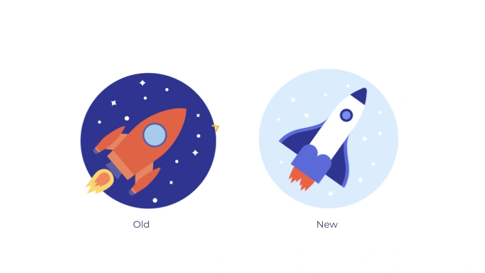
Small visuals, big personality.
A library of spot illustrations designed to work across UI, marketing, and product touchpoints. Each one distills the brand’s tone into a single, versatile graphic — simple enough to sit alongside text, distinctive enough to feel owned.
Character Based
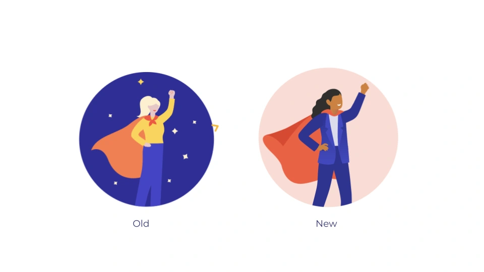
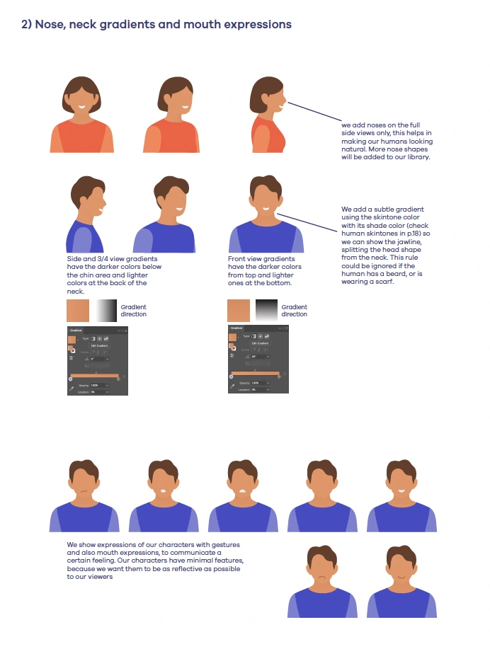
Deliverable 3: Character Design, Diversity & Expression
A character system built from a flexible facial anatomy framework. Expression sheets map out how each character communicates emotion — ensuring they stay on-brand whether they’re celebrating, thinking, or prompting action.
The range of skin tones and representation is baked into the system from the start, not added as an afterthought.
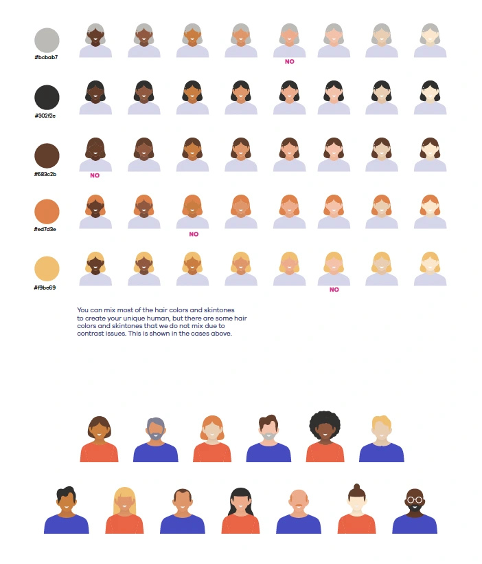
Diversity
Faces that feel familiar.
Deliverable 4: Character Turnarounds
Full turnaround sheets show how characters hold up across orientations and contexts. These act as the reference point for anyone producing new assets — locking in proportions, styling, and detail so the brand reads the same no matter where the character appears.
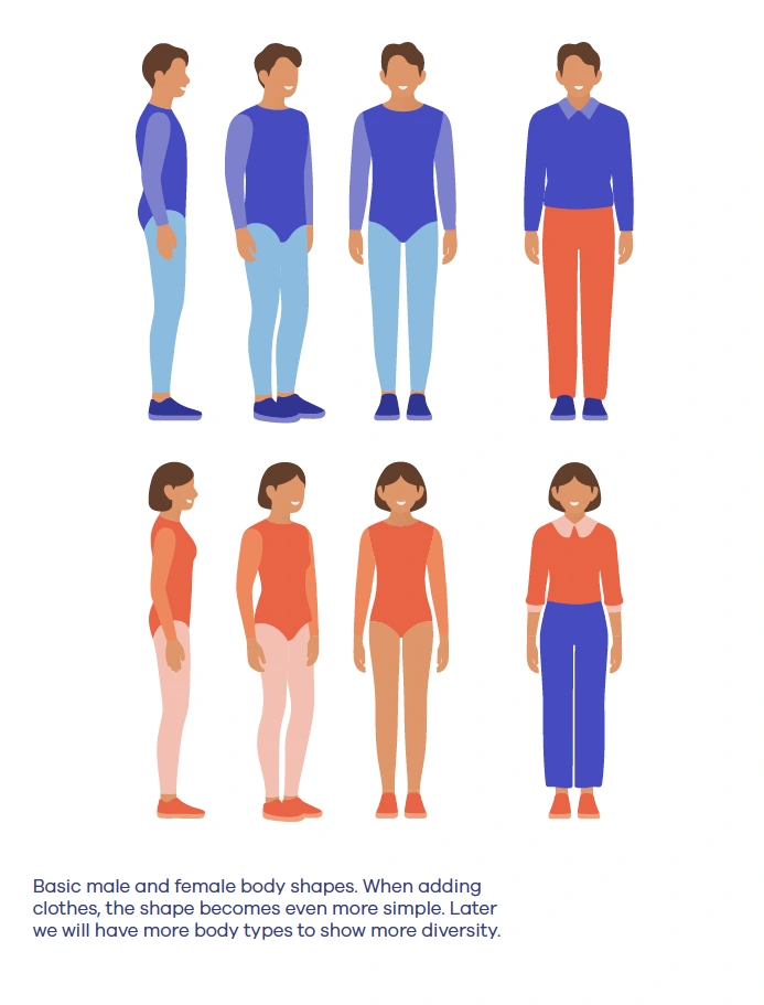
Consistency from every angle.
The Parts that make the whole
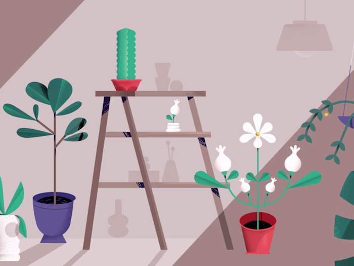
Deliverable 5: Environment & Background Illustrations
Worlds that extend the brand.
A set of full-scene background illustrations that place the characters in context. Each environment follows the same colour logic and stylistic rules, creating a visual universe that feels lived-in and consistent — not a collection of one-offs.
Deliverable 6: Brand Guidelines
From exploration to rules.
The final deliverable: a set of guidelines that codify every decision into a usable system. Character usage, colour application, illustration dos and don’ts, and typographic hierarchy — everything a team needs to extend the brand without diluting it.
Like this project
Posted Jun 2, 2026
Developed a complete brand identity and custom illustration system for a digital coaching startup — from logo and color palette to a scalable visual language.