Brand Identity and Web Presence for Pear Diagnostics
Aavirash Mitra

Pear Diagnostics:
Cancer Treatment with Certainty
Building a brand identity and web presence for a healthtech startup developing personalized cancer diagnostics — in collaboration with Merck Group.
The Challenge
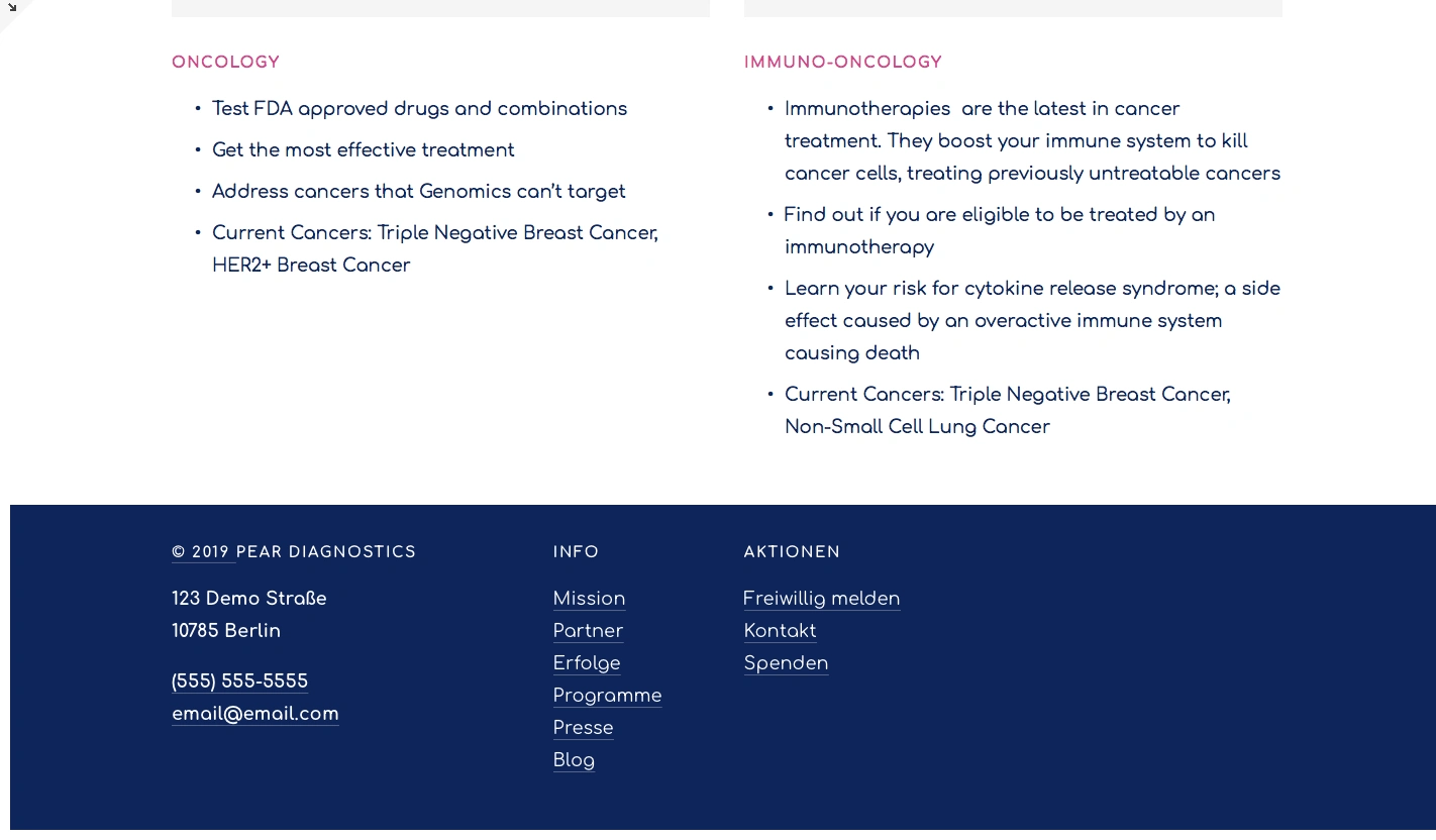
Pear Diagnostics is a startup based in Waterloo, Canada, focused on personalized cancer treatment. Their technology targets cancers without biomarkers for targeted drugs — patients who typically face a combination of treatments with uncertain outcomes. The company needed a brand identity that could communicate complex science with warmth and humanity, and a landing page that spoke to three distinct audiences: patients, doctors, and pharmaceutical partners.
The project was a collaboration with Merck Group, giving us direct access to stakeholders in the pharmaceutical and diagnostics space. The brief: create a visual identity and web presence that makes cutting-edge cancer diagnostics feel trustworthy and human.
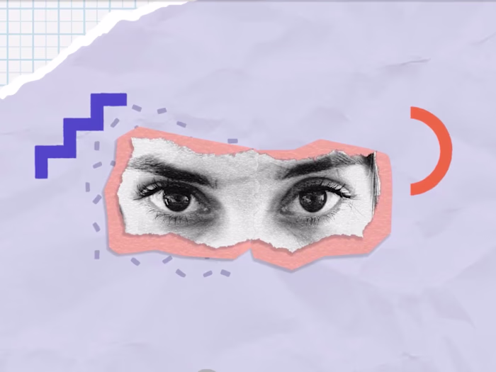
The core tension: How do you brand a company that works with simulated human body devices and complex cancer diagnostics, yet needs to feel approachable to patients going through one of the most difficult experiences of their lives?
A Visual System Rooted in Science and Care
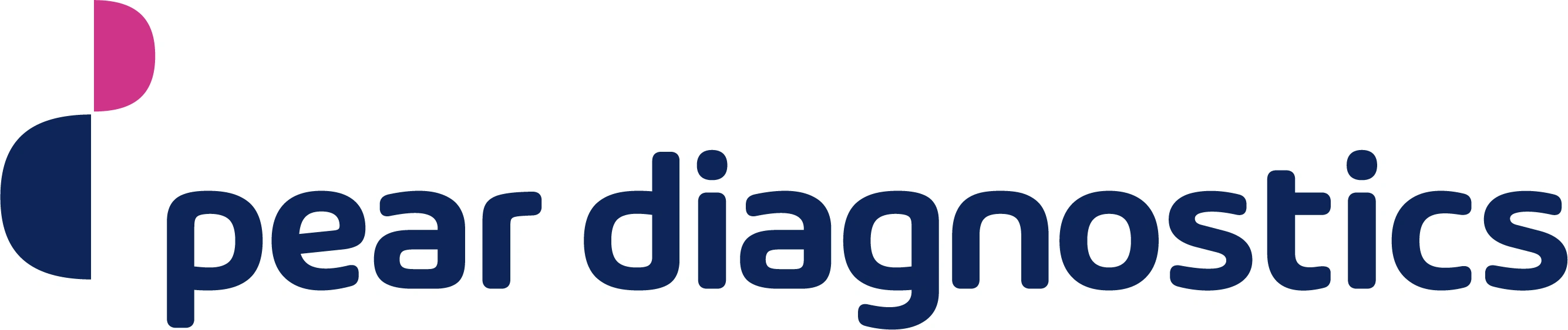
The logo takes its shape from the letter "p" — deconstructed into two semicircles in navy and magenta. The geometric forms reference precision and diagnostics; the rounded edges and warm color pairing soften the clinical associations. The mark works across scales — from business cards to web headers — and the two-tone construction creates a system of design elements that can be used independently throughout the brand.
The color palette draws from fruit names (fitting the "Pear" brand), anchoring the identity in something organic even as the science is deeply technical. Fig, Blueberry, Plum, Dragonfruit, Leechy — each color has a functional role in the system.
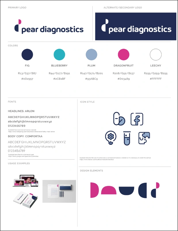

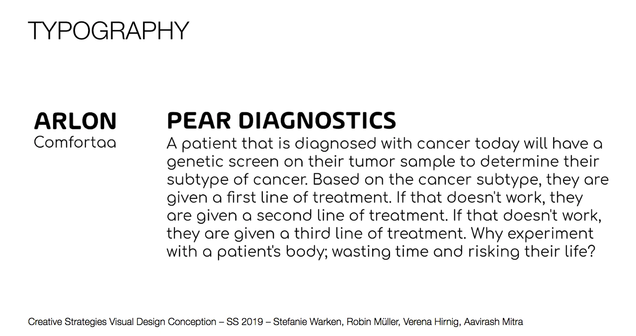
Typefaces:Arlon (headlines) — clean, modern sans-serif for authority. Comfortaa (body) — rounded, friendly for approachability.
Icon style:Thick navy outlines, rounded corners, occasional light blue fills. Medical and scientific motifs — pills, test tubes, lightbulbs, puzzle pieces.
Design elements: Semicircles and quarter-circles extracted from the logo mark, used as compositional shapes across print and web materials.
From Screen to Print
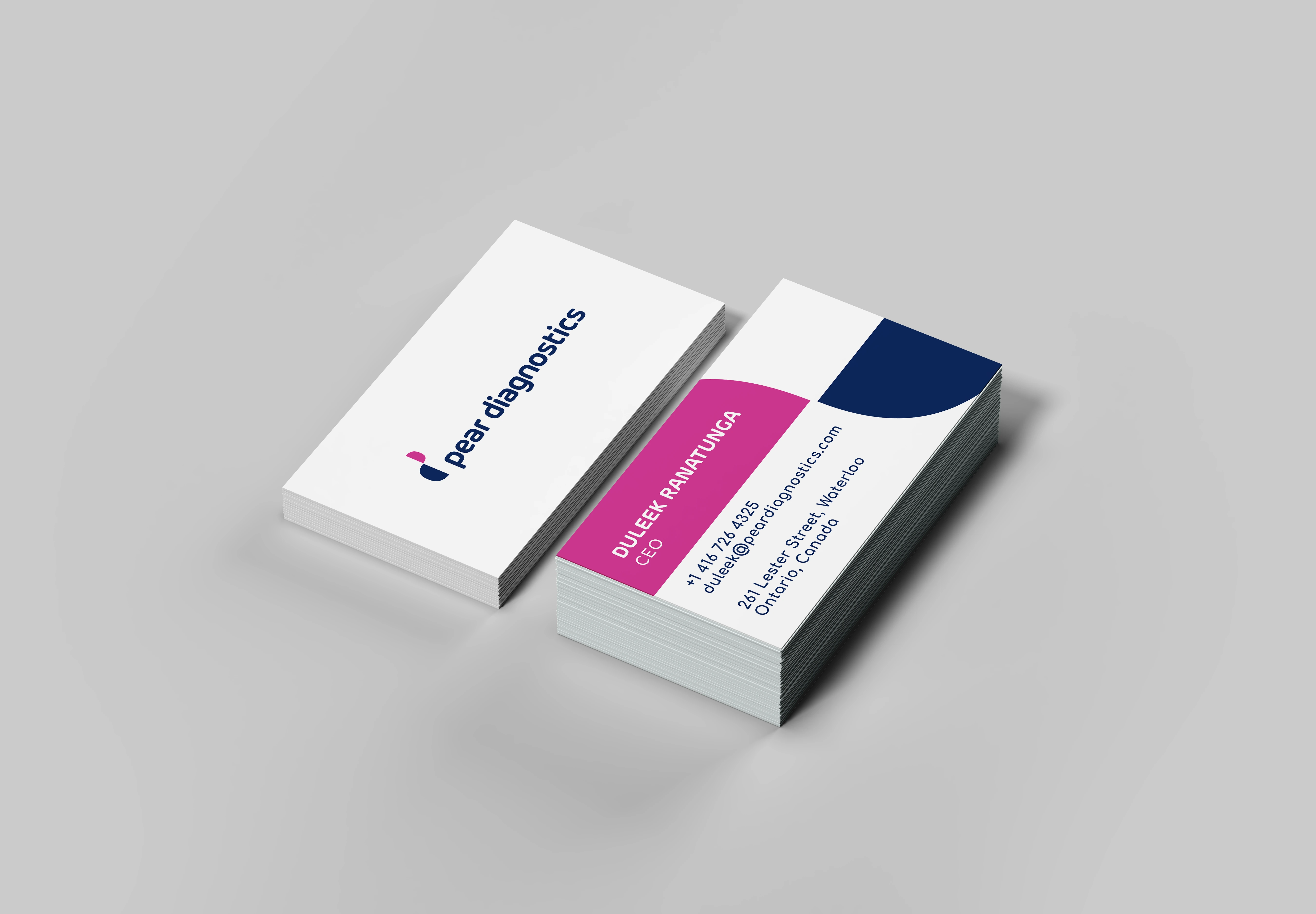
The identity was tested across a full suite of brand collateral — business cards, letterhead, and envelopes. Business card design went through multiple explorations, testing different arrangements of the brand's signature semicircle shapes, color blocking, and information hierarchy. The final direction pairs a clean white front (logo only) with a solid navy back carrying contact details in white — confident and minimal.
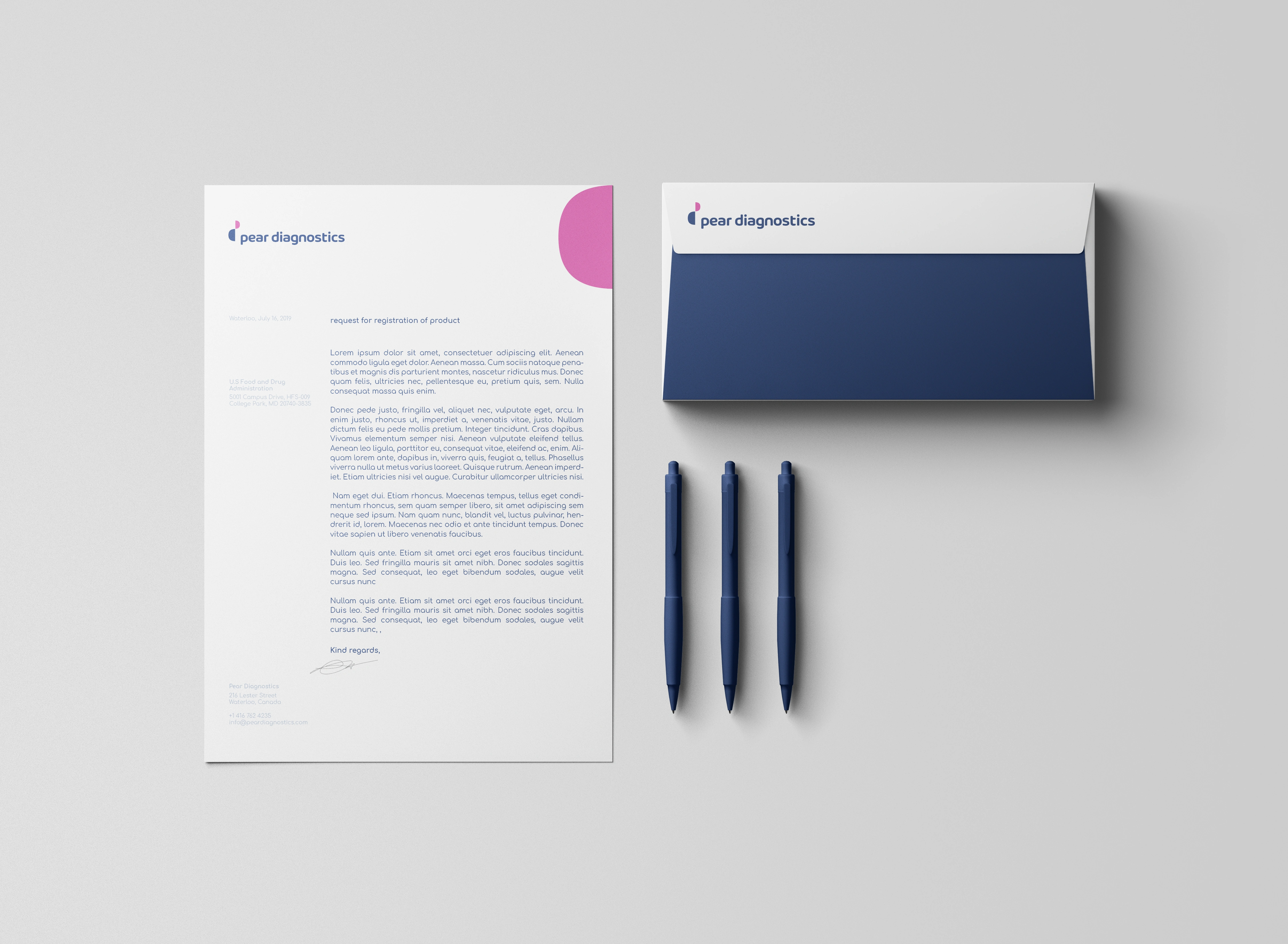
The stationery suite — letterhead, envelope, and pen set — reinforces the color system. The envelope's navy interior lining is a small detail that signals premium quality when opened. The letterhead keeps the logo centered at top, with a clean type hierarchy below.
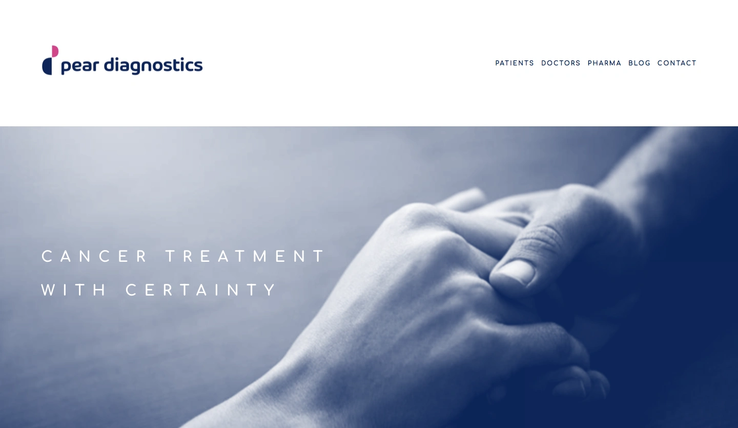
Three Audiences, One Story
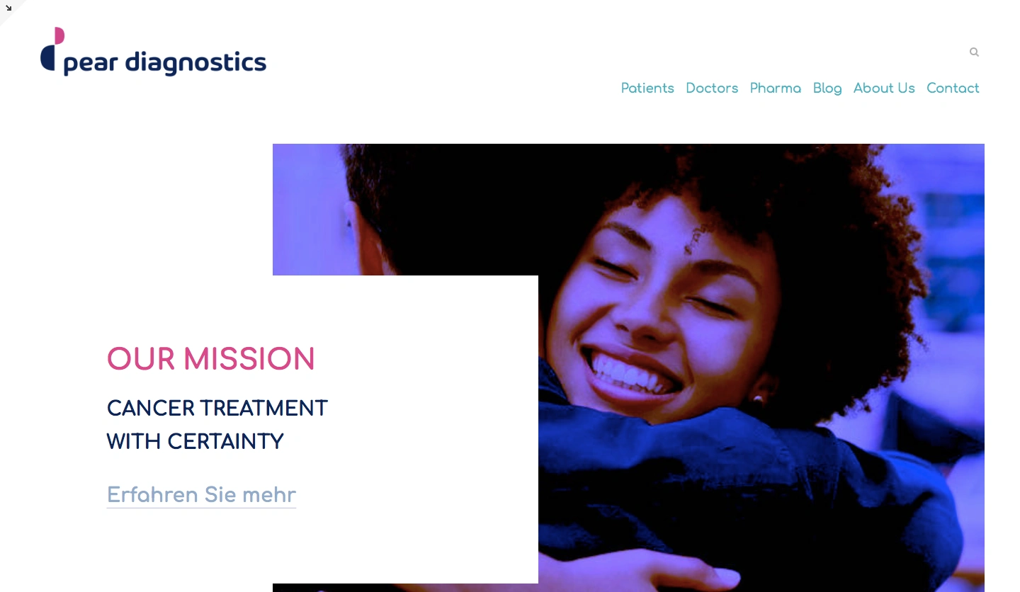
The landing page needed to serve patients, doctors, and pharma partners — each with fundamentally different needs and emotional states. The navigation reflects this directly: PATIENTS, DOCTORS, PHARMA, BLOG, CONTACT. The hero leads with the brand's core promise — "Cancer Treatment with Certainty" — over a blue-toned photograph of two people in a comforting embrace. The image choice was deliberate: the company's technology is clinical, but the outcome is human connection.
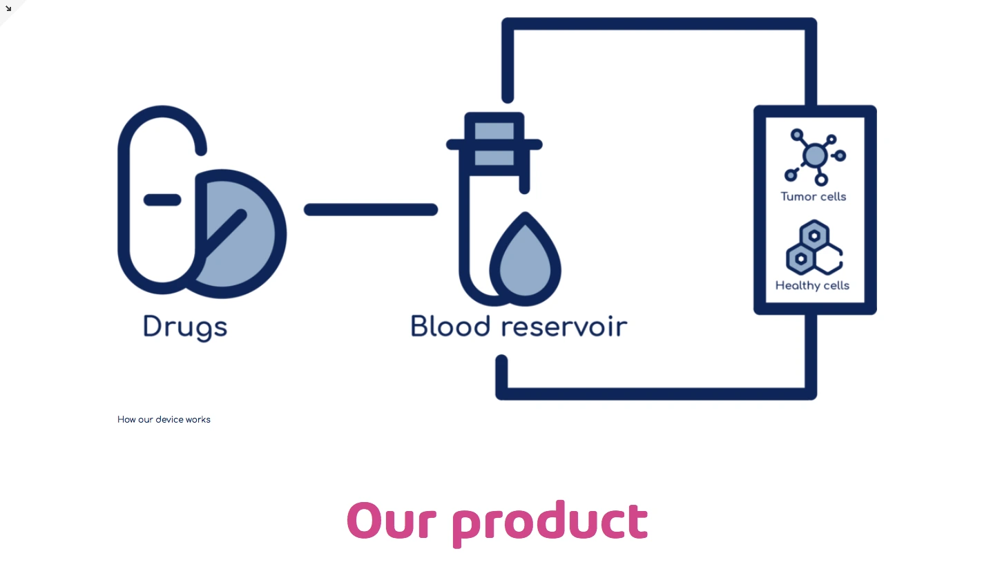
Below the hero, content sections break down the science in accessible language, explaining how the simulated human body device works and why their approach to cancers without biomarkers matters. The page uses the brand's stepped-shape image cropping — a compositional technique derived from the logo's semicircle geometry — to create visual rhythm between text and photography.
Hero:Full-width blue-toned photograph with "Cancer Treatment with Certainty" in white, tracked-out sans-serif. Logo and navigation in clean white header.
Mission section:"OUR MISSION" in magenta headline, paired with an emotional photo of two people embracing — reinforcing the human impact. Bilingual CTA ("Erfahren Sie mehr") reflecting the Merck/German collaboration context.
Footer:Muted blue bar with white text — Toronto address, navigation links (Mission, Partner, Blog, Jobs, Contact). Clean and functional.
What This Project Taught Me
What This Project Taught Me
Designing for healthcare means every visual decision carries weight. The wrong shade of blue feels sterile. The wrong typeface feels dismissive. The wrong stock photo feels exploitative. This project pushed me to think about how branding communicates at the emotional level — especially for people in vulnerable situations.
Working within the university-Merck collaboration added a layer of real-world stakeholder complexity that most student projects don't have. The brand needed to work for a startup founder pitching investors, a pharmaceutical partner evaluating technology, and — ultimately — a patient searching for hope. That range of audiences in a single identity system was the hardest and most rewarding part of the project.
Scope:Full brand identity — logo, color system, typography, iconography, design elements, business cards, stationery, and landing page
Key constraint:Bridging clinical precision with emotional warmth across three distinct audience segments
Tools: Figma, Adobe Illustrator, Adobe Photoshop
Like this project
Posted Jun 15, 2026
Branded a cancer diagnostics startup to feel both scientifically precise and deeply human — logo, web, and full collateral suit!