issaumer.com - One-Page Lead Gen Funnel Site

Muhammad Issa Umer


issaumer.com, a personal site built as a working funnel
A one page site with one job: turn a cold visitor into a booked teardown call.
I sell funnels and conversion work, so a standard portfolio site would have undercut the pitch. A grid of projects and an "about me" tab is a brochure, not an argument. If my claim is that structure and copy decide whether traffic converts, the site itself had to be the evidence.
So I built one page that runs the full sequence: hook, problem, proof, story, offer, close. Every scroll increment narrows the reader toward a single action, booking a free funnel teardown. There is no second CTA competing for attention, no blog, no services matrix, no contact form that goes into a void. One button, repeated at the moments where intent is highest.
Your startup doesn't have a traffic problem
The headline names the reader's real problem instead of introducing me. Most founders arrive believing they need more traffic, so opening with the counterclaim earns a second of attention that a name and job title never would. The subhead does the qualifying work in one sentence: I build funnels and landing pages, whether you need one from scratch or yours isn't converting. That line exists so both types of visitor recognize themselves immediately and neither one bounces thinking "this isn't for me."
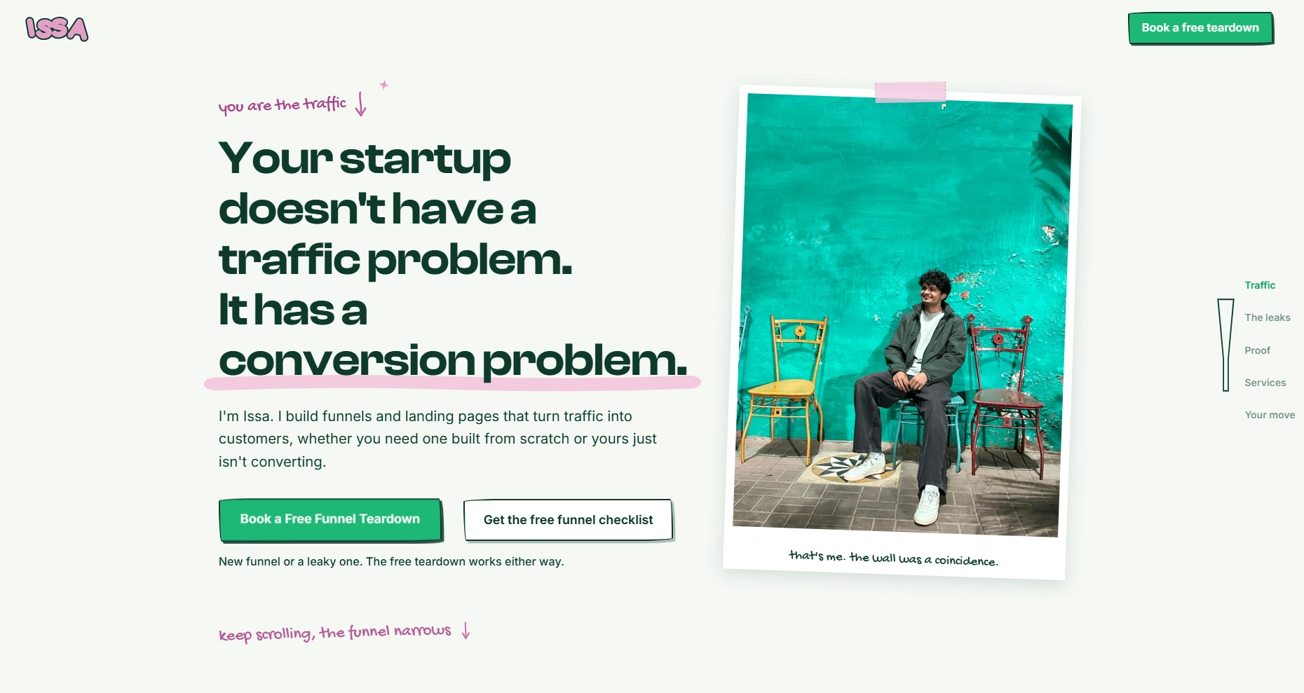
the whole offer in five seconds, one button, no menu maze
Naming the leak before selling the fix
Nobody buys a solution to a problem they haven't admitted they have. This section lists the three failures I find in almost every startup funnel: a landing page a stranger can't parse in five seconds, one weak sentence sitting above the CTA, and a signup flow that bleeds people at every extra field.
Each one is written as a scene rather than a category, "they land, they squint, they leave," so the founder sees their own analytics in it. By the end of the section the reader has diagnosed themselves, which means the services section later reads as relief instead of a pitch.
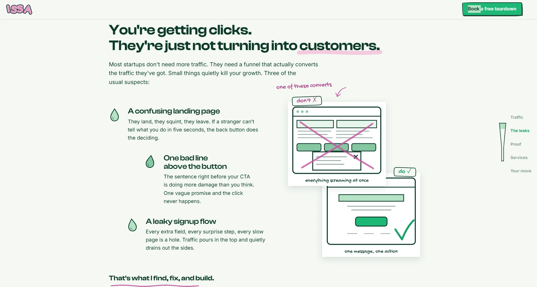
three leaks, written so founders recognize their own funnel in at least one
Everything screaming at once vs one message, one action
The entire thesis of the page compressed into a visual you can read without reading. One side is the cluttered page competing with itself, the other is a single message and a single action. It sits directly after the problem section so the fix is visible before I've asked for anything, and it does in two seconds what a paragraph of theory does badly.
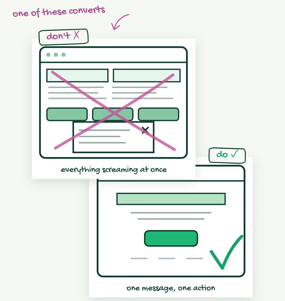
don't ✗ / do ✓, the argument without the essay
Numbers placed exactly where doubt starts
Right after the reader agrees they have a problem, the next reflex is "can this person actually fix it." So the numbers land there and nowhere later: 200,000+ users generated for Bitcoin Yay from zero, $20K+ in ad revenue and sales, $100K+ in client crypto portfolios managed, plus the names I've worked with.
No case study language, no percentages without context, no vanity metrics. Three figures and four logos, then the page moves on before it starts bragging.
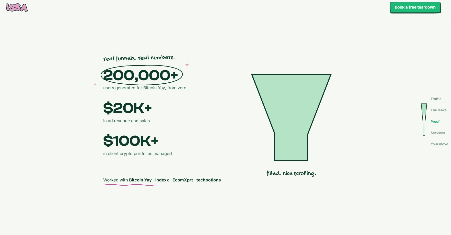
200K+ users, $20K+ revenue on under $5K spend, $100K+ managed
I'm not a guru, I'm a problem solver
Personal branding in this niche defaults to authority theatre, so I went the other direction. The bio is a timeline of things that actually happened, including six years of tutoring while still a student, an anime clothing brand with two sold out drops, and a CS degree I finished and never collected.
The photos are deliberately unpolished, a kid grinning at a green wall and me hugging a plushie in a food court, with lowercase captions like "definitely not a guru." Credibility came from the numbers a section earlier. This section only has to make me a person the founder would want on a call, which is a different job and needs a different tone.
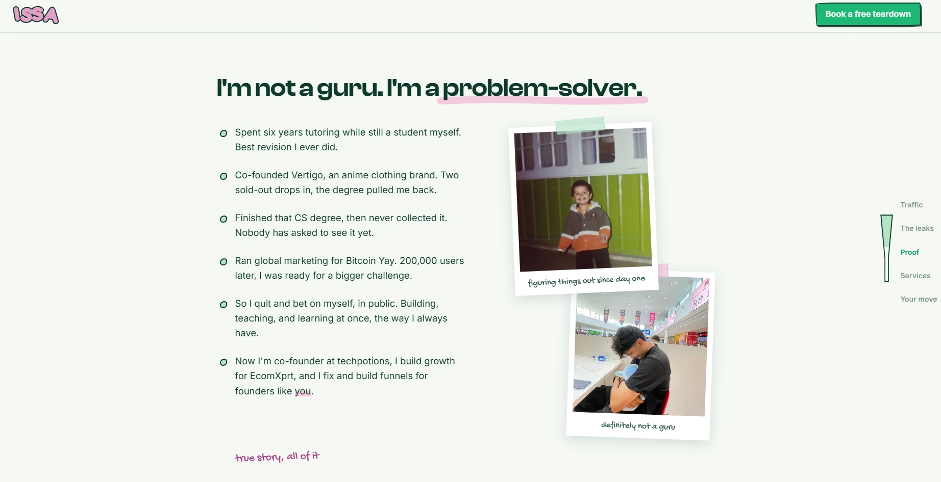
the bio as a timeline, not a brag
Problem, what I did, result, three times
Every case follows the same three beat structure so nothing has to be hunted for. Bitcoin Yay, a crypto app nobody had heard of, where I built the acquisition system end to end as Global Marketing Director and took it to 200,000+ users on under $5K spend. Smart Crypto, a webinar with empty seats, where I ran the ads and built the registration, replay, and offer flow that turned attendees into six figure portfolio clients. EcomXprt, an Amazon agency with zero inbound, currently live and booking calls.
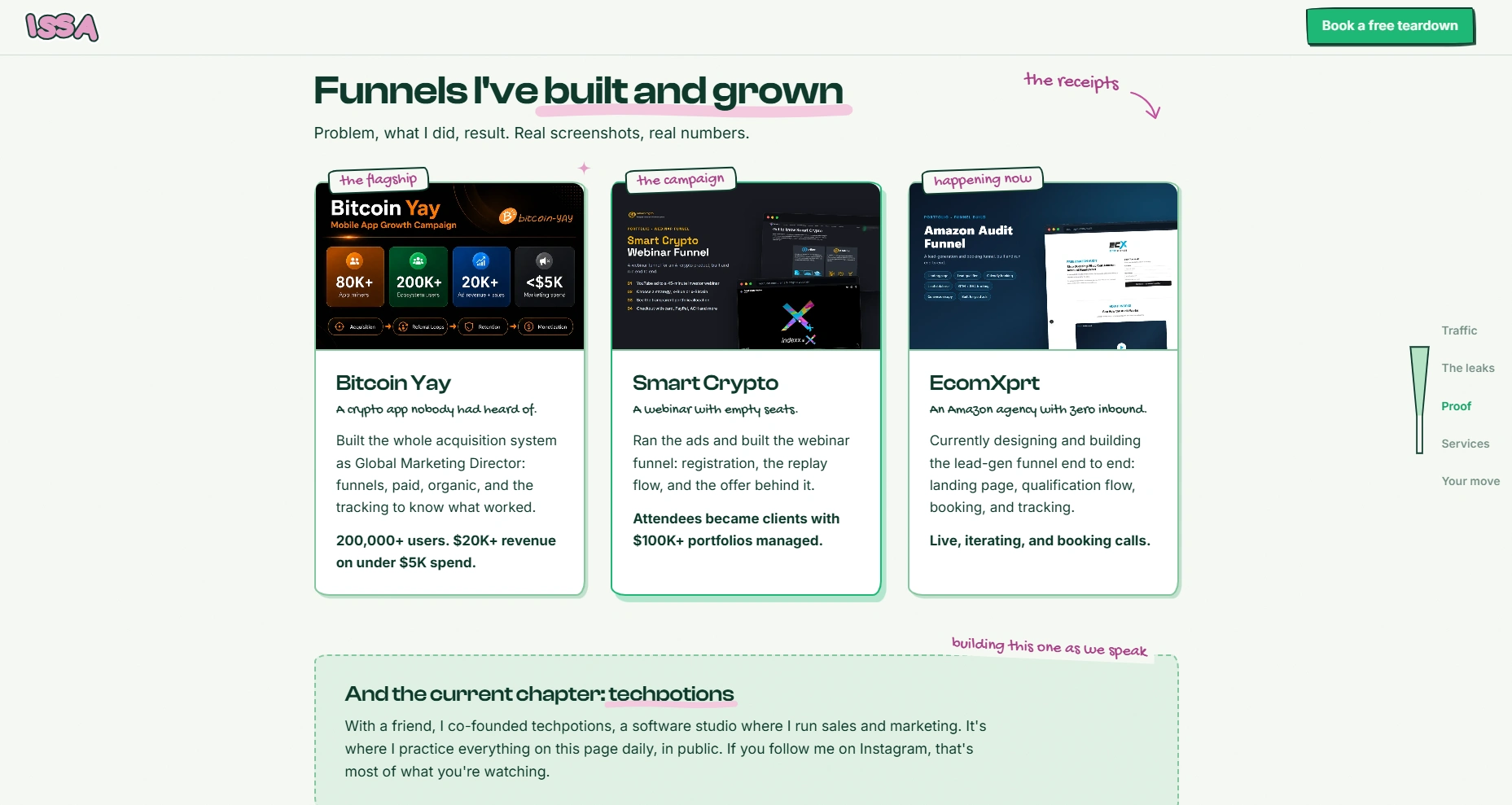
same three beats every time, so nobody hunts for the outcome
Three doors, one next step
Funnel Audit, Funnel Build, Growth Strategy. Three entry points for three levels of readiness, but each one ends at the same booking link, so choosing between them never becomes a reason to stall. The bullets are written as outcomes rather than deliverables, "a prioritized fix list, not a 40 page report," and "no theory you can't act on Monday."
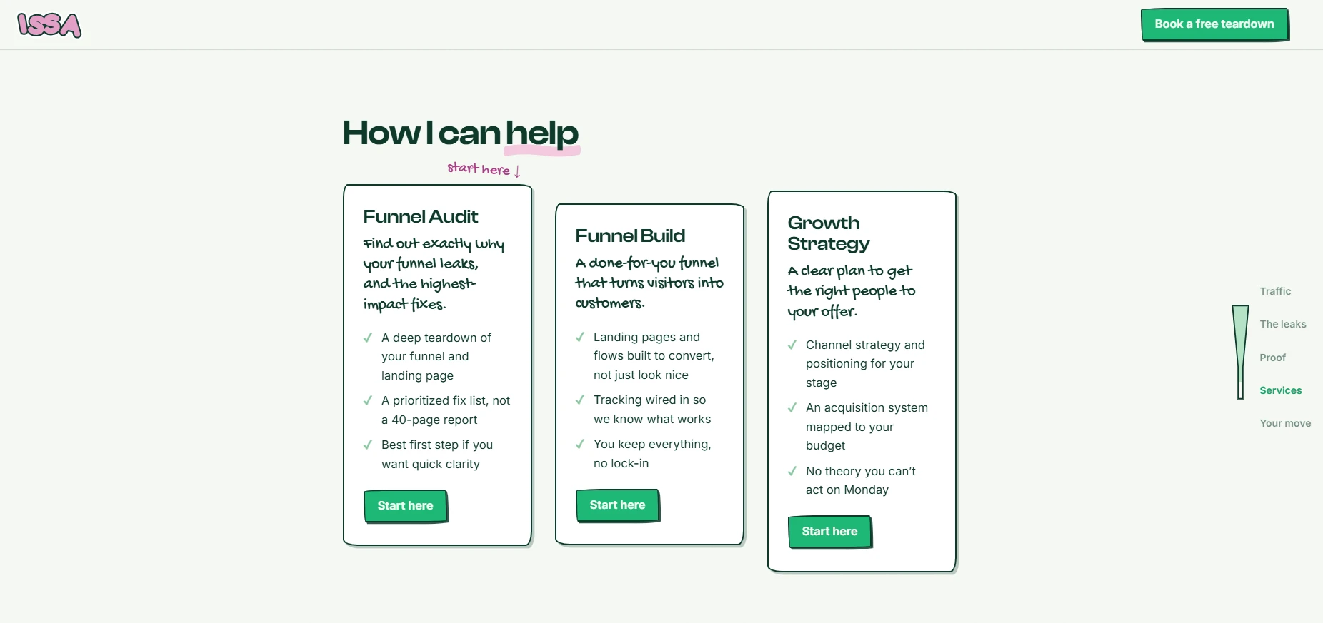
audit, build, strategy, all pointing at the same call
An exit ramp for the not ready yet
Most visitors won't book on the first visit, and without an alternative they leave with nothing and I get nothing. The Startup Funnel Checklist, the 15 things I check before touching any ad budget, gives them a low commitment yes.
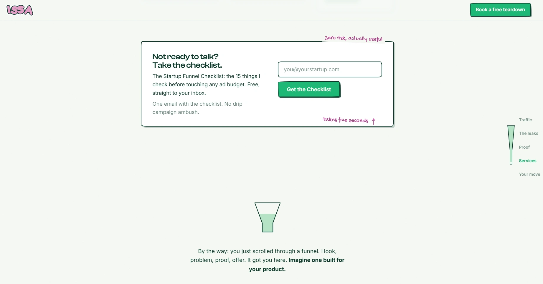
one email, one checklist, no drip campaign ambush
Telling them it was a funnel the whole time
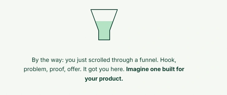
The final section makes the argument explicit. "By the way, you just scrolled through a funnel. Imagine one built for your product." Everything above becomes the case study, and the reader is the proof it worked.
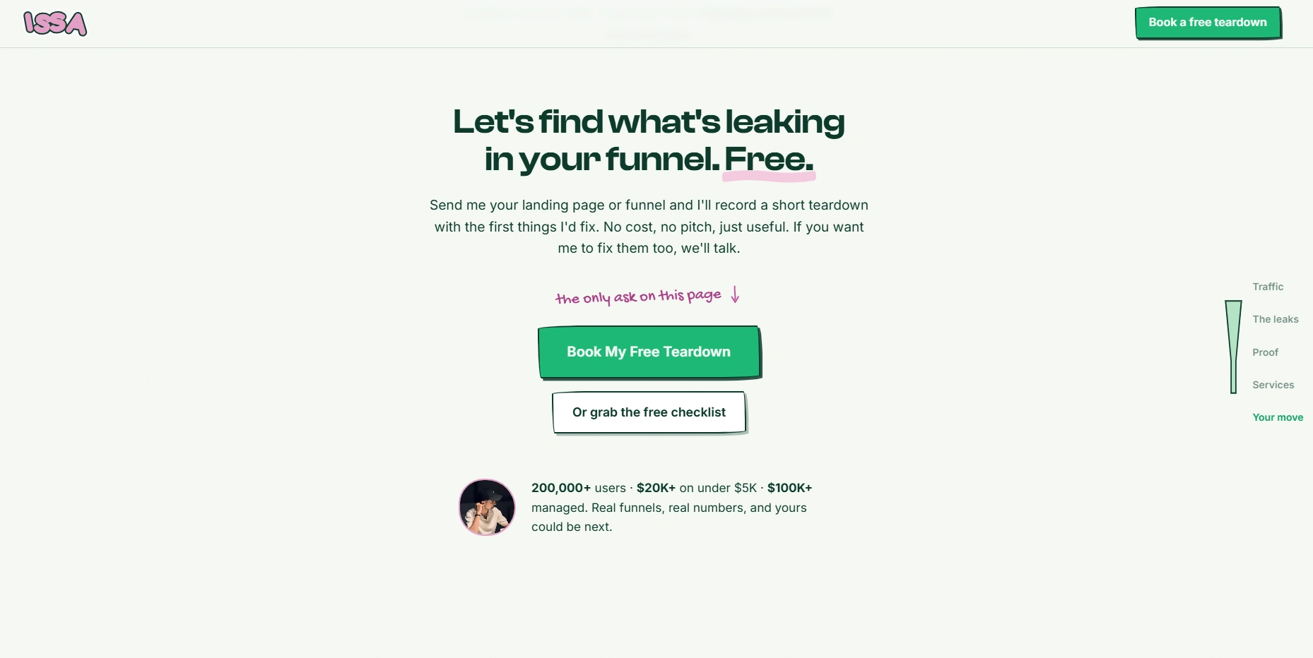
Then the only ask on the page: send me your landing page and I'll record a short teardown of the first things I'd fix, free, no pitch. Offering the work before the invoice removes the risk that keeps founders from booking, and it means the first conversation starts with me already having done something useful.
Fast enough that nobody thinks about it
The page is image heavy and animated throughout and still loads in about a second. That isn't a vanity detail. Every hundred milliseconds is a leak, and a funnel consultant with a slow site is arguing against himself. Static build, compressed assets, animation that doesn't block render.
animated, image heavy, still loads in about a second
Like this project
Posted Aug 18, 2026
A one-page lead-gen funnel I designed and built for myself. Astro, Cal.com booking, 0.93s first paint. The visit itself demonstrates the service.
Likes
2
Views
7