
Coral Pay is a payments app for sending and receiving money in any currency, fast. Rent for a flat abroad, a client paying in yen, paying a friend back after a trip. It's for anyone whose money crosses a border.
The name came first, and it set the tone. Coral feels warm and alive, which is rare for a money app. Most of them look like banks, so this brand had to feel friendly and a little playful.
The mark
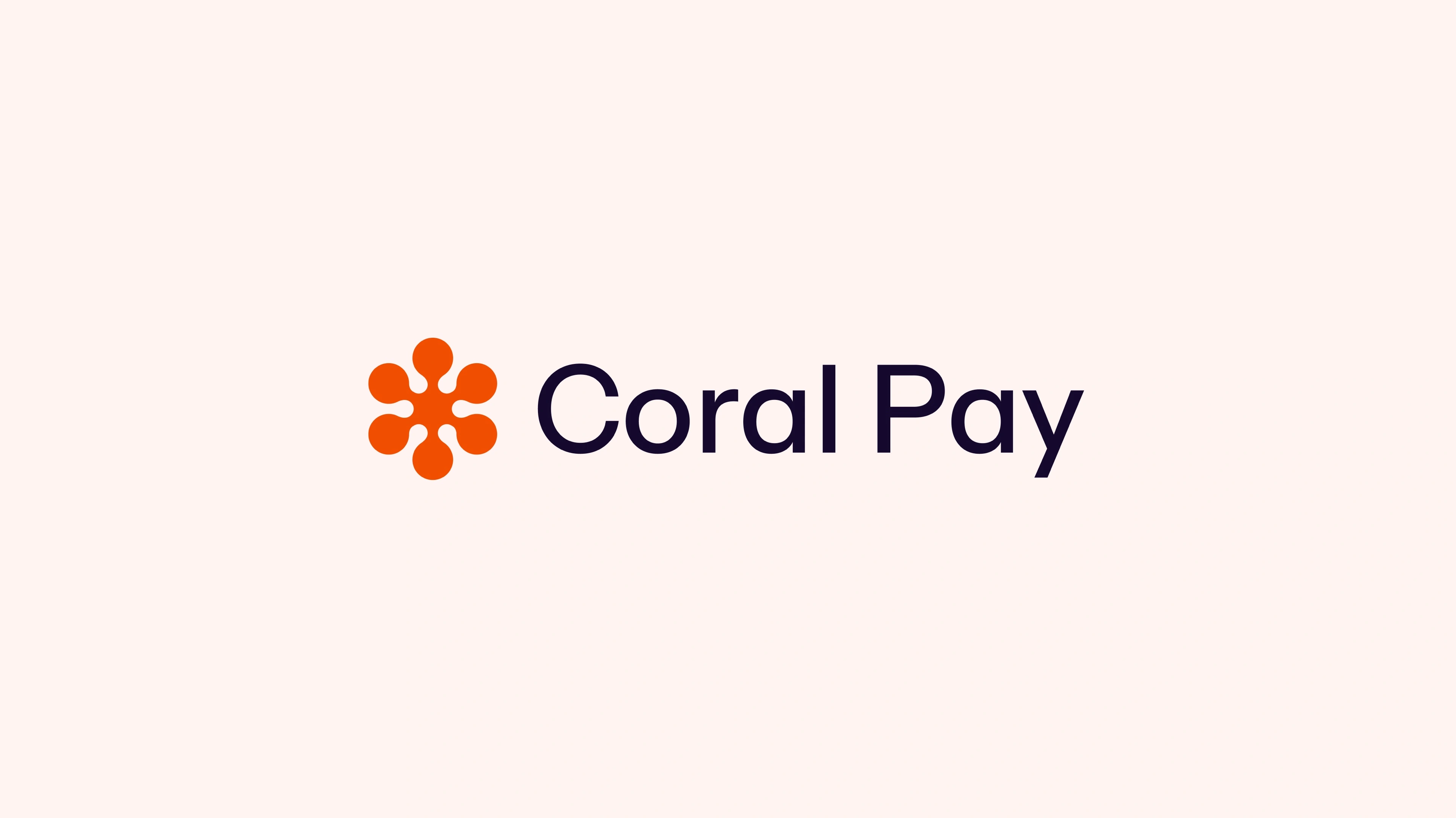
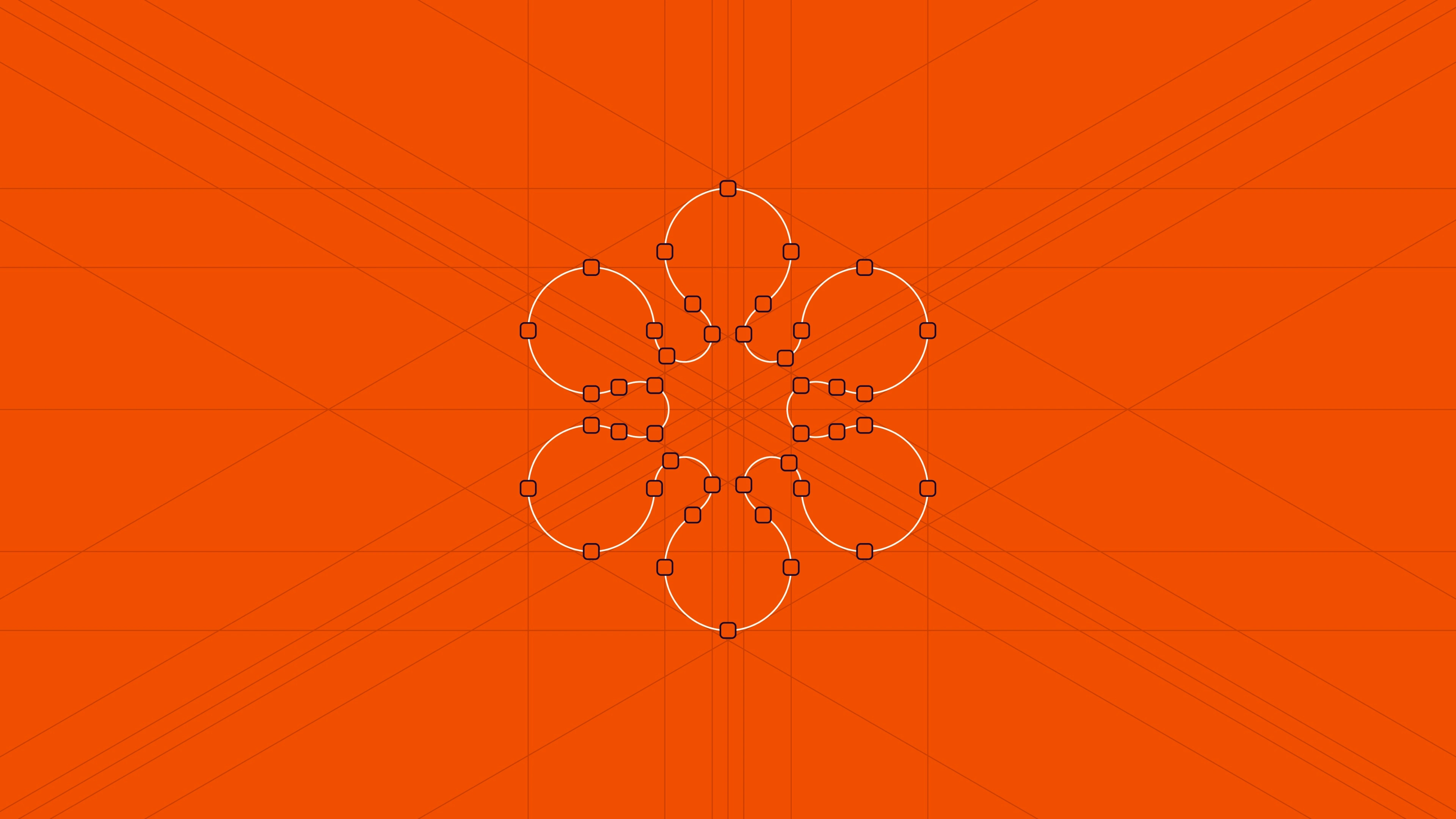
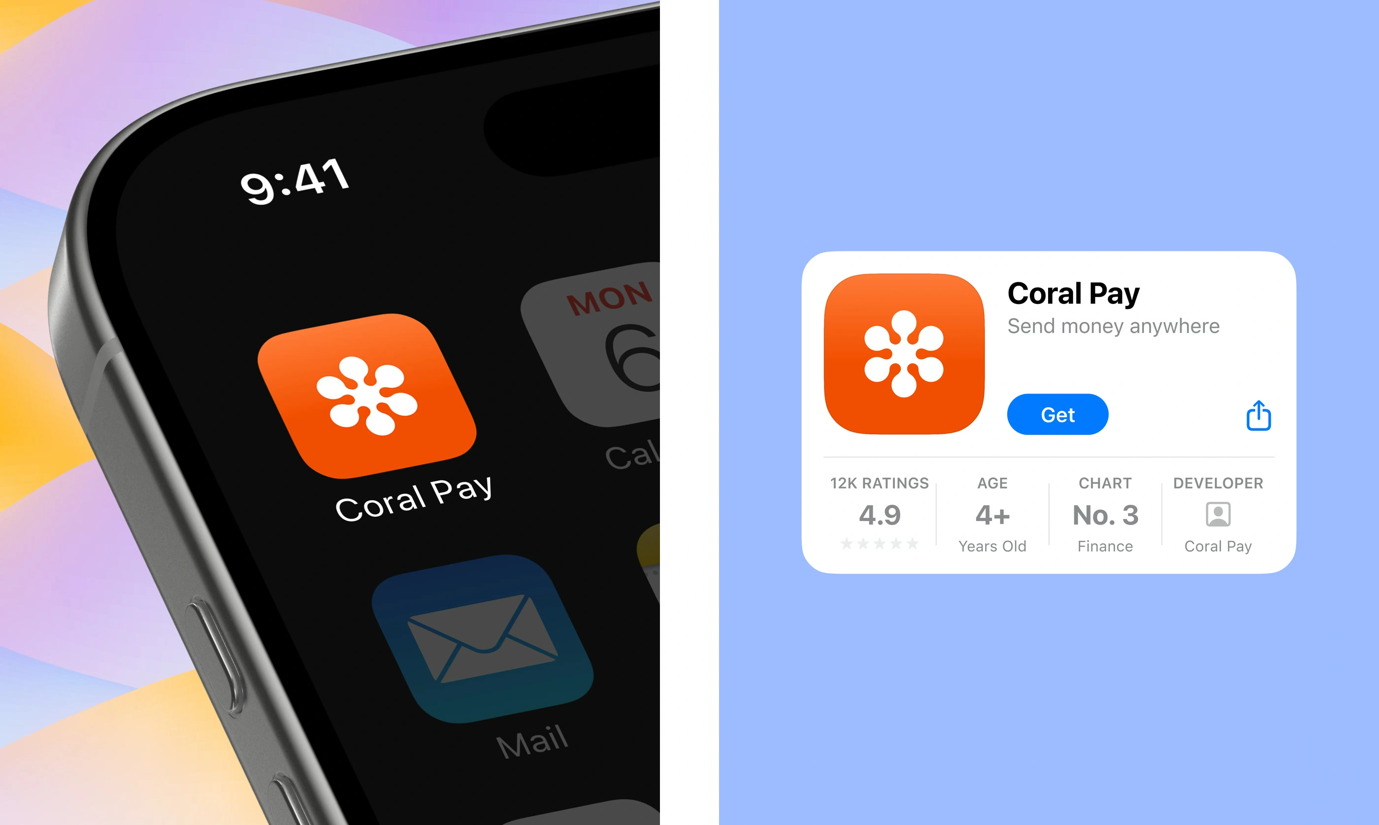
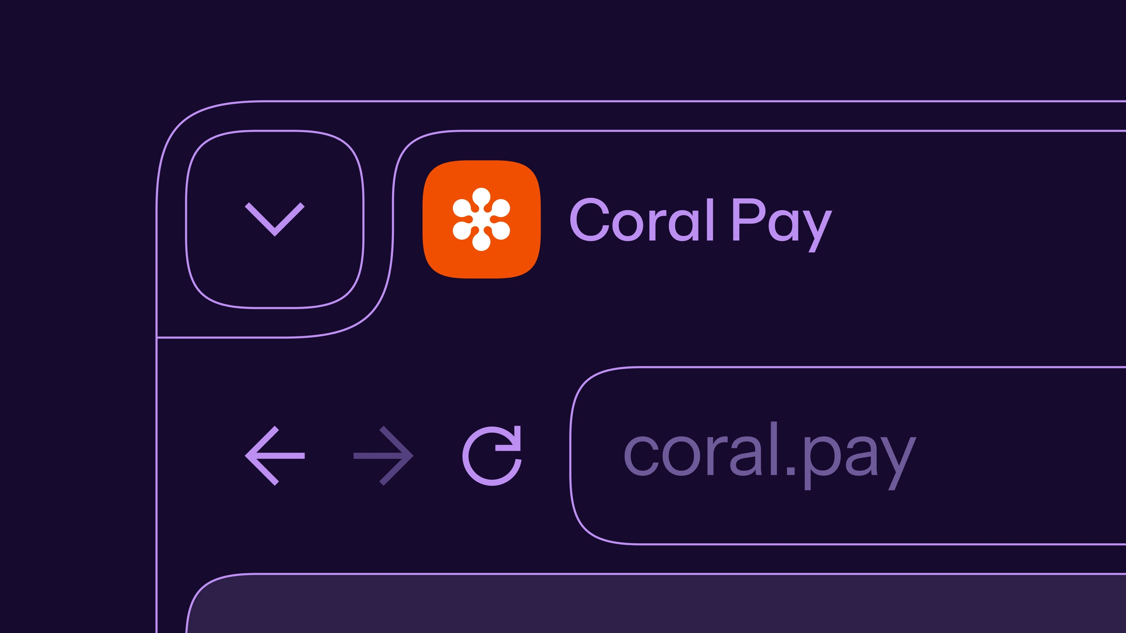
The mark starts from real coral. Many coral shapes were simplified down to six rounded petals around one center, like money going out to people in every direction. It also had to work as a tiny app icon, so it stays simple and chunky.
Colors
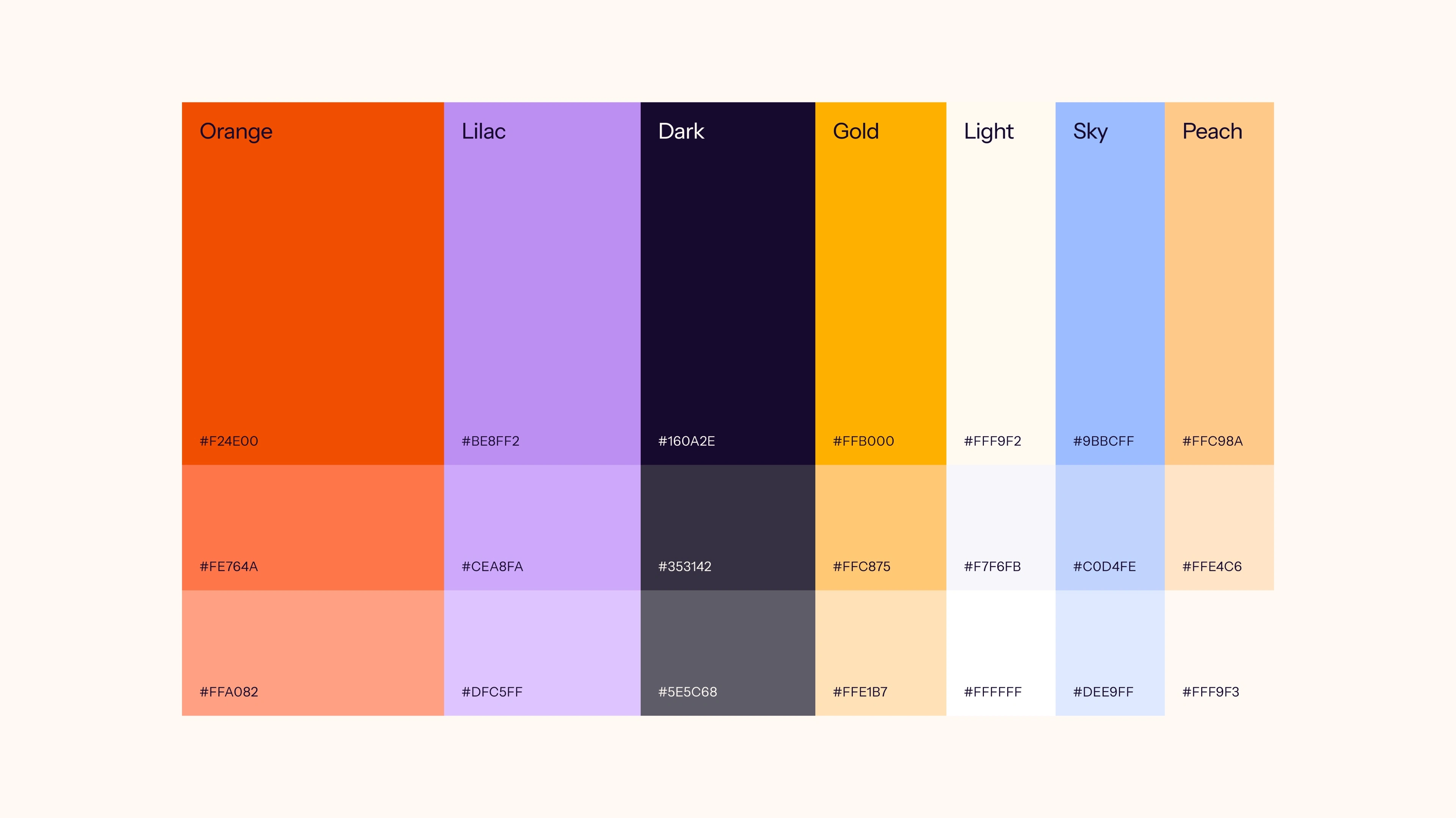
The colors are meant to feel happy. Orange leads, with lilac, gold, peach and sky around it, plus a dark and a light that keep everything readable.
The glass
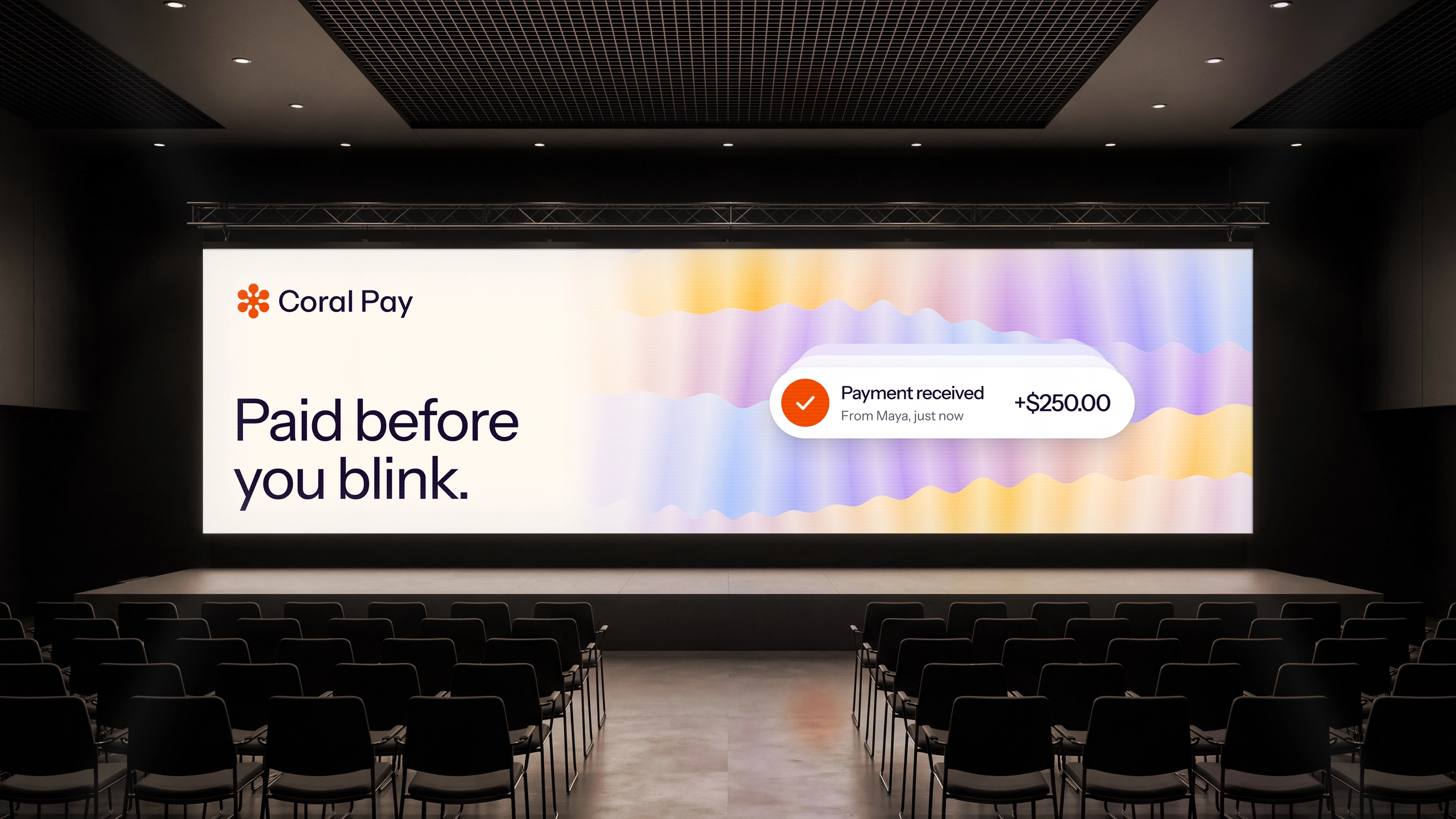
For bigger visuals, the mark turns into lilac glass over soft iridescent waves. It adds depth and shine, and it shows up on the cover, the business cards, the envelopes and the lobby wall.
In the app
In the product, the brand stays quiet so the money stays clear. The send-money card shows recent contacts. The converter shows exactly what the other person gets. The balance dial spins through currencies.
Everything else
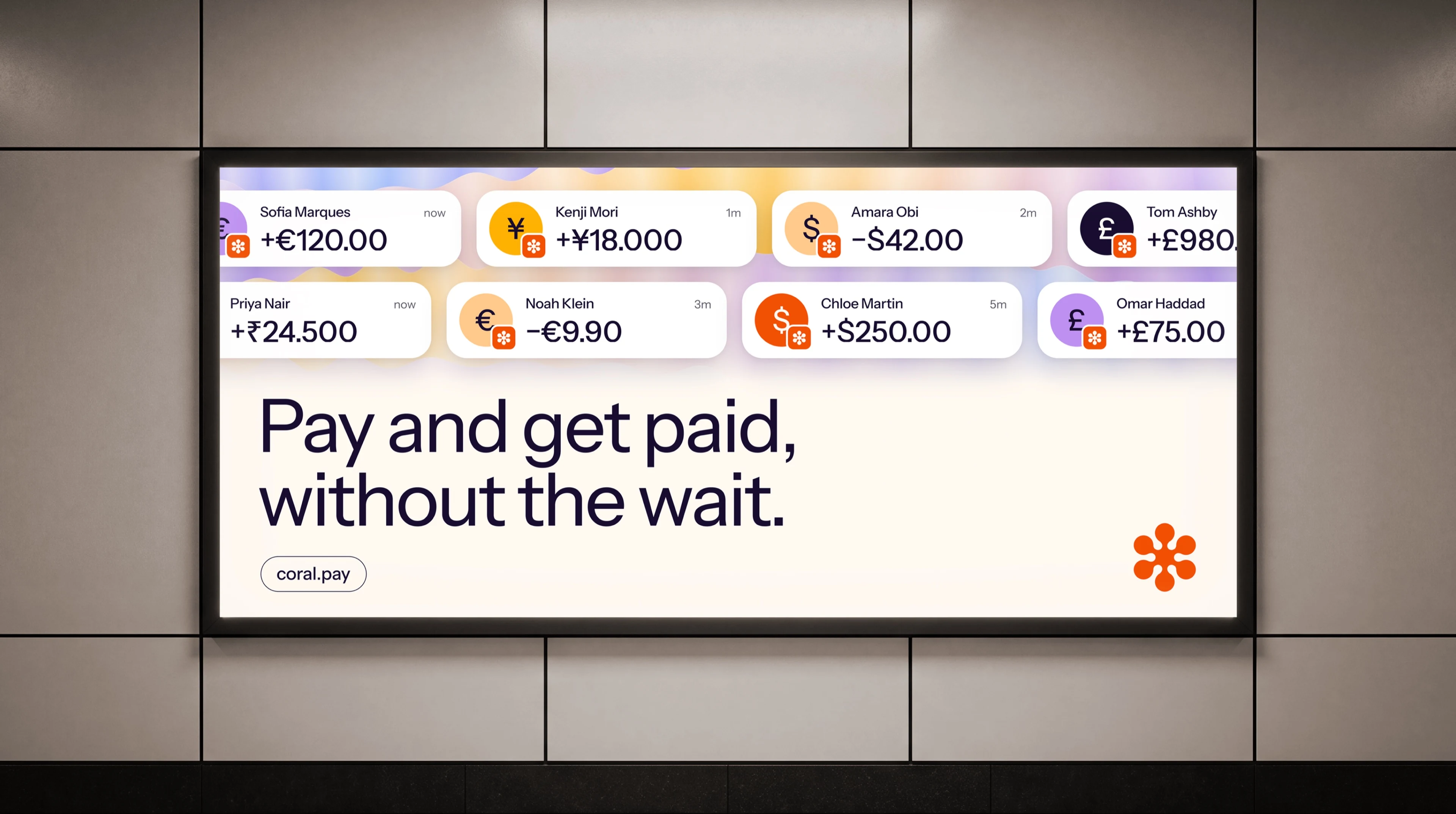
From there, the system goes everywhere: posters, business cards, badges, folders, tote bags and T-shirts. It reads as one brand.
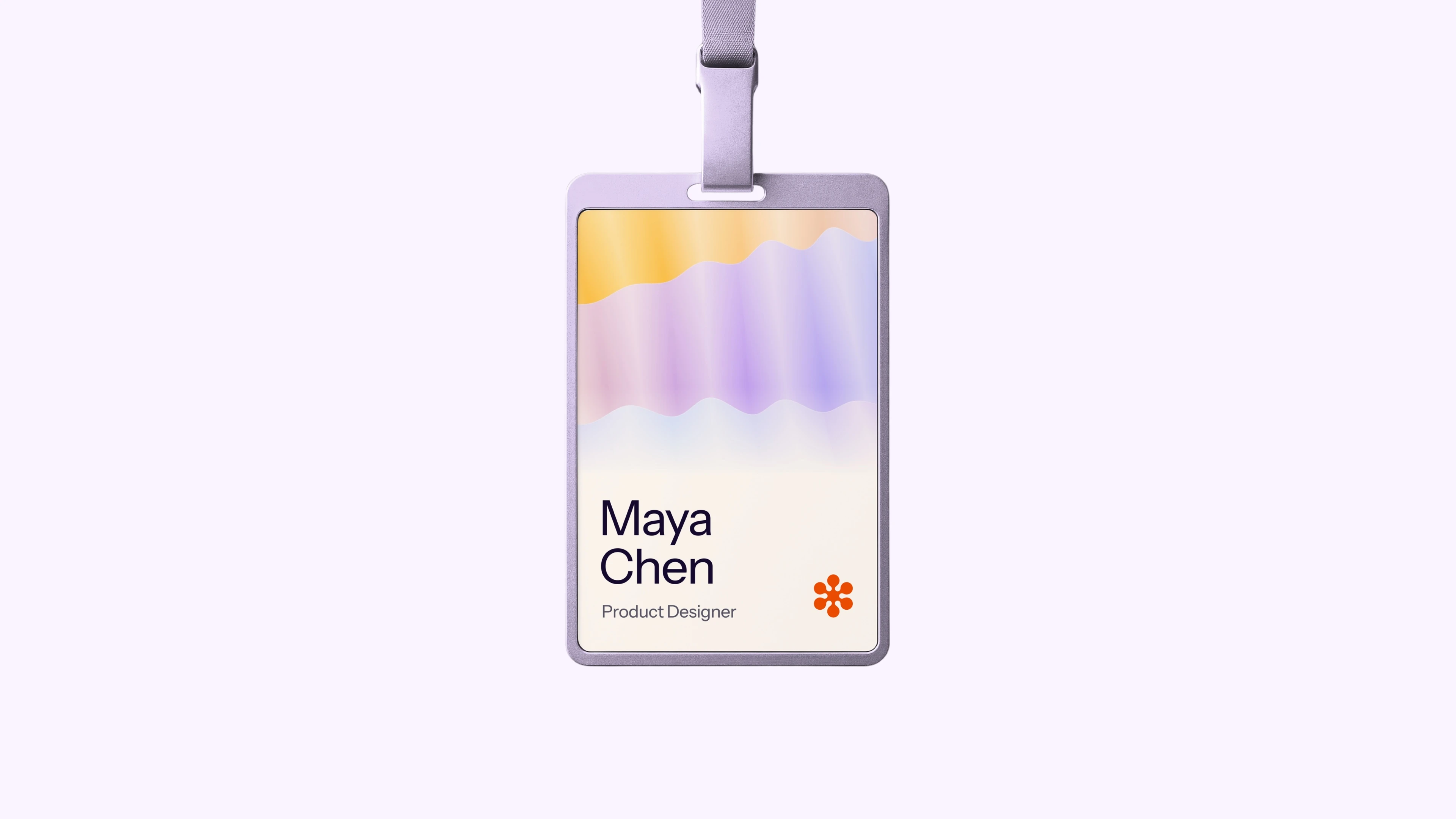
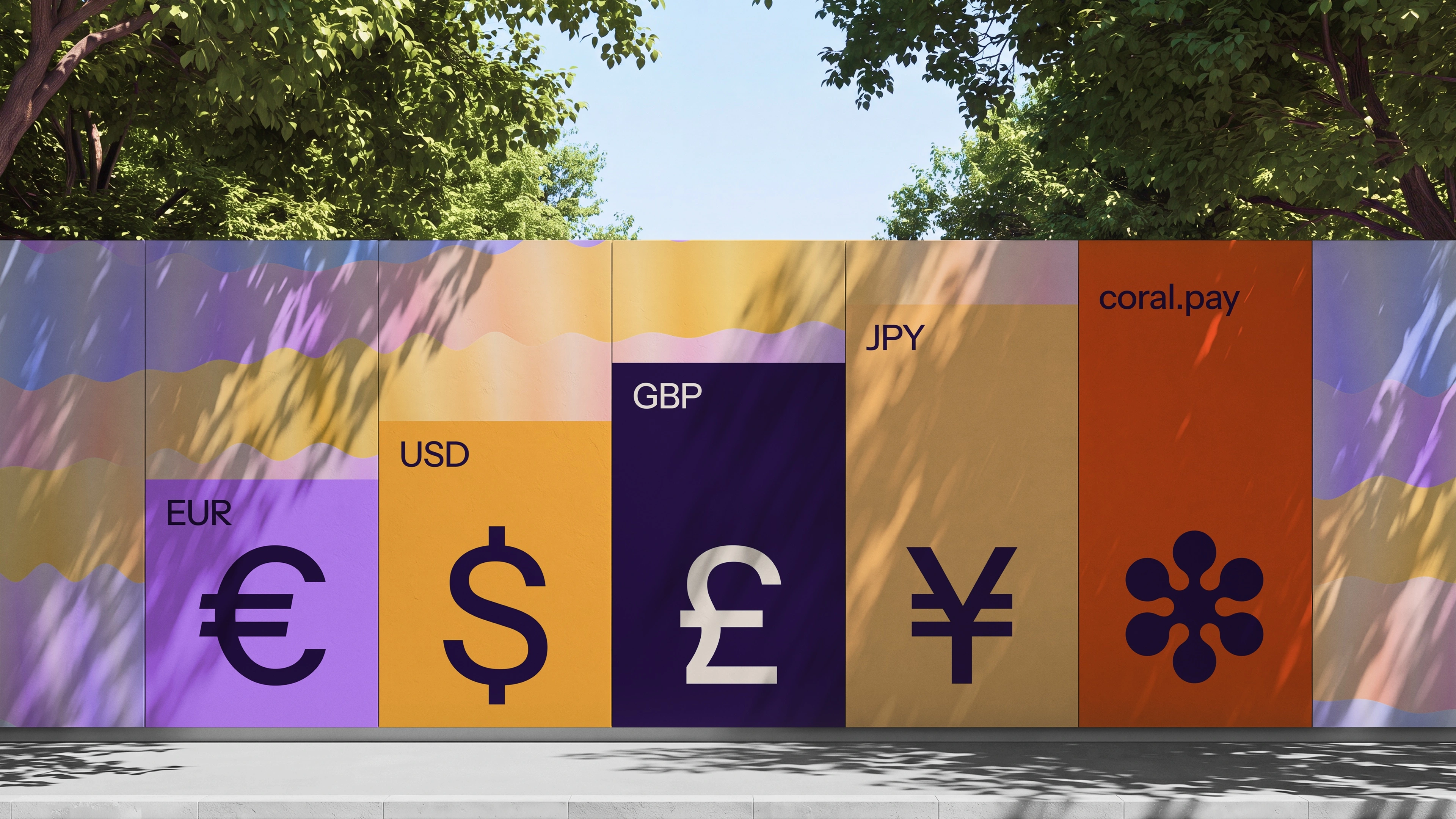
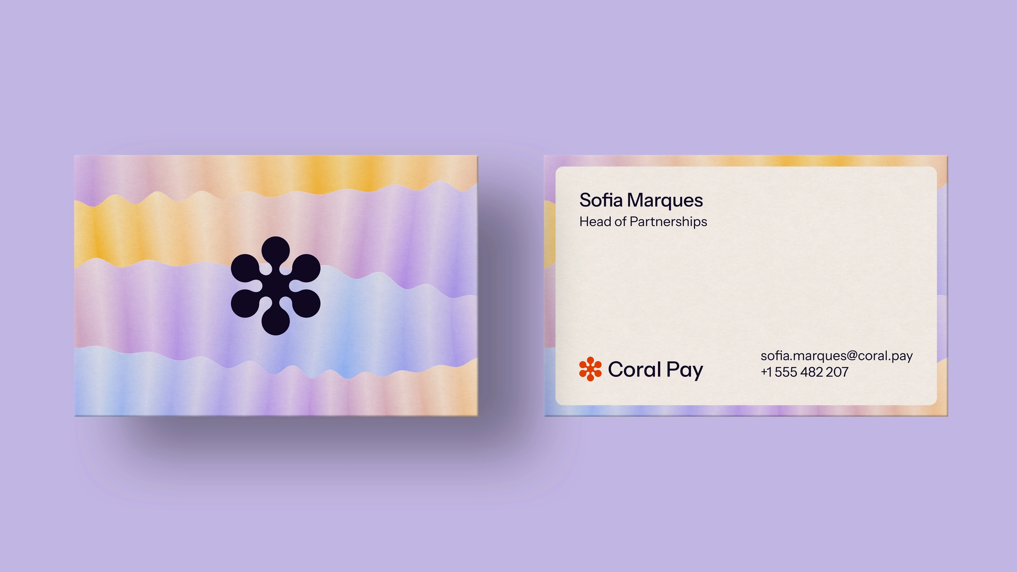

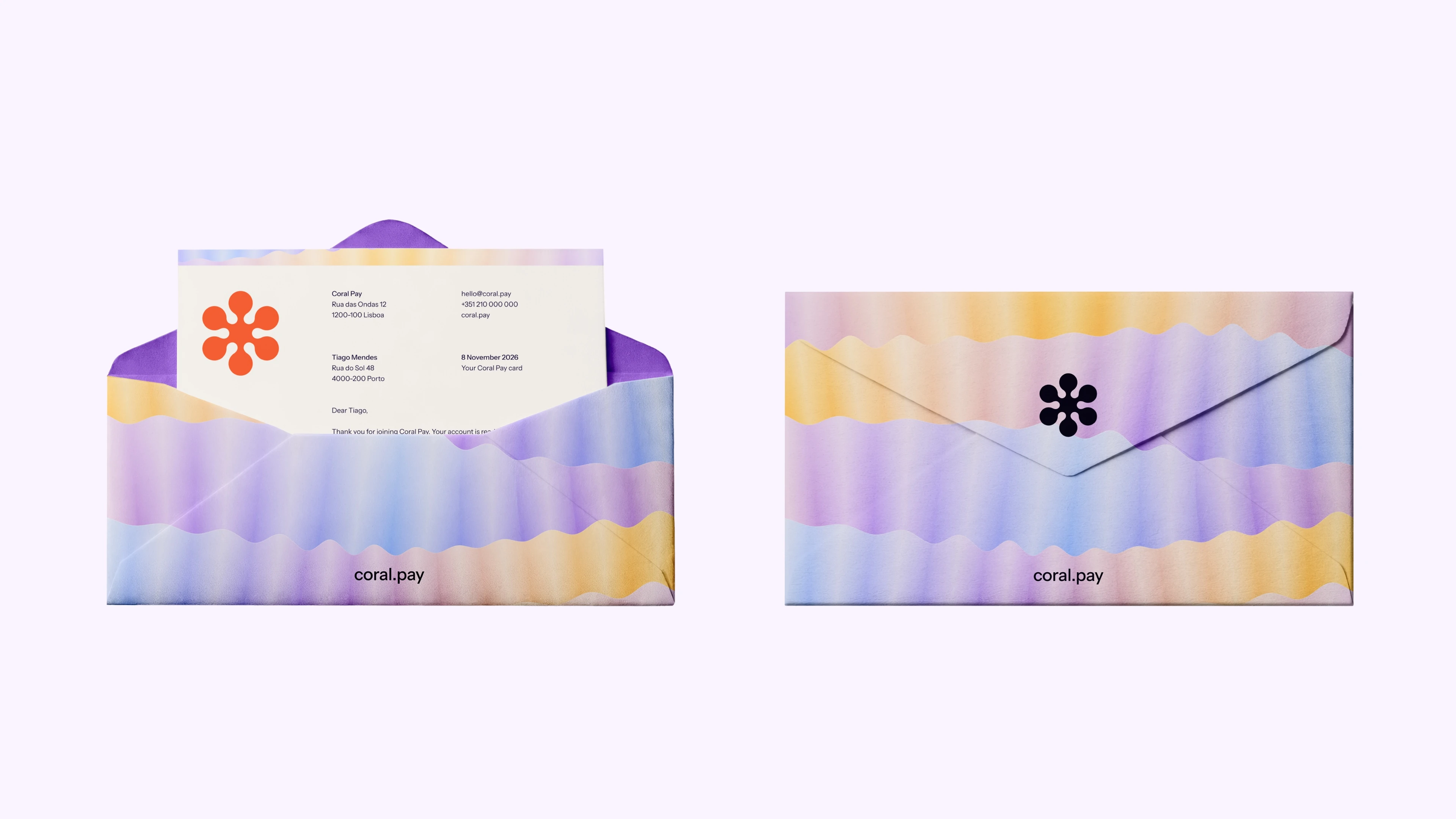
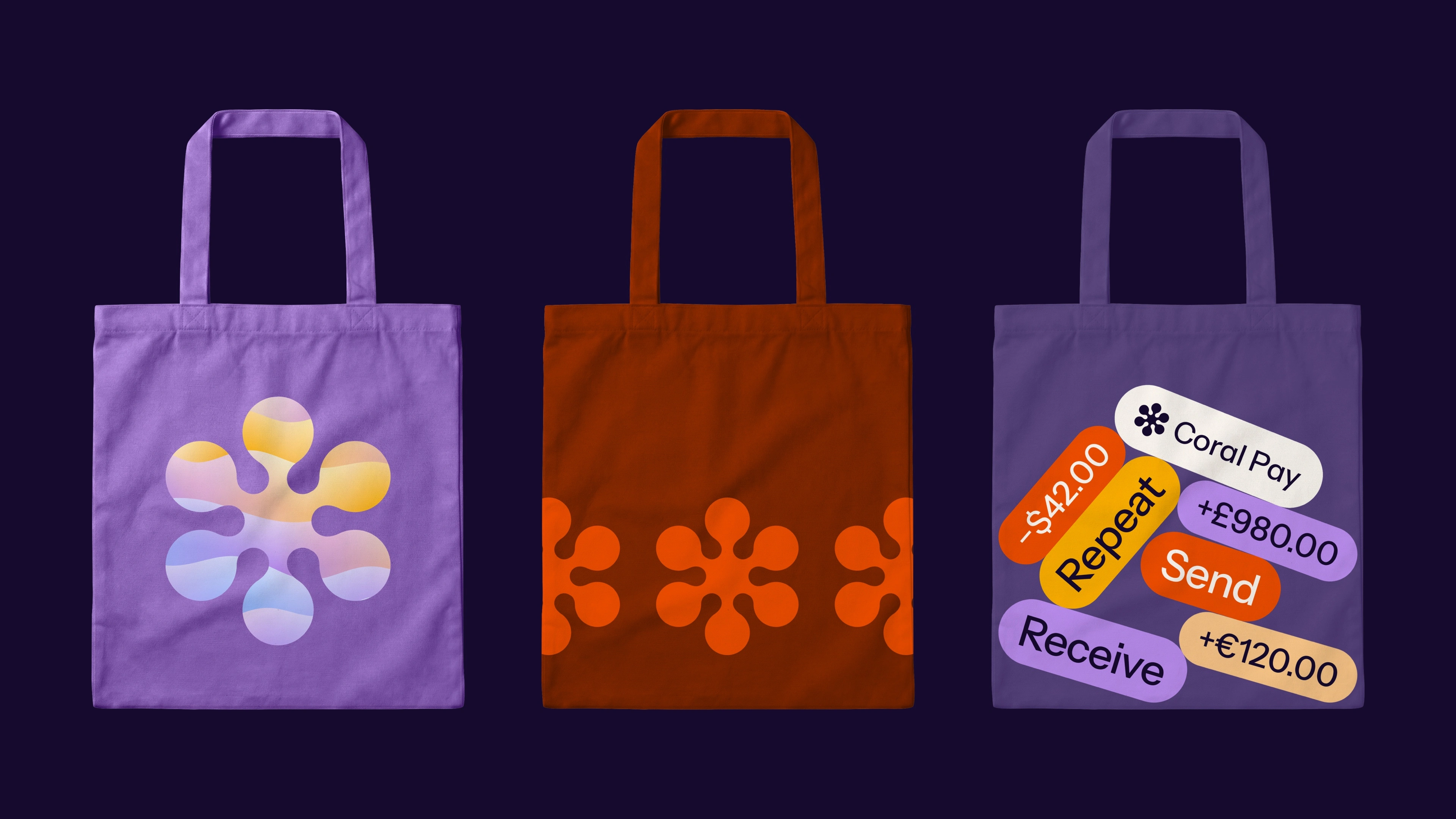
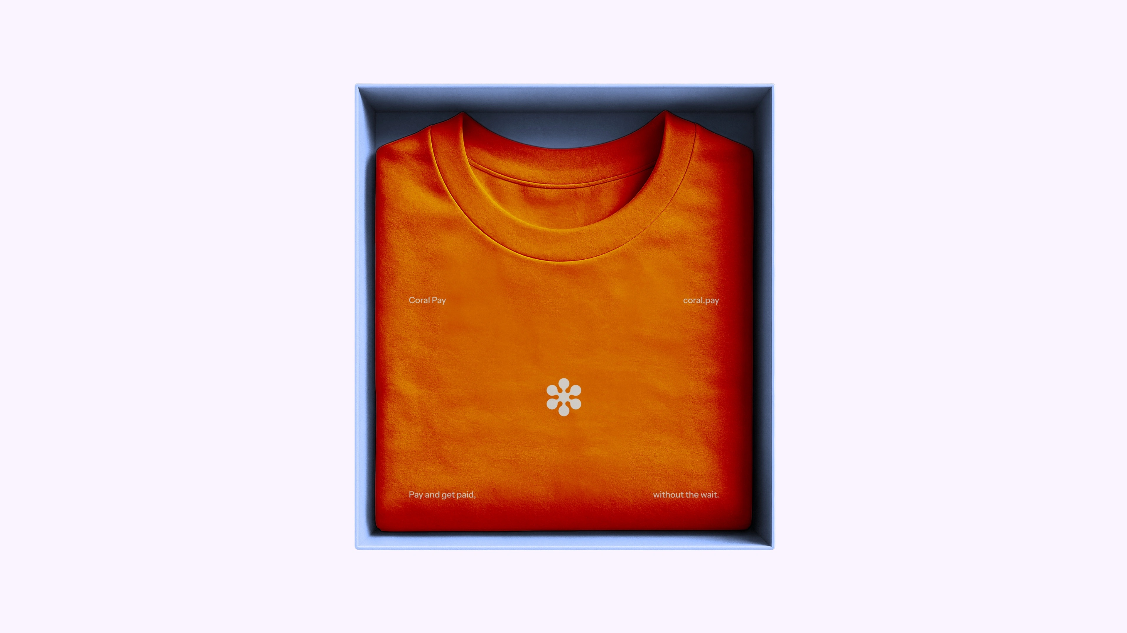
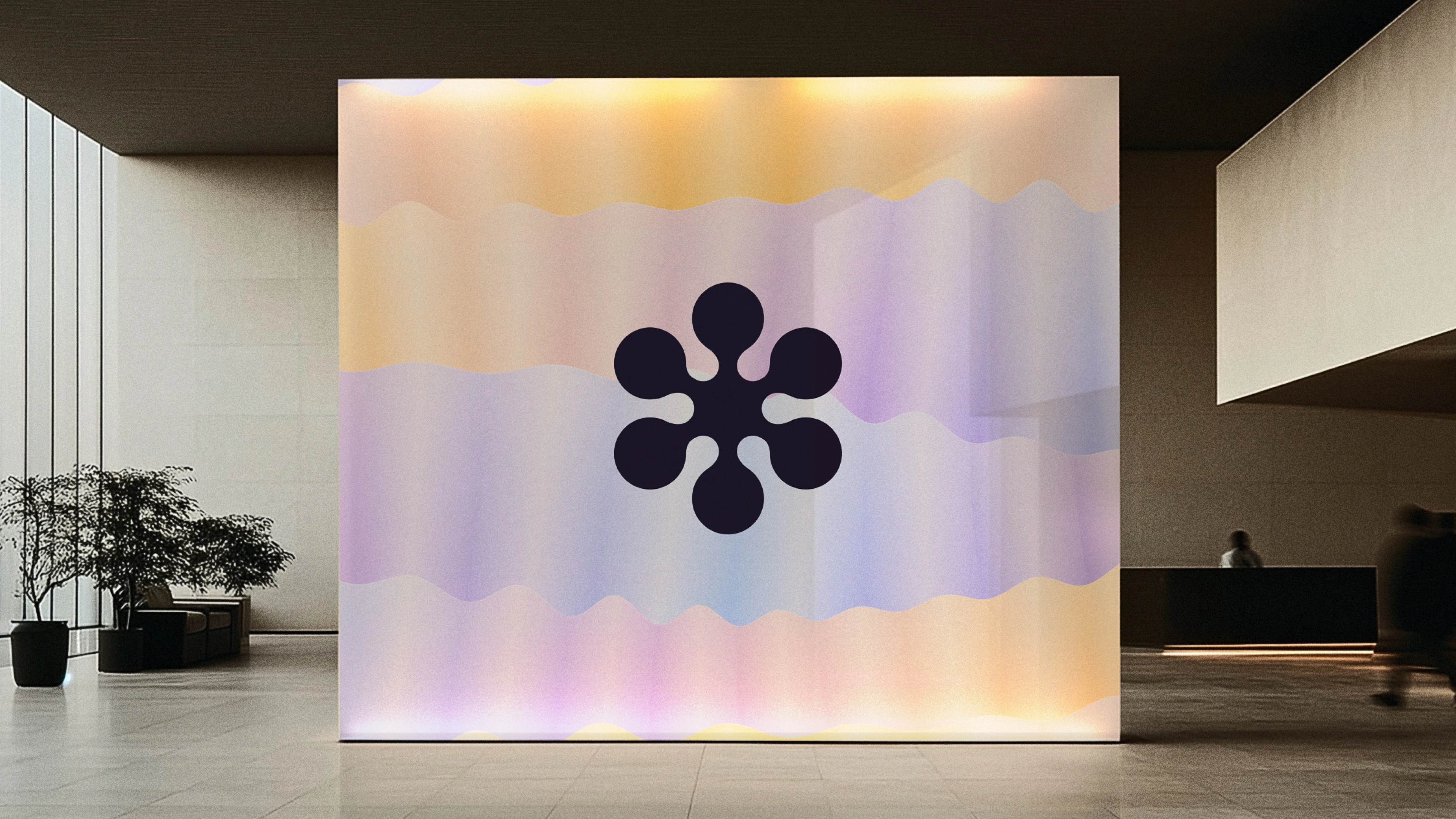
Delivered: the logo and mark, color palette, app icon, product UI, motion, print and merch.
Next brand, yours?
Brand identity, logo design, web design, product UI and motion, built as one system. Send a message on Contra.
1 like · 2 views · Nov 12, 2026
Brand identity and logo design for Coral Pay, a fintech payments app for sending money in any currency. Friendly, warm and nothing like a bank.


