Simpl. Branding and Identity

The Brand:
Simpl is a preventive nutritional brand specializing in daily snacking that incorporates the nutritional benefits of Asian superfoods into Western flavour profiles.
Our mission is to help people reduce long-term disease risks through accessible, wholesome snacking choices.
Our vision is to be the trusted food brand that people incorporate into their daily lives to naturally prevent long-term diseases, promoting a healthier and more vibrant future for all
Elevating daily nutrition with global superfoods for a healthier, better life through the power of preventive nutrition.

The Concept:
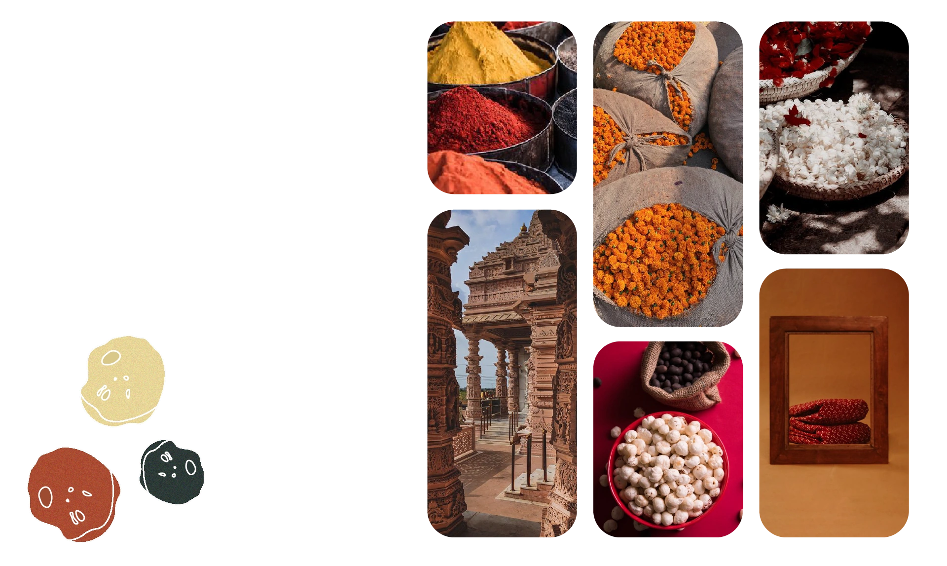
Simpl. is a brand that at it's very core values and wants to shine a light on culinary exploration, hollistic wellness, cultural richness and fusion. For their brand they wanted an overall earthy aesthetic in fusion with some maximal elements.
To show this, we chose earthy colours with minimal fonts and a more playful logo.
The Colours/Aesthetic:
White background and earthy colours representing the various Asian flavour options
Colourful logo with variations according to flavour
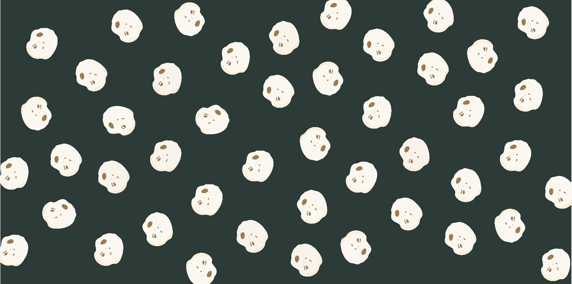
Pattern made of product illustration in different sizes

The Fonts:
While the Logo is of a more playful font, the primary and secondary fonts represent the earthy tone the brand follows.


The Product:
Fox nuts: These nuts are crunchy, crispy, full of fiber and loaded with nutrition
Flavonoids, which are found in fox nuts, are also antioxidants. It combats free radicals and slows the ageing processFox nuts boosts protein and fiber intake, aiding in weight loss by reducing cravings and promoting appetite regulationConsumption of Fox Nuts over time can aid in the regeneration of dead tissues and the treatment of chronic inflammation.Reverse AgeingWeight LossReduce Inflammation
The Pattern:

Like this project
Posted Jan 5, 2024
Overall branding for a fusion snack brand wanting to target and break into the Western market while highlighting their Asian Flavours.


