Jewel Babe didn’t need a

Hoorain Arshad


Jewel Babe didn’t need a prettier logo. It needed to know who it was talking to. I started with research into her: a trend-conscious, Pinterest-styled woman who wears jewelry to express herself.
From there I locked the strategy (durability, feminine confidence, affordability, plus a casual, soft, trend-aware voice) before touching a single logo sketch.
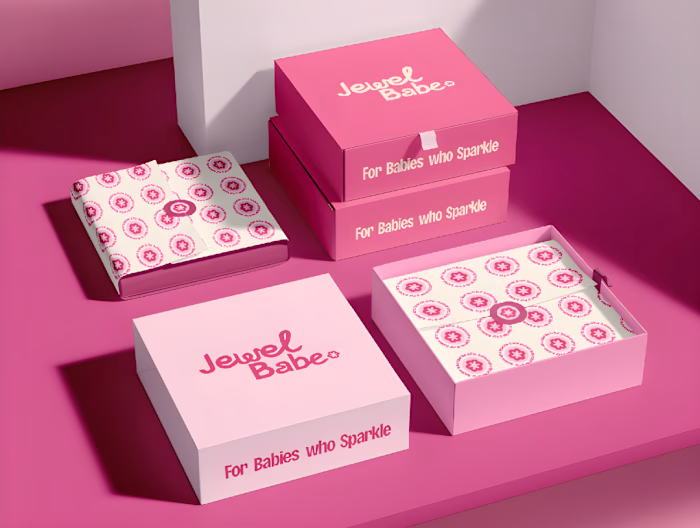
The result is a bold pink identity with a new wordmark and symbol, the tagline “For Babes Who Sparkle,” and a system that runs across packaging, print, and social so every touchpoint feels like one brand.
Want an identity built on strategy, not just good looks? Let’s talk.
Like this project
Posted Oct 14, 2026
Jewel Babe didn’t need a prettier logo. It needed to know who it was talking to. I started with research into her: a trend-conscious, Pinterest-styled woman ...
Likes
0
Views
1
Timeline
May 14, 2026 - Jun 14, 2026