Face It Cosmetics branding
Face It is a revolutionary makeup brand focussed on breaking the notions of traditional beauty industry.
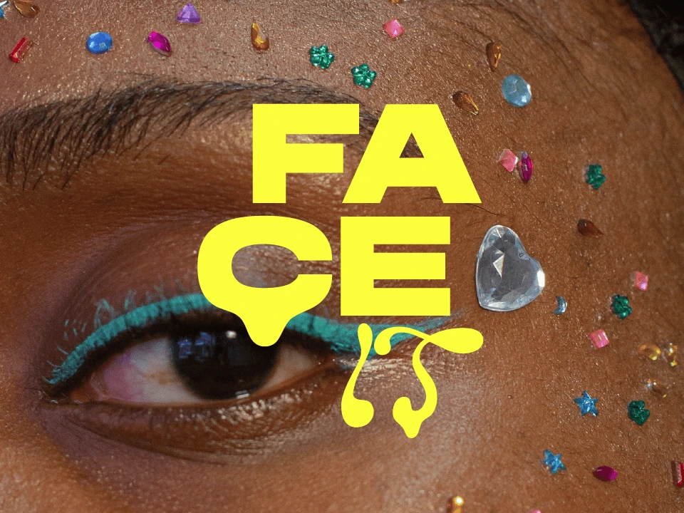
Brand concept:
Face It is a revolutionary makeup brand focussed on breaking the notions of traditional beauty industry by empowering their customers to express themselves through makeup completely freely, not caring about gender norms or beauty standards. The brand wants people to view makeup as a form of art rather than a tool to make you look prettier. They claim that makeup is for everyone to just have fun with it and they transfer the values of inclusivity and freedom into every part of the brand.
Objective
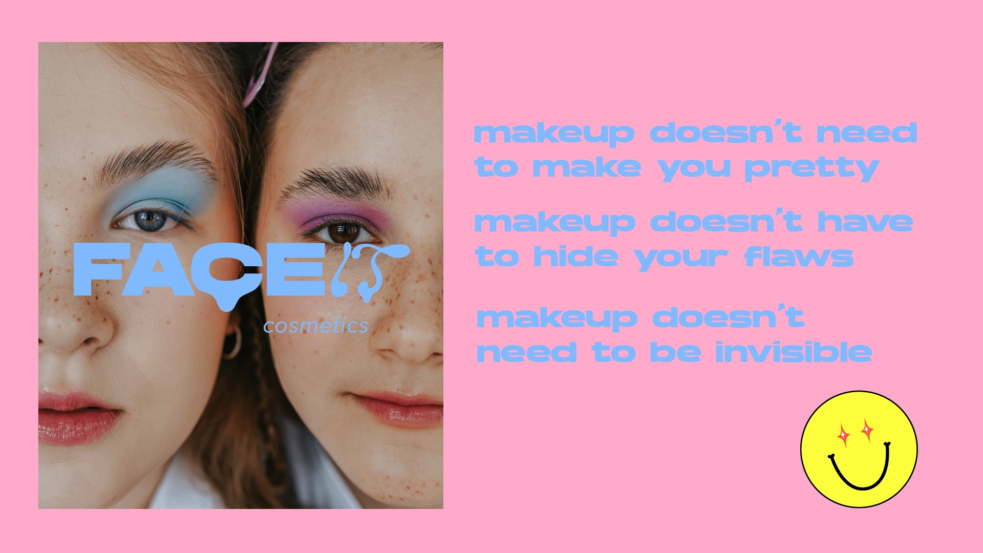
To communicate brand values of inclusivity, freedom of expression, creativity and unfettered fun to the gen z consumers in a bold, daring way that will make the brand stand out from the saturated beauty market and help it gain a cult-like following.
Solution
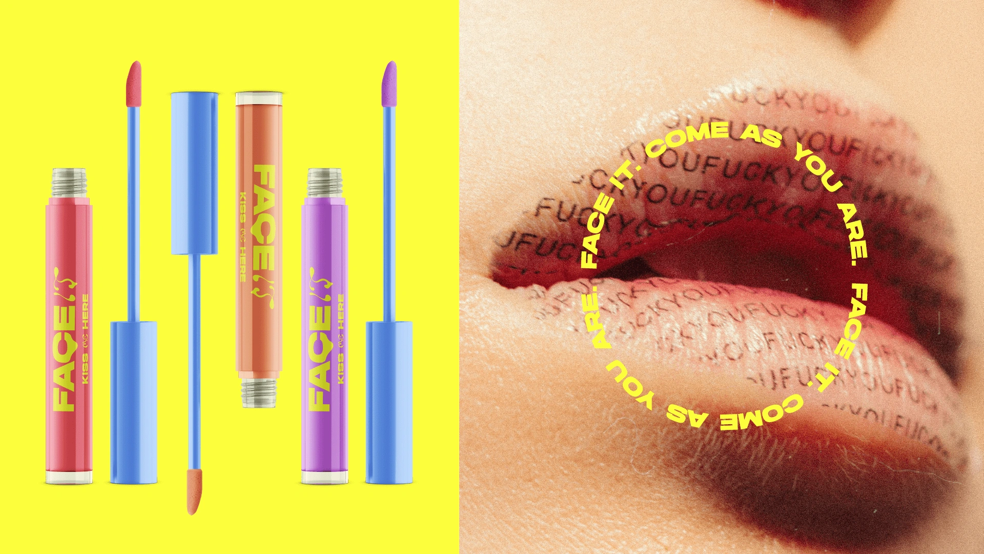
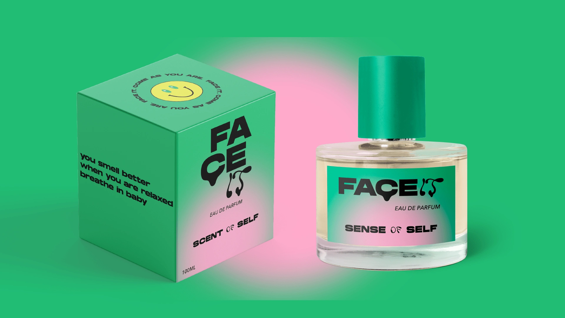
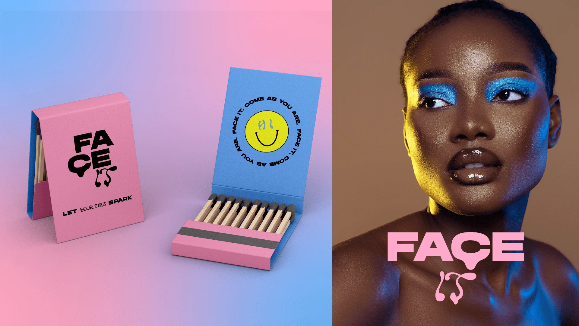
Brand uses the name “Face It” with a tagline “Come as you are” setting the tone for the whole communication, promising unapologetic authenticity and courage to express oneself fully.
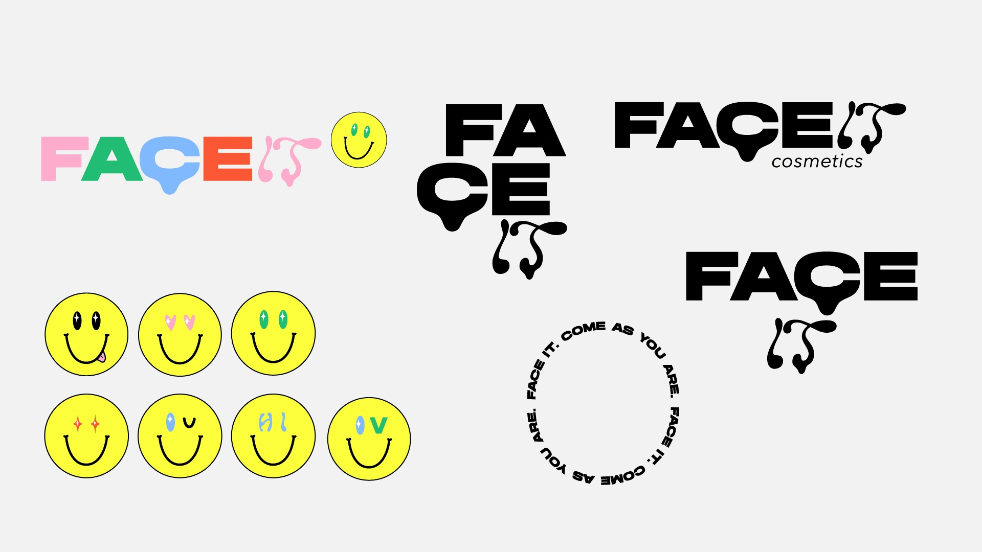
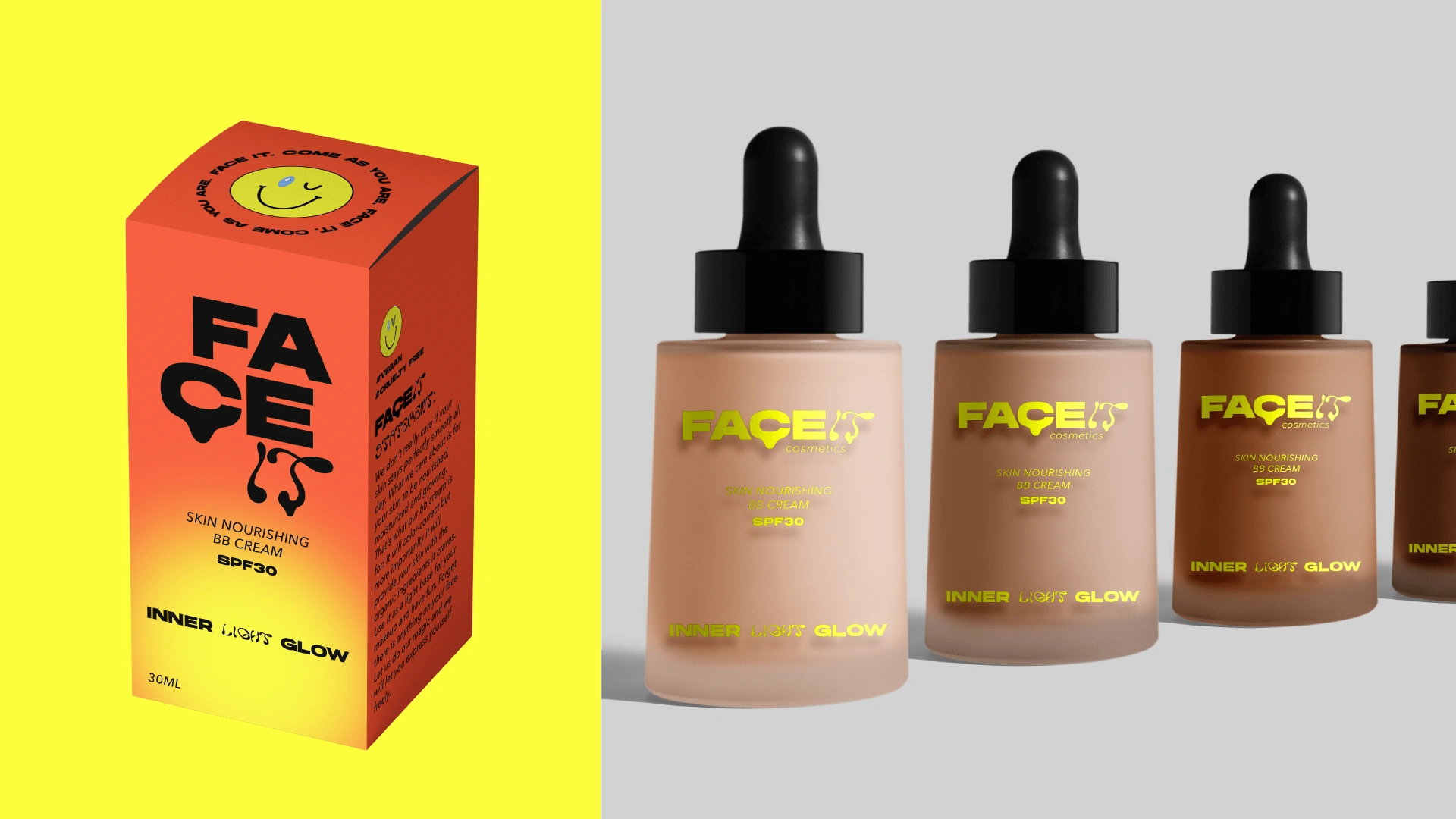
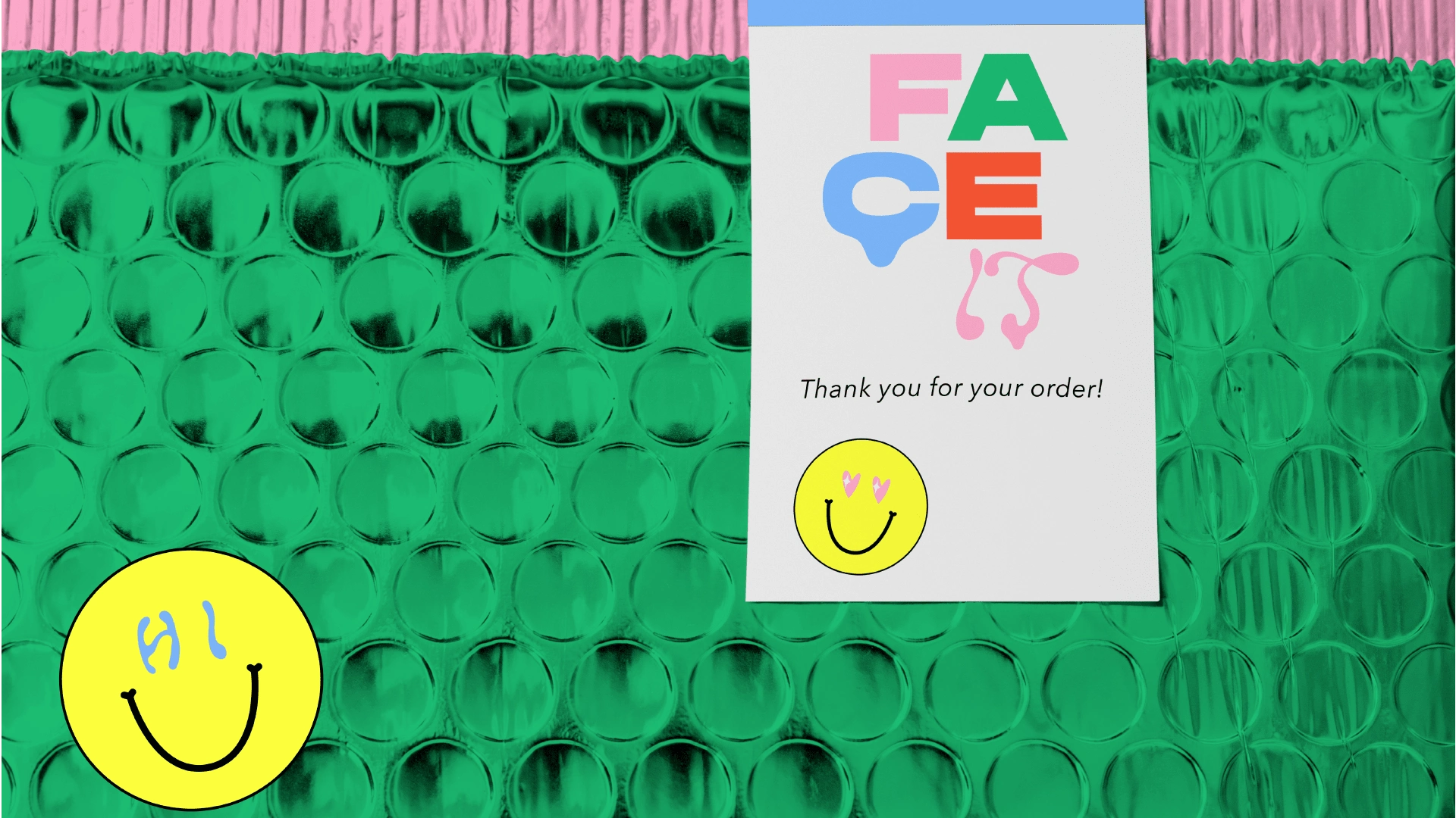
Brand logotype is a combination of bold sans serif font and a fluid display font. Combining the two contrasting fonts create a very distinct, modern look and evokes associations with imperfect makeup, a little bit uneven, yet eye-catching.
Color palette and imagery
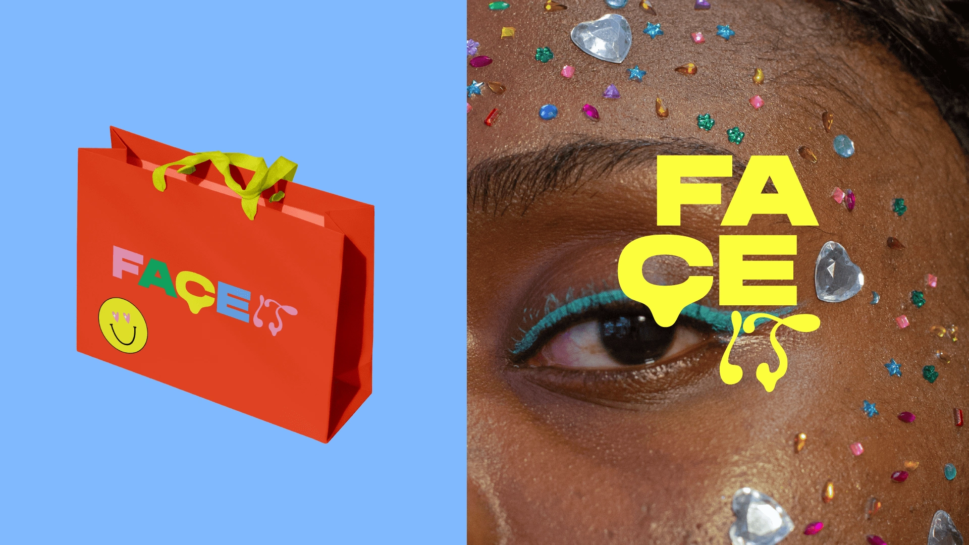
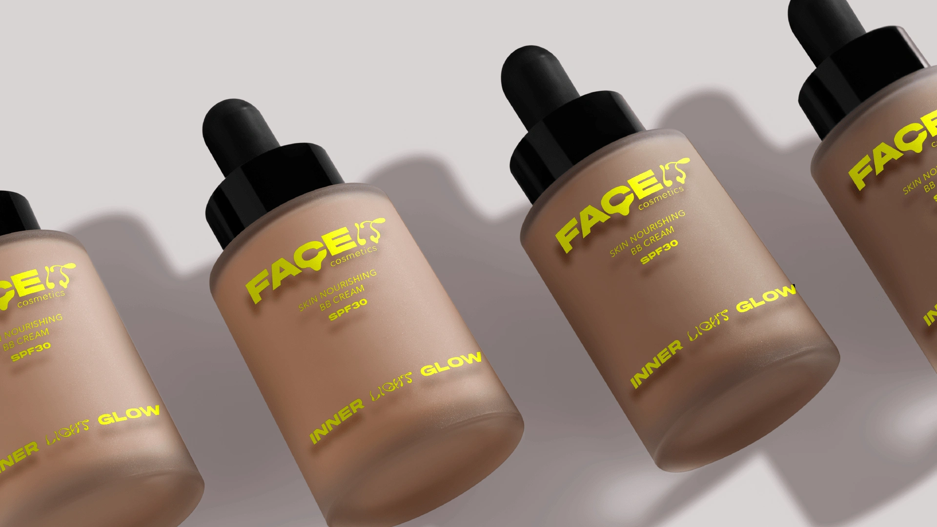
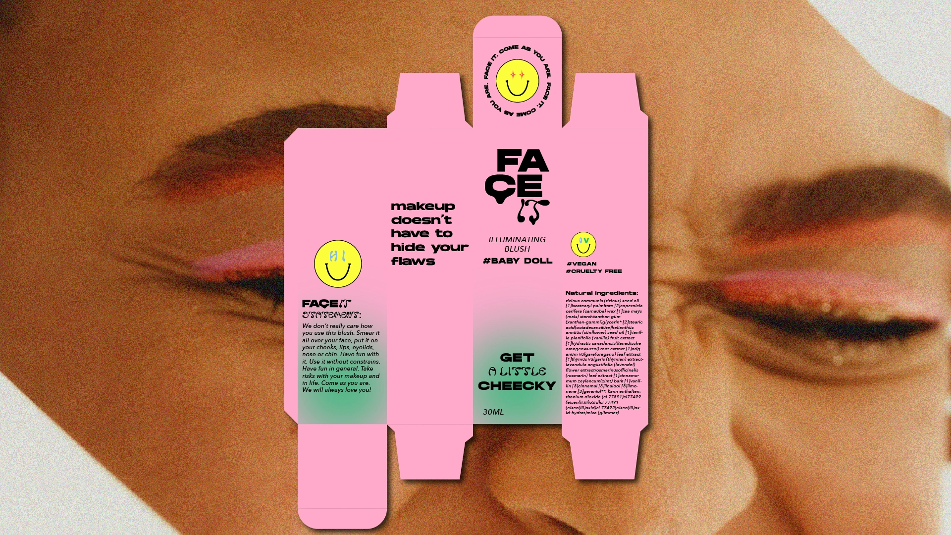
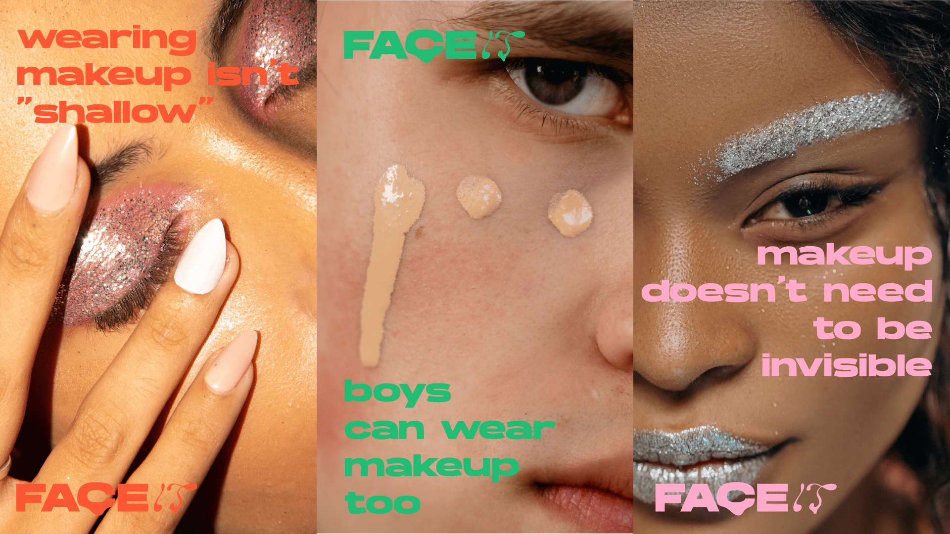
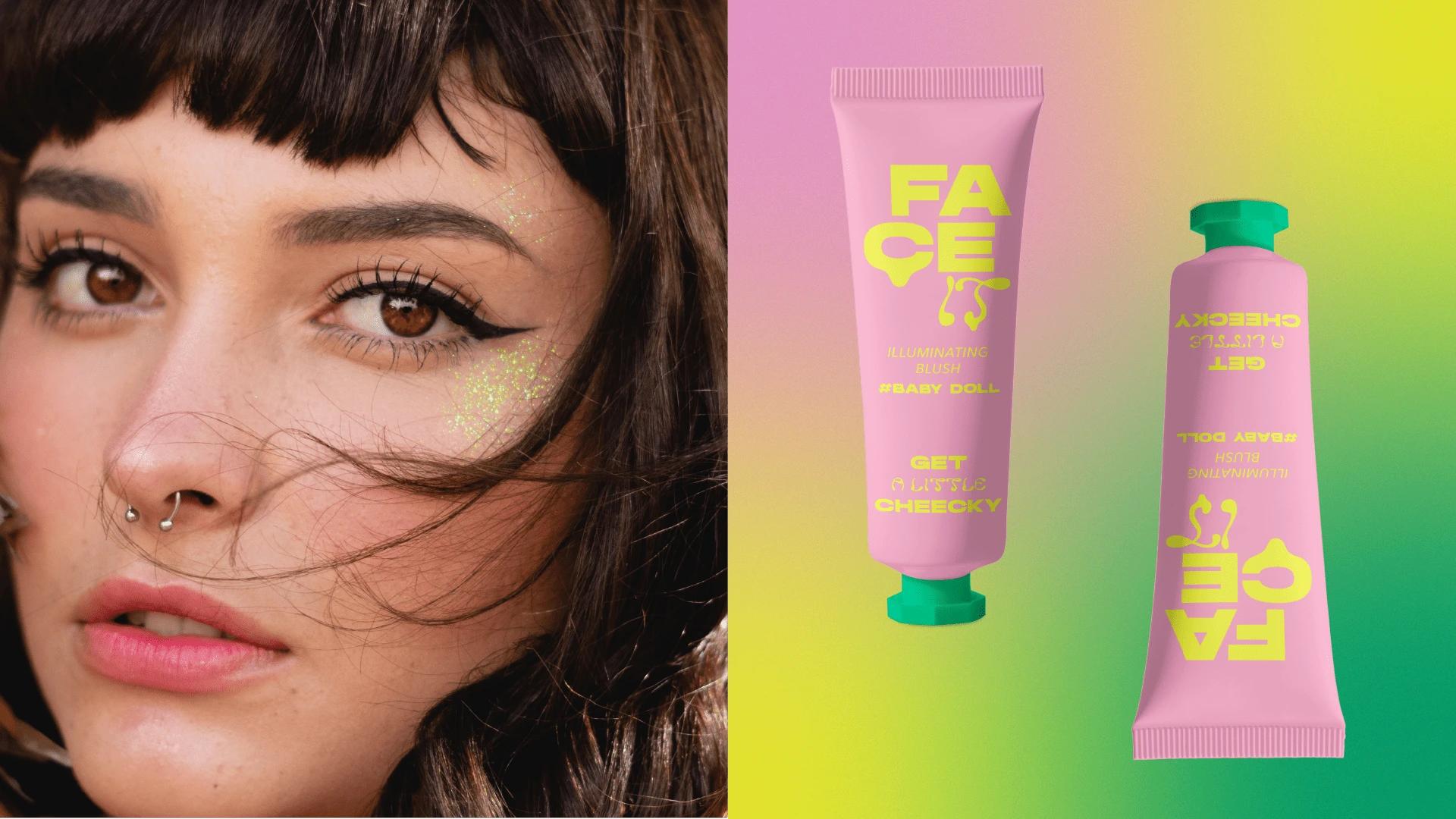
Brand color palette and imagery are fun and youthful. The imagery for the brand focuses on presenting makeup as a creative outlet using models in really interesting, colorful makeup looks going against the mainstream beauty market focusing on “clean look” and “no makeup makeup”, Face it boldly shows that it is good to stand out and not be afraid.
Like this project
Posted May 16, 2023
Face It is a revolutionary makeup brand focussed on breaking the notions of traditional beauty industry.

