Logo Redesign for Potters International College
Jacob Asare
Potters International School is an accredited career-oriented training college based in Accra-Ghana. The college offers certificate courses, advanced diplomas and foundation programs to students passionate about turning their interests into professional skills.
Color Palette
Potters new identity is characterized by the use of a vibrant palette of complementary shades for greater contrast. The entire branding highlights humans through a series of hand-picked photos. The primary color scheme is composed of intense hues, with softer variations added to balance out the overall impact. The marketing components are dressed and accompanied by bold colors that capture the eye, while section backgrounds are more frequently associated with pastel declinations. The rounded typeface with a light serif evokes the tenderness found in elegant finishes.

Photography
The photos cut out and masked into the logo's shield presented on a colored background, show friendly and smiling people. They are integrated into a shape that allows them to stand out from the background.

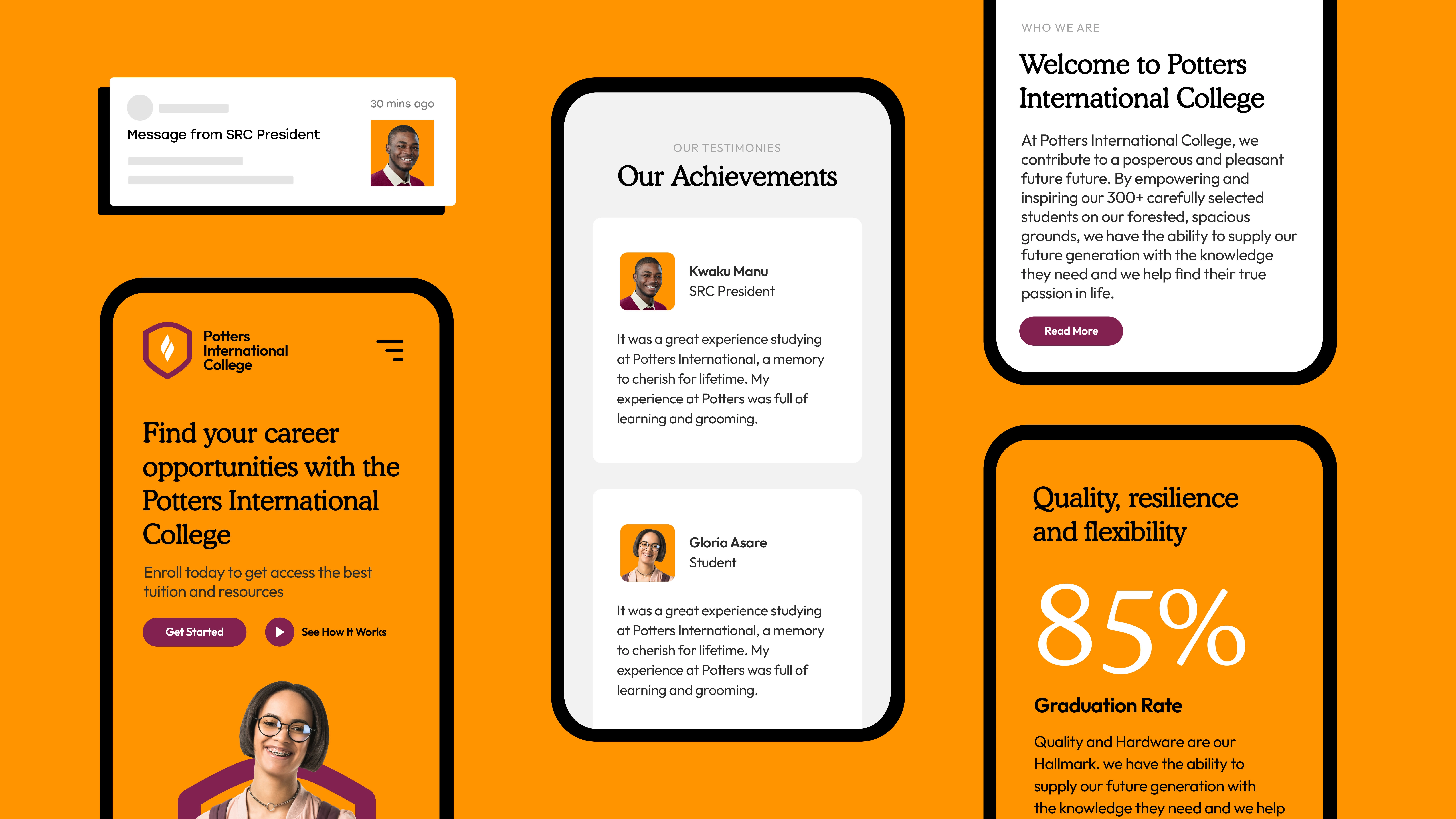
Potters Website
All the elements mentioned above are combined and organized on the website, the online ambassador of this new warm and accessible identity.
Like this project
Posted May 14, 2023
Redesigned the logo of an International School to better reflect its brand values and target audience, resulting in increased brand recognition