Olite Logo & Brand Identity Design
Abdul Rehman
Olite Logo & Brand Identity.
Olite is an AI intelligence platform that helps mid-to-large businesses transform their raw data into real-time decisions. Operating at the intersection of artificial intelligence and enterprise software, Olite sits as an invisible layer between a company's existing tools, reading signals, surfacing patterns, and delivering precise insights at the exact moment they are needed.
The company serves operations leaders, data teams, and executives at organizations of all sizes across logistics, fintech, healthcare, retail, and SaaS.
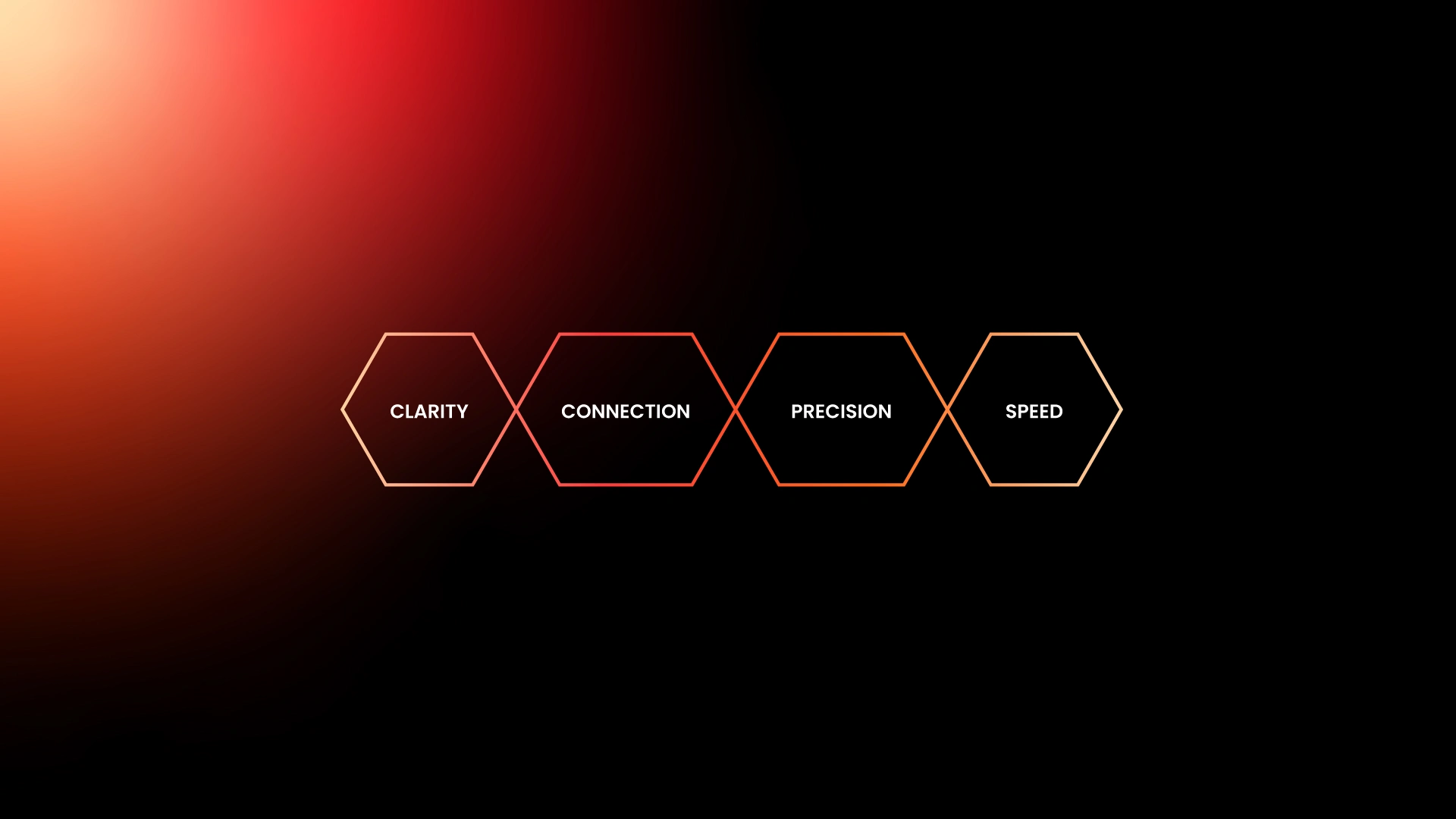
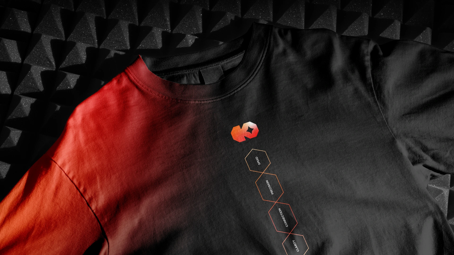
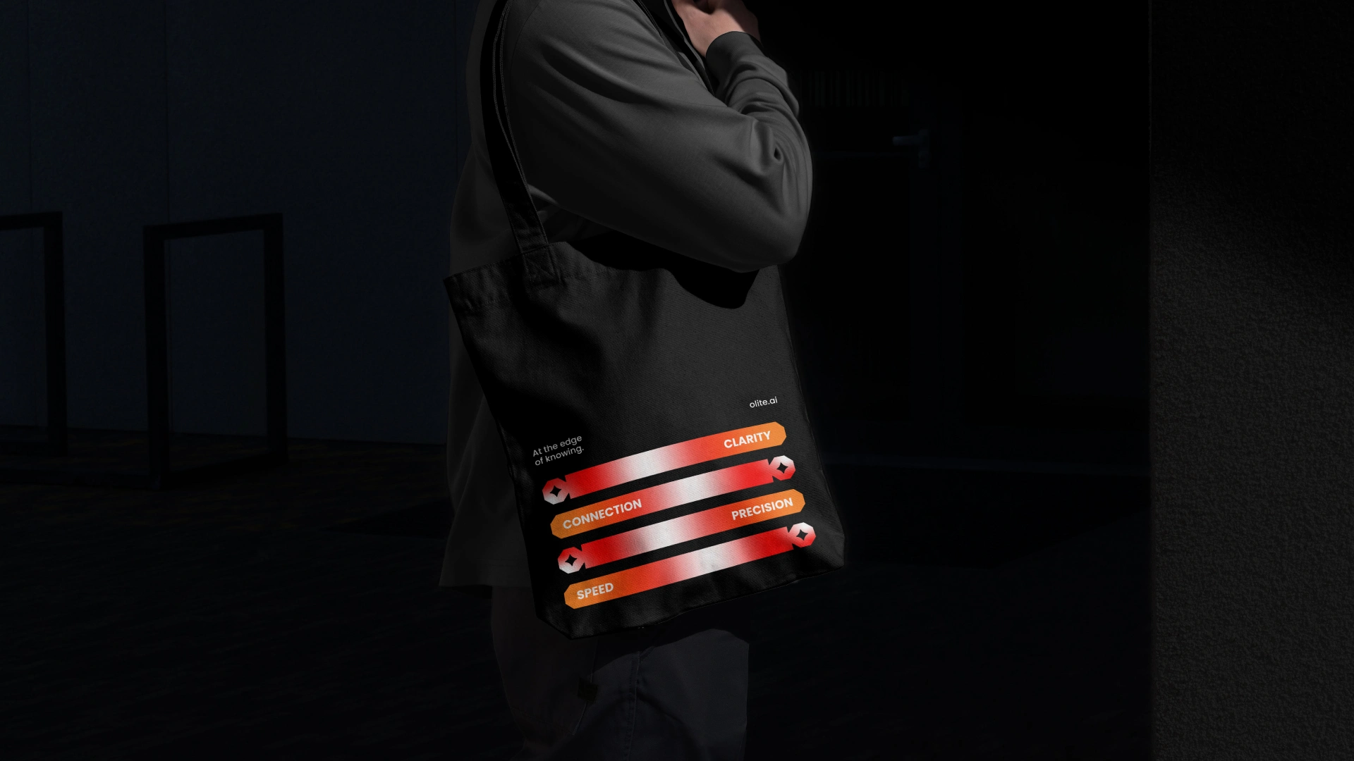
Olite is built on four core principles. Clarity, because the right signal should never be buried in noise. Connection, because no system, team, or decision should ever work in isolation. Precision, because approximately right is never good enough. And Speed, because the best insight delivered too late is no insight at all.
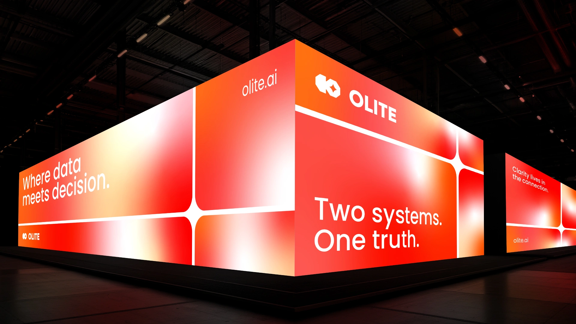
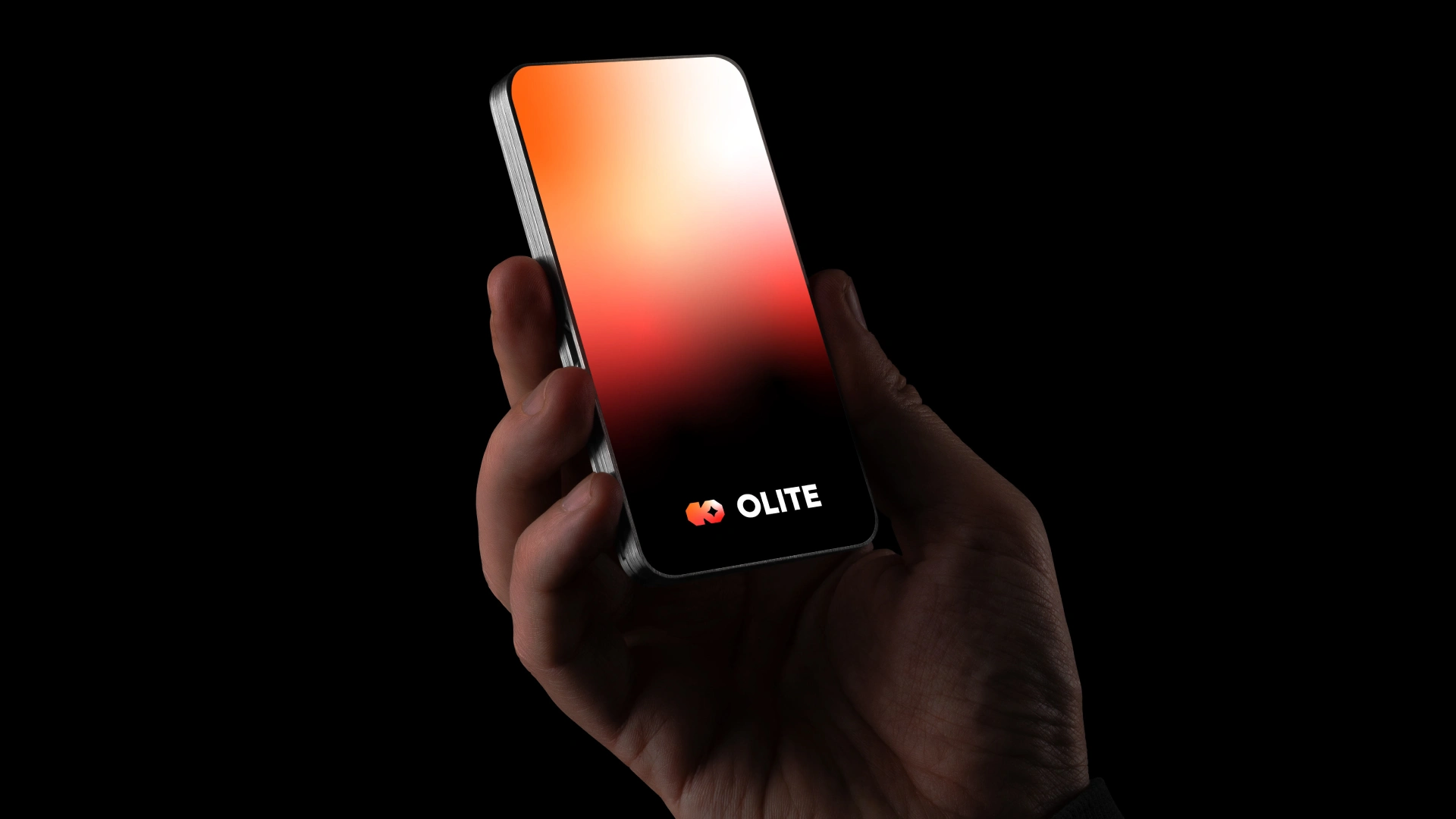
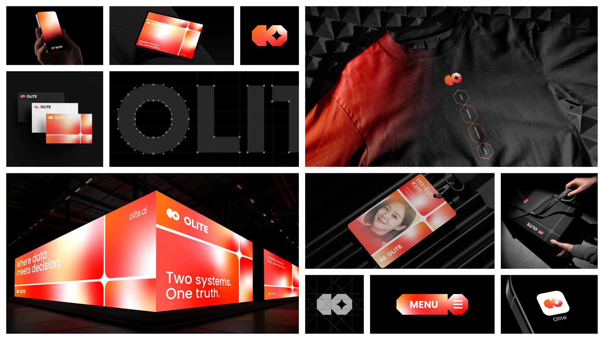
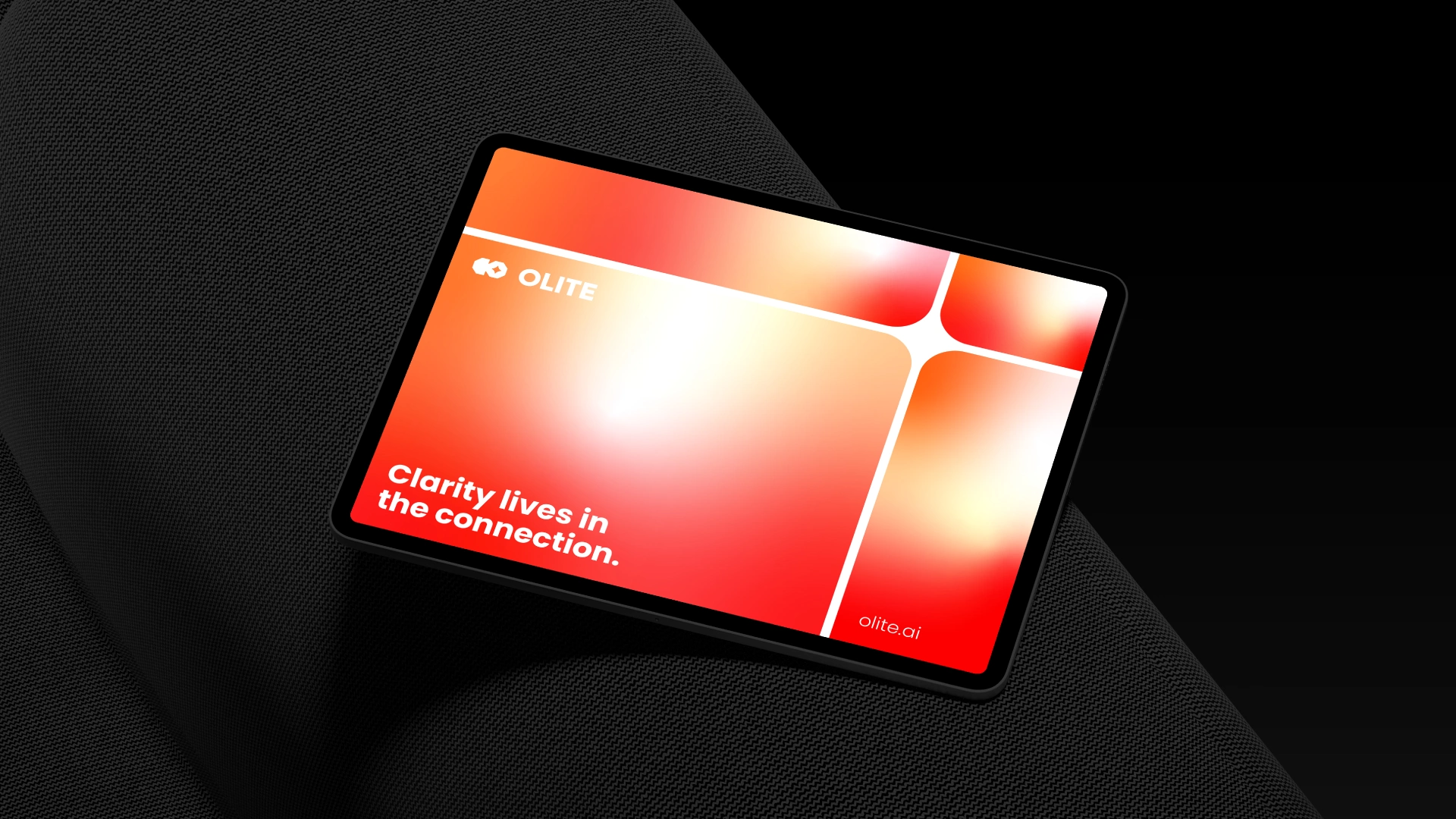
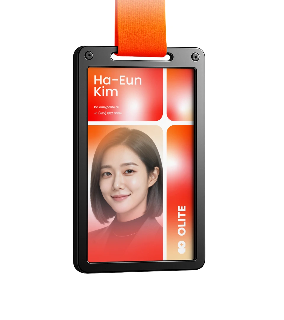
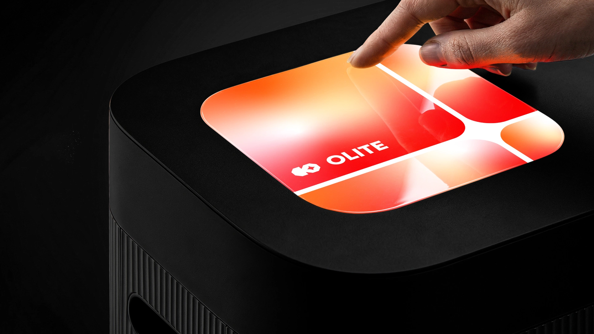
The Olite color system is built on a warm gradient that moves from deep red through burnt orange into pure white light. The palette is bold without being aggressive, energetic without losing refinement. The gradient is never static — it shifts, glows, and breathes across every touchpoint, always returning to that central point of light. A visual metaphor for the brand idea itself. Clarity emerging from complexity.
Olite uses a clean modern sans serif typeface to represent the brand's commitment to simplicity and intelligence. Sharp, legible, and quietly confident — the type never competes with the idea.
The Olite visual system extends from the logo itself. A modular grid of four panels divided by a clean white cross, each carrying the warm gradient that flows across the brand. At the center, a four-pointed star emerges naturally at the intersection — the same mark from the logo, now a system. A point of light that holds everything together.
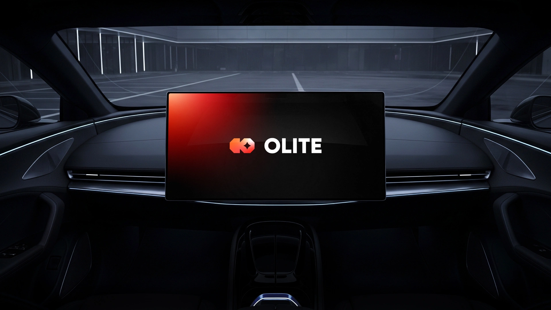
The Olite logo mark is built for adaptability. Beyond the identity, the interlocking octagon form translates directly into UI components — buttons, navigation elements, and interactive controls that carry the same visual language as the brand. The mark does not just identify Olite. It becomes the system.
The Olite logomark combines two interlocking octagons forming the letter O, with a four-pointed star at the heart of the mark.
O. The star represents precision and clarity — a single focused point of light. The octagons represent connectivity, two systems becoming one. Every element of the mark carries meaning. Nothing is decorative.
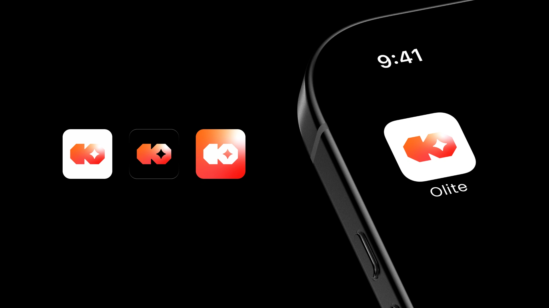
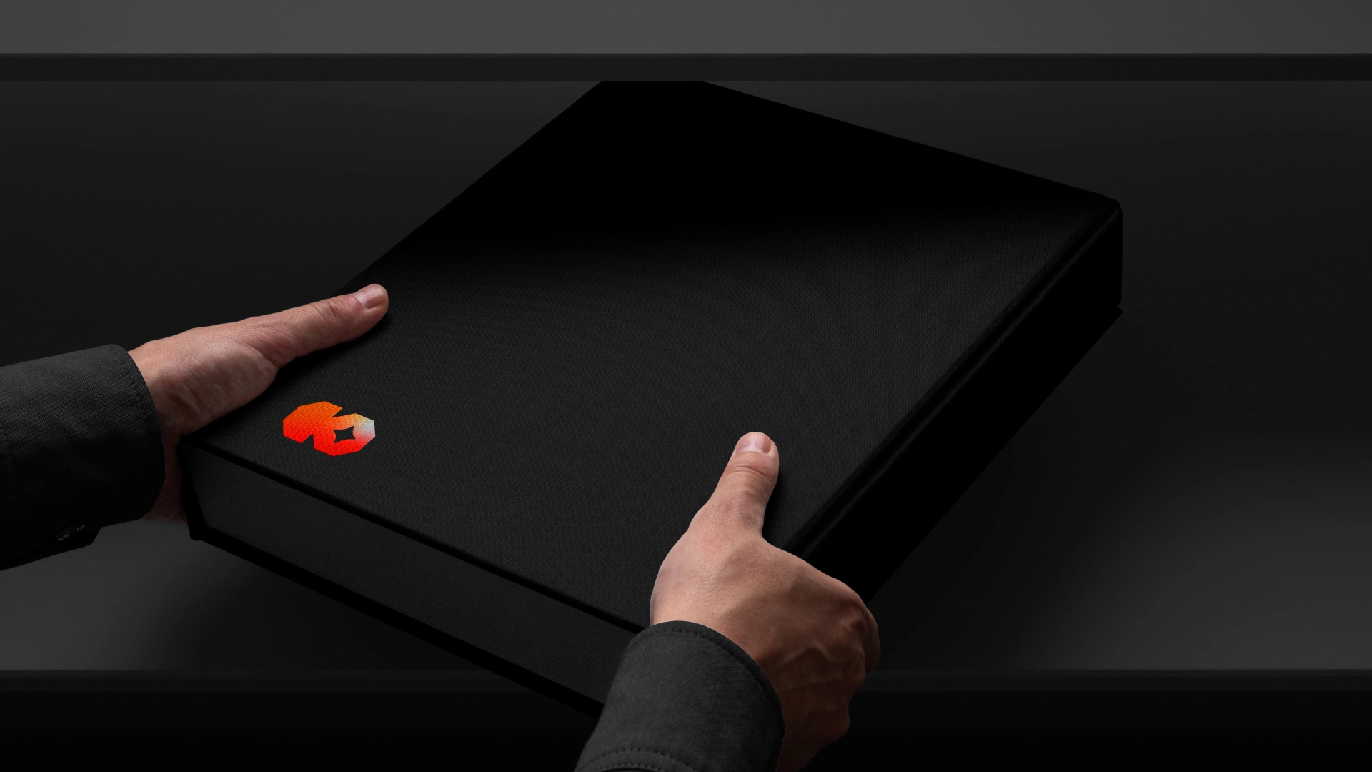
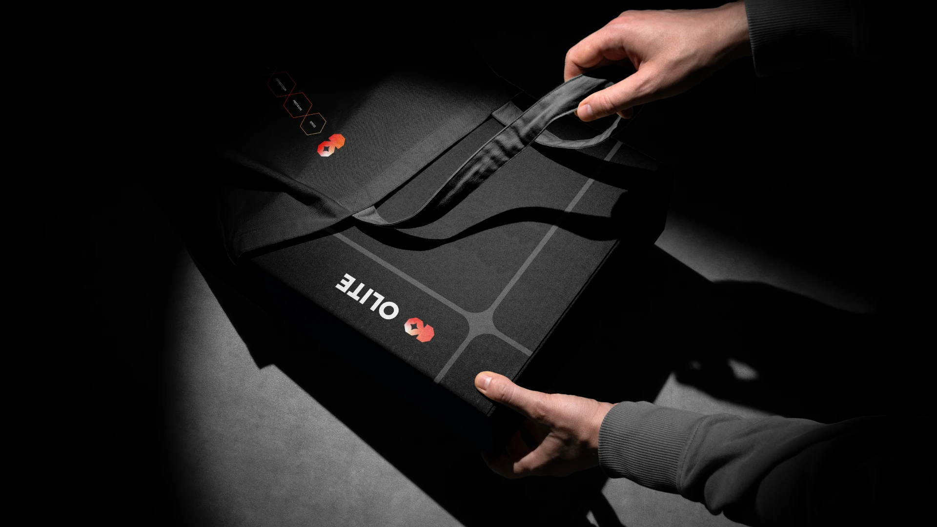
The Olite logomark is built to live everywhere. From digital screens to printed materials and embroidery, the mark holds its integrity at every scale and across every surface.
Like this project
Posted May 22, 2026
Created a logo and brand identity for the Olite AI platform recently. it was a fun project. Love the geometry of the logo and the gradient is looking amazing!