
W, D and S sketch in as outlines, then fill like panes of tinted glass
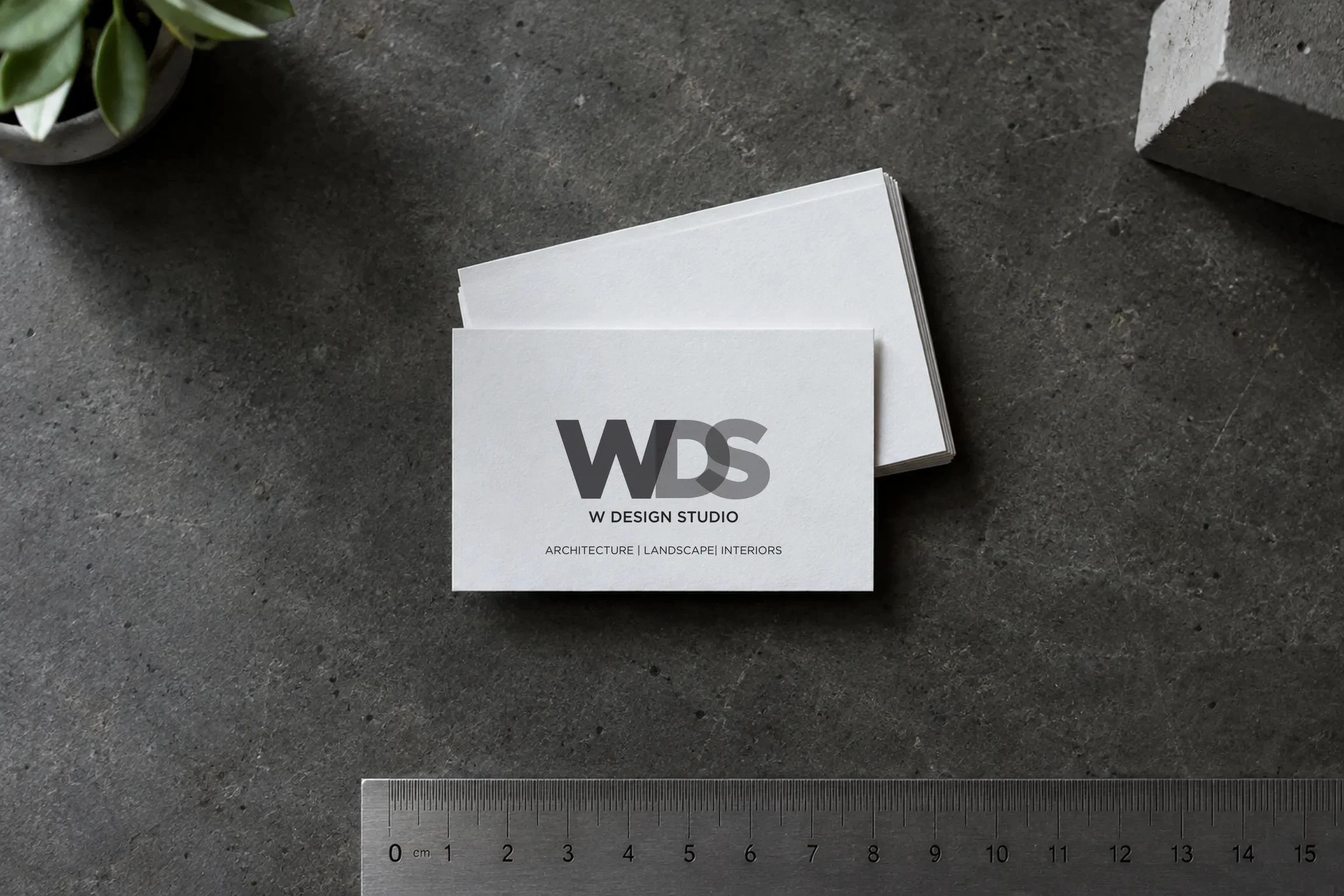
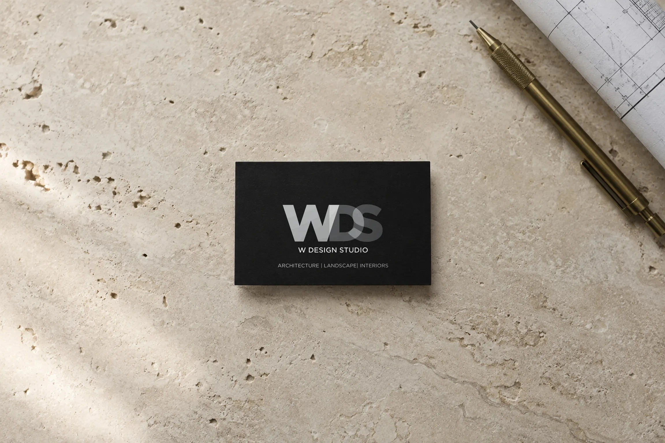
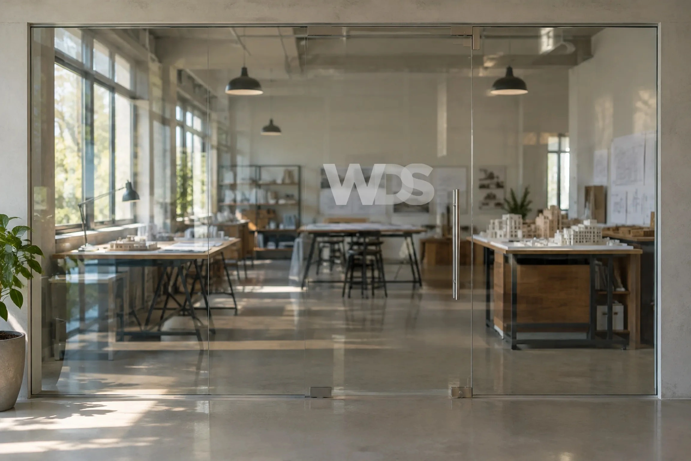
The brief: the studio's old mark was a serif W. The new identity had to feel as considered as the buildings, and work as well on a facade as on a business card.
Our approach: we called the route an intersection of thoughts, ambitions and new ideas. Where two letters meet, the tone deepens. Only greys, black and white, so the mark reads the same in brushed steel, frosted glass or print.
Deliverables: logo, identity, a steel facade sign and a full stationery suite.
0 likes · 2 views · Nov 16, 2026
Logo animation for W Design Studio, an architecture practice. W, D and S overlap like panes of tinted glass, and the tone deepens wherever two letters meet.


