
Eight spokes fly in and lock into the Konark wheel
The brief: a platform for ideation, innovation and incubation needed an identity rooted in Odisha that still looks like the future.
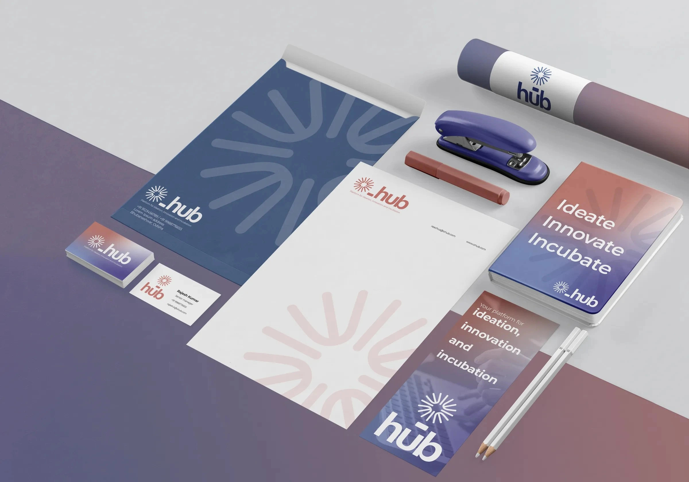
Our approach: eight rounded spokes, each standing for a value that starts with O (opportunity-driven, open-minded, outward-looking, optimal, organic, onward, original, outreach-oriented). Warm terracotta for the temples, deep ocean blue for the coast, earthy brown to tie them together, set in Montserrat.
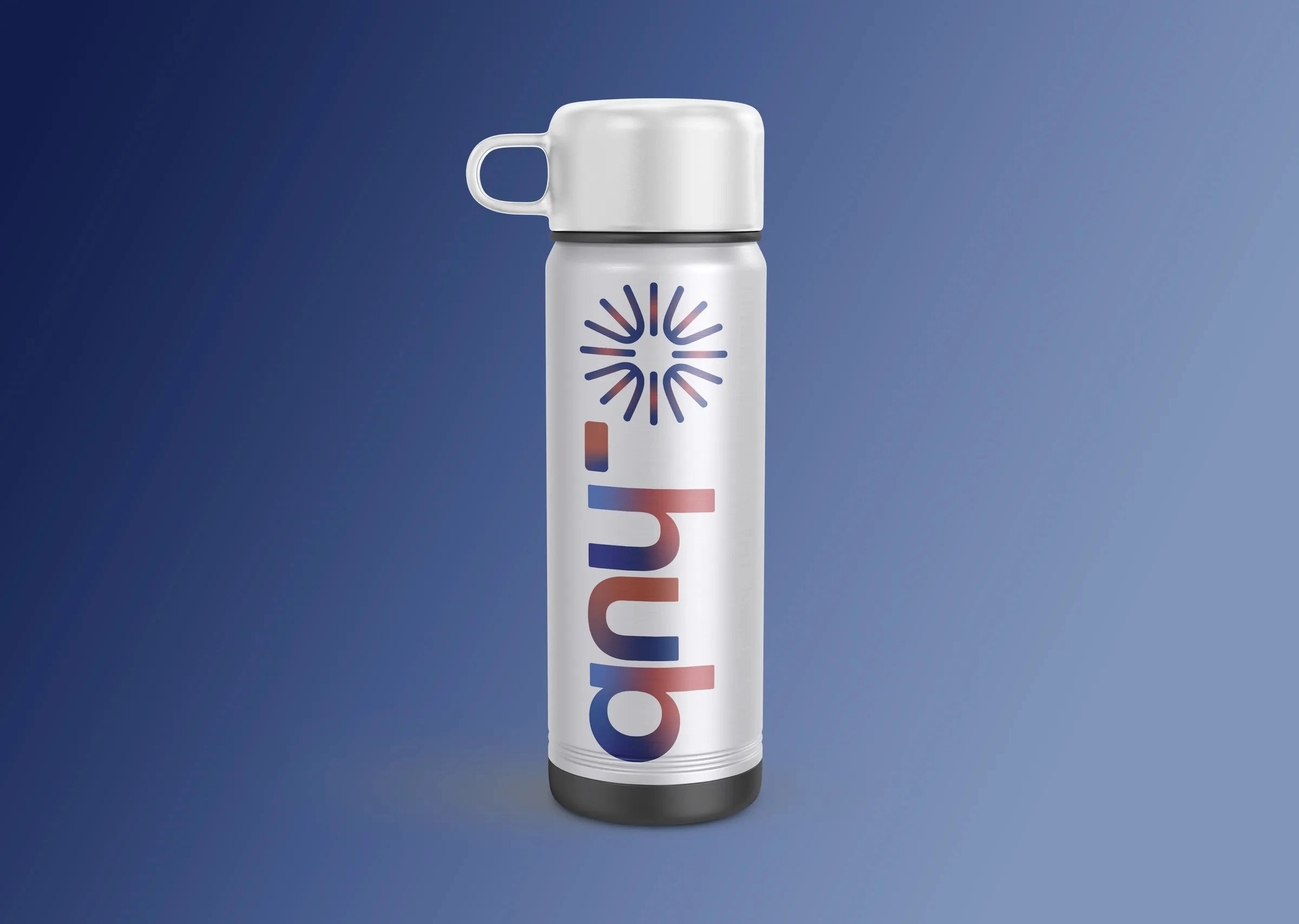
Deliverables: brand identity and values, wayfinding and signage, stationery, ID cards, merchandise, an app icon and a desk booking interface.

0 likes · 1 view · Nov 16, 2026
Logo animation for O-hub, the Government of Odisha's start-up hub, with W Design Studio. The Konark chakra meets an O: eight spokes, each carrying a value.


