Built with Framer
Inverted: Blog Website Design Case Study
Ekta Bhoraniya
Problem Statement
Inverted needed a clean, visually captivating blog platform that would showcase thoughtful long-form content while maintaining excellent readability and visual hierarchy.
Process
I began with content analysis to identify key user personas and reading patterns. The design process prioritized:
A minimalist navigation system
Illustration-forward visual storytelling
Content categorization that emphasizes discovery
Solution
The final design features:
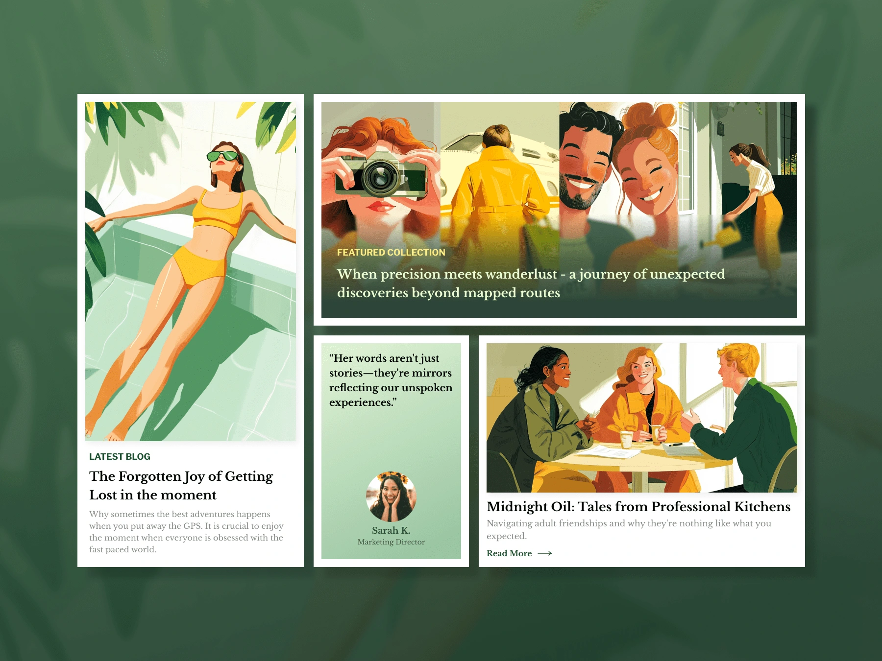
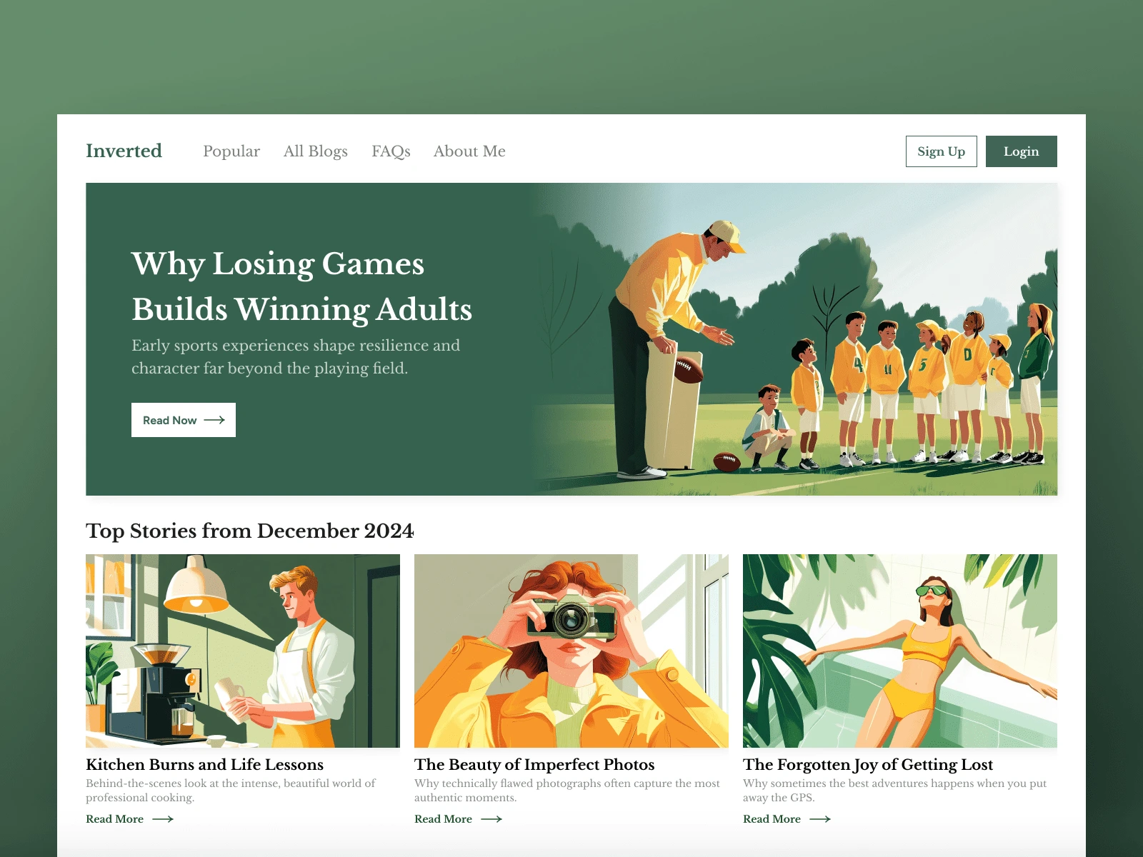
Editorial-Style Hero Section
A prominent feature article with custom illustration creates an immediate emotional connection while establishing the blog's thoughtful tone.
Image-Driven Content Cards
Custom illustrations for each article create a cohesive visual language while providing instant visual cues about content themes.
Versatile Grid Layout
Varying card sizes establish content hierarchy while maintaining visual interest across different screen sizes.
Color Psychology
The calming green palette evokes feelings of growth and reflection, perfectly aligning with the contemplative nature of the content.
Design Insights
The grid-based layout balances visual excitement with readability, while testimonial integration builds credibility. The consistent illustration style creates a distinctive brand identity that stands apart from photo-heavy competitors, making the content instantly recognizable.
Like this project
Posted Mar 3, 2025
Inverted needed a clean, visually captivating blog platform that would showcase thoughtful long-form content while maintaining excellent readability.