🔧 B2B Automotive ERP — UI/UX Redesign
Lika Chernysheva
About the project
This was a complete UI/UX overhaul of a B2B operations platform for a multi-location automotive parts and ELV (end-of-life vehicle) dismantling business in Australia. The platform is used daily by staff across three sites to manage everything from vehicle acquisitions and parts inventory to invoicing and customer records. It had grown organically over the years and desperately needed a ground-up rethink.
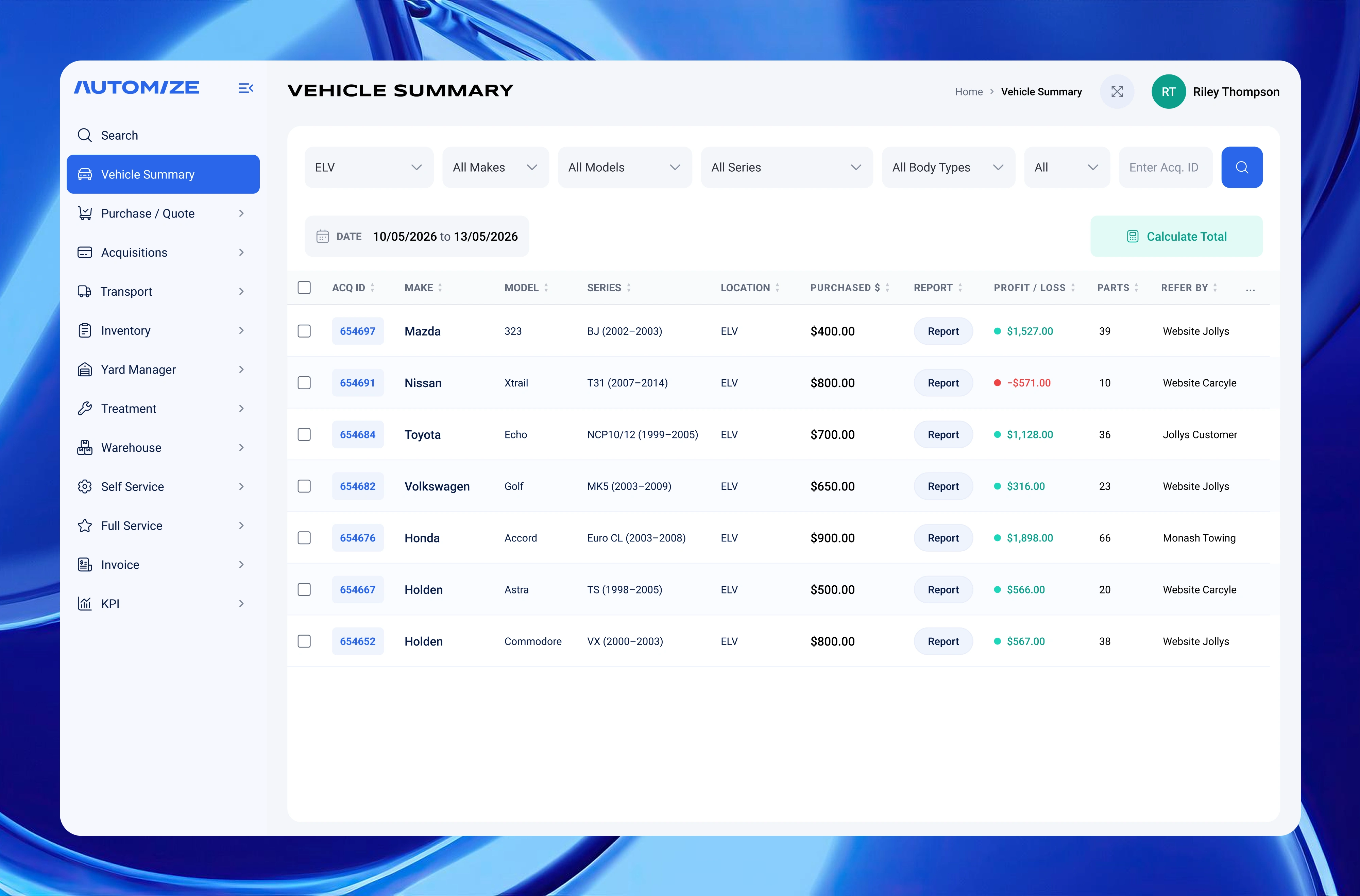
Vehicle Summary: Filterable data table tracking acquired vehicles with profit/loss and parts count across multiple locations.
The Problem
The existing interface was dense, inconsistent, and built for power users who already knew the system inside out. New staff took weeks to get up to speed. Forms were cluttered with fields that didn't match how people actually worked; the invoice module had overlapping buttons with no clear hierarchy; and the dashboard data, while technically there, was hard to read at a glance.
The client came to me with a collection of existing screenshots and clear frustrations — but no design system, no component documentation, and no consistent visual language. My job was to go from that messy starting point to a clean, scalable, developer-ready design.
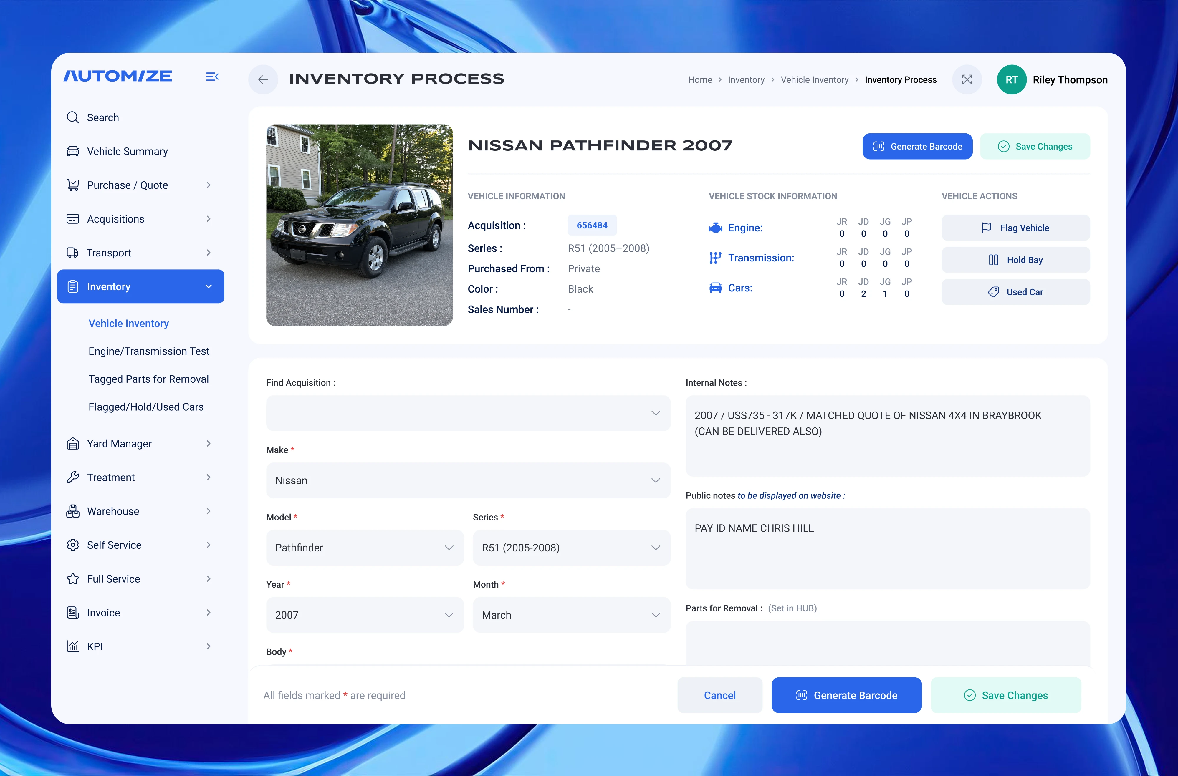
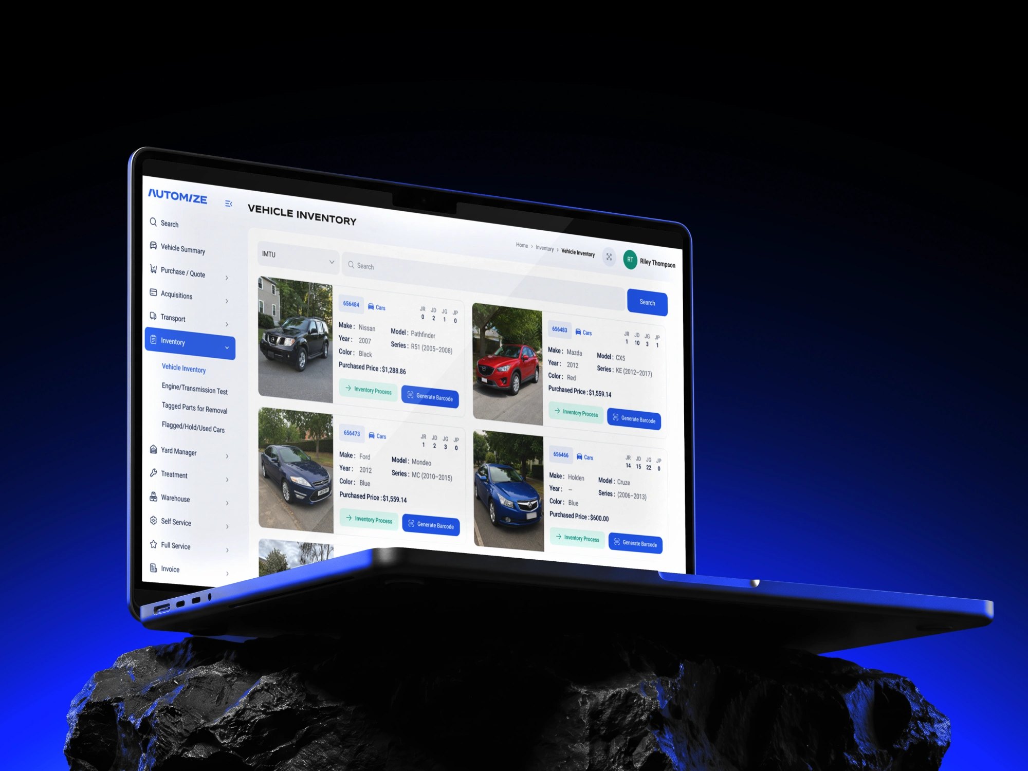
Inventory Process: Vehicle intake form combining acquisition data, multi-location stock counts, and internal/public notes.
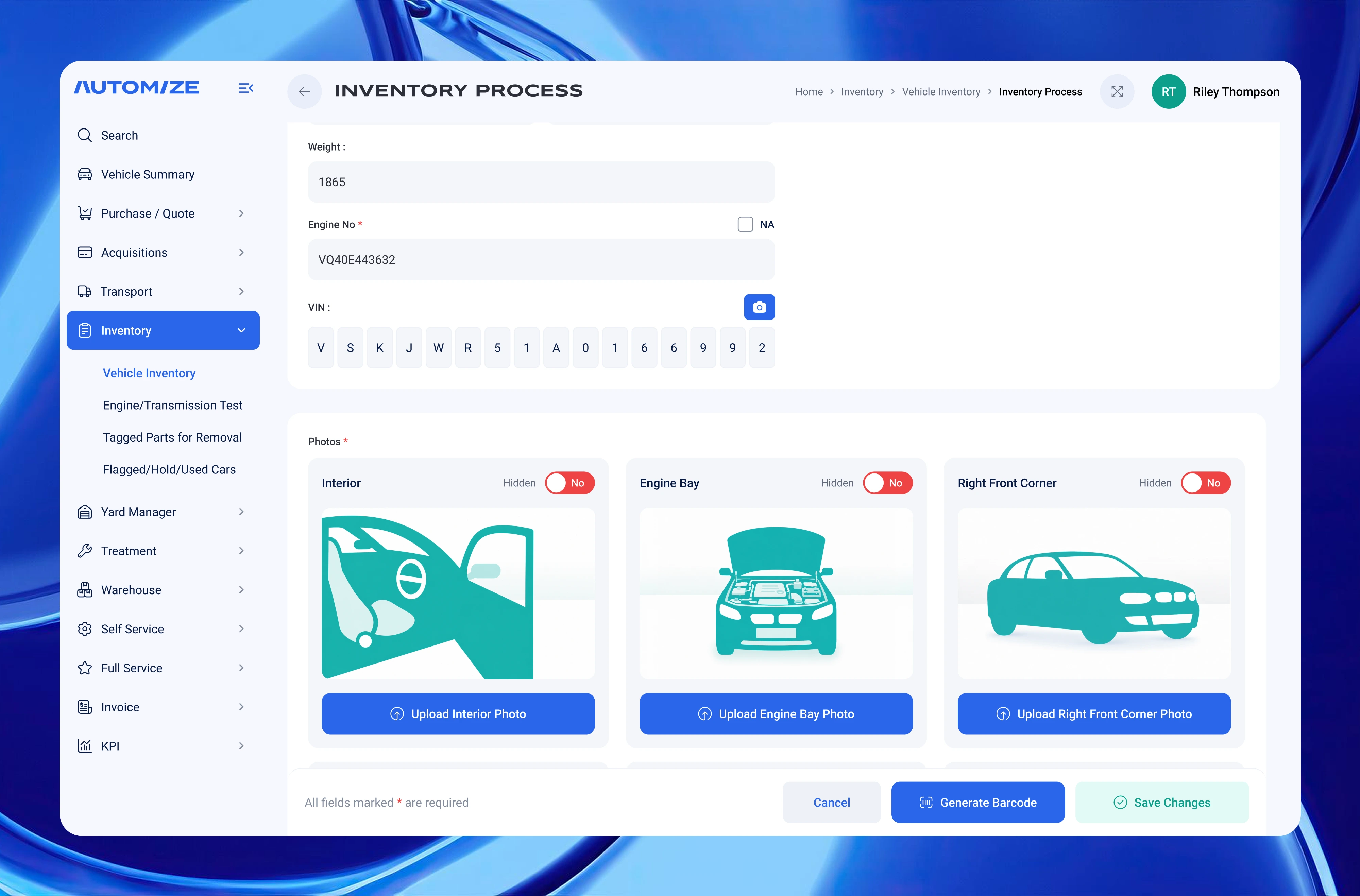
Inventory Process: Engine number, VIN entry, and photo upload cards with per-photo visibility toggles.
What I Built
I started by building the design system from scratch — an 11-shade neutral palette, custom color tokens, semantic status colors, and a two-font scale (Syncopate Bold for headers, Roboto for everything else) — so every screen that followed would stay consistent without re-specifying anything.
The analytics dashboard was reorganised from a confusing stacked bar chart to a clean grouped-bar view comparing revenue across three locations side by side. The date filtering moved from a separate control into the calendar itself, with built-in Today / This Week / This Month presets. A standalone reusable calendar component was also extracted and exported separately. The global sidebar navigation was simplified and regrouped to reflect how staff actually move through the product.
The invoice creation flow got the most structural work. The original had three buttons that all seemed to do the same thing (Create Invoice, Save, Finalize) with no clear hierarchy — once we untangled the logic, the layout sorted itself. I added distinct empty and filled UI states so the screen guides users step by step rather than presenting a wall of blank fields, and structured the line-items table with an inline add-item row.
The vehicle acquisition form was the most field-heavy screen. I restructured it into logical Owner and Vehicle sections, added a VIN/rego lookup bar at the top (RedBook & NEVDIS VinRego API), and introduced an intake mode toggle that switches the form layout depending on the type of acquisition. The focus throughout was keeping only the fields the team actually uses — nothing invented, nothing extra.
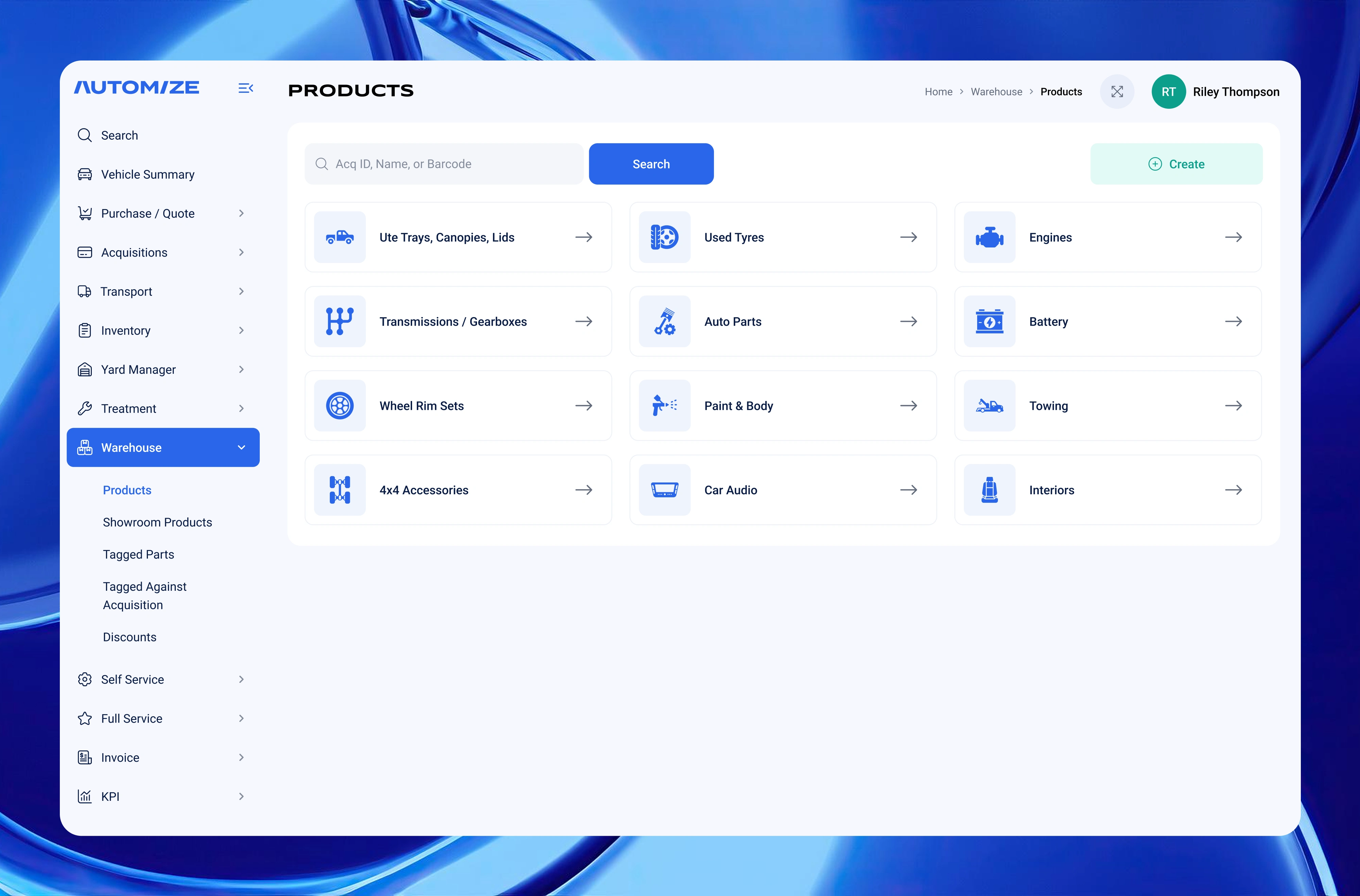
Products: Icon-based warehouse category hub with global search — designed for fast navigation in a high-SKU B2B parts platform.
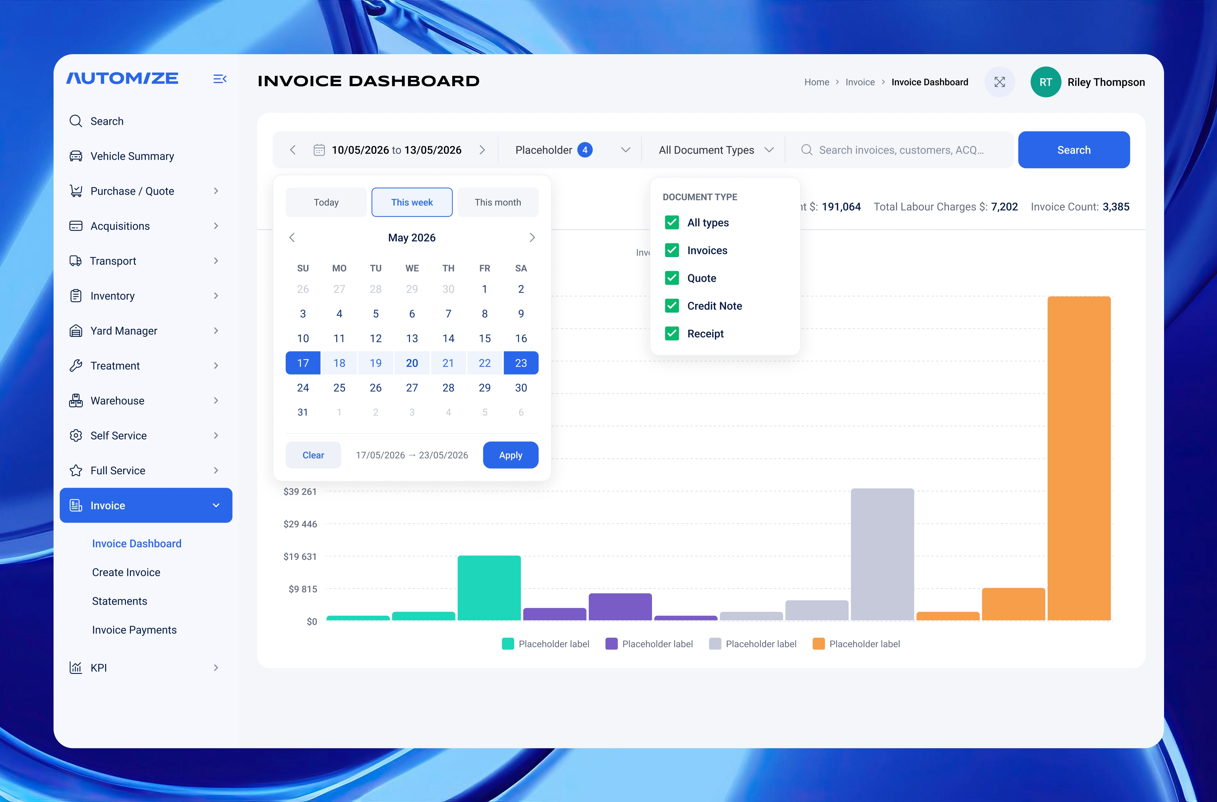
Invoice Dashboard: Date-range calendar with Today / This week / This month presets and document type filters driving the revenue chart.
What Made This Interesting
The real design challenge wasn't aesthetics — it was untangling a product that had accumulated features without a clear UX strategy. A lot of decisions came down to asking: what is this actually for, and who is it for?
For example, the original Create Acquisition screen had an overly complex search block with tabs and segmented inputs that weren't even in the client's own screenshots. Stripping it back to the essentials — VIN field, Rego field, State dropdown, Search button — was the right call. Same logic applied everywhere: the simpler the form, the fewer mistakes staff make under pressure.
That combination of clean visual design and clear operational logic is what makes B2B tools actually get used.
Skills & Tools Used
Figma · Design tokens · Component library · B2B SaaS UX · Data visualisation · Form design · Information architecture · Dashboard design
Like this project
Posted Jul 3, 2026
UI/UX redesign for an automotive parts platform enhancing usability and visual consistency.
Likes
1
Views
1
Timeline
May 3, 2026 - May 10, 2026