A pool construction company with

Heidi Daiane

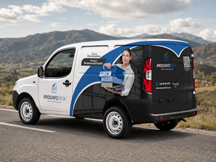
A pool construction company with great work and no brand to match it. The logo grew out of the contour of a pool itself - a simple, memorable symbol that ties the brand directly to its field. From there, I built a full visual system: water-inspired blues with orange accents, fluid shapes that extend across every touchpoint - business cards, stationery, uniforms, the company truck, and a website born in the same visual language. Identity and website designed together from the start, speaking the same language from start to finish.
Like this project
Posted Jul 8, 2026
A pool construction company with great work and no brand to match it. The logo grew out of the contour of a pool itself - a simple, memorable symbol that tie...