Passenger-First UI Design for Autonomous Taxis
Jacob Tran
Autonomous ride-sharing won’t scale without trust. Riders feel uneasy when dashboards are cluttered, outdated, or vague about what the car is doing. The result is anxiety instead of assurance.
I designed a passenger-first UI that replaces noise with clarity. Look once and you know what the car is doing and what it will do next. Unambiguous autonomy states, guided ride steps, and safety cues keep attention light and trust high.
Urban riders want safety, clarity, and trust.
Without a driver, the UI must provide clear feedback to reduce anxiety and build confidence in autonomy.
Key Improvements
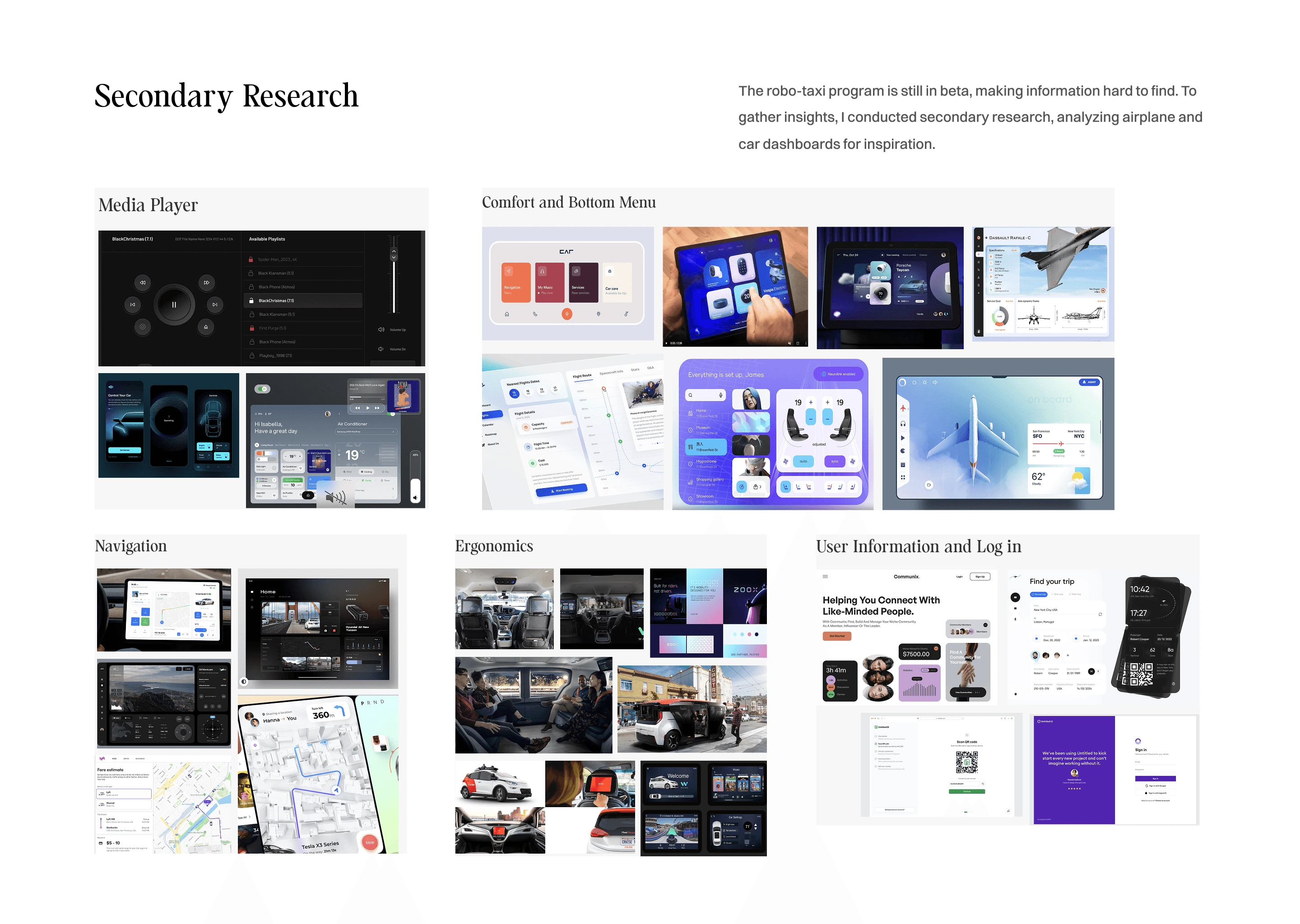
I researched user pain points, analyzed competitors, then built wireframes and prototypes. Usability testing refined the design for accessibility and real-world use.
Passengers felt anxious in self-driving taxis due to cluttered dashboards, poor safety visibility, and limited feedback.
The design needed to
Deliver clear safety and navigation cues
Simplify the UI to avoid overload
Stay accessible to all riders
Help passengers feel informed and in control without a driver
Create a stress-free experience without overwhelming users
Design a calming, intuitive UI for first-time riders
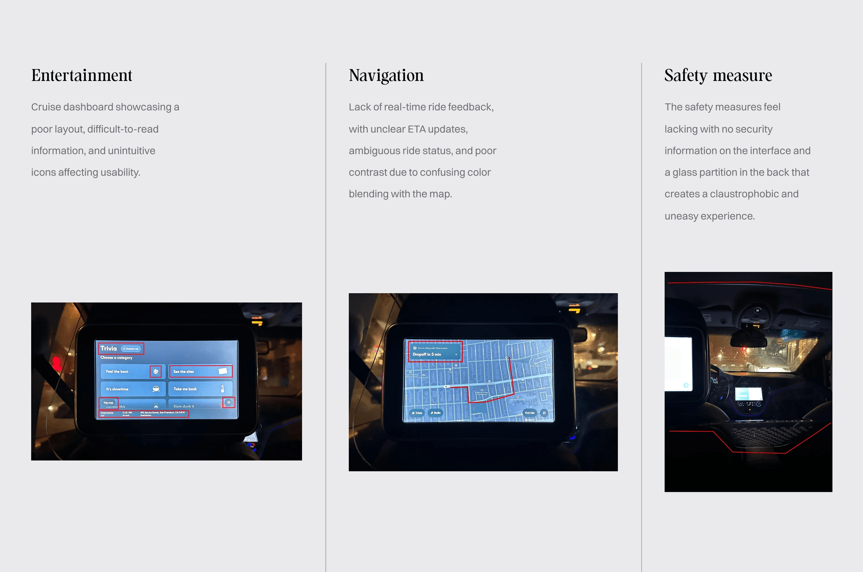
The Moment Rider Trust Breaks in a Self-Driving Taxi
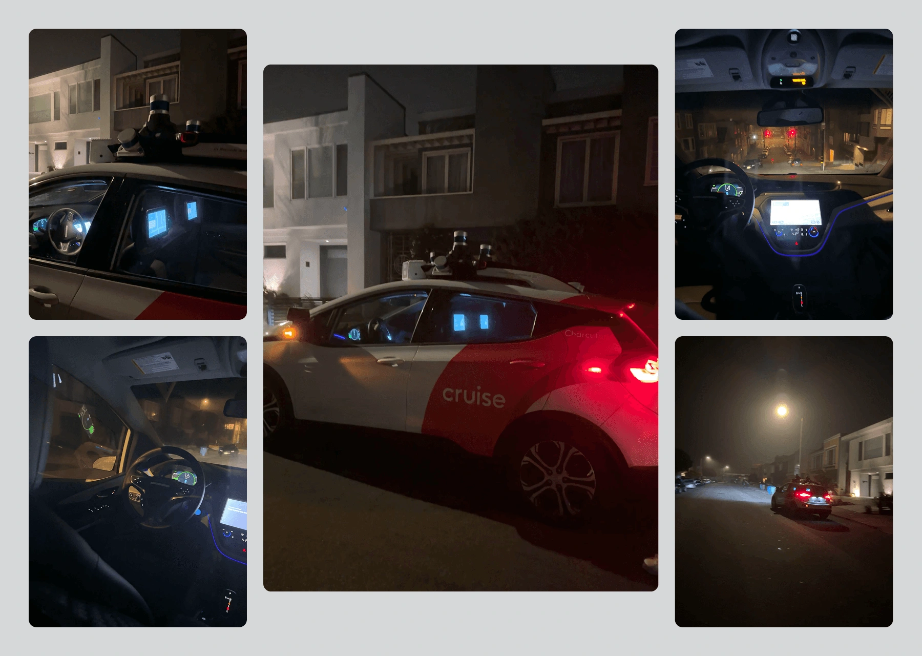
I joined Cruise’s beta program and rode in a self-driving taxi to document the experience. The analysis revealed three gaps.
Cluttered dashboards overwhelmed riders
Limited feedback created uncertainty
These insights shaped user interviews and design priorities.
I interviewed five nightlife riders to uncover what builds trust and comfort. Four themes emerged: safety, navigation, transparency, and comfort. A prioritization matrix highlighted features with high value and low complexity.
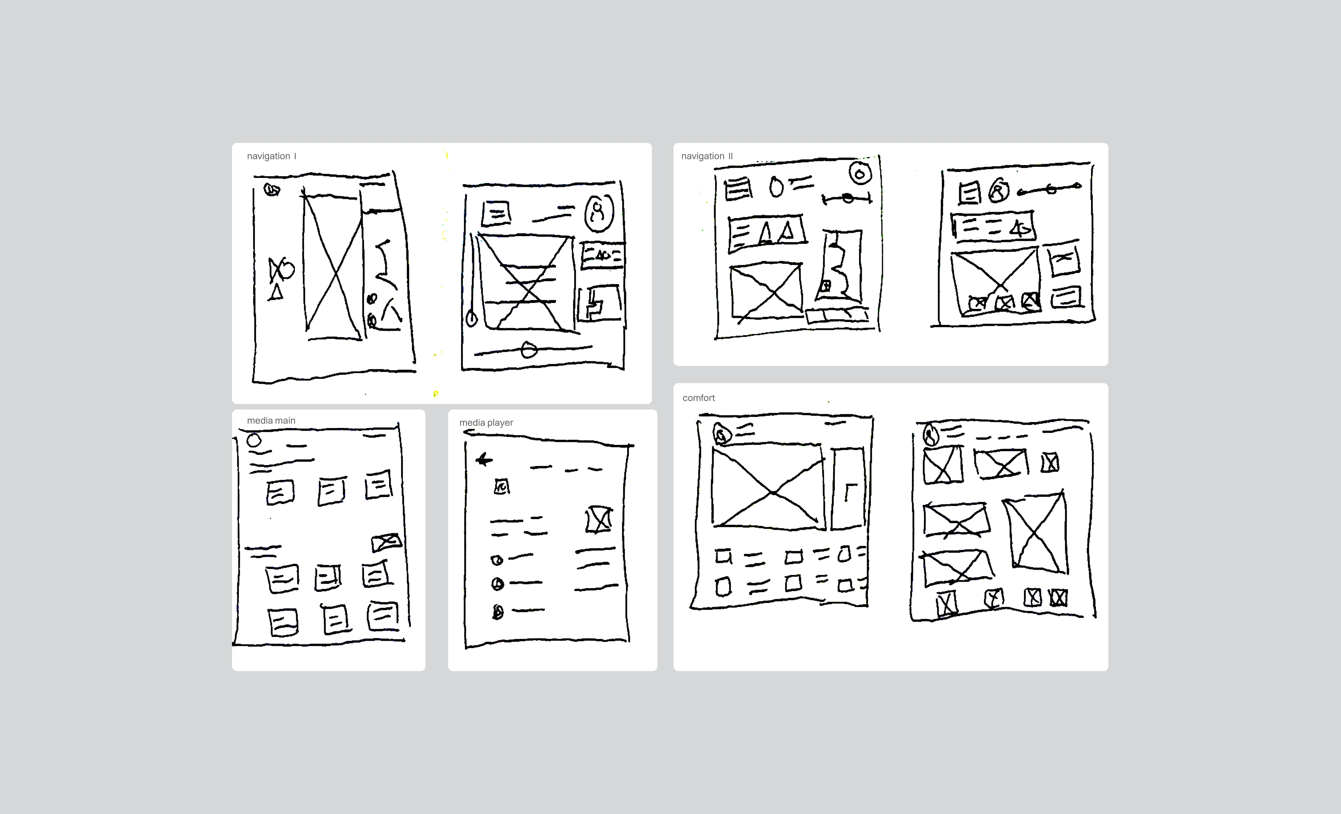
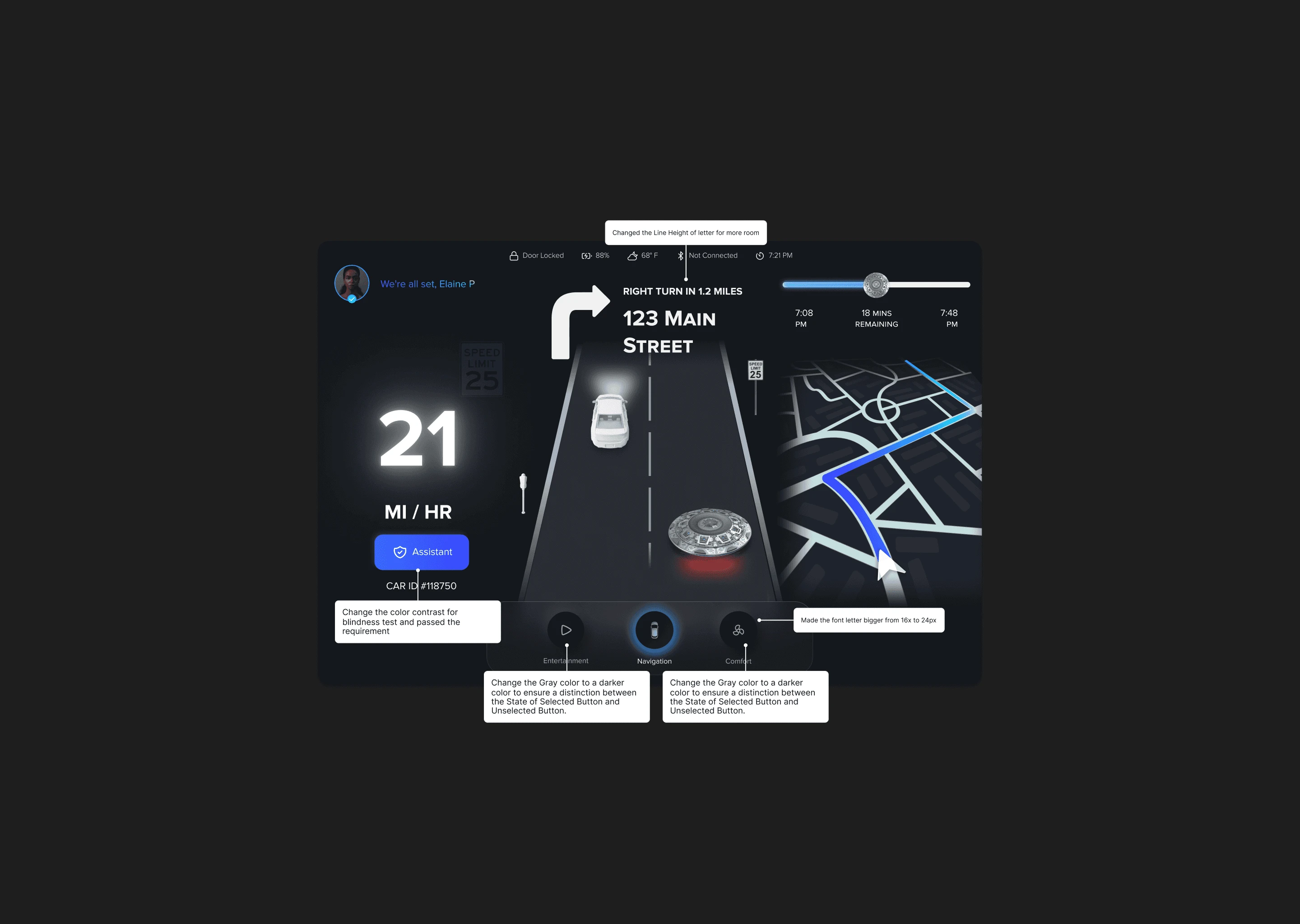
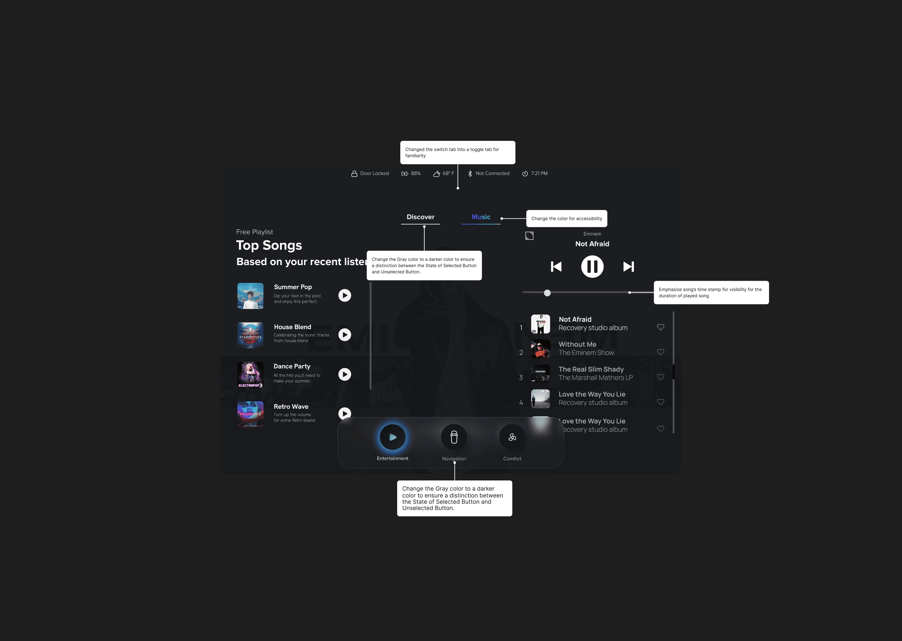
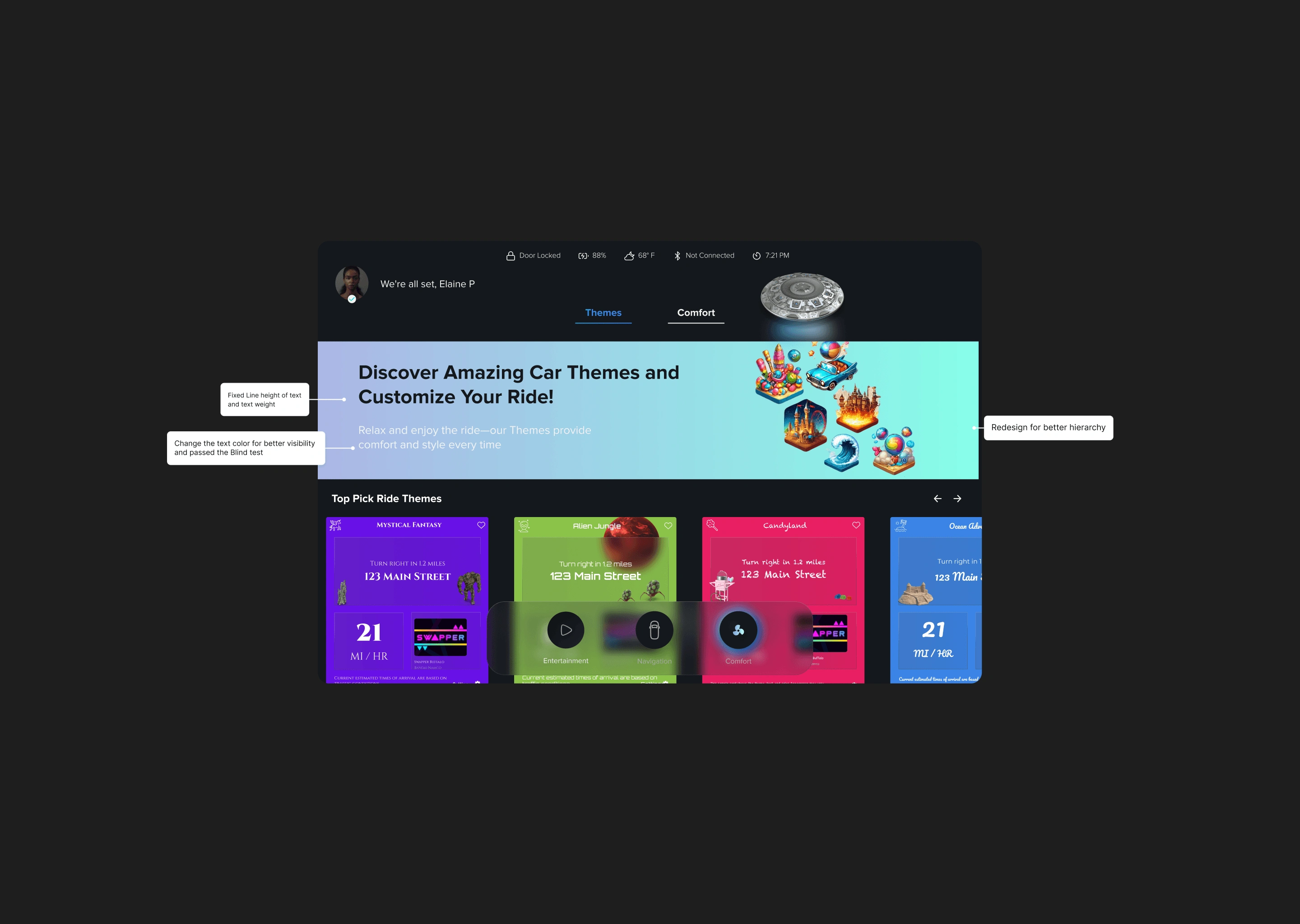
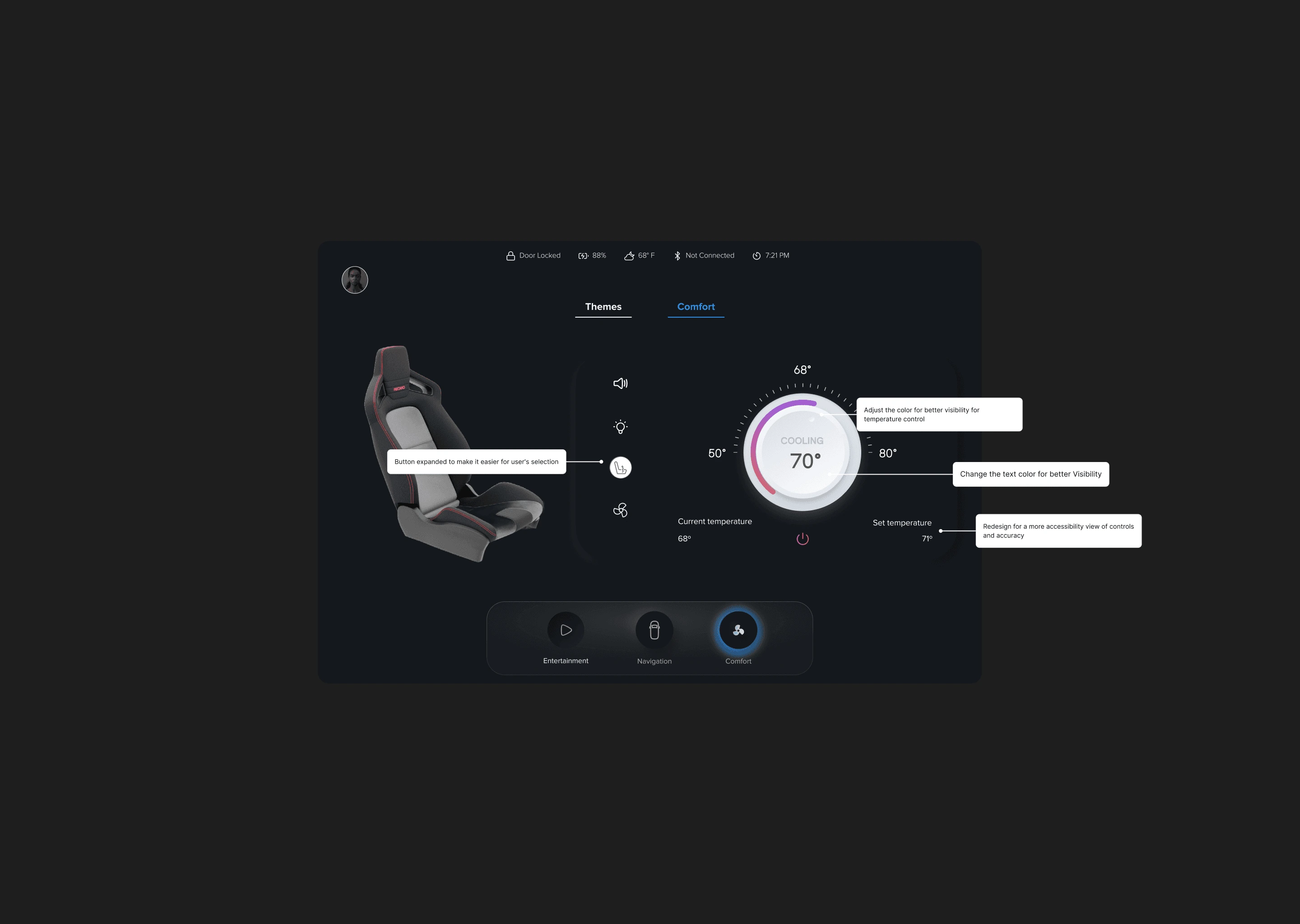
I sketched wireframes and tested concepts to spot usability issues. Key pain points were unclear navigation, poor accessibility, and confusing labels. These findings shaped layout iterations before high-fidelity designs.
Follow-up tests led to a larger full-screen button, clearer wording, and better accessibility, creating a smoother experience.
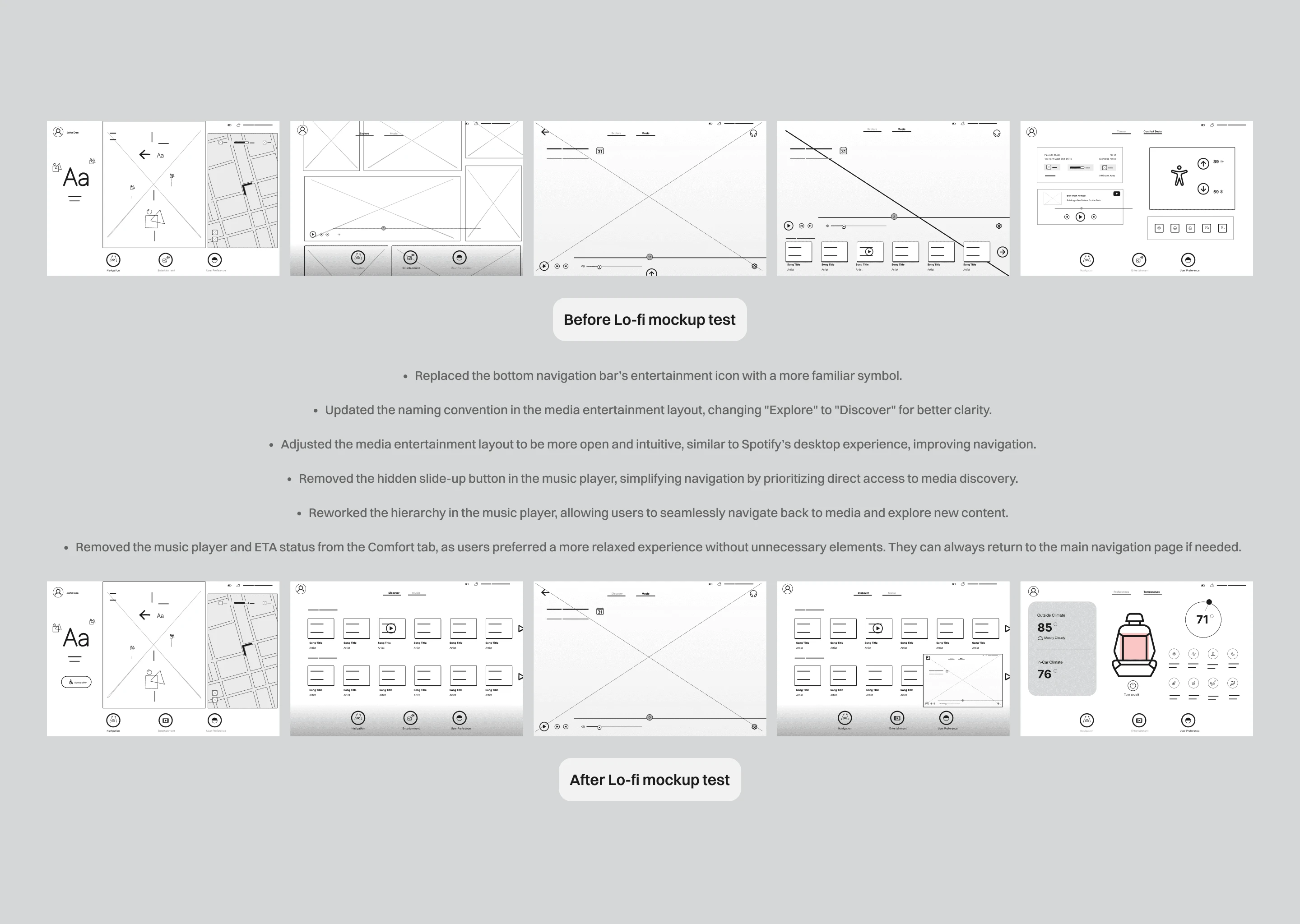
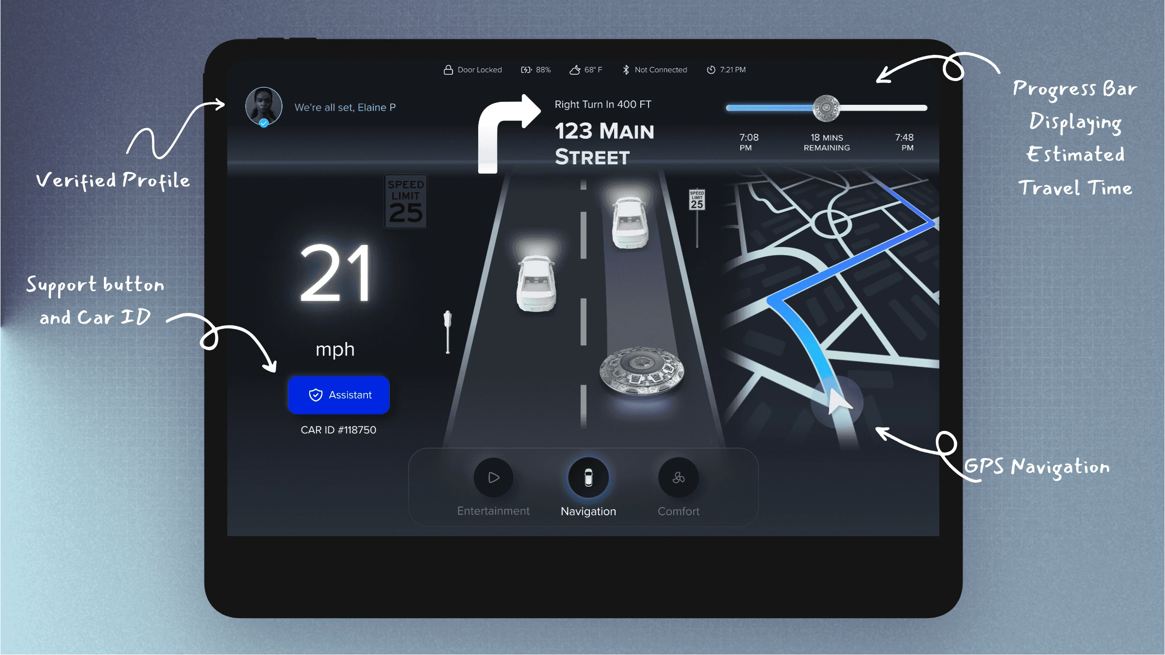
I refined hierarchy, improved color contrast, and polished components for clarity. Feedback led to a larger full-screen button, clearer labels, and a live navigation feed to reduce uncertainty and build trust.
Designing a Ride That Puts Passengers in Control
The redesigned UI boosted clarity, accessibility, and trust.
Key Enhancements
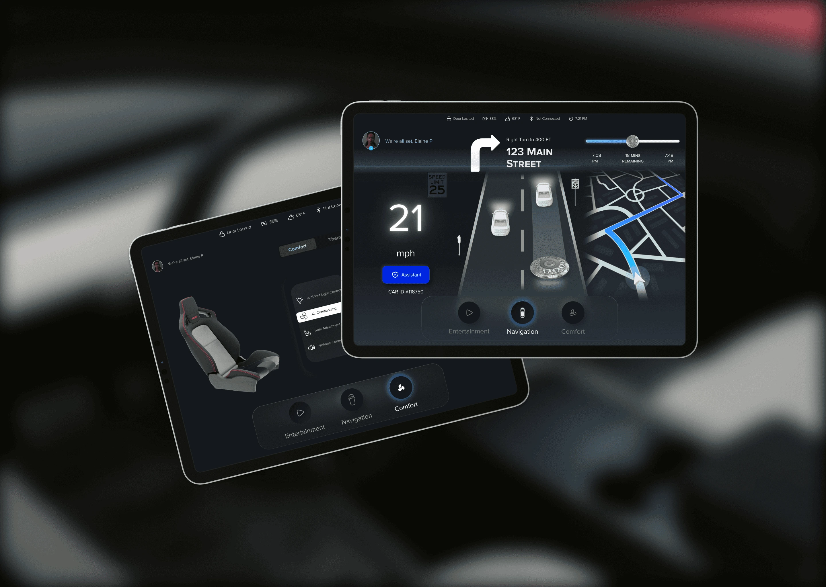
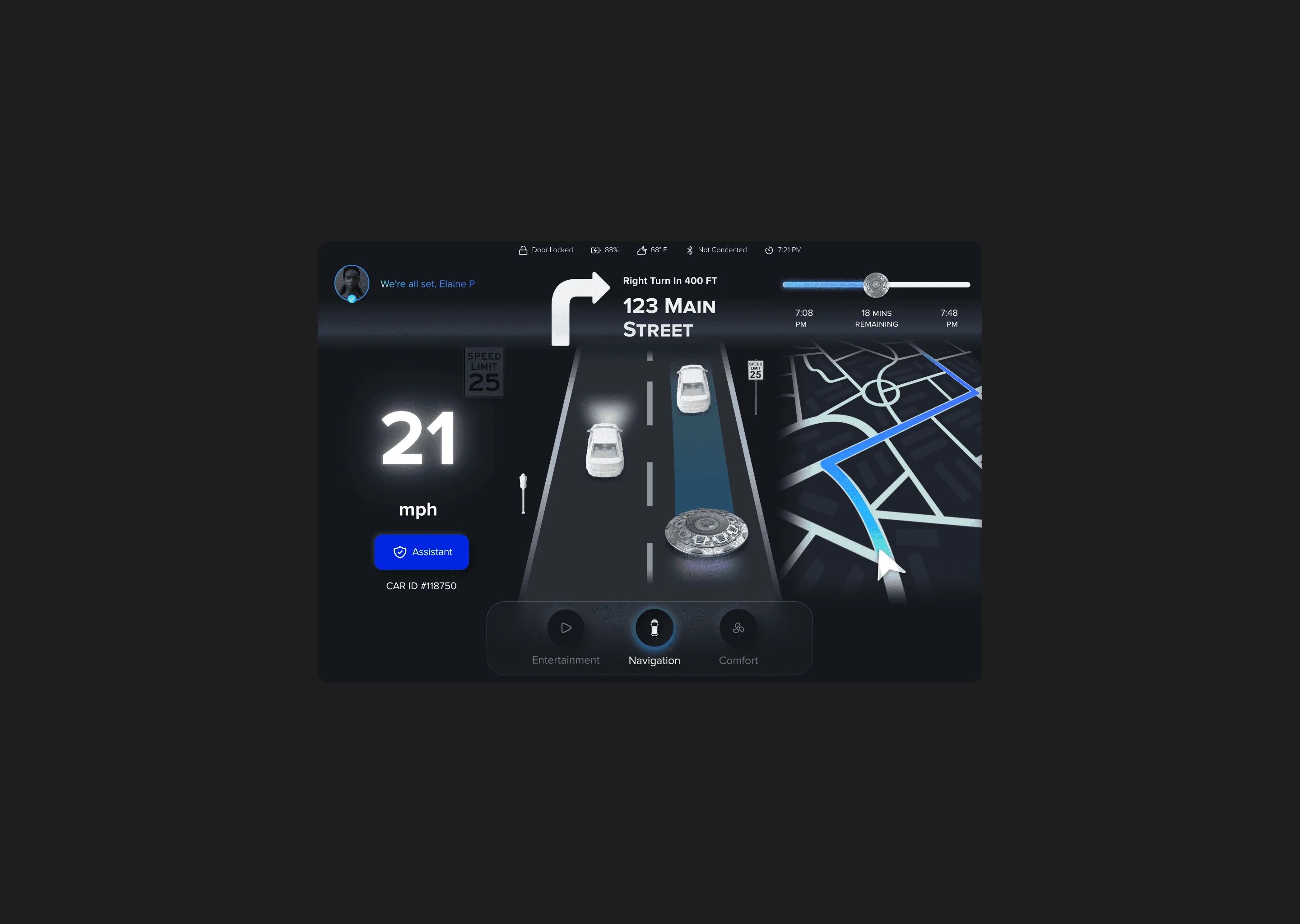
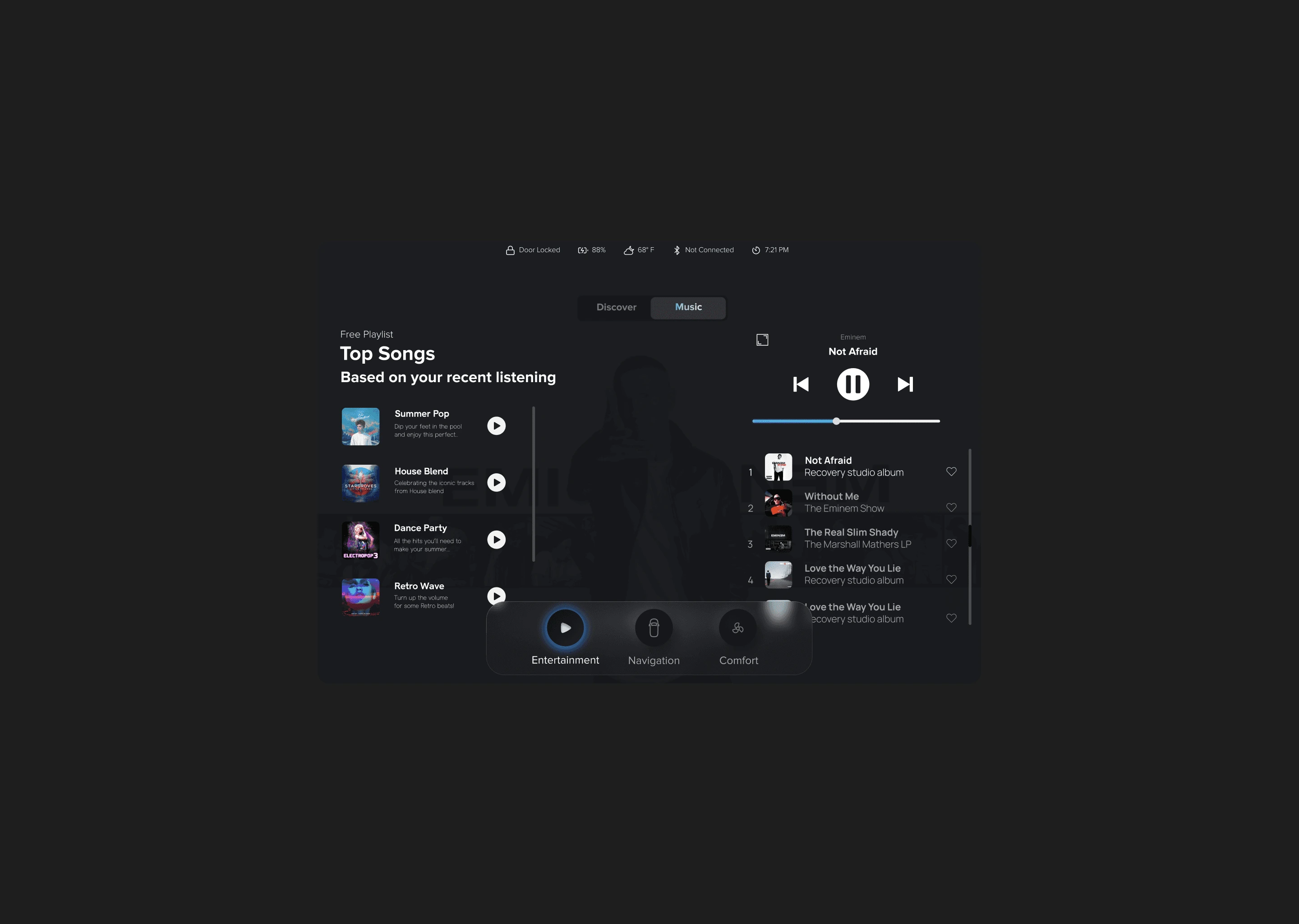
Cleaner dashboard with better readability
Larger safety indicators for reassurance
Live street view and tracking to cut uncertainty
Improved accessibility with contrast, bigger buttons, and clear labels
These updates created a transparent, intuitive ride that kept passengers informed, safe, and in control.
Passengers felt uneasy with cluttered dashboards and no safety feedback. I simplified navigation, enlarged indicators, and added live street-view tracking to build trust and comfort.
I would pilot the redesigned dashboard with real passengers in a test fleet to gather live feedback and see if trust and comfort improve. Use the results to refine the interface and validate that the design works in real-world conditions.
Like this project
Posted Aug 21, 2025
Designed a passenger-first UI for Cruise's autonomous taxis to enhance trust and clarity.
Likes
5
Views
11
Clients
Cruise