Satorres Abogados - Landing Page - Logo Design
Jere Diberto
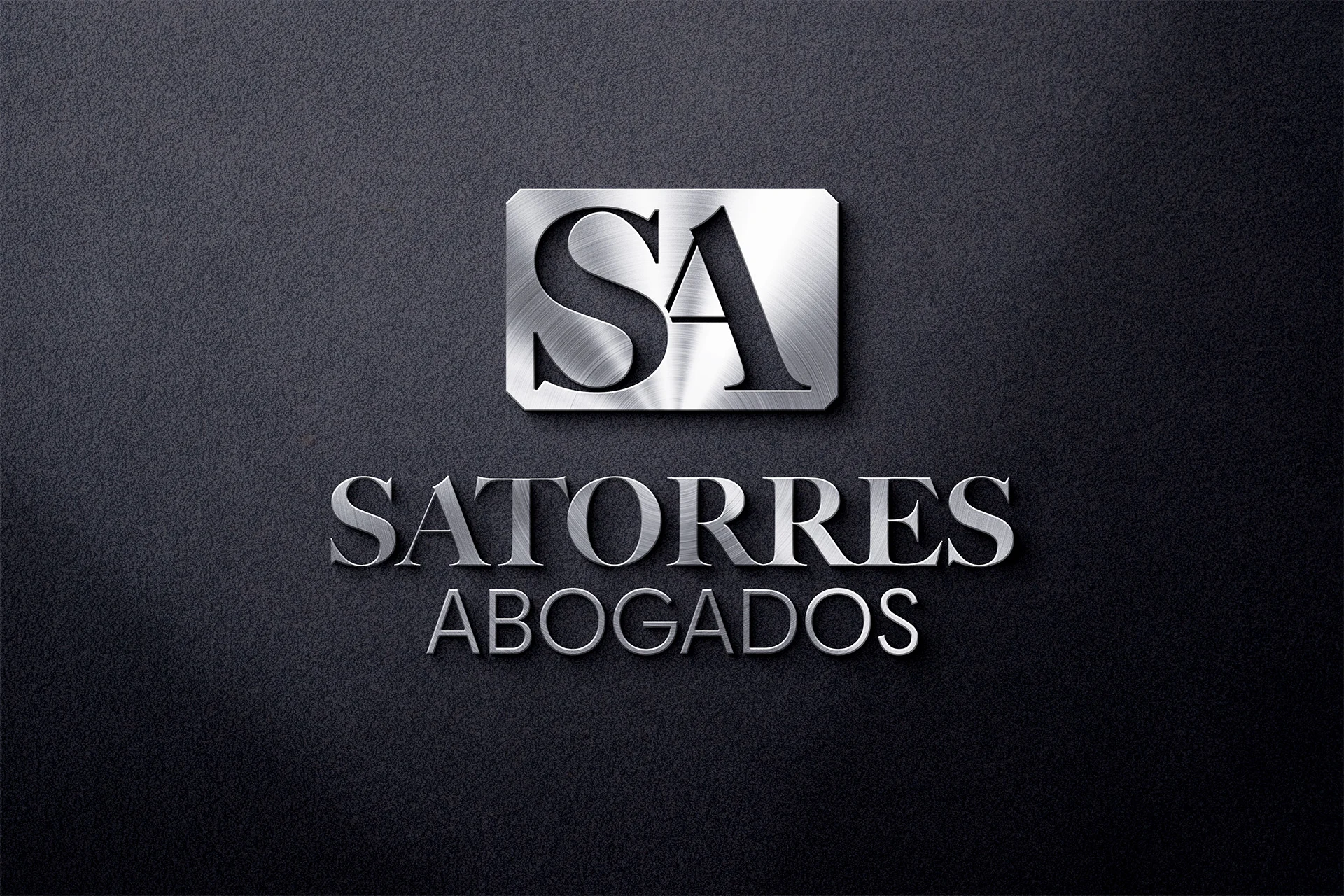
Satorres Abogados: Formalizing Legacy and Designing for Trust Across Generations
The Legacy Challenge: Satorres Abogados thrived for years on the power of word-of-mouth, but the new generation of leadership recognized the need for a formal identity to secure their future. The challenge was significant: I needed to create a logo and digital presence from scratch that preserved the firm’s core values—seriousness, trust, and multigenerational stability—while providing a modern, accessible experience.
Solution: Bridging Tradition with Typographic Authority
I crafted a comprehensive identity and digital strategy designed to validate their long-standing expertise and welcome every client.
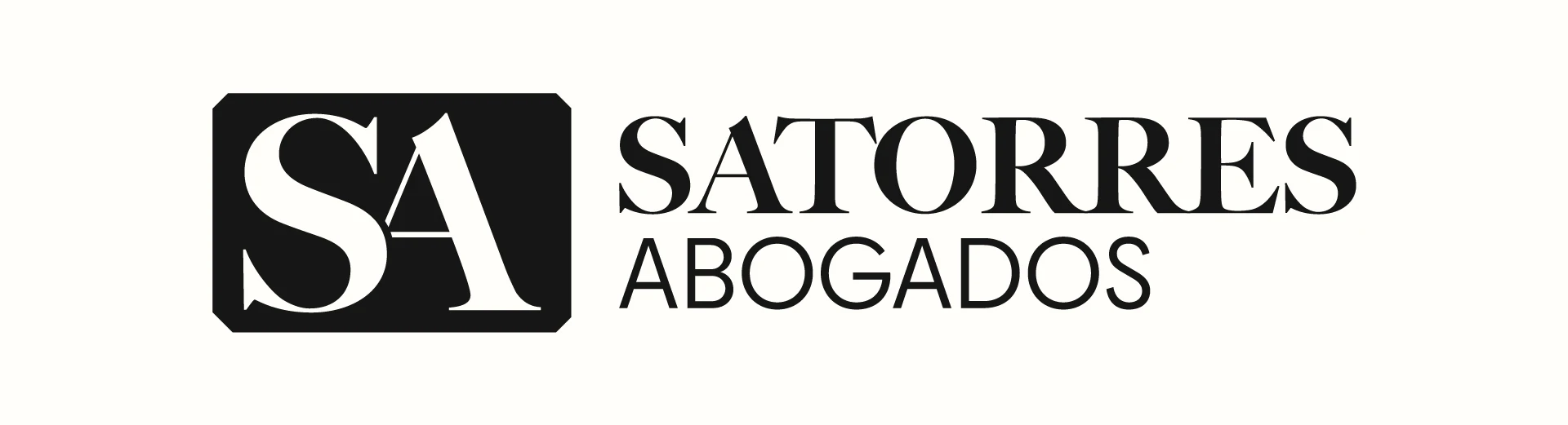
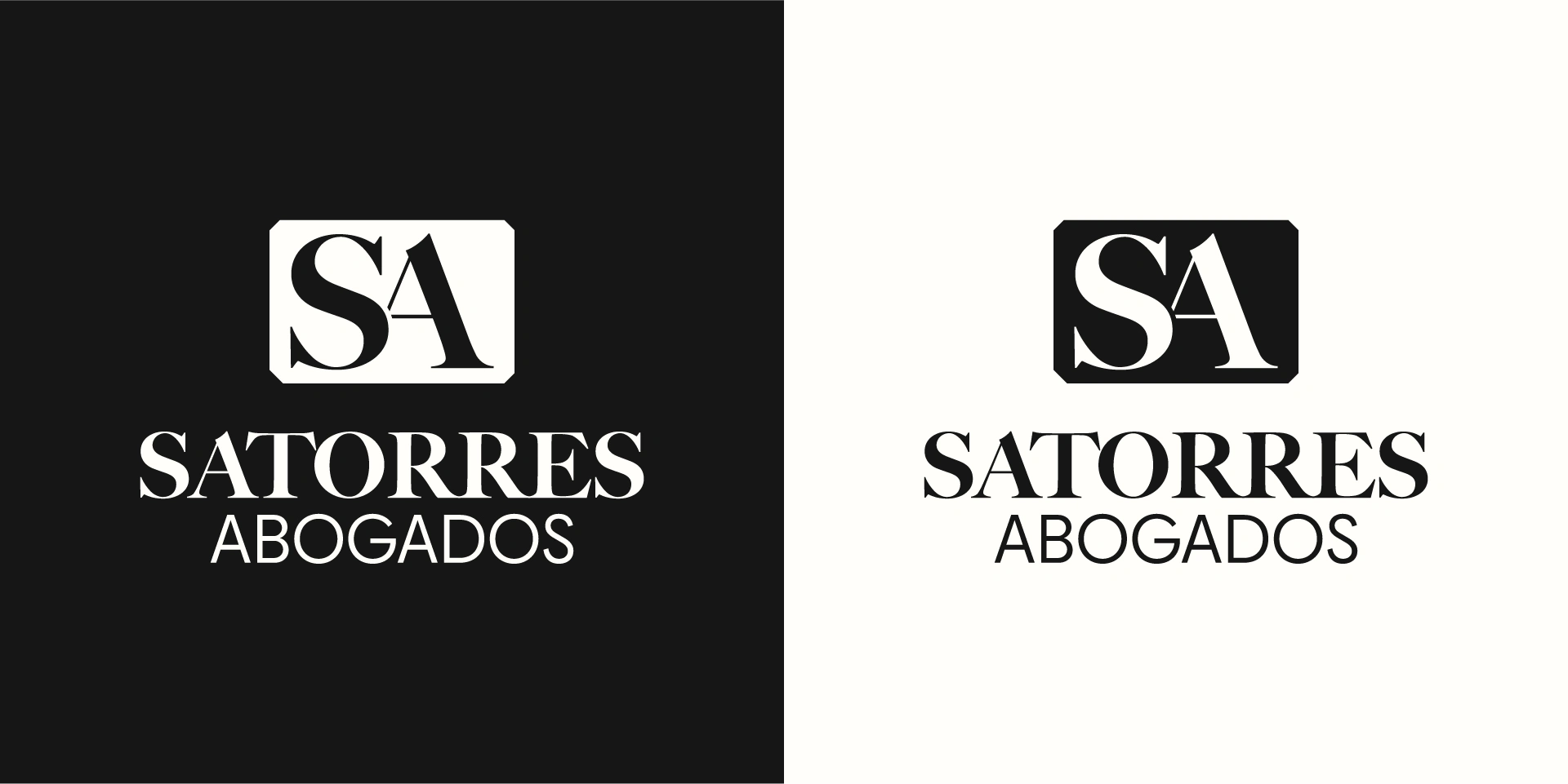
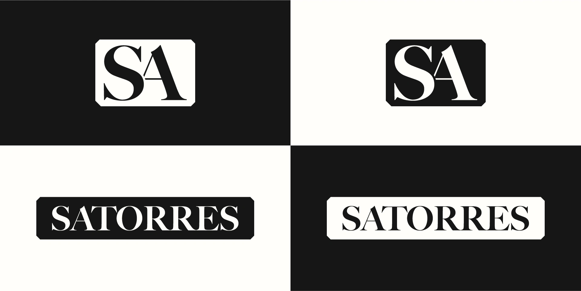
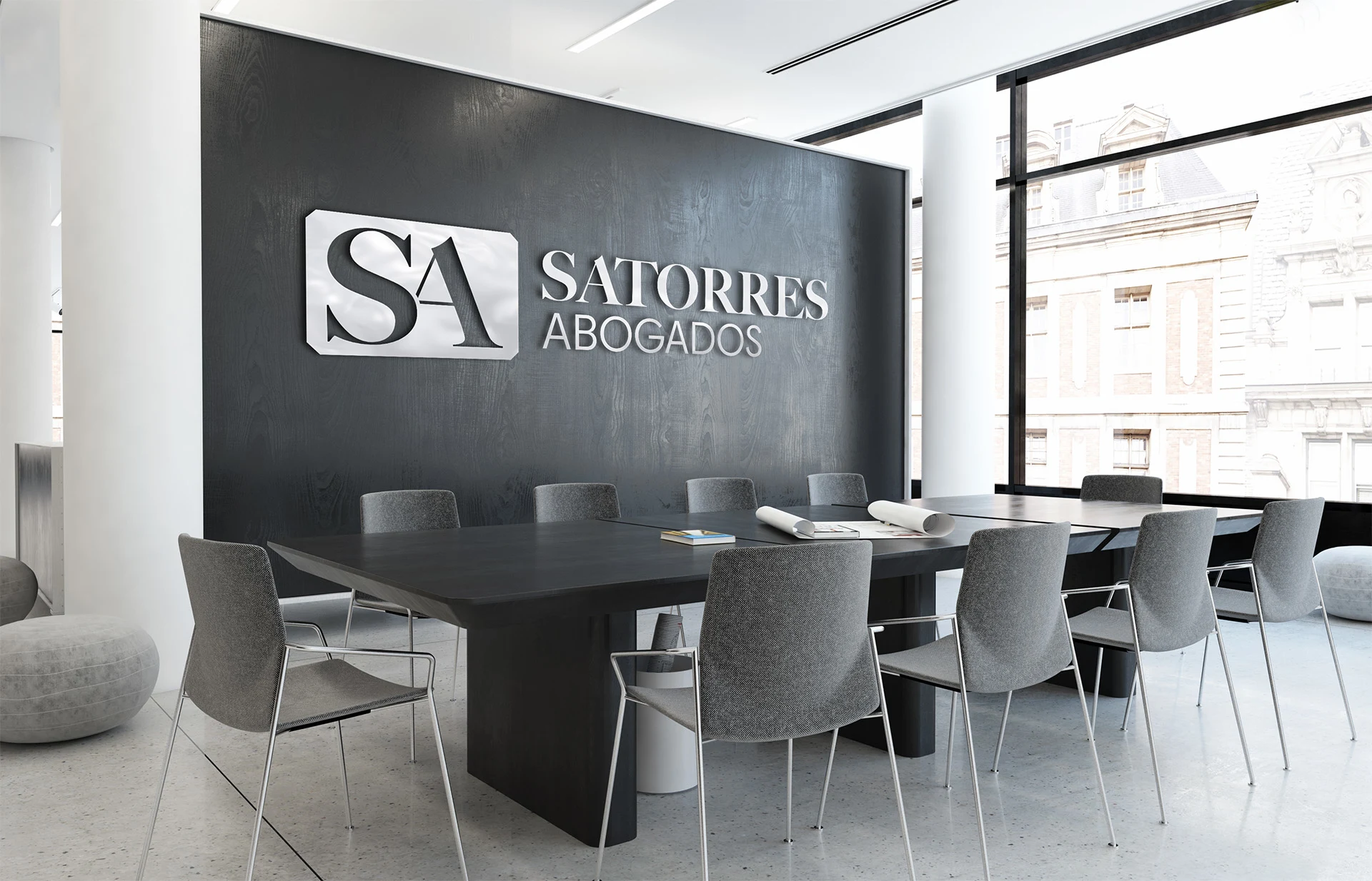
The Bifocal Logo: To visually represent the blend of legacy and modernity, I employed a deliberate typographic contrast. The family name, "Satorres," is set in a timeless Serif font to honor tradition and permanence, paired with "Abogados" (Lawyers) in a clean Sans-Serif font, signaling a modern commitment to new clientele and technologies.
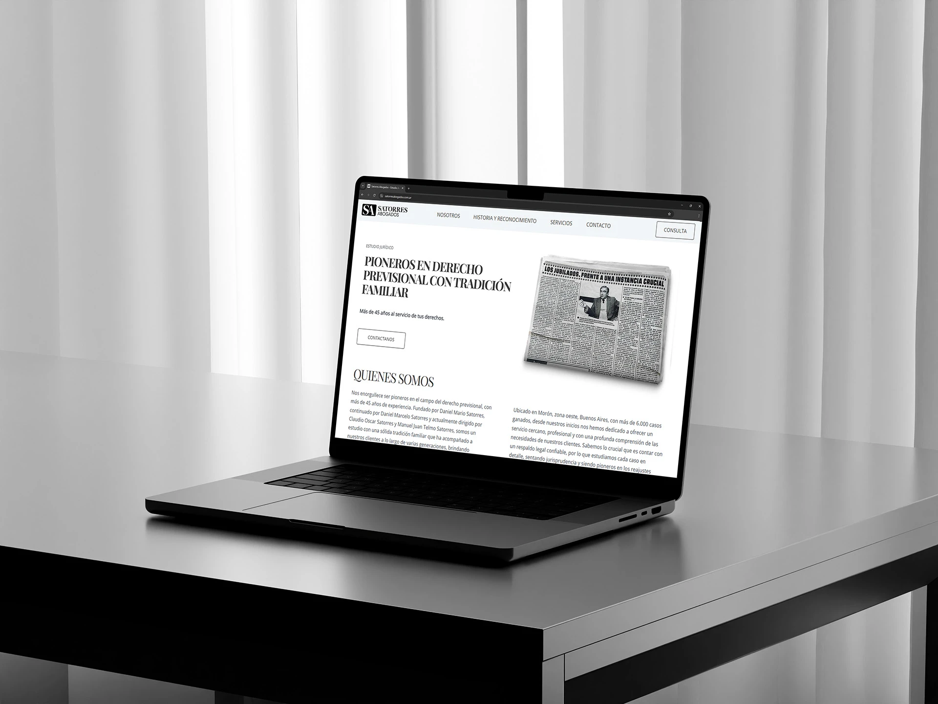
Accessible Digital Design: Considering their core older demographic, the website was designed with intentional simplicity, neutrality, and clarity. Every element was crafted to be intuitive, ensuring that clients less familiar with technology feel comfortable, focused, and confident in the firm's expertise, free from visual clutter.
The result is an identity that formalizes decades of trust and clearly positions Satorres Abogados as the authoritative choice for today and tomorrow.


Like this project
Posted Oct 8, 2025
New identity for the next generation of leadership at Satorres Abogados, a family-run law firm, blending tradition with modernity to build trust.
Likes
3
Views
15
Timeline
Mar 1, 2025 - Apr 1, 2025