SeamSeeker
Overview
In 2020, I started an ethical apparel brand. Even during the pandemic, the hardest obstacle I faced was finding a Canadian manufacturer that produced high-quality garments responsibly.
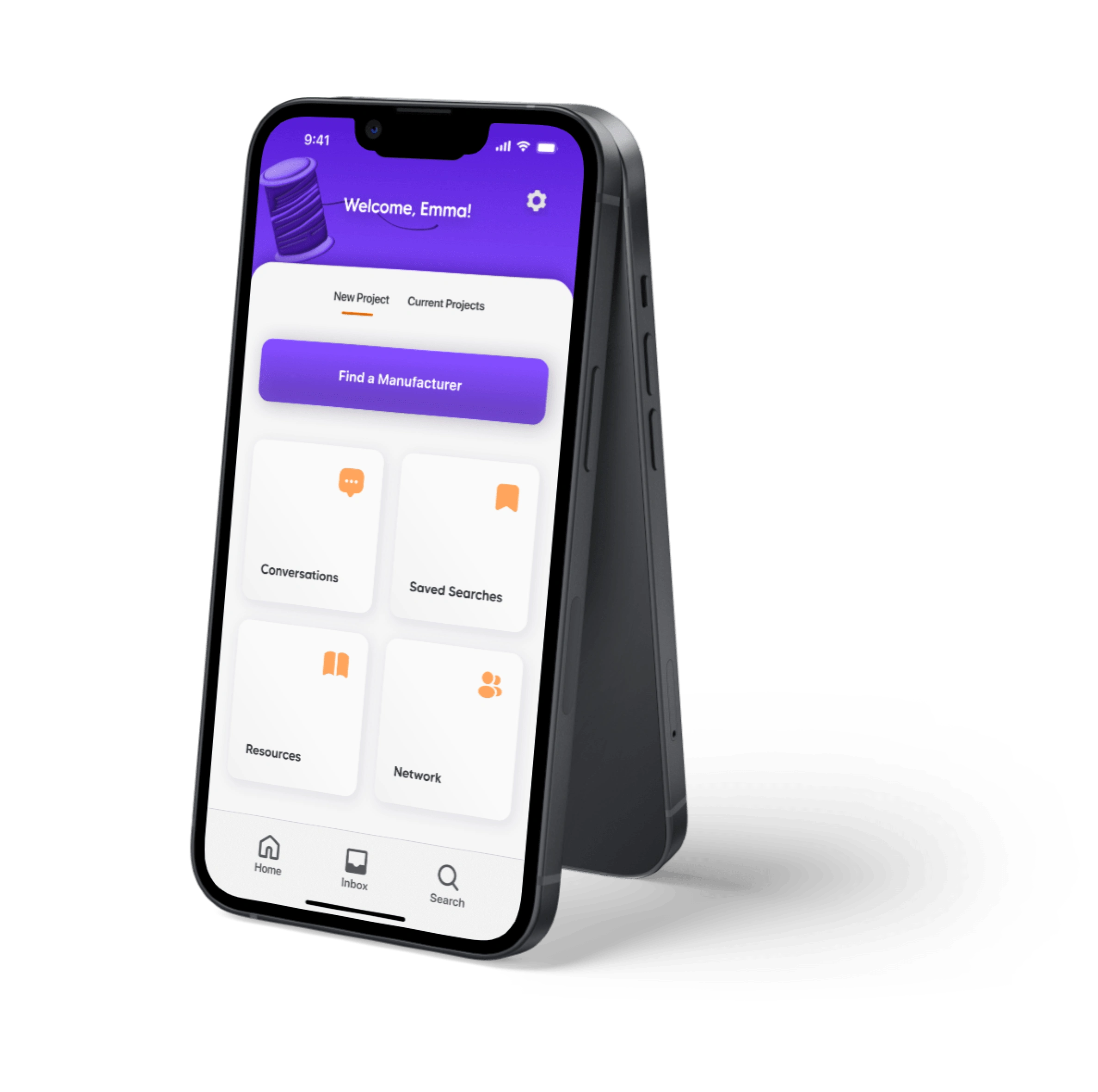
So, when tasked with creating a mobile application for my Capstone project in the BrainStation UX Bootcamp, I developed SeamSeeker. SeamSeeker helps small apparel brand owners source, compare and connect with responsible manufacturers that meet their brand values.
Following the Design Thinking Methodology, this process enabled me to develop my skills in UX Research, Wireframing, Prototyping, User Testing and UI Design.
Secondary Research
Looking deeper into the apparel production industry, I collected some unsettling statistics to further emphasise the need for a shift to ethical production practises.

Hypothesis
I’ve always been a firm believer that there is always a solution out there, you just need to find it. So, rather than assuming the problem is a lack of ethical manufacturers or a lack of interest from brand owners, I hypothesise that the issue lies in brand owners struggling to source manufacturers due to a lack of online presence.
User Interviews
To gain even better insights on the problem space, I conducted one-on-one interviews with 5 responsible brand owners about their experiences with manufacturing. I was then able to organise their thoughts into motivations, behaviours and pain points using an Affinity Map, which helped me identify some common themes between each of the participants. These themes then developed into three key insights which affirm the need for intervention in my problem space:

Access to Information was the most common and compelling insight, so I developed it further into the following How Might We Statement to better articulate the design challenge I aim to tackle:

Persona & Experience Mapping
After collecting ample data from my secondary research and user interviews, I created a persona that embodies all of my findings to help me envision my key user group and inform features and functionality of my product.
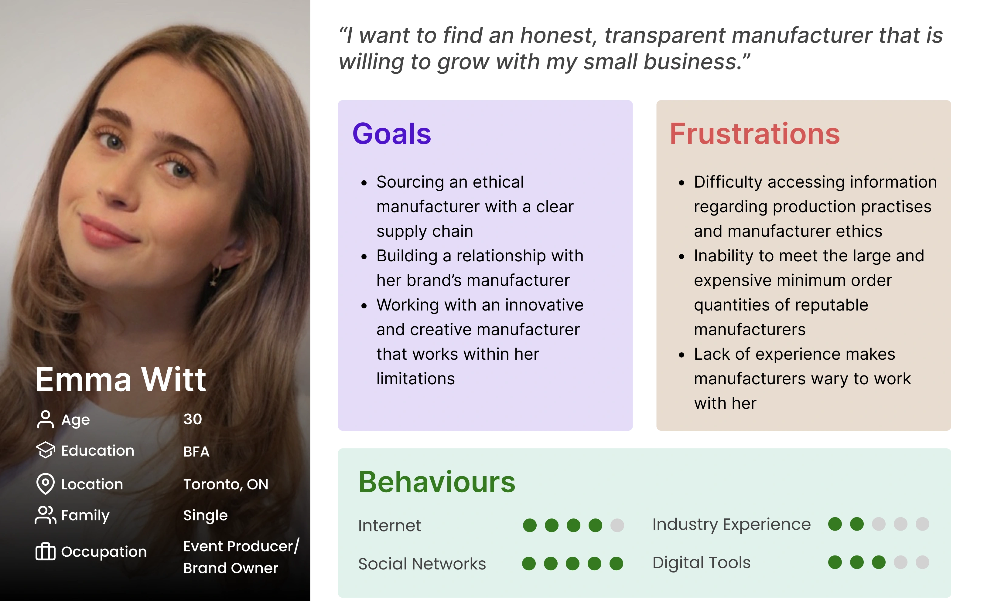
Meet Emma, my primary persona. Emma recently started an apparel brand as a fun side project. She loves fashion but doesn’t want to contribute to the negative impact the industry has on the environment. She’s been scouring Google for weeks trying to find a local responsible manufacturer, but has been frustrated by the lack of results that meet her needs. She’s new to this whole industry, so with no connections to turn to for help, she feels unsure of what to do next.
With Emma’s goals and frustrations in mind, I created an Experience Map to help me better envision her full journey as she tries to find a manufacturer for her brand.
Emma’s experience starts off positively as she is excited about the creative process she’s about to embark upon, but she quickly becomes discouraged as she realises just how difficult it will be to bring her ideas to life. Although she ends up finding a manufacturer in this experience and feels satisfied through fulfilling her creative vision, she is mostly relieved that the stressful and frustrating process is over with.
This Experience Map helped me to identify which points in the journey were the most frustrating, and thus held the most opportunity for improvement. With two areas of opportunity identified, I came up with the following solutions:
Create a database with ethical manufacturers organised by location, type of apparel, core values, etc.
Develop a networking community for brand owners and suppliers to connect on a more meaningful level
User Stories & Task Flow
As I thought about how I might digitise either of these solutions, I created over 30 User Stories to help me envision different functionalities that my digital solution could have. I then organised these User Stories by theme into 3 different epics: Communicating, Search & Compare, and Finding Educational Resources.
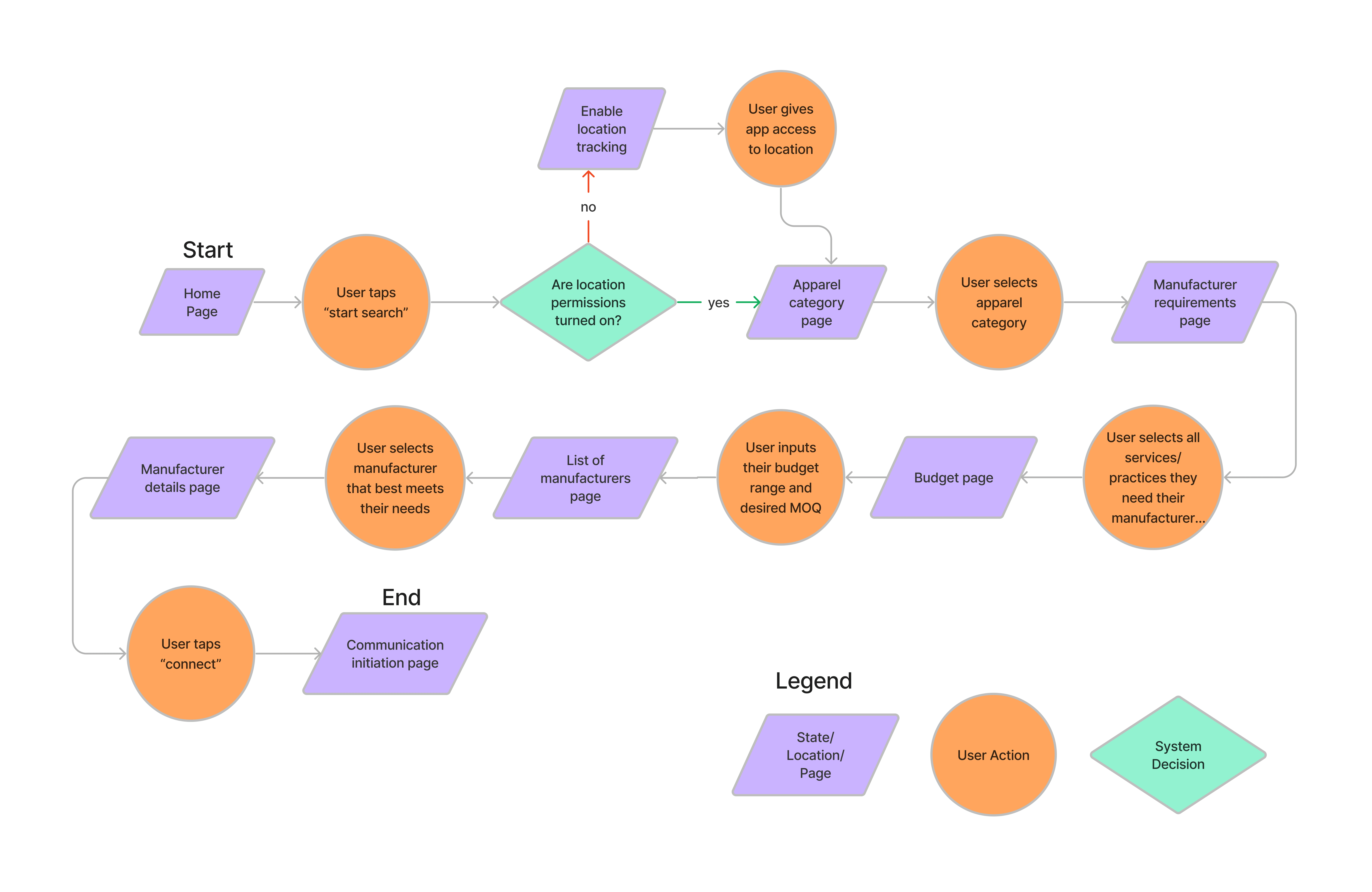
Search & Compare was the most robust out of all of the epics and I felt it was most aligned with Emma’s key frustrations throughout her experience. Narrowing it down even further, I created a Task Flow around the following User Story from this epic:
“As a small apparel brand owner, I want to source a high quality, ethical manufacturer so that I can get my products made to my standards.”
Sketches
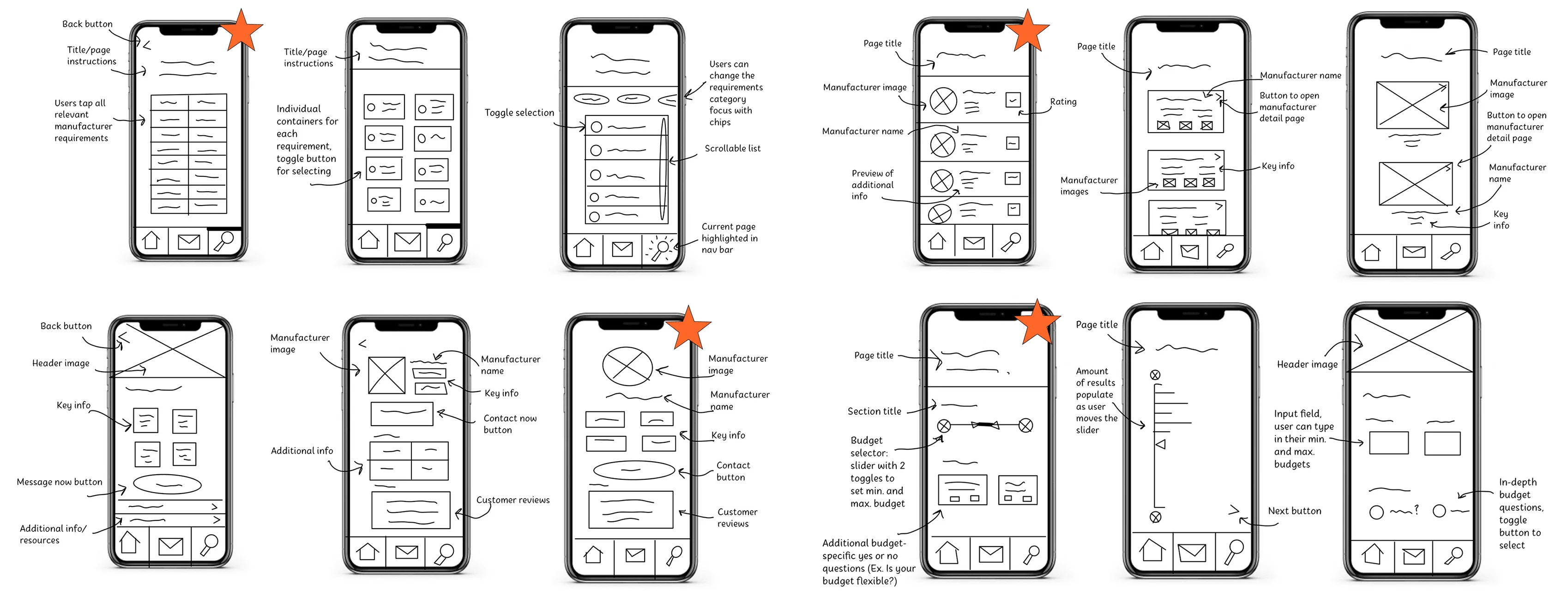
Now that we have a verbal idea of how Emma will use the digital solution to meet her goals, it’s time to start ideating how this will translate to the screen. I started off by creating a UI Inspiration Board, sourcing lots of interesting ideas and designs to help get the ball rolling. I then created some exploratory sketches of the screens defined in my Task Flow, trying to come up with a variety of potential designs.
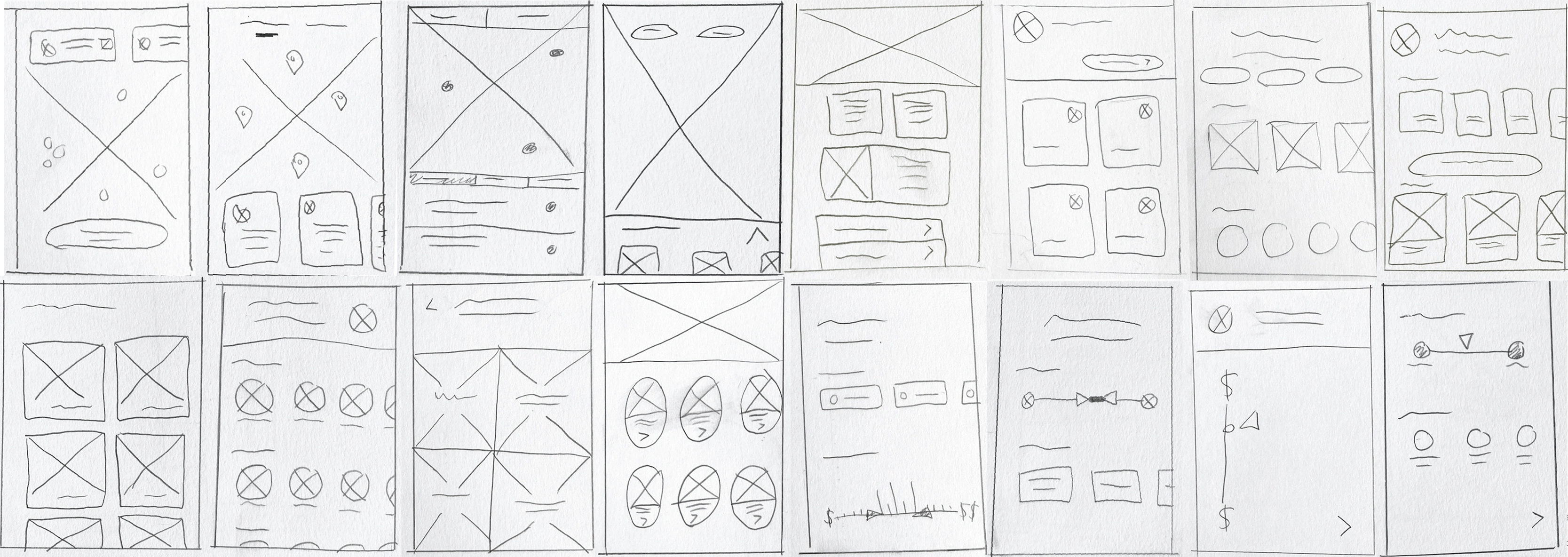
From there, I took bits and pieces from the best concepts and melded them into more refined solution sketches. Out of these sketches, I chose the best ones to bring into Figma.
Mid-Fidelity Prototype
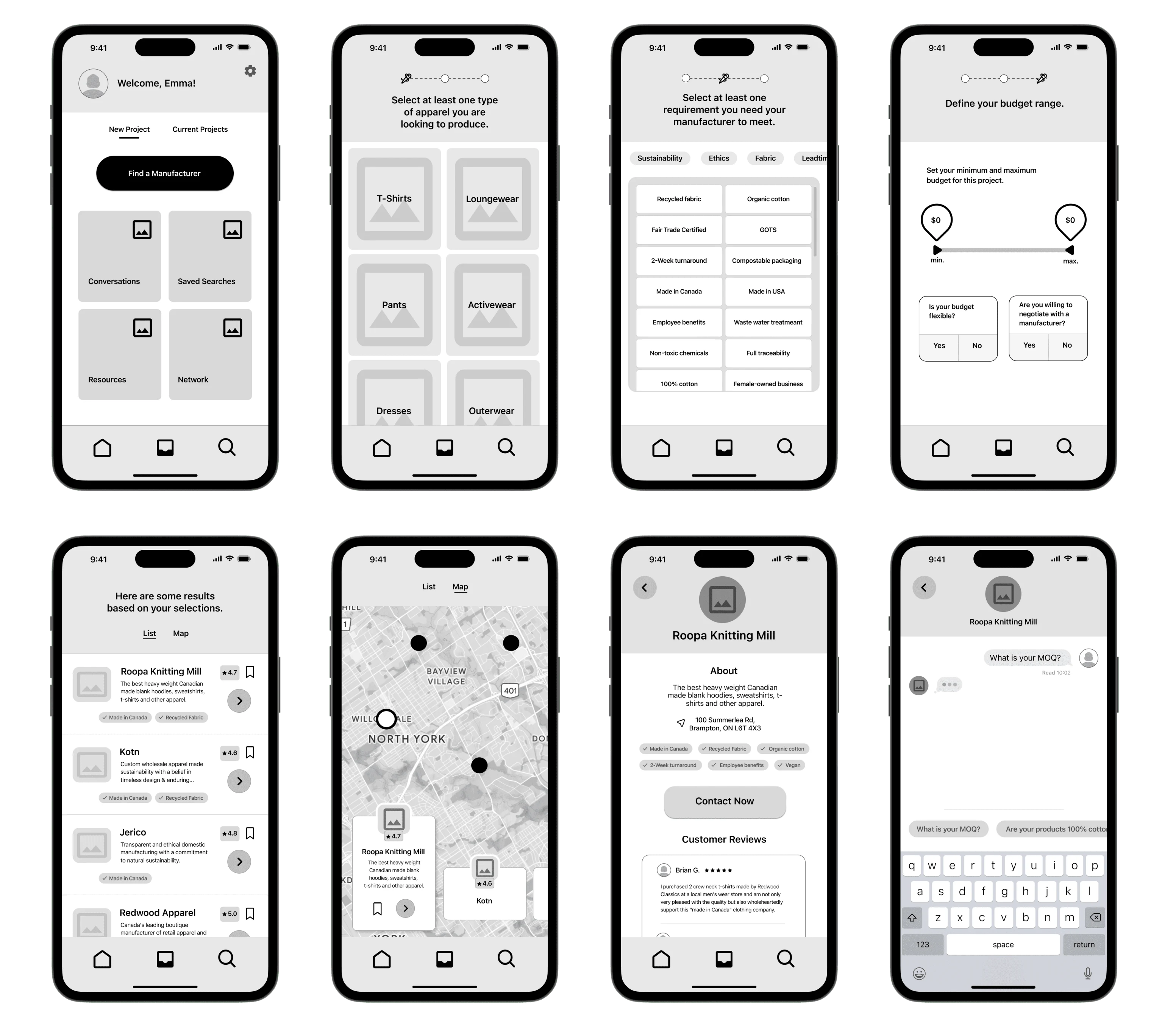
Now it was time to start developing mid-fidelity wireframes from my solution sketches. The task flow was pretty simple, but I wanted to ensure the process was as simple and straight-forward as possible, so a user who is new to the fashion industry wouldn't feel confused or overwhelmed. I added in the key functionalities to make it into a working prototype, which meant I was ready to start user testing.
User Testing
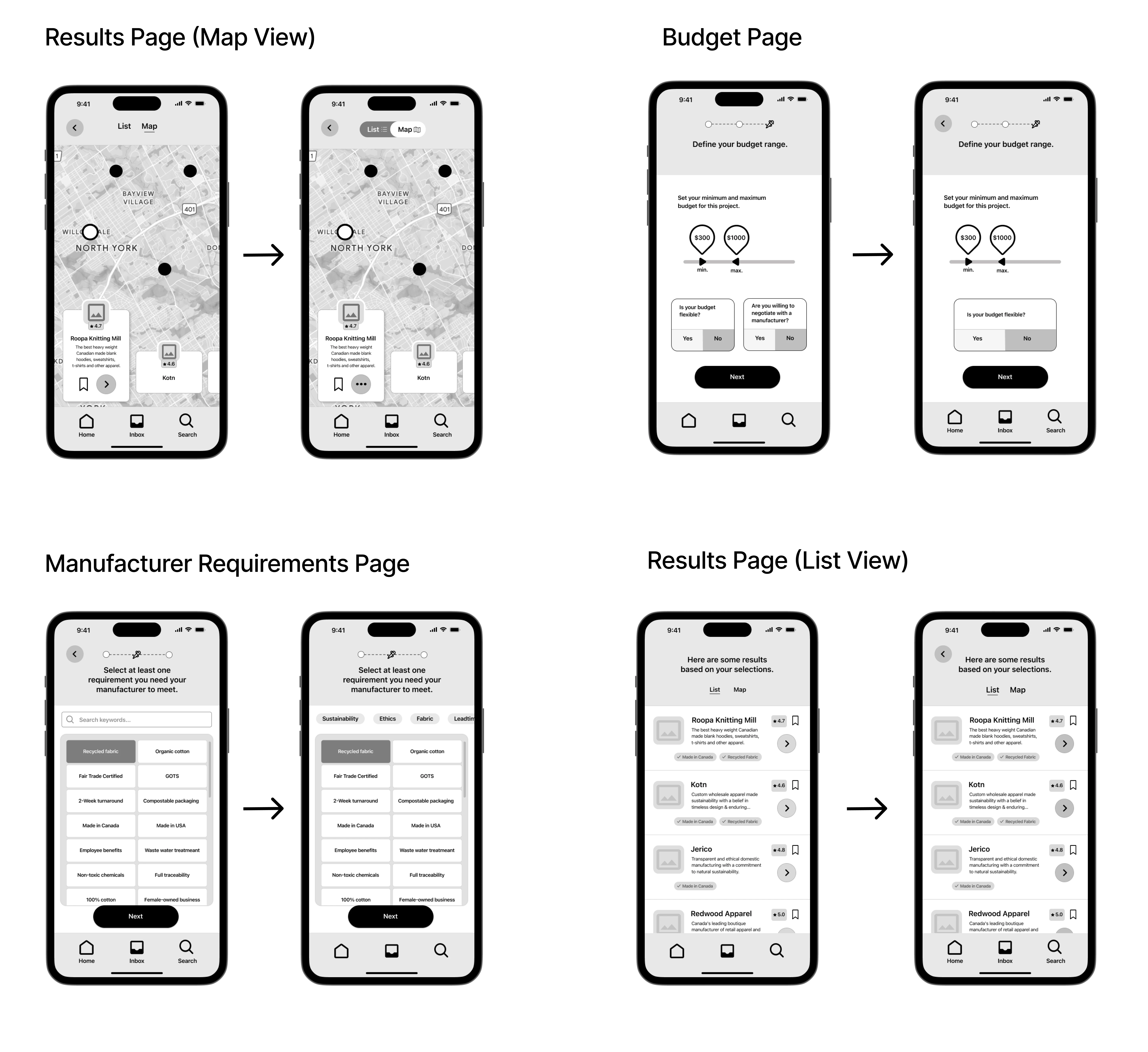
In order to identify any usability issues, I conducted 2 rounds of user testing on 10 individuals. Most of the testers were able to complete all of the assigned tasks, but the main issues I found revolved around sizing and iconography. I organised all of the testing results into a Design Prioritization Matrix, allowing me to identify which issues would be the most beneficial and time-efficient to fix.
Below are some of the refinements I made to improve the overall usability of the app:
Branding
With the key usability issues solved, it was time to start developing my brand identity. As an apparel brand owner myself, I’ve seen a lot of stale manufacturing websites. I know they’re more focused on the technical side of things, but come on, we’re making fashion here!
I also know that as creatives, we tend to get bogged down when it comes to the industrial side of things. But again, it’s fashion, so I think every part of the process should be as exciting as possible. So when it came to branding, I knew I wanted to go an energising and amusing route.
To get the creative juices flowing, I created a Moodboard with images, colours and some descriptive words to help me develop the direction for my brand.
Then it was time to come up with a name. This was a bit difficult as I wanted to find the balance between something catchy and something that embodied the functionality of the app. After several visits to ChatGPT, I settled on SeamSeeker. I think some alliteration is always fun, and the word “seeker” inspires thoughts of creativity and discovery.
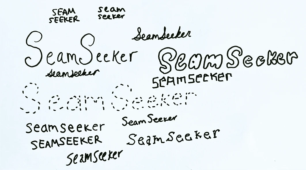
It didn’t take long for me to create a Wordmark and application icon. I first started playing around with different typography styles and found that adding some kind of seam element into the font was the way to go.
For my application icon, I started off by thinking of any object that visualised “seeking” – maps, glasses, magnifying glasses, etc..
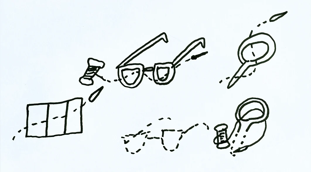
Throw in a little movement with the needle and thread, some 3D metallic flair, and I had my icon.

Lastly, I created a responsive marketing website to showcase SeamSeeker and further develop its brand identity.
High-Fidelity Prototype
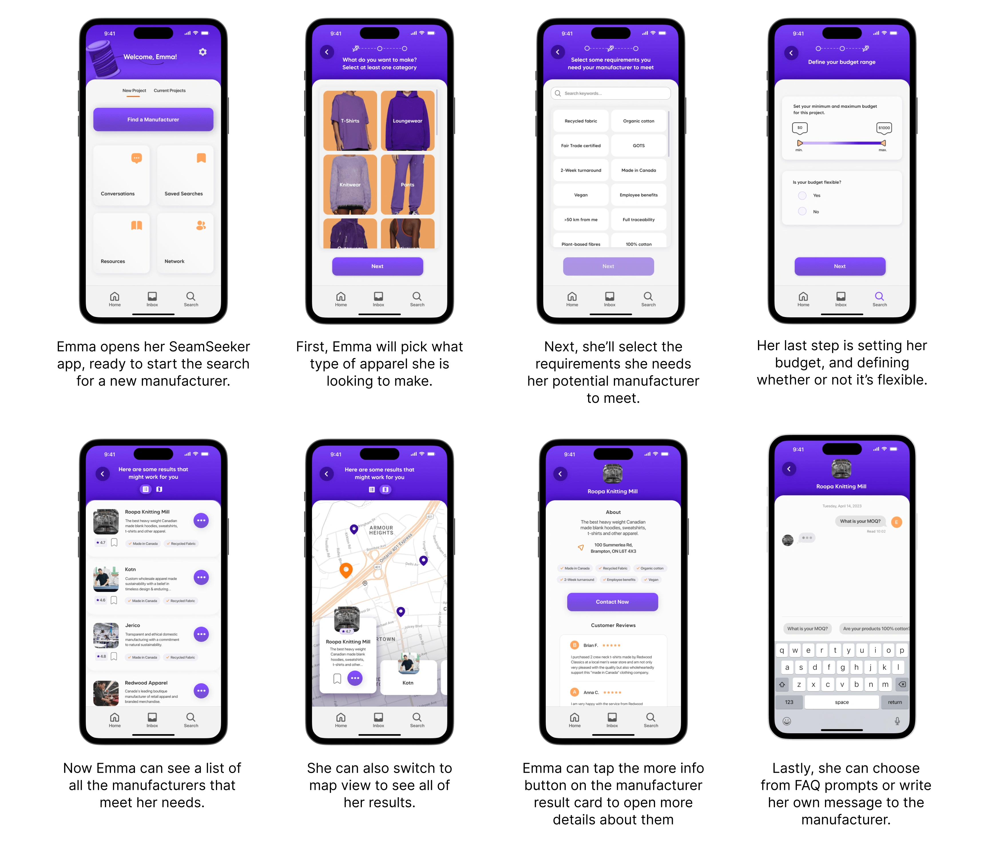
After lots of research, iterations, critiques, and colour injection, SeamSeeker is finally ready.
After so much research, testing and prototyping, I (incorrectly) expected that adding colour to my app would be the easiest and most enjoyable part of the process. What I found was that it was extremely difficult to balance my bright colour palette, not overwhelm my users and keep that feeling of fun and excitement simultaneously. After trying multiple iterations with my colour palette and changing some UI elements, I landed on a product I felt conveyed my desired atmosphere while still being clean and easy to use.
Next Steps & Measures of Success
As I reflect on this project, I realise that there are several important next steps that I should consider to improve SeamSeeker. Firstly, I would like to add more functionality based on the other key epics found through user stories: Communication and Finding Educational Resources. This could involve incorporating networking features and more robust communication tools, which would help users to learn more about ethical production practices. In addition, I plan to conduct further user research and testing to gather feedback on the app's current design and functionality. By leveraging this feedback, I can make informed decisions about future updates and improvements to create an exceptional user experience that meets the needs and expectations of my target audience.
Like this project
Posted Aug 15, 2023
SeamSeeker helps small apparel brand owners source, compare and connect with responsible manufacturers that meet their brand values.
