Brigid’s Forge
Siddharth Jhawer
Get to Know the Project
Brigid's Forge is a school dedicated to the Irish goddess of spring, fertility and life, Brigid. Running from a small city in Ireland, this school focuses on spirituality and spreading the word of their goddess.
The client was passionate about her faith and wanted the logo to capture the essence of that. She associated the goddess with 3 elements and believed it to be the cornerstone of what Brigid stood for.
The Design
The design focuses on inculcating the three elements the client stated - The Anvil, The Forge and Fire. The three elements come together in a bold palette of red and white. The font is chosen to seem like malleable metal hinting at the forge and anvil, and the colour closely resembles a roaring flame from the start to finish of the logo.
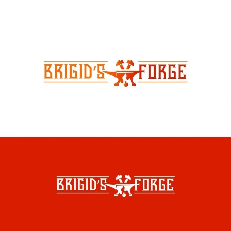
Logo Design

Social Media Banner
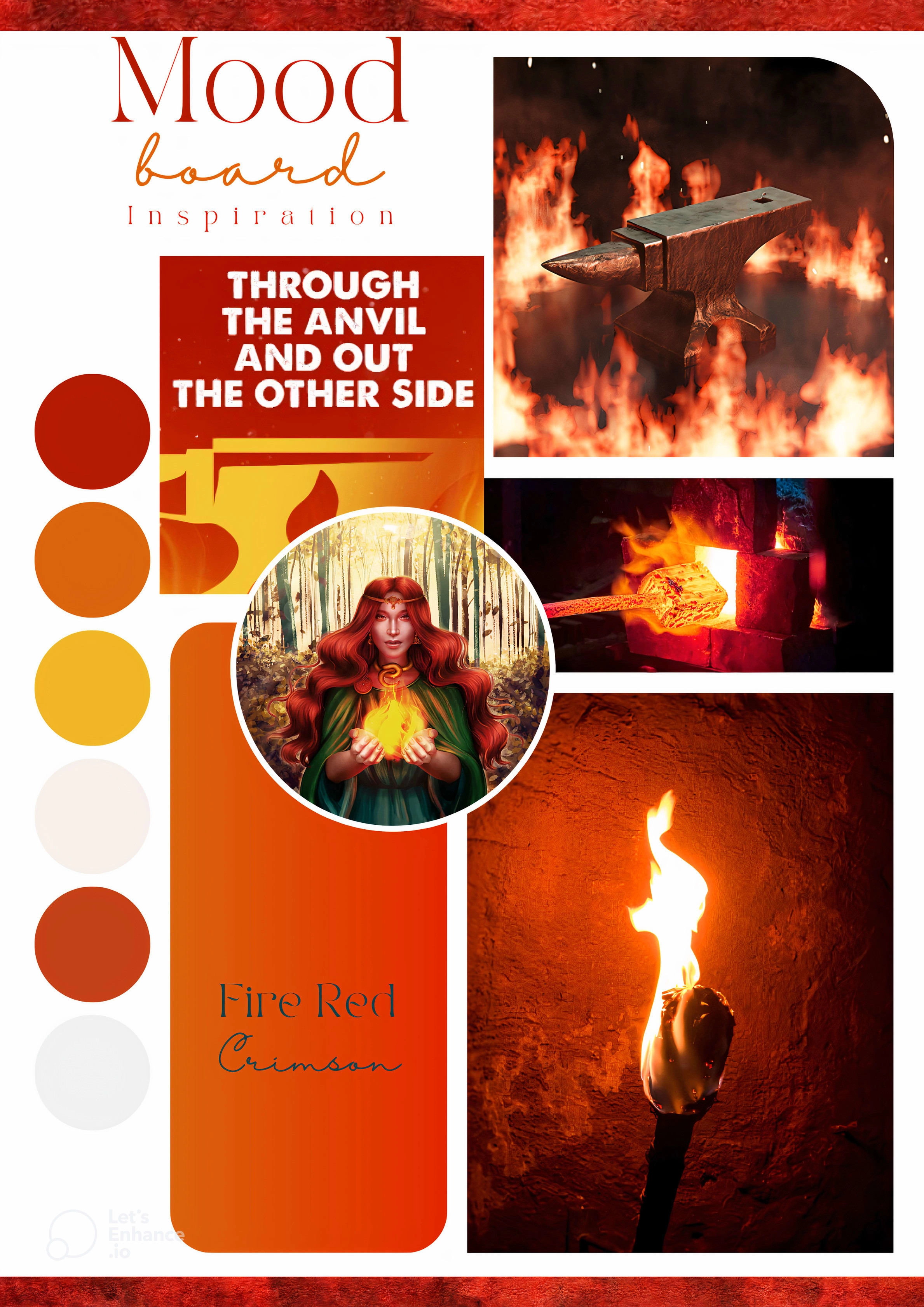
Mood Board

Business Cards
What the Client Said...
I have a fairly speficic business that involves spirituality. Siddharth researched on my culture and came out with an absolutely fantastic design that I'm really happy and proud of. I’ve been getting a lot of compliments. He worked really quickly and was effective. He paid attention to what I wanted and I'd heartily recommend him to anybody else.
Like this project
Posted Jan 24, 2024
This showcases the logo, business cards and banner design of Brigid's Forge, a school dedicated to the Irish goddess.
Likes
0
Views
7