Interactive Swipe Card Stack for Framer

Anastasia Satnichenka



Swipe Card Stack
An interactive card component for Framer.
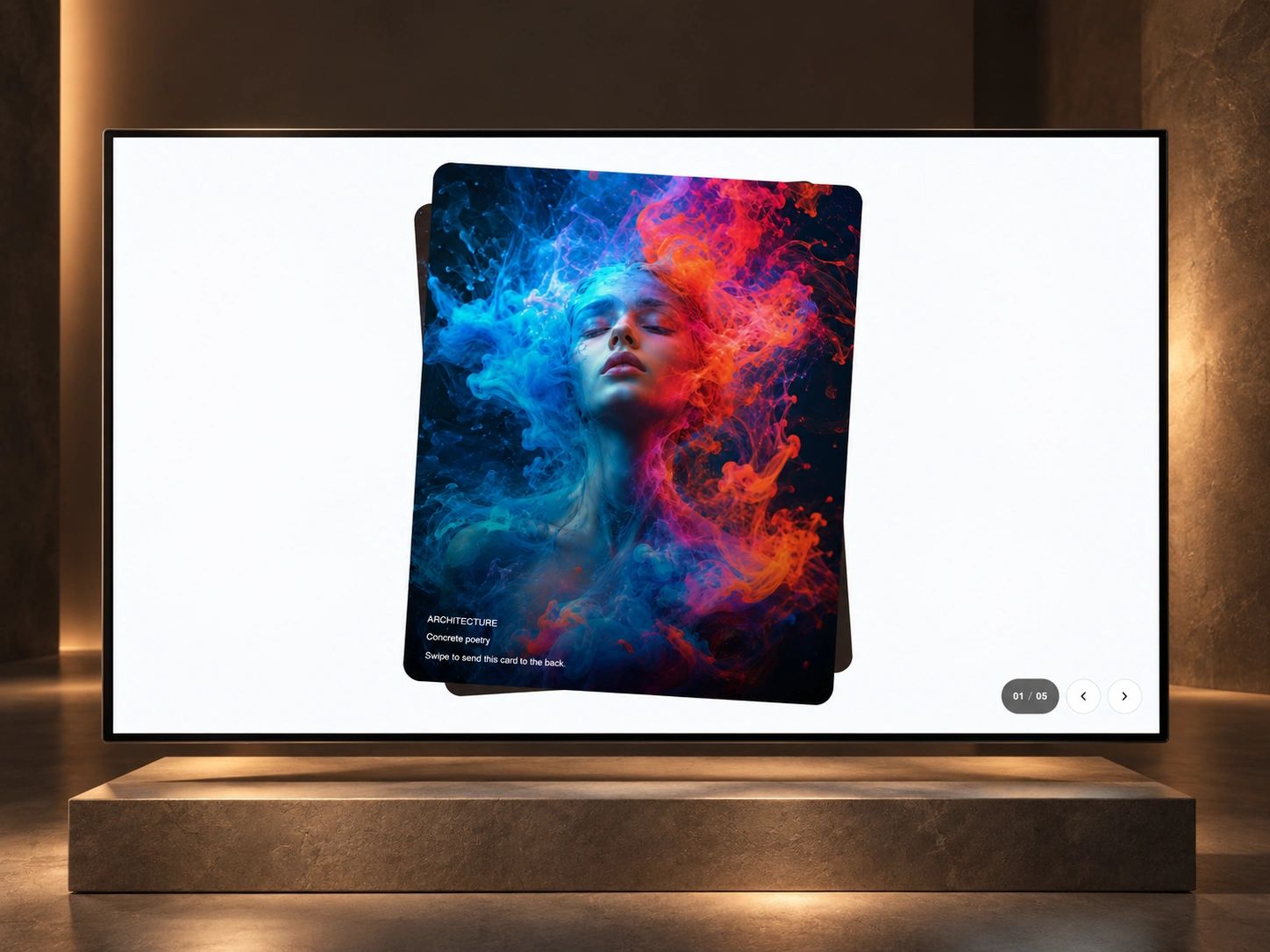
A gallery with a sense of touch. Swipe Card Stack brings images into a layered deck, using depth, rotation, and spring motion to make browsing feel tactile.
Designed for portfolios, editorial galleries, campaigns, and product stories.
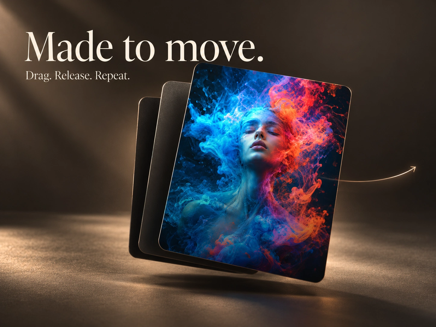
Made to move.
Drag a card left or right to move through the stack. Visitors can also use navigation buttons, keyboard controls, or optional autoplay.
Each card supports its own image, text, colors, and links — including separate destinations for left and right swipes.
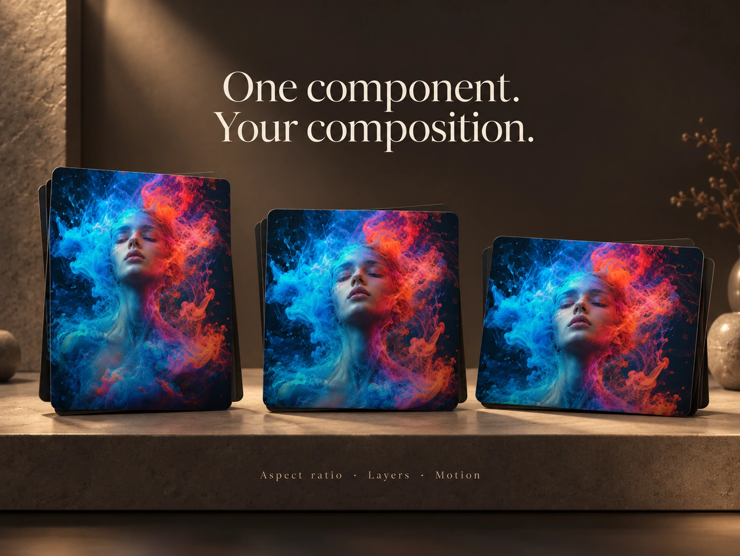
One component. Your composition.
Shape the deck directly in Framer Properties. Adjust the aspect ratio, visible layers, spacing, scale, rotation, and opacity to suit your layout.
Typography, navigation controls, and motion settings are editable too, giving the same component a different rhythm and visual character across projects.
Ready for your next project.
Replace the imagery, add your content, and tune the interaction. Use it as a focused visual moment or build a story visitors can explore one card at a time.
Like this project
Posted Jul 25, 2026
A responsive swipeable deck with layered depth, smooth spring motion, directional links, keyboard navigation, autoplay, and fully editable cards.
Likes
0
Views
12
Timeline
Jul 23, 2026 - Jul 25, 2026