Webapp for Endorphin 1st place lovable challenge

Sergey Bertagnini
Verified


Endorphin is the biggest run community in Turin. 150+ people show up to a single Thursday run, and until now there was no website: every "can I come?" arrived as an Instagram DM or a WhatsApp message, and a small volunteer crew answered each one by hand.
In five days I designed and built their site, a one-tap booking flow and a dashboard for the organisers, from brand strategy to a working product on Lovable and Supabase.
This project won the 1st place Lovable Challenge by Lovable and Contra.
My role: strategy, brand system for the web, product design, build
Timeline: 5 days
Tools: Figma, Lovable, Supabase
The problem
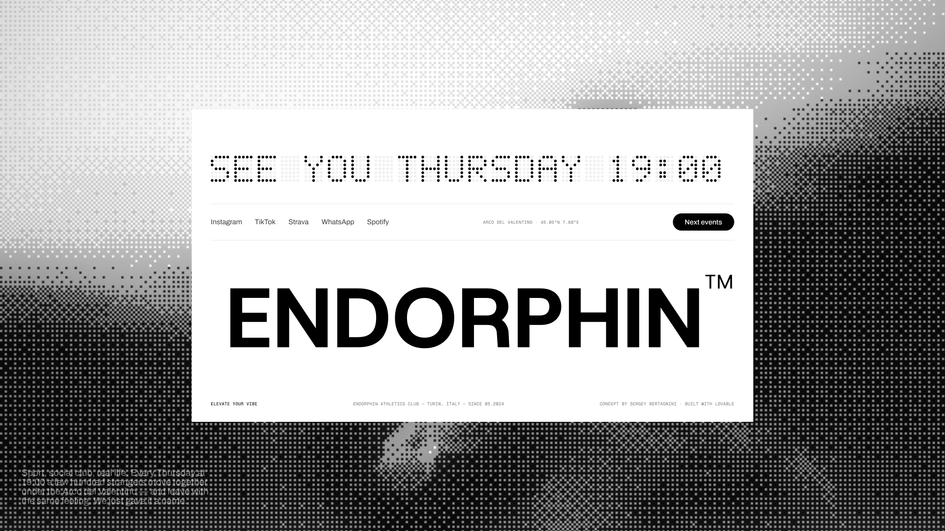
Endorphin started in May 2024 with two friends. Every Thursday at 19:00 a few hundred people meet under the Arco del Valentino, run 5 km at an easy pace and stay for coffee long after. On top of that, the crew runs limited events with brands like Nike and adidas, and trips out of the city.
All of it lived in an Instagram bio line, stories, a Linktree and two WhatsApp groups. When's the next run? Where do we meet? Am I too slow? The questions were the same every week, and every answer was typed by hand.
Before designing anything, I went through their posts, highlights and reels and split what I found into two lists: what I could verify, and what I was only assuming. I designed on the first list. The second became questions for the crew.
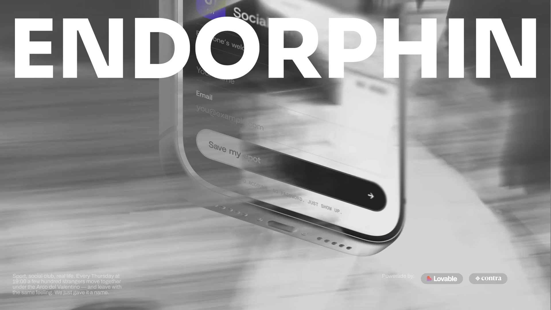
Day one, I built the wrong thing
My first version was a clean booking tool with its own product name, capacity caps on the Thursday run, waitlists and no-show tracking. It solved a logistics problem.
Endorphin doesn't have that problem. Their Thursday run is free, open to every pace, with no tryouts. A cap on it would have broken the one promise the club makes to everyone who walks up to the arch.
So I threw it away and changed three things before drawing another screen:
→ No sub-brand. The site is Endorphin's own front door and carries only their name.
→ No booking on Thursdays. Saying you're coming is a signal. Real booking only exists where spots are really limited.
→ One job for every page: take someone from scrolling on Instagram to showing up at the arch.
Fast tools make it cheap to throw a version away. That only helps if someone notices the version is wrong. Strategy first, pixels after.
The run is the excuse
The club's founding idea is that how you feel after a run matters more than how fast you ran. That became the rule for every screen: talk about people, never about performance. No paces to hit, no "members only", no software words.
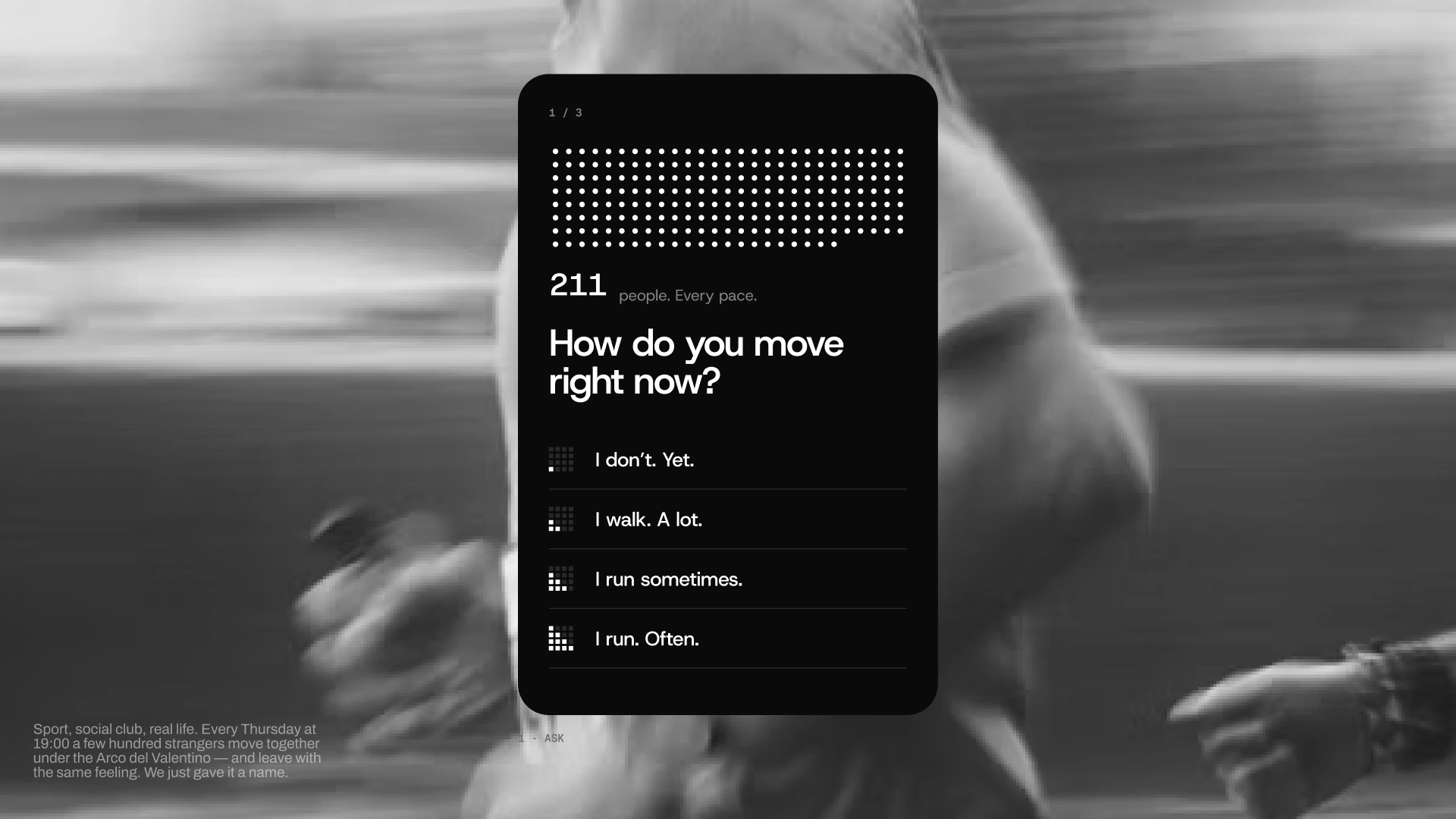
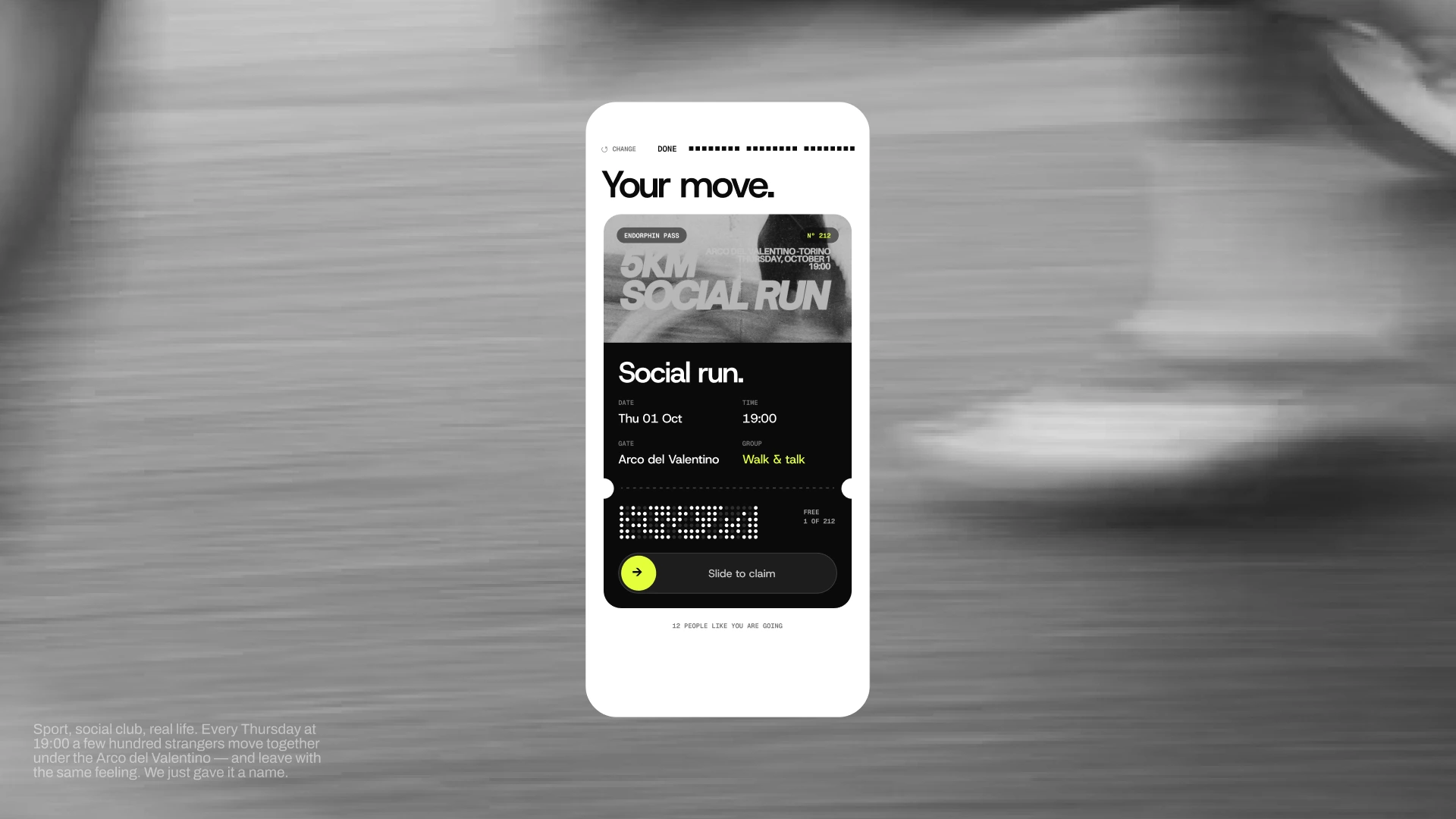
You don't cancel, you pass your spot on. You don't book, you say "I'm coming". Sold out becomes waitlist open. Onboarding becomes "find the flag", because the crew waits for first-timers under a black flag from 18:45.
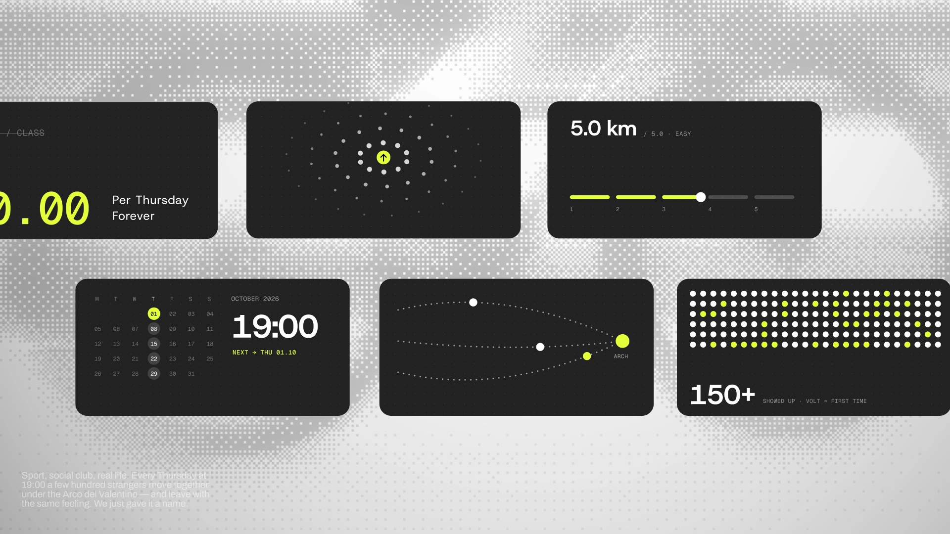
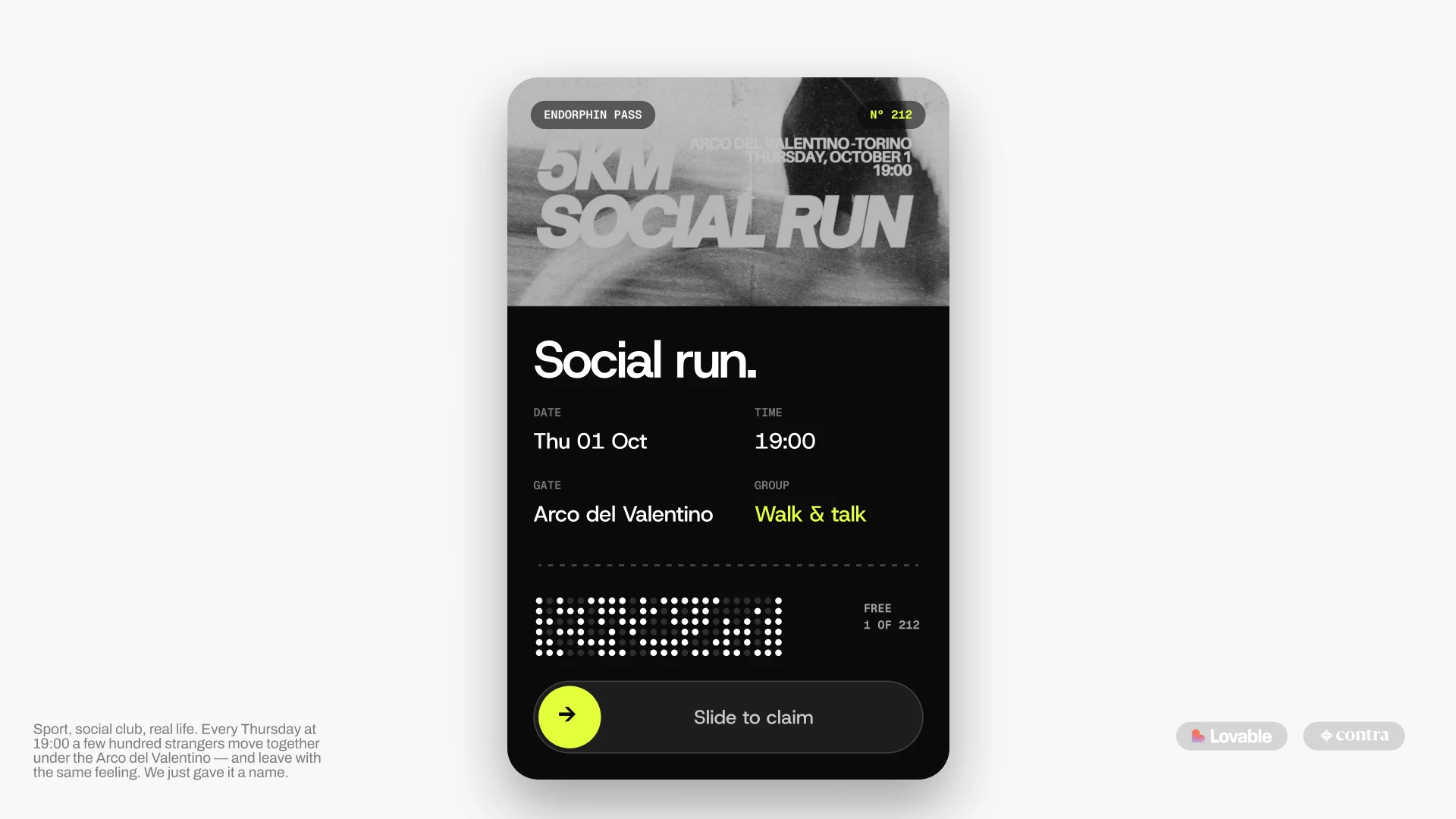
The visual system comes from their own channels: white, black and one volt accent sampled from their posts, a heavy grotesk for headlines and a mono for times, dates and counts. The homepage even writes the Social Run as a formula: 5 km, 150+ people, €0, every pace, Thursday 19:00, one flag.
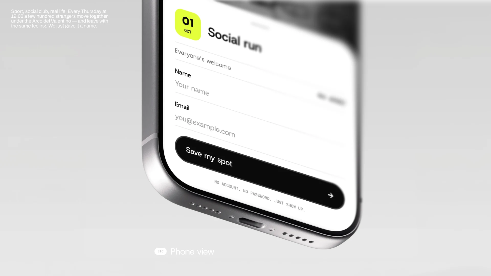
Thursday: one tap, on purpose
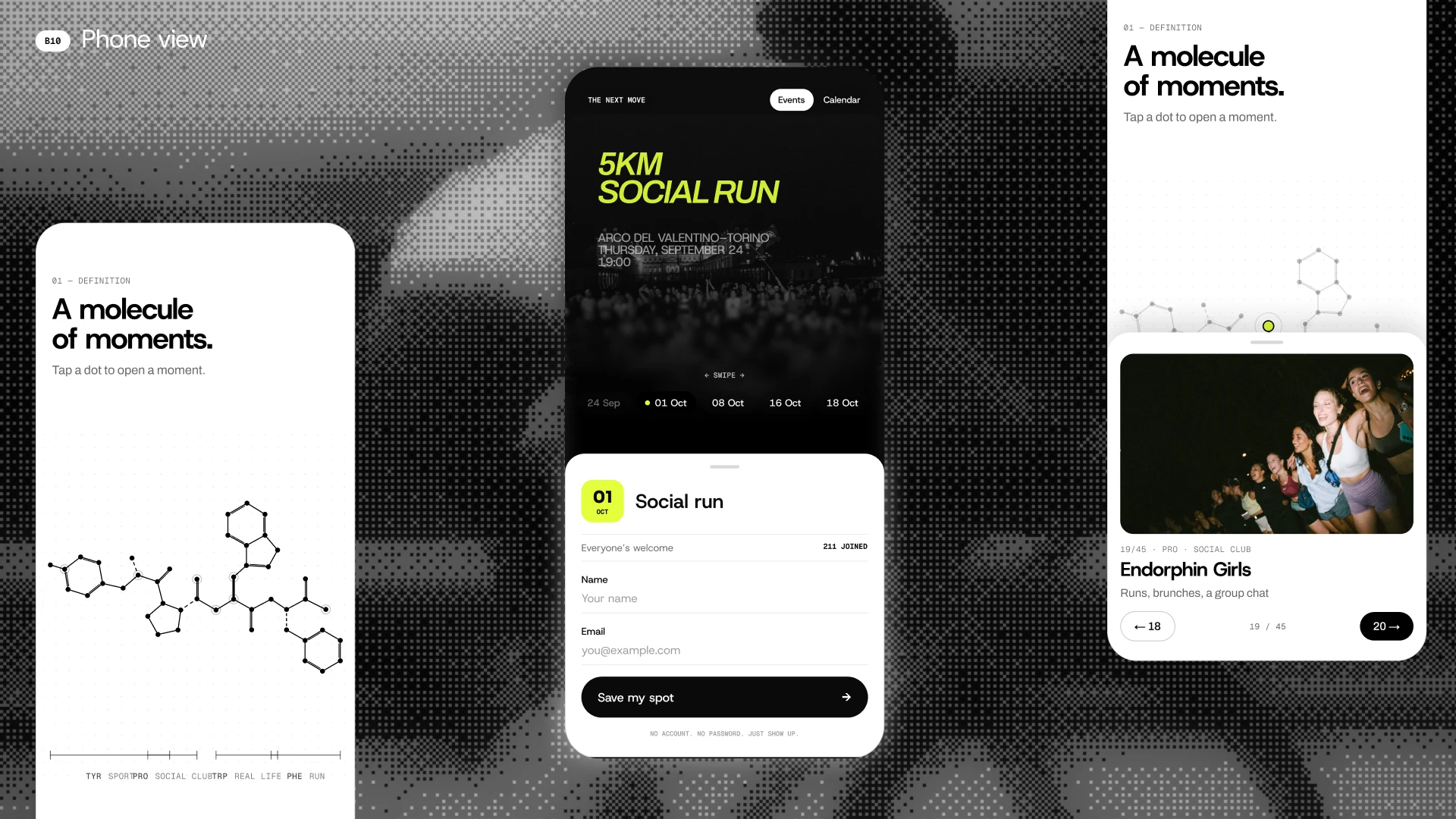
For the Thursday run nothing is limited and nothing is required. New visitors type a name and an email and they're in. Returning visitors are remembered on their device, so it takes a single tap. No account, no password, ever.
First-timers are told someone from the crew will meet them at the black flag, and the crew gets a live count to pass on to the cafés by the arch.
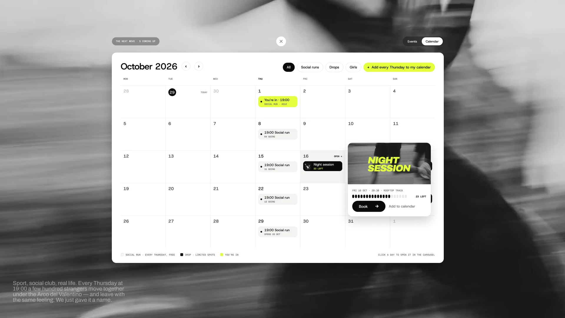
The Crew Room: zero DMs to answer
The same three answers organise Thursday for the crew. In the Crew Room they see who's coming, who's new, which groups need pacers and which brand requests are waiting. The crew edits one line for the next run and the whole site updates.
What used to happen in an inbox now happens on its own:
→ "When's the next run?" is answered by the site.
→ Spots for limited events claim, pass and refill themselves.
→ Headcounts for cafés and partners are live.
→ Brand dates arrive as structured requests instead of DMs.
→ The crew knows who's new before they arrive.
Details only this club has
Endorphin is named after a molecule, so the site borrows the language of chemistry. One section draws endomorphin-1, one of the body's own endorphin-family peptides, as dots and bonds. It has 45 vertices and four amino acids: every vertex holds a moment from the club, and each amino acid is one of the four pillars in their navigation. Hover a dot and the moment opens with its photo.
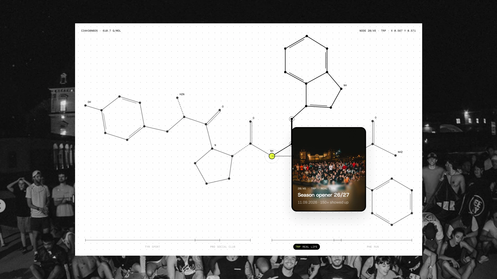
Every component was designed with all of its states, from hover to loading to "You're in", so the build in Lovable matched the design instead of approximating it.
Five days, start to finish
Day 1: research, the wrong first version, and the rewrite.
Day 2: the brand system for the web and the homepage in Figma.
Day 3: site, database and one-tap booking built in Lovable on Supabase.
Day 4: limited events, the calendar, Your move and the Crew Room.
Day 5: motion, mobile polish, demo video and submission.
One person across strategy, design and build. The project won the Lovable Challenge, judged on problem-solving impact, owner-effort reduction, craft and storytelling.
If you're a founder
You're probably not a run club. The method is the same: start from what your users already do, question the brief while changing direction is still cheap, and ship something that runs, not a mockup.
I work with two founders at a time, directly. If you have a launch, a round or a product flow coming up, send me a message here on Contra.
Like this project
Posted Oct 20, 2026
Designed and built a website and booking system for Endorphin in 5 days.