Bom Dia – Restaurant & Bakery Brand Identity
Elihle Gama
Overview
Bom Dia is a Portuguese restaurant and bakery that celebrates the warmth and authenticity of Portuguese cuisine. The brand identity was crafted to capture the essence of traditional Portuguese culture, with a modern, inviting aesthetic.
Brand Concept & Inspiration
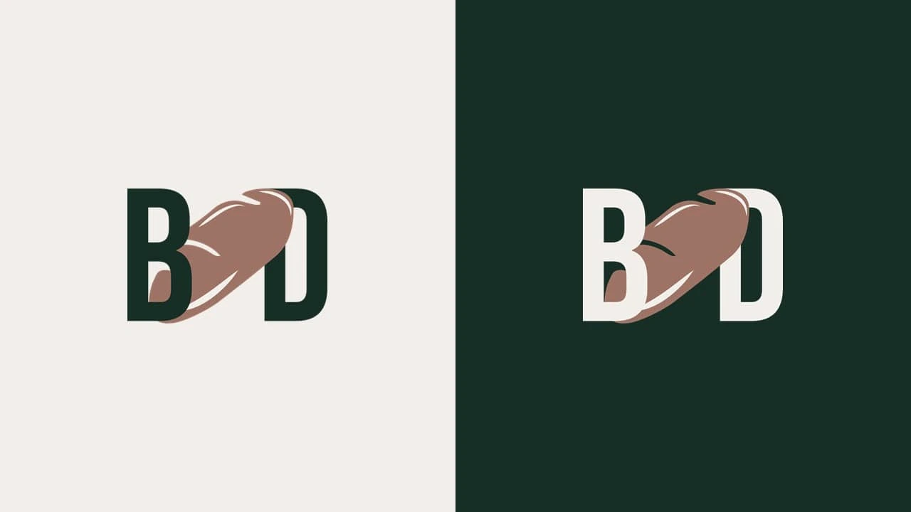
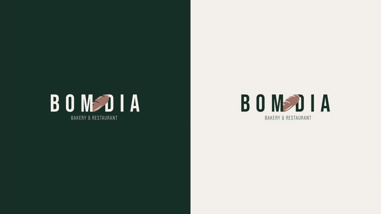
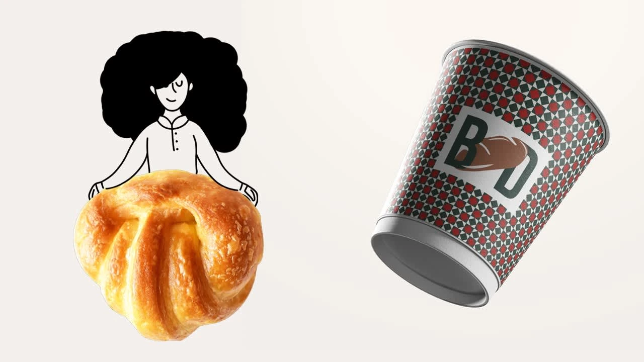
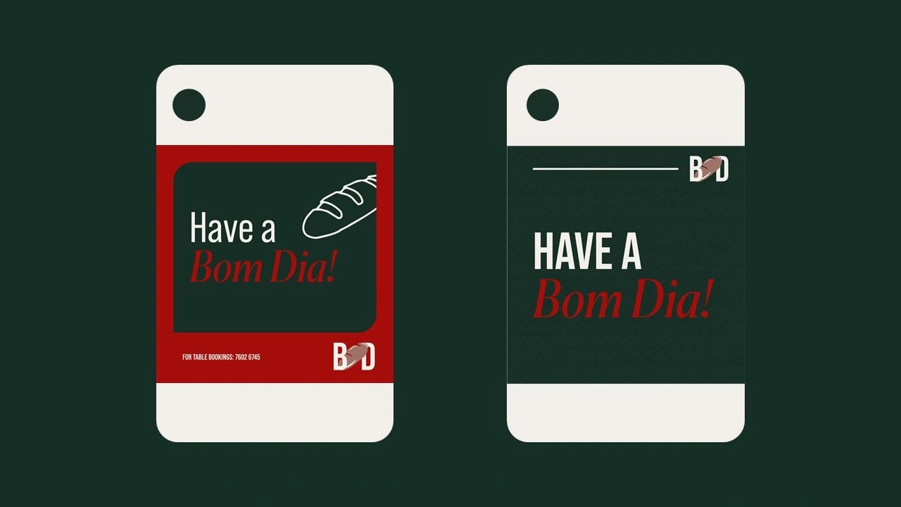
The logo design was inspired by the Pão (Portuguese bread roll), an iconic staple in Portuguese bakeries and a symbol of comfort, tradition, and community. By integrating the shape of the pão into the typography, the logo creates a seamless blend of culinary heritage and contemporary design. The subtle yet effective use of negative space within the letterforms enhances memorability and reinforces the connection to fresh, artisanal baking./
Color Palette & Visual Language
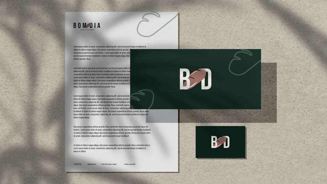
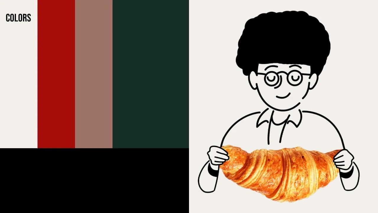
The color palette is a refined mix of warm neutrals, deep green, rich brown, and bold red. These colors were carefully chosen to reflect the essence of Portuguese culture and cuisine:
Off-white – A neutral base, evoking simplicity and warmth.
Deep red – Inspired by traditional Portuguese ceramics and spices, adding vibrancy and passion.
Warm brown – A nod to the golden crust of freshly baked bread.
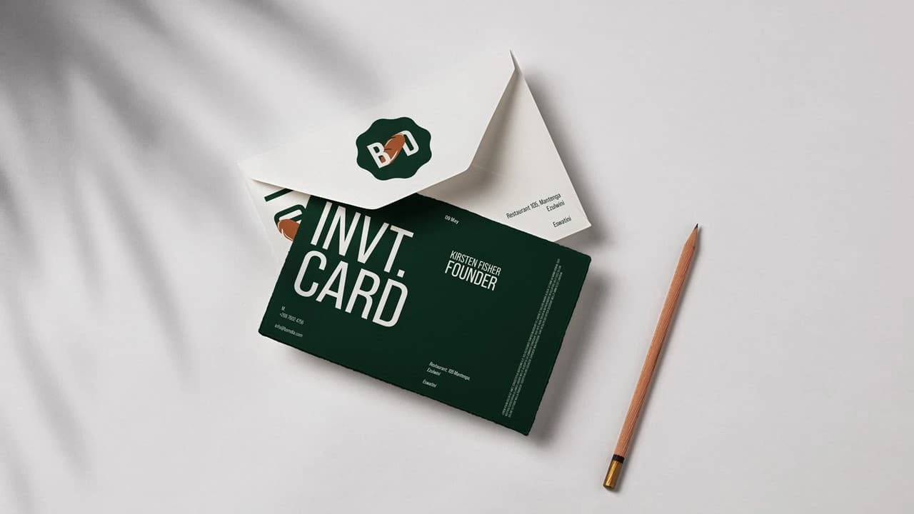
Dark green – A grounding color, representing authenticity, heritage, and timeless elegance.
Black – Used sparingly for contrast and clarity in typography and illustrations.
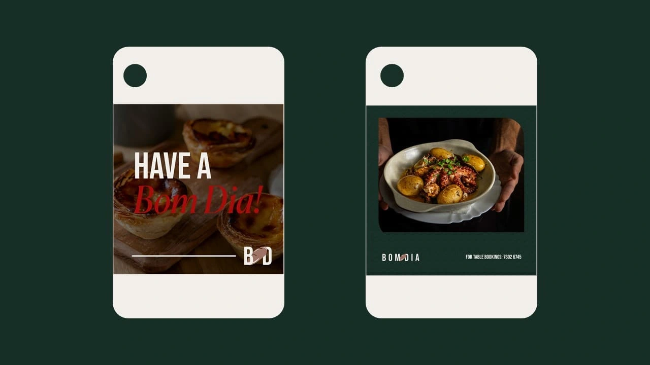
This combination creates a cohesive, modern aesthetic that stays true to the rich culinary and cultural heritage of Portugal while maintaining a contemporary feel. The deep green and warm brown tones provide an earthy, artisanal touch, while the red adds a lively and memorable accent.
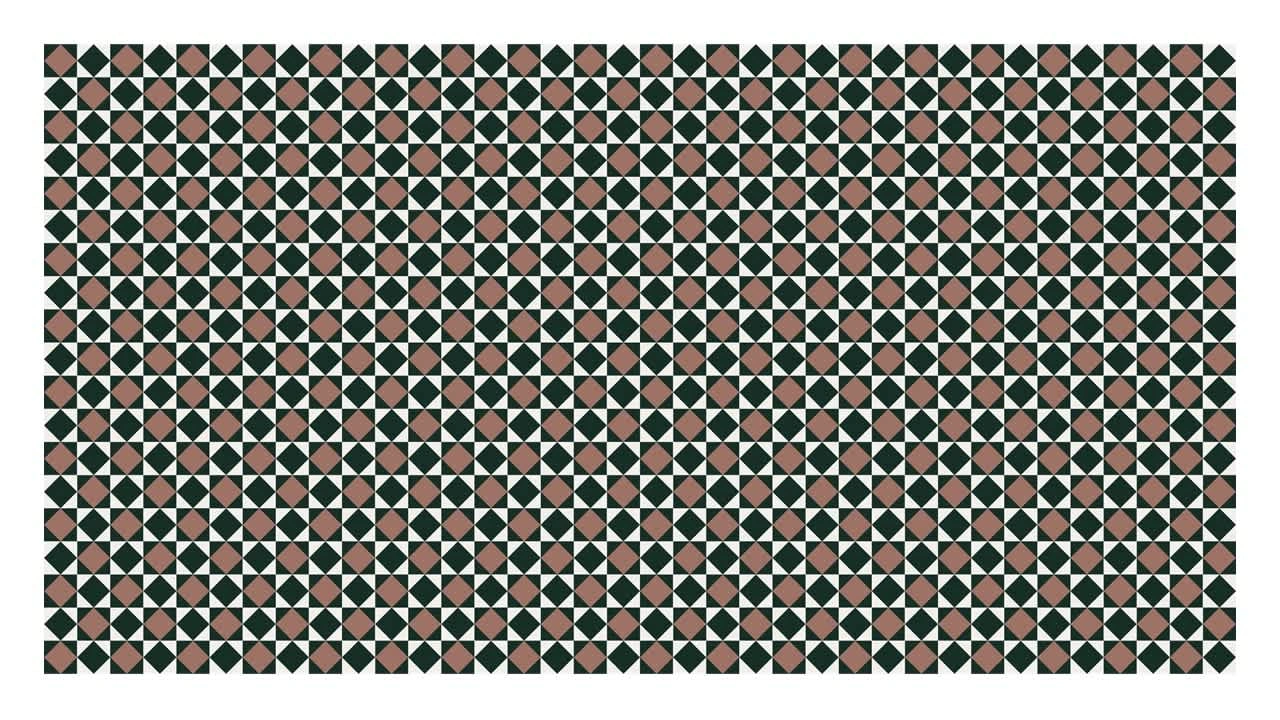
Pattern & Decorative Elements
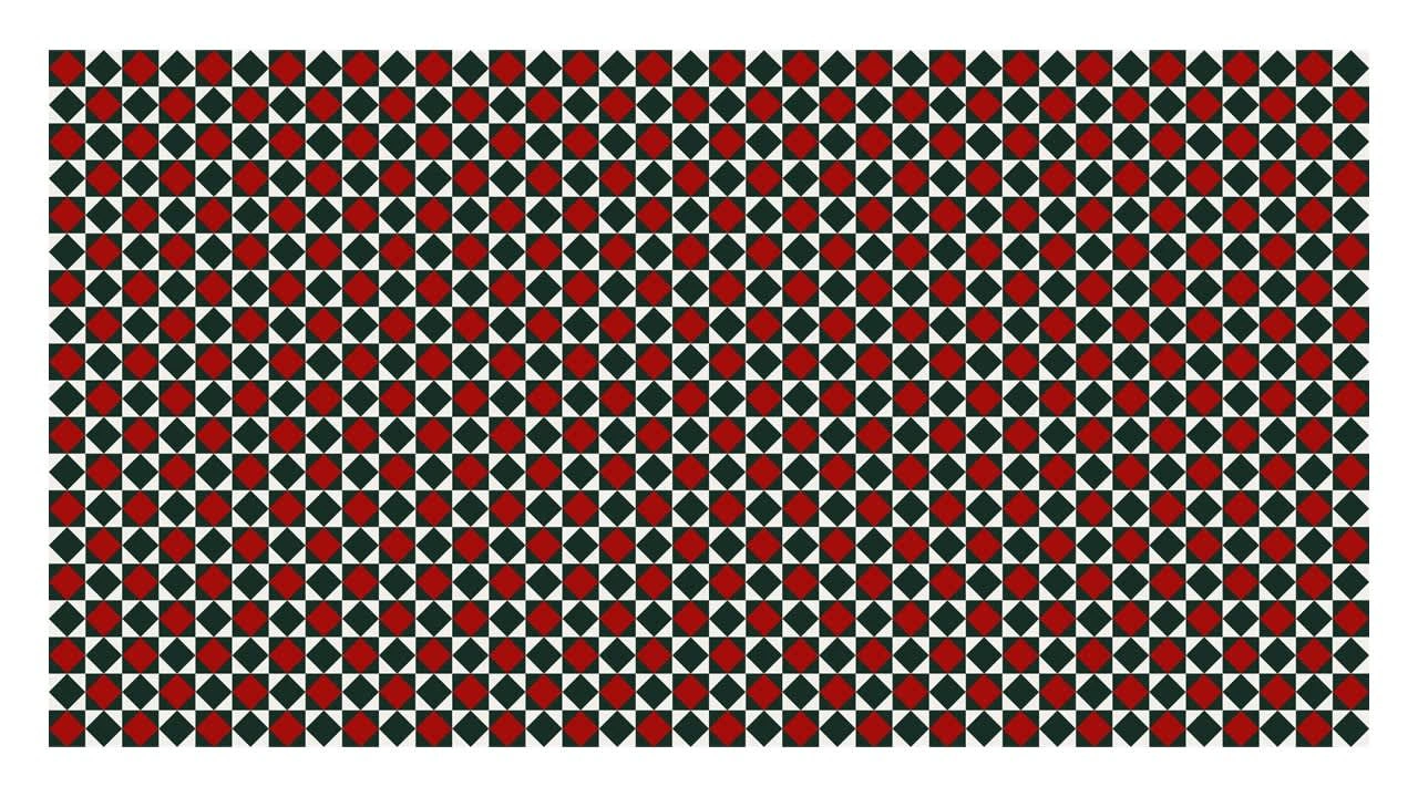
The supporting visual identity draws inspiration from Portuguese azulejo tile patterns, a hallmark of Portuguese architecture and design. These intricate patterns not only add cultural depth but also create a recognizable and elegant aesthetic across brand applications. Used subtly on packaging, menus, and interior decor, they reinforce the brand’s authenticity while maintaining a modern, clean look.
Strategy & Brand Positioning
The goal for Bom Dia’s brand identity was to strike a balance between tradition and modernity. While deeply rooted in Portuguese heritage, the design ensures a contemporary feel that appeals to both local and international audiences. By leveraging familiar cultural symbols in a fresh and refined manner, the brand creates an inviting and memorable experience for customers.
Bom Dia’s brand identity is more than just a logo—it tells a story of culture, tradition, and the joy of sharing food. Through thoughtful design choices, the brand captures the heart of Portuguese hospitality while remaining visually distinctive and versatile across all touchpoints.
Like this project
Posted Mar 8, 2025
Brand Identity for a Portuguese restaurant & bakery with modernity but rooted in tradition.