Branding project | Gefa Preven
Gefa | One step ahead
Gefa Preven is a brand with more than 20 years of experience in the risk prevention market. In its expansion strategy, Gefa Preven sought to become a medium-sized operator nationwide.
In its growth process was important to redefine the brand, on the one hand, integrate new teams, and on the other, consolidate the project by expanding it to new horizons. Collaborating with redvinilo I had the honor to be in charge of the visual identity design.
Strategy
If there is one phrase that could encapsulate the brand strategy, it would be “Back to basics”.
The key was to go back to basics and make sure every step was done right. We translated this as “going one step further”. We also highlighted the values of expertise and commitment that underpinned Gefa’s purpose as an organisation.
Based on an insight from our research that people desired peace of mind of being able to count on Gefa when needed, no fuss, a brand purpose was born: to make prevention simple.
Visual concept
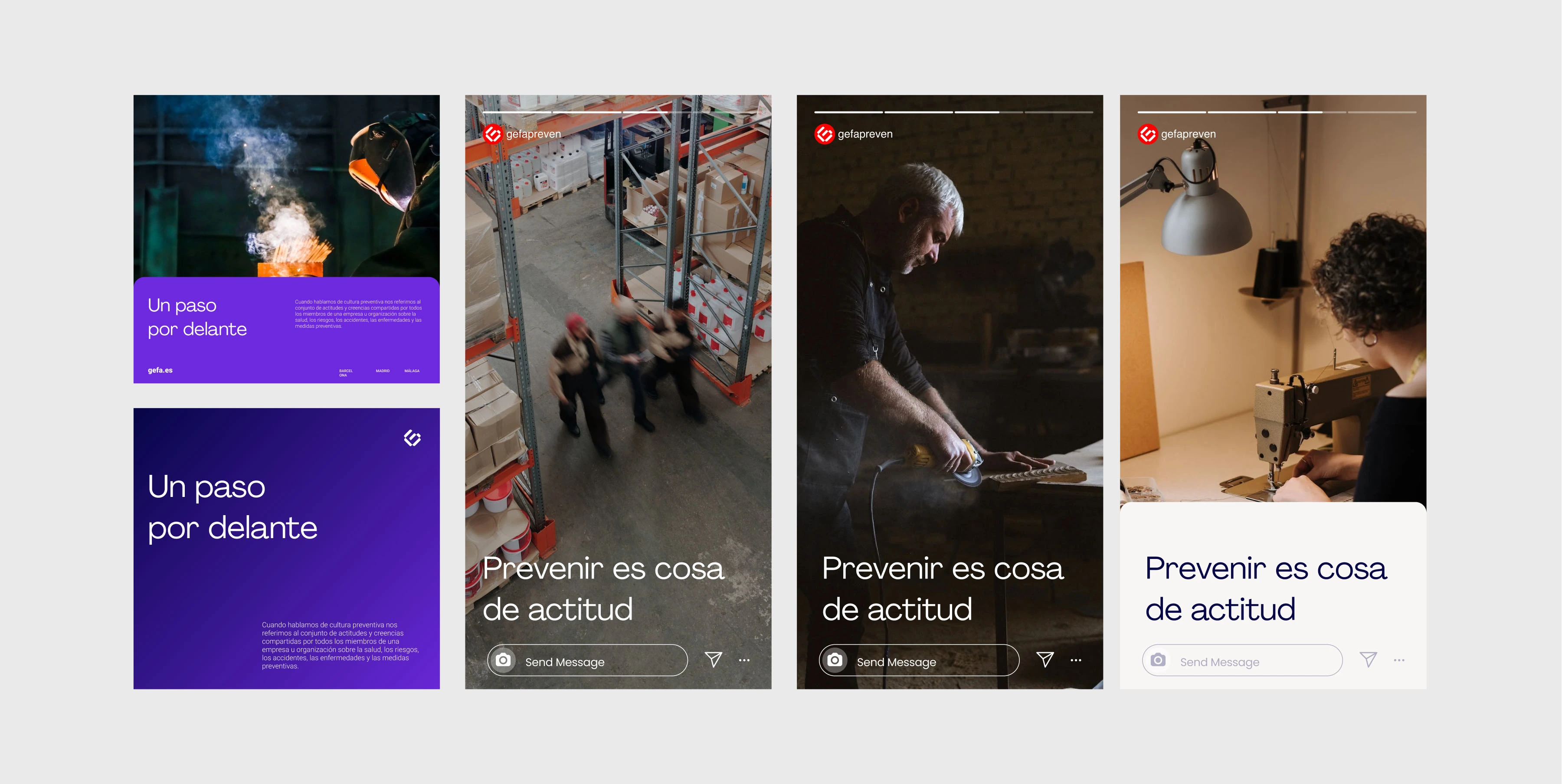
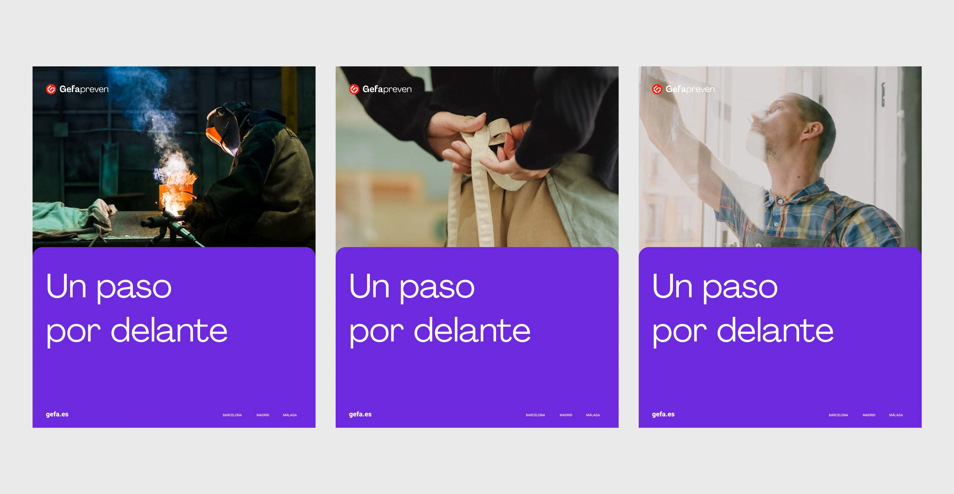
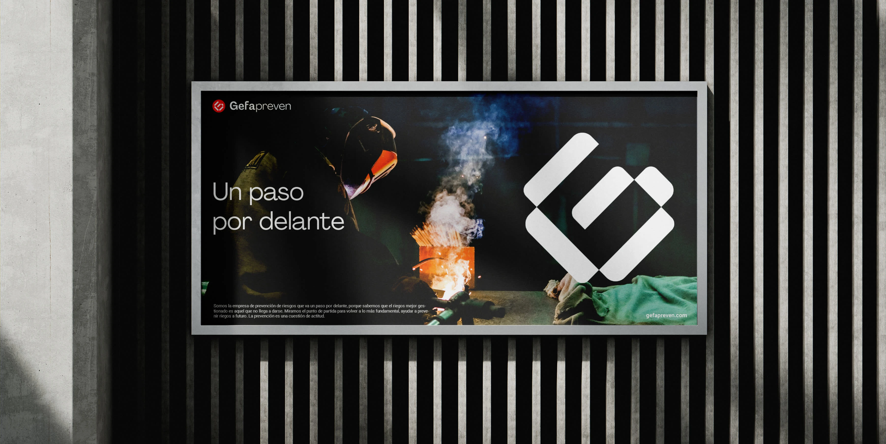
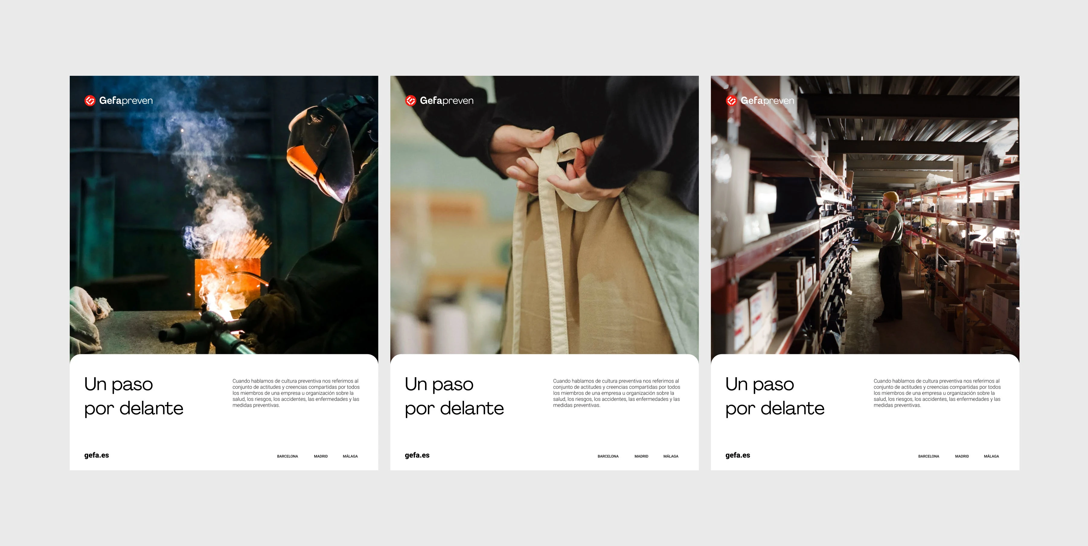
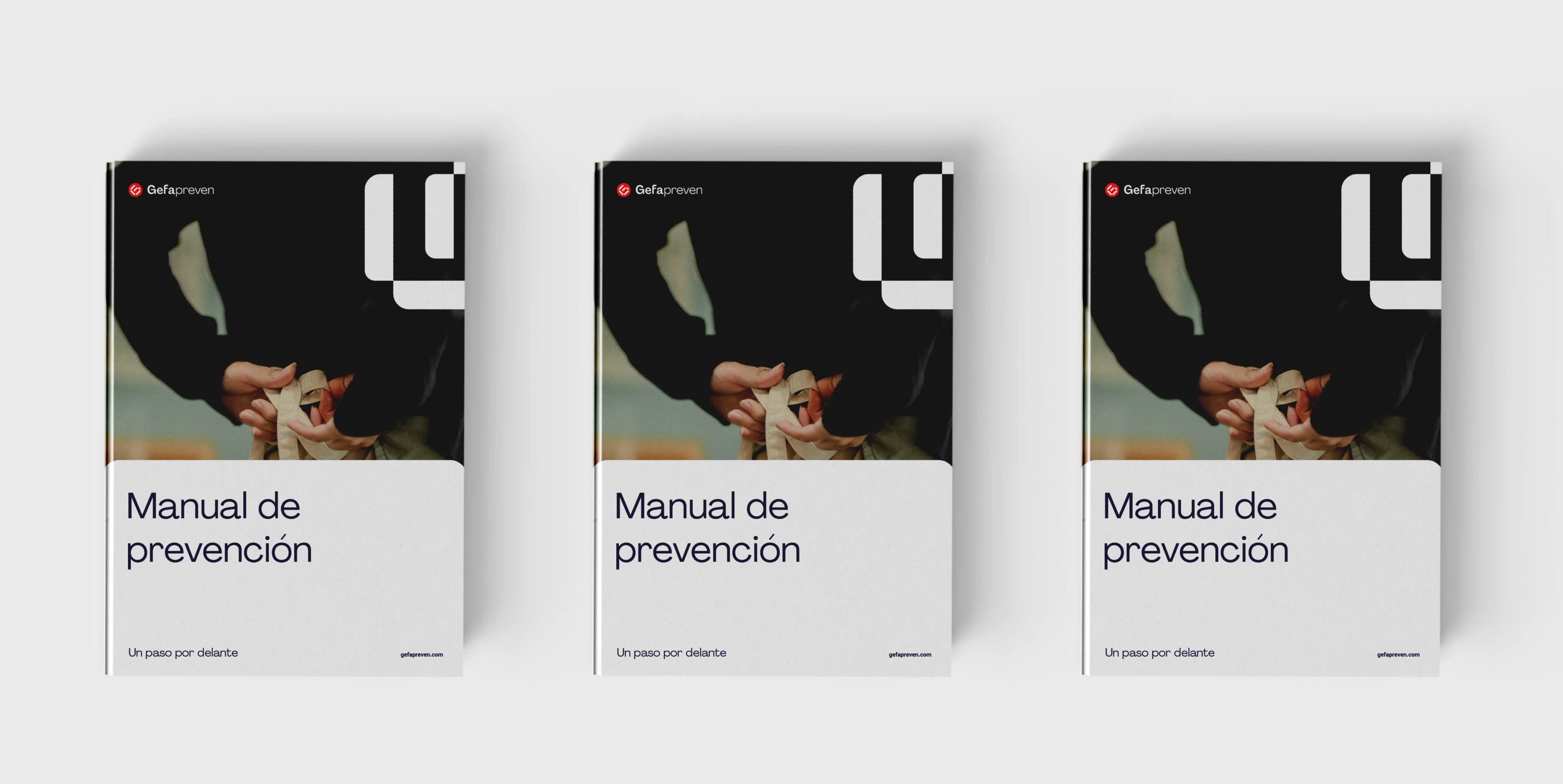
As for Gefa Preven’s visual identity, We developed a versatile and minimalist graphic identity that would stand the test of time. We moved away from conventional visual concepts in the prevention sector, seeking to combine trustworthy expertise with a modern look.
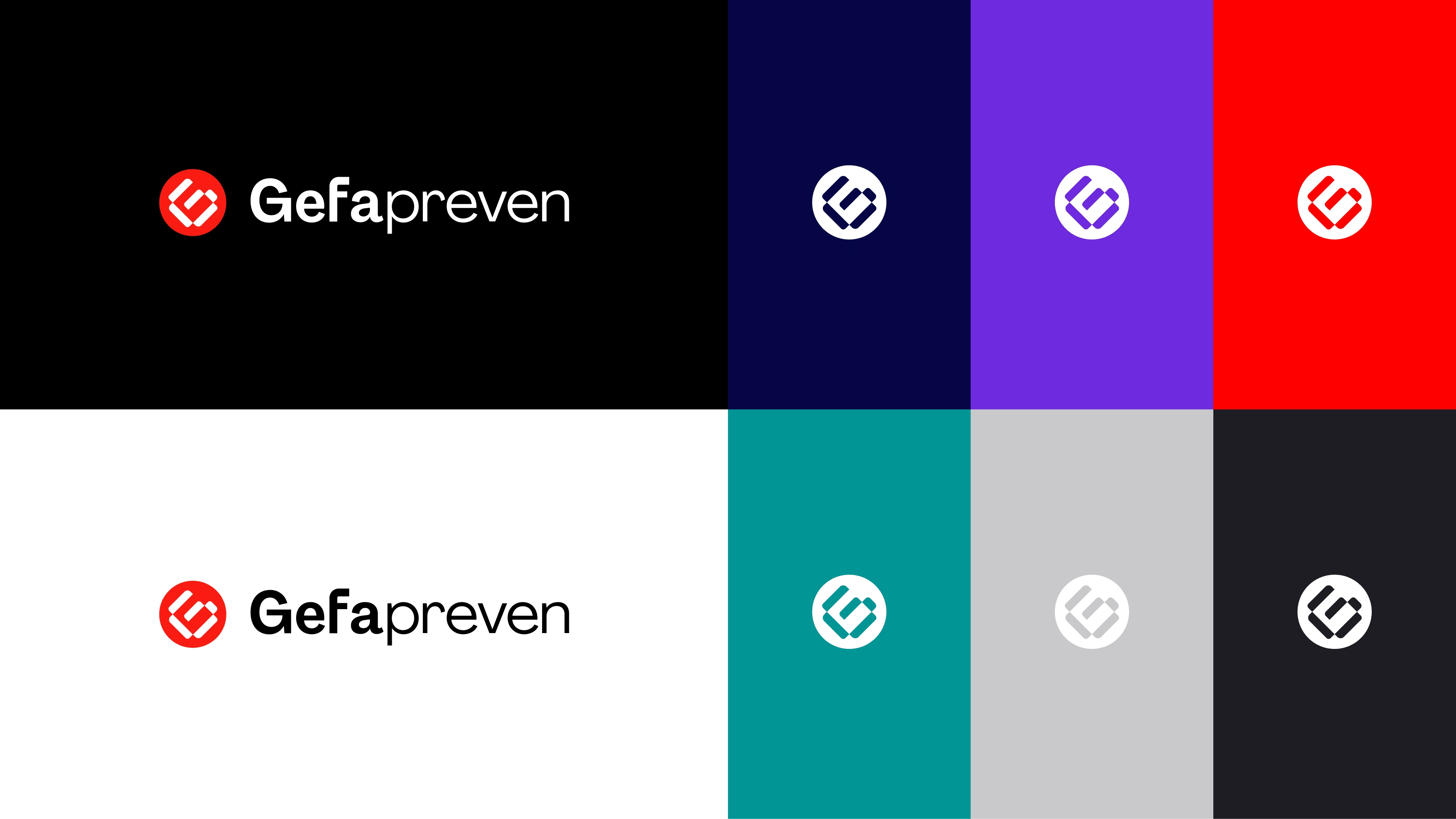
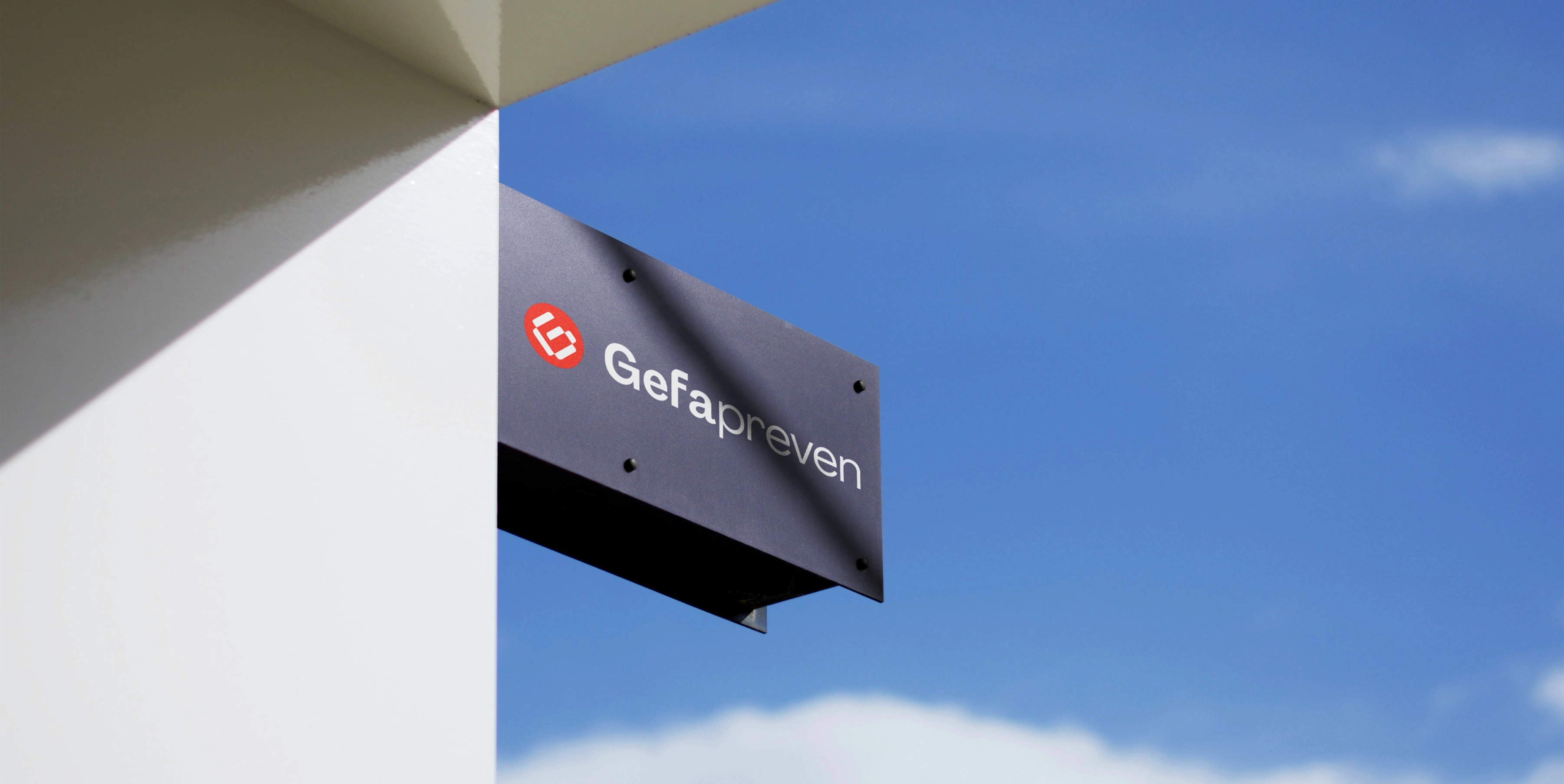
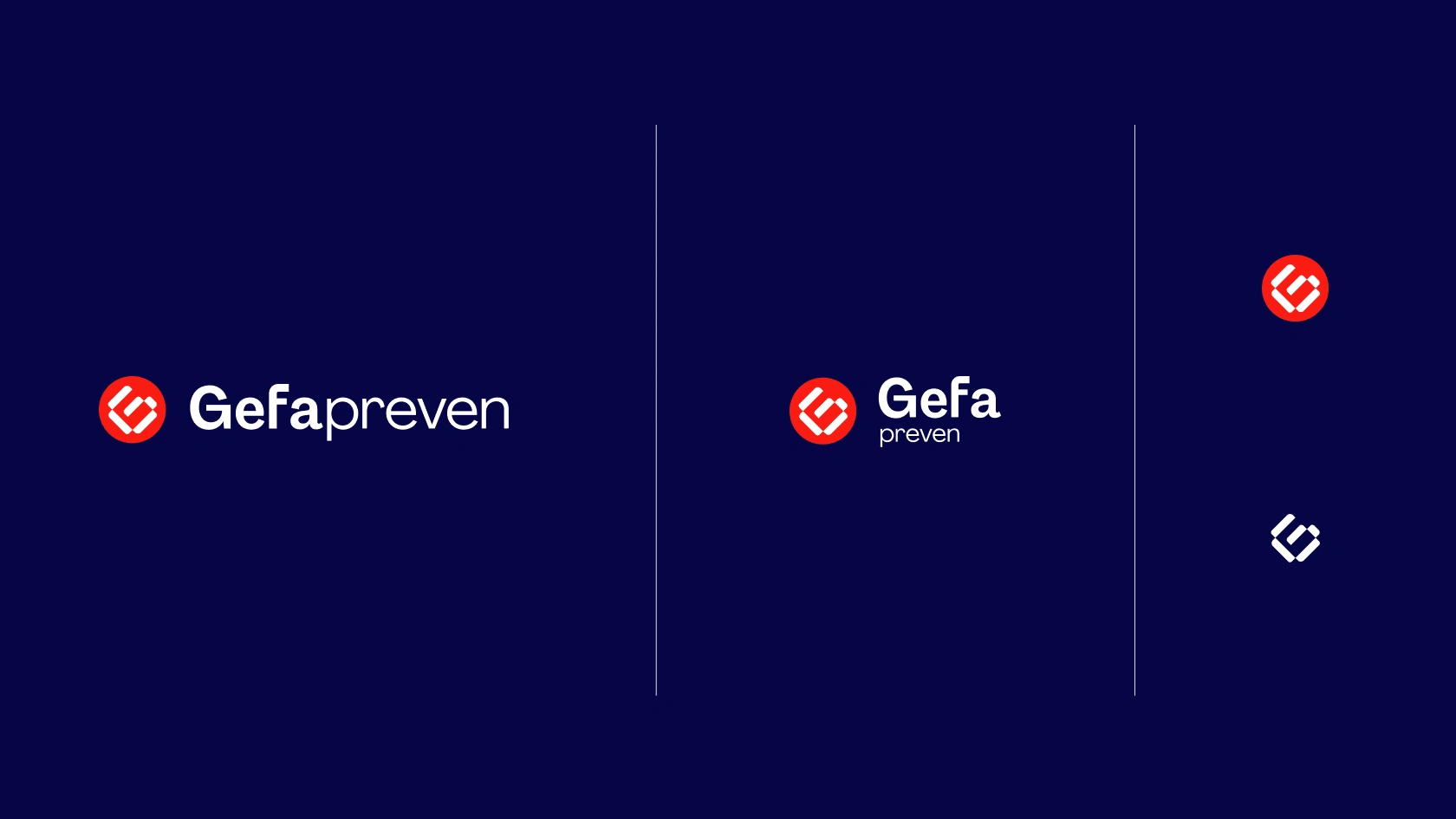
We added a red dot to represent a subtle call for attention. Gefa Preven is always protecting, like a lighthouse, to safeguard the protection of organisations.
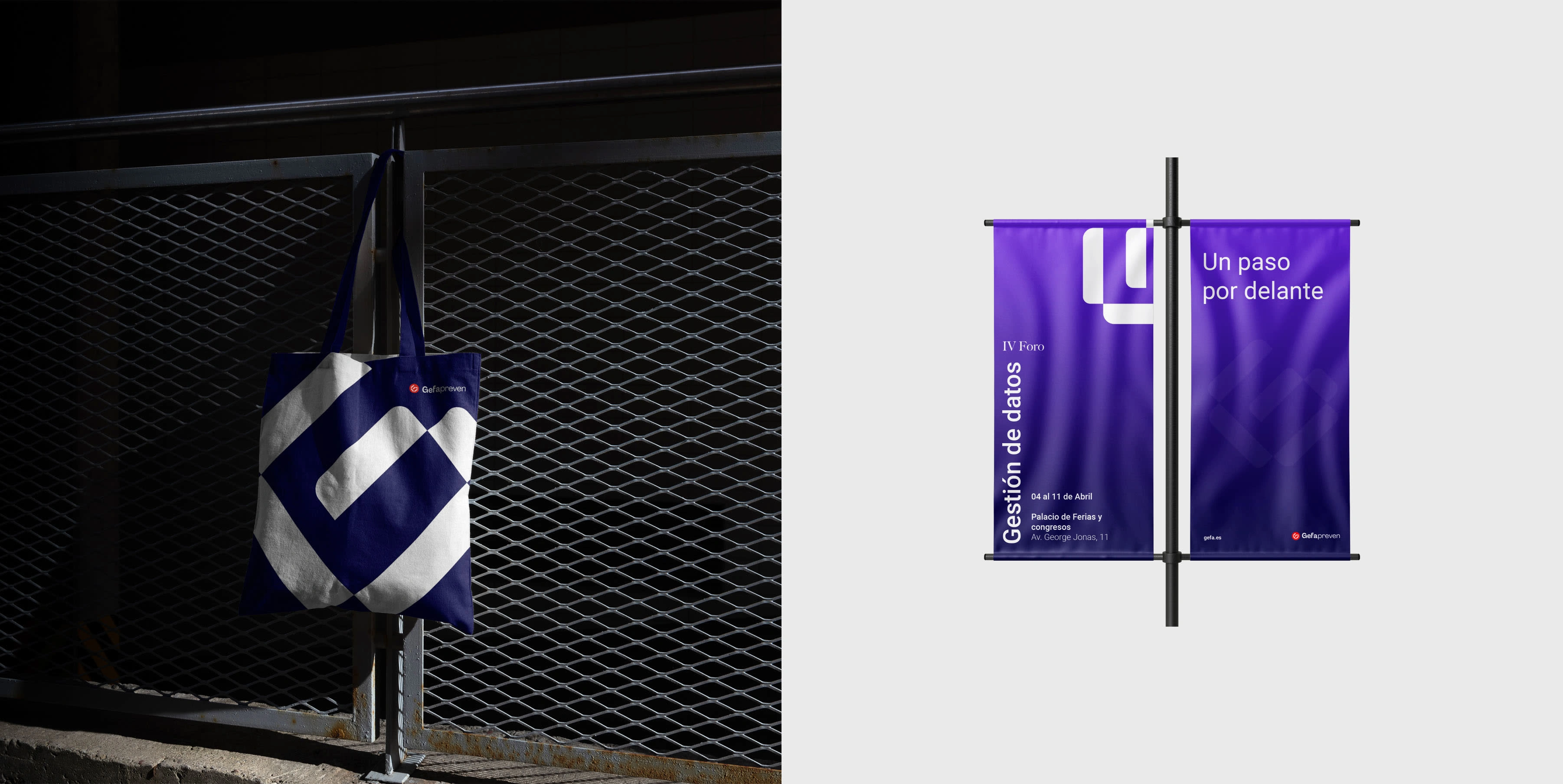
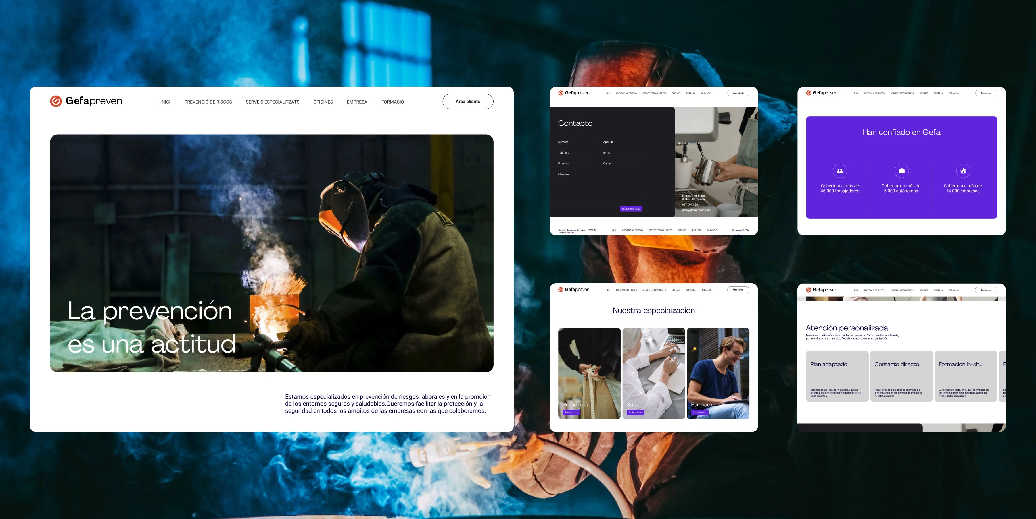
We developed an adaptable identity, with colour palettes that accommodate digital formats with brighter and bolder colours. The GEFA G symbol is also a very versatile and distinctive point of focus.


If you are interested in knowing more about this project drop me a message to get further information 🙂
Like this project
Posted Jan 2, 2024
Gefa preven is a brand with more than 20 years of experience in the risk prevention market. In its expansion strategy, Gefa Preven sought to become a...
Likes
0
Views
33
Clients
Redvinilo

