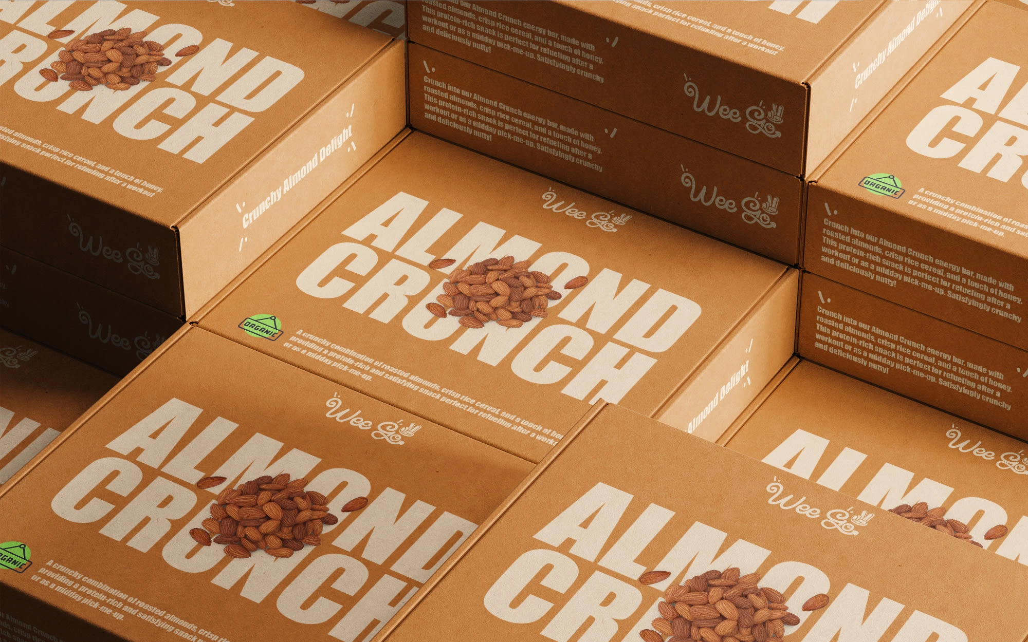
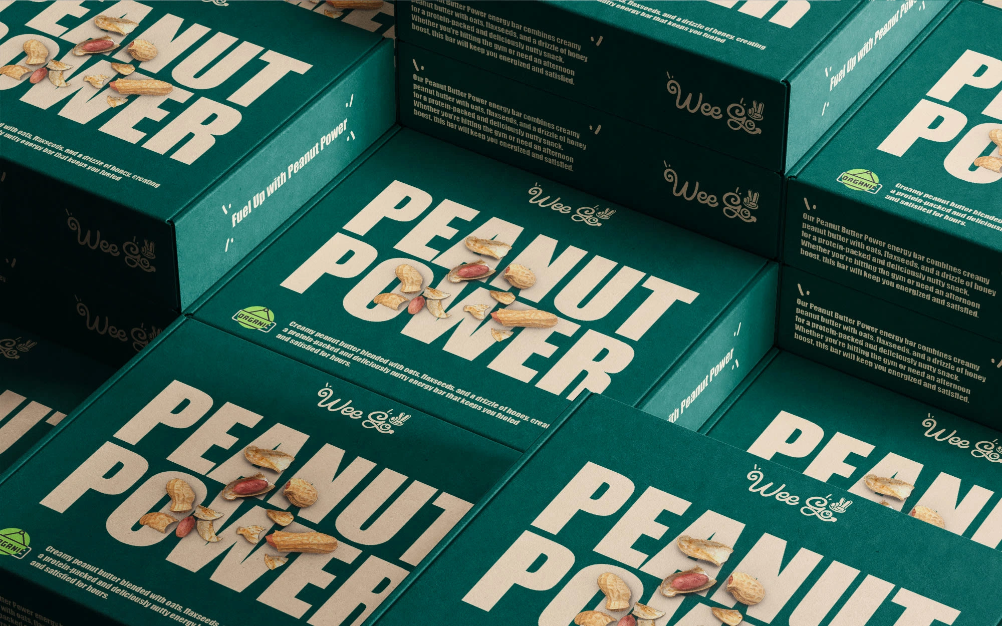
Wee Go Energy Bars Packaging Design
youssef zenit
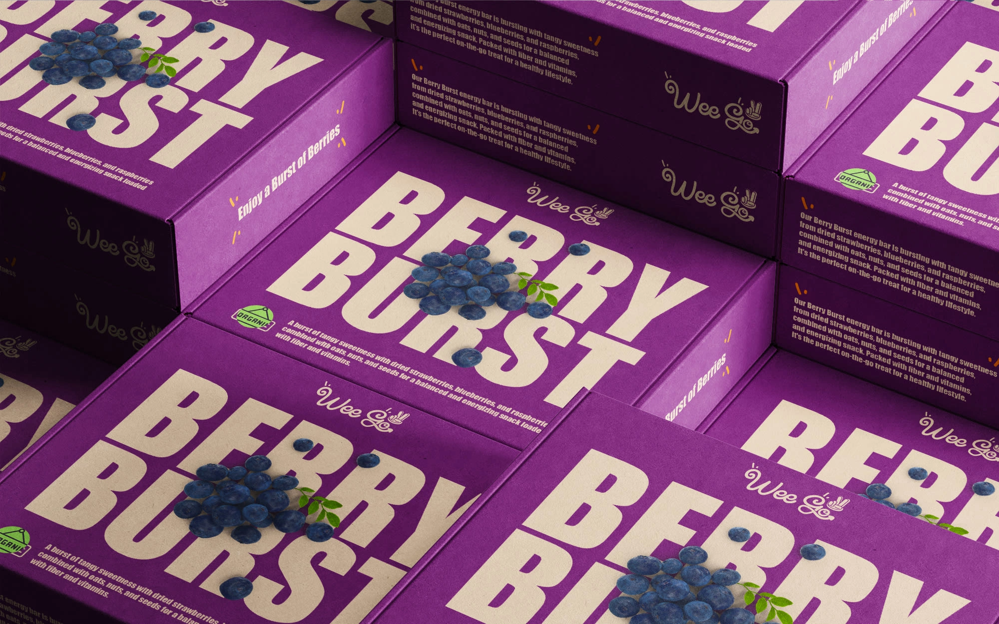
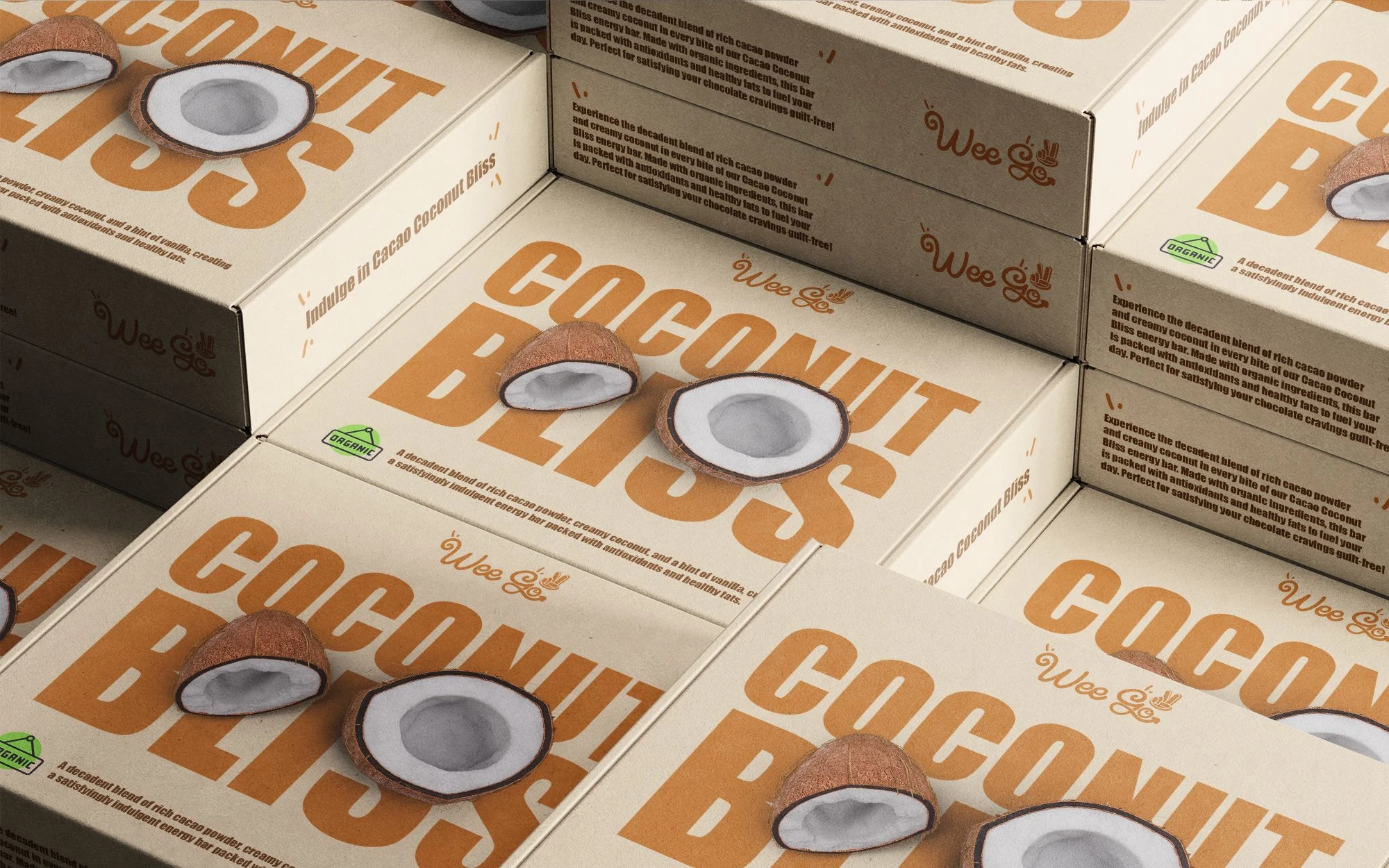
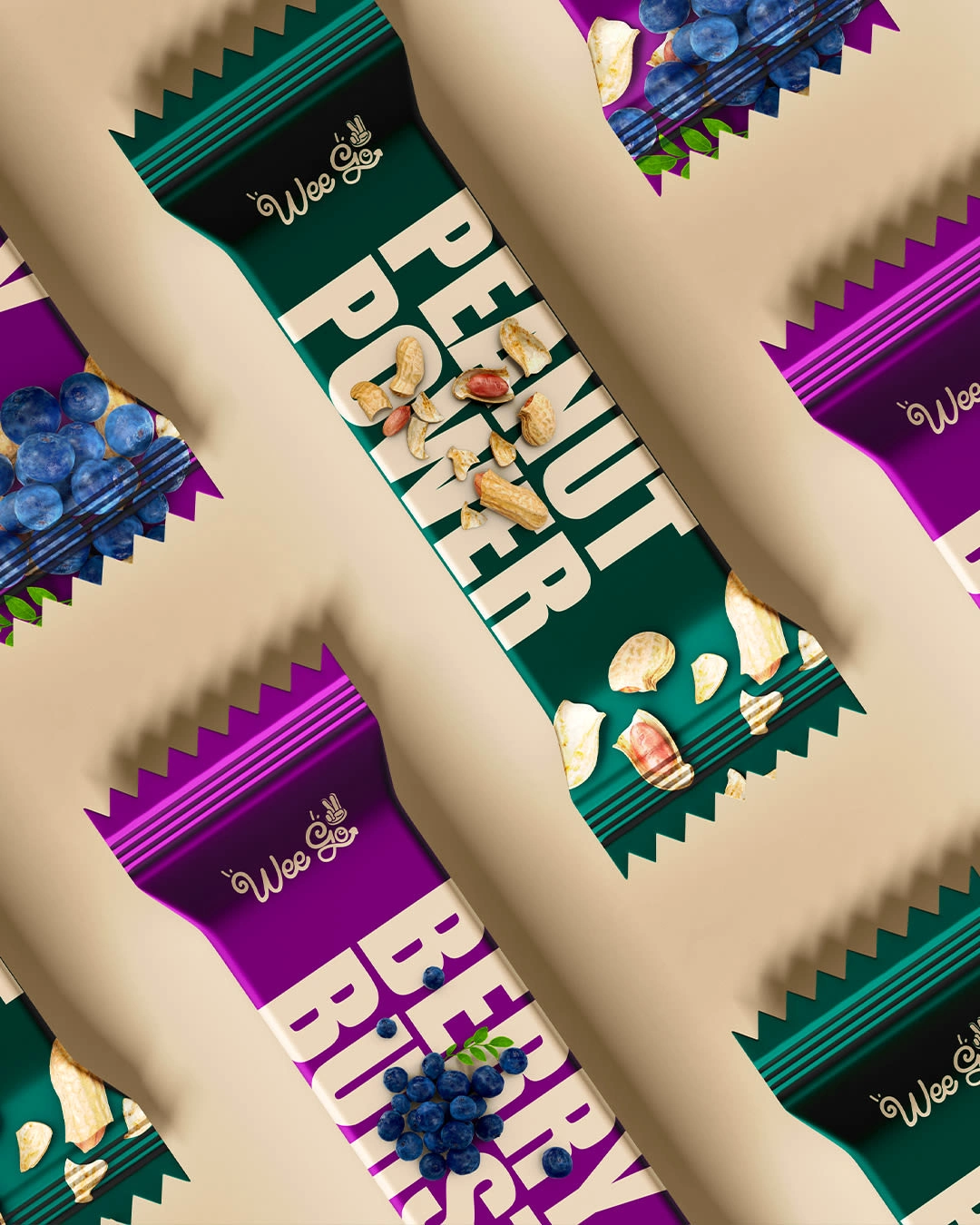
As a brand identity designer, I am thrilled to introduce the new packaging design for Wee Go energy bars. Crafting a visual identity that authentically represents the essence of a brand is both an art and a science, and I am proud to say that every element of this design has been carefully considered to reflect Wee Go's commitment to health, sustainability, and deliciousness. From the choice of colors and typography to the incorporation of natural motifs, each detail has been thoughtfully crafted to create a cohesive and memorable brand experience. I am excited for you to see how this visual identity will come to life and resonate with consumers, reinforcing Wee Go position as a leader in the organic food market. 💚
Like this project
Posted Aug 5, 2025
Designed new packaging for Wee Go energy bars, reflecting health and sustainability.
Likes
0
Views
5
Clients
Wee Golf