
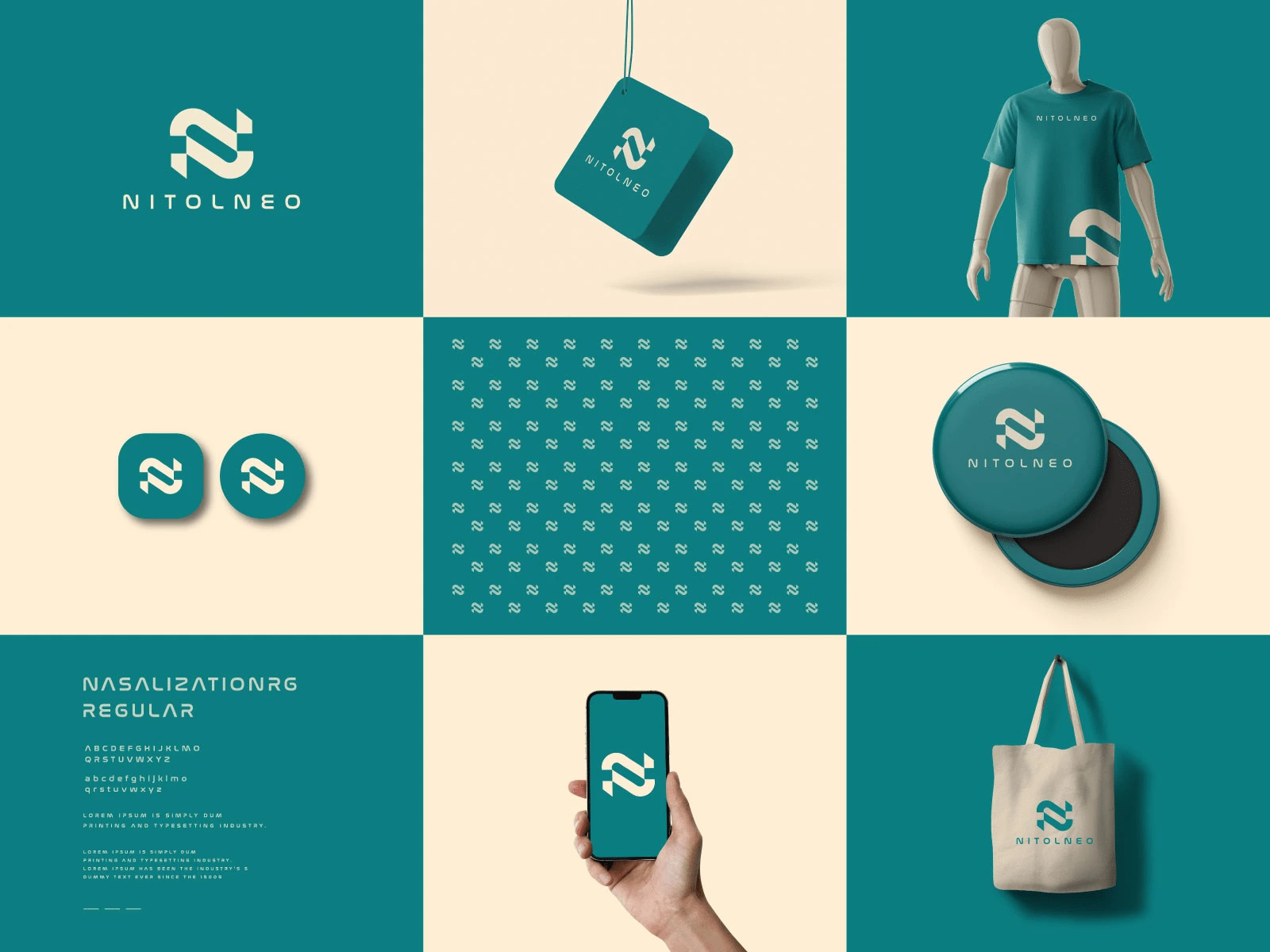
NitolNeo’s brand identity is a seamless blend of modern aesthetics and functional design. With a clean, sophisticated logo and a cohesive visual system, the branding reflects professionalism, innovation, and versatility.
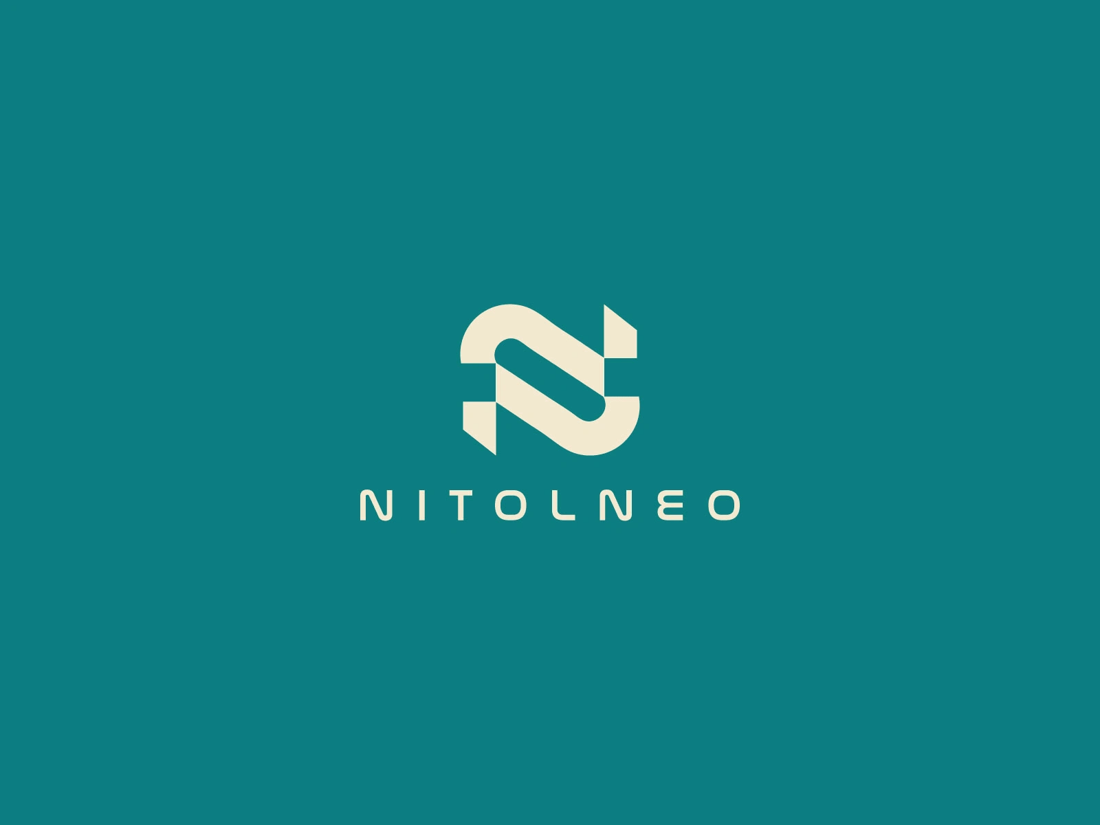
Key Design Elements:
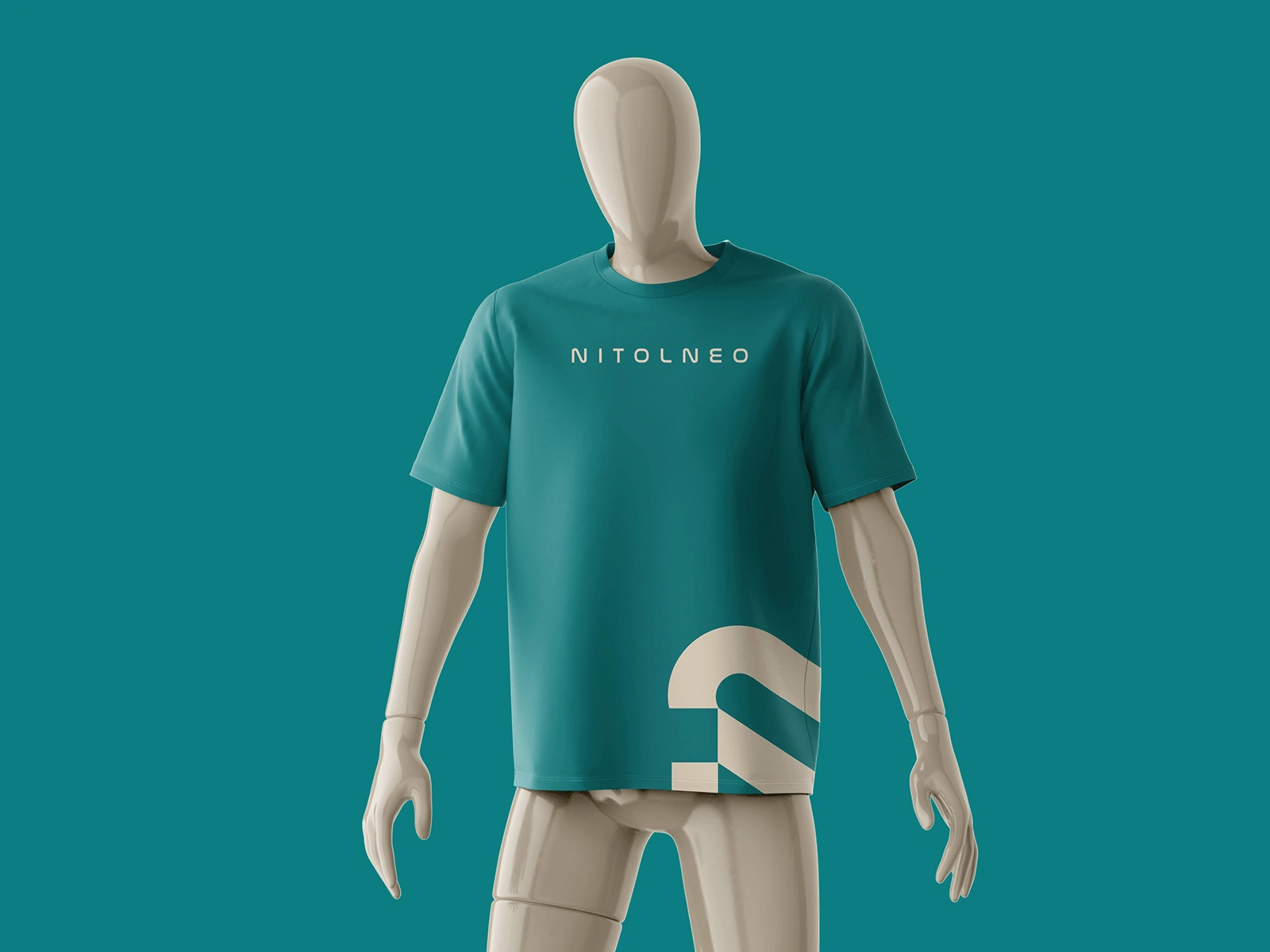
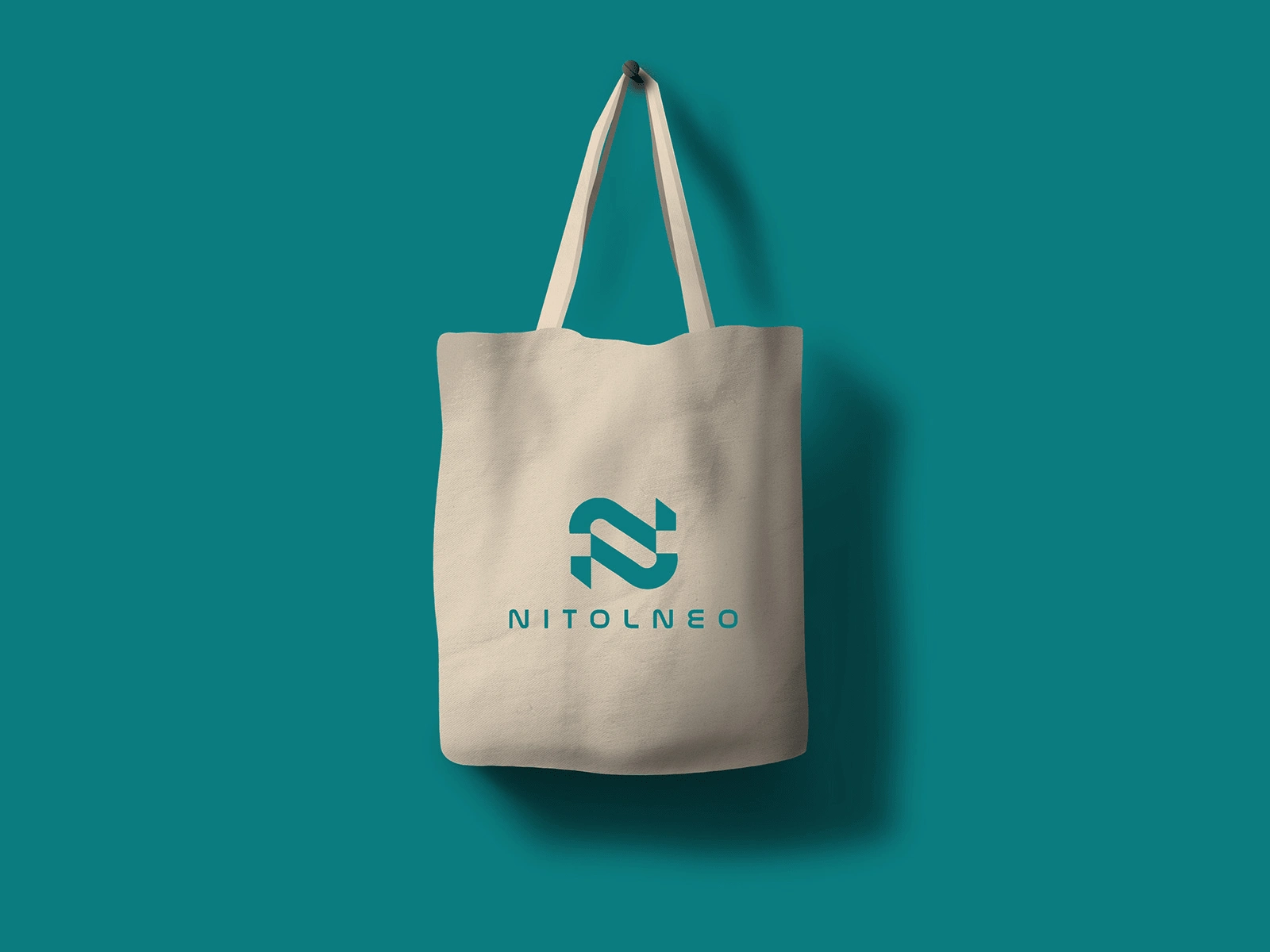
🎨 Color Palette: A harmonious mix of teal and beige, evoking trust, stability, and elegance.
🔤 Typography: The Nasalization RG font enhances the futuristic and contemporary appeal.
📱 Logo Design: A sleek, abstract “N” symbol that is dynamic and visually distinct.
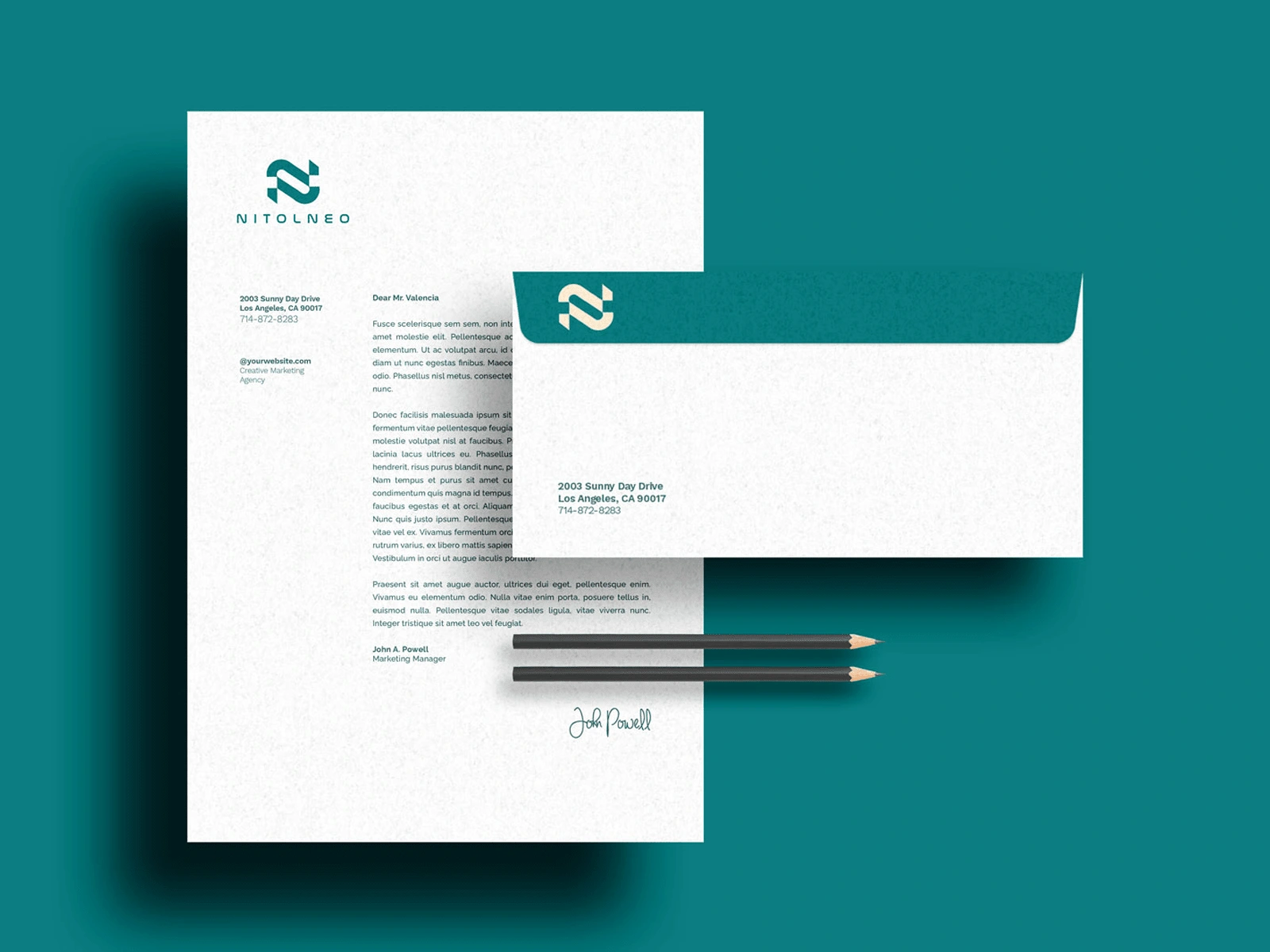
🛍️ Brand Applications: The identity is consistently applied across digital platforms, apparel, packaging, and promotional materials.
Why NitolNeo Stands Out?
✔ Minimal Yet Impactful: A refined aesthetic that balances simplicity with strong brand recognition.
✔ Versatile & Scalable: Works seamlessly across various mediums, from mobile apps to merchandise.
✔ Timeless Appeal: Designed for longevity, ensuring the brand remains relevant and engaging.
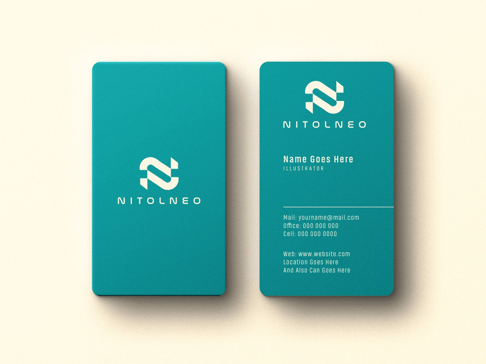
NitolNeo’s branding captures a bold and futuristic essence, positioning it as a leader in its industry while maintaining a professional and approachable identity. 🚀
0 likes · 17 views · Feb 6, 2025
NitolNeo’s brand identity blends modern minimalism with versatility, featuring a sleek logo, bold typography, and a timeless color palette for lasting impact.


