Built with Ideogram
FIZZR Brand Design
Afroz Ahmed
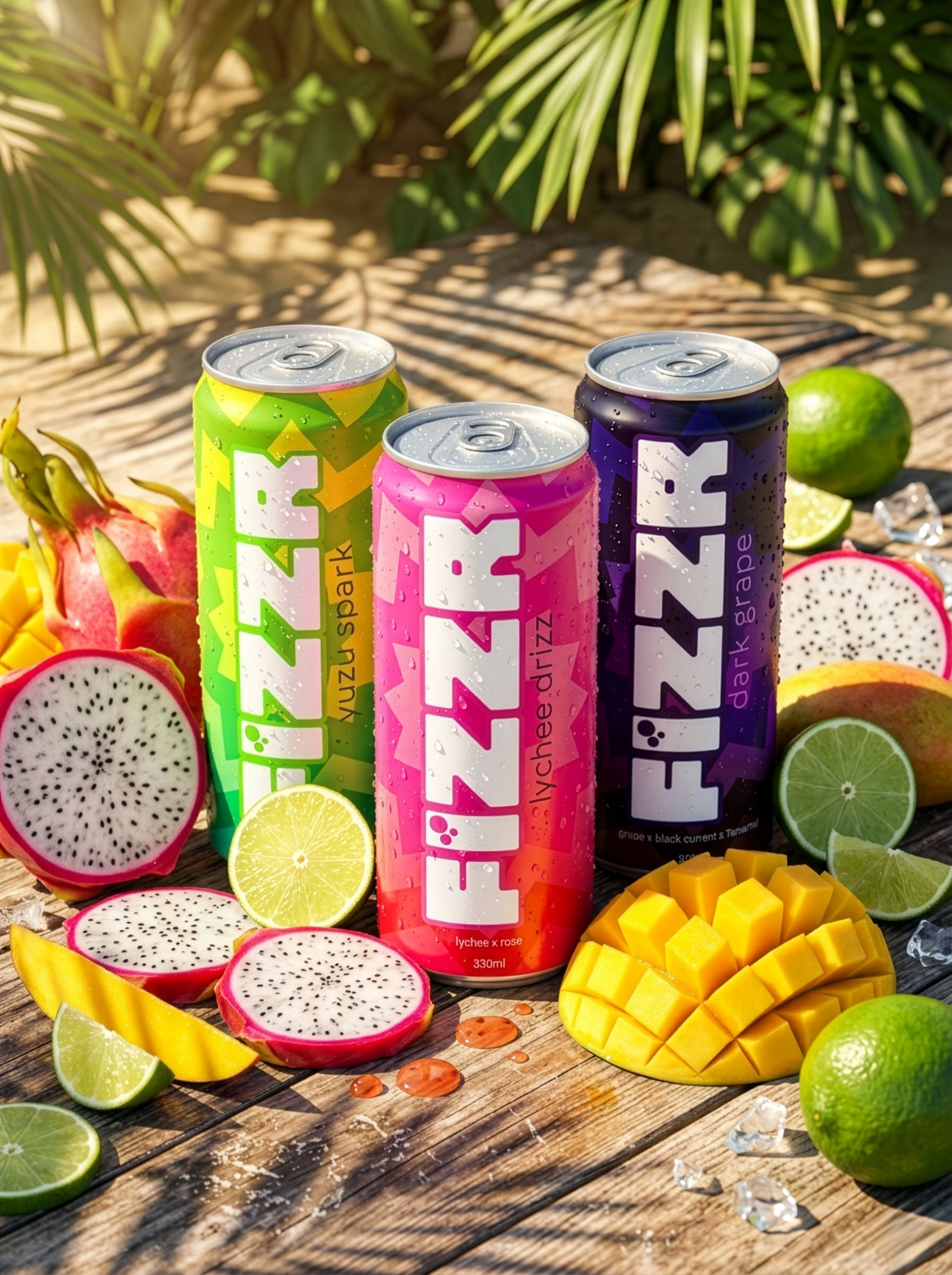
Brand personality - "Visually maximum, tonally minimal. A friend who shows up in neon but speaks at normal volume."
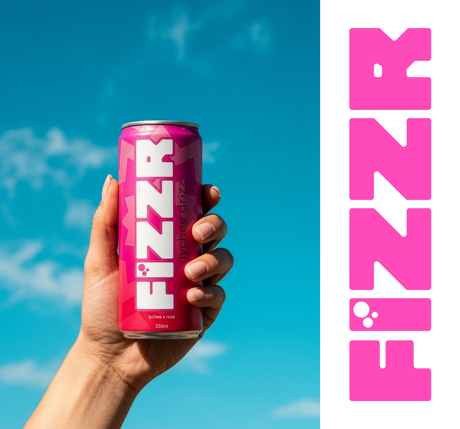
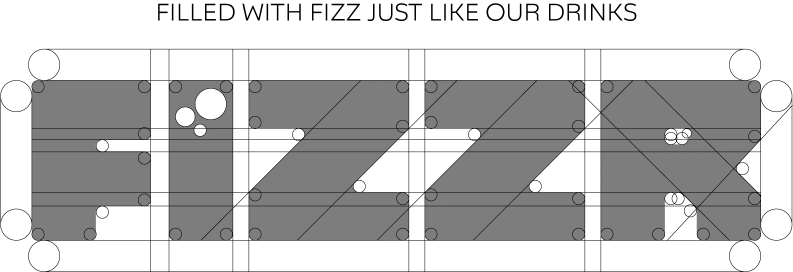
"Explored distorted/glitched letterforms but landed on a clean, confident custom rounded sans-serif . The simplicity allows color and context to carry the brand energy. Paired with a minimal bubble mark motif replacing the 'tittle' of the letter "i"."
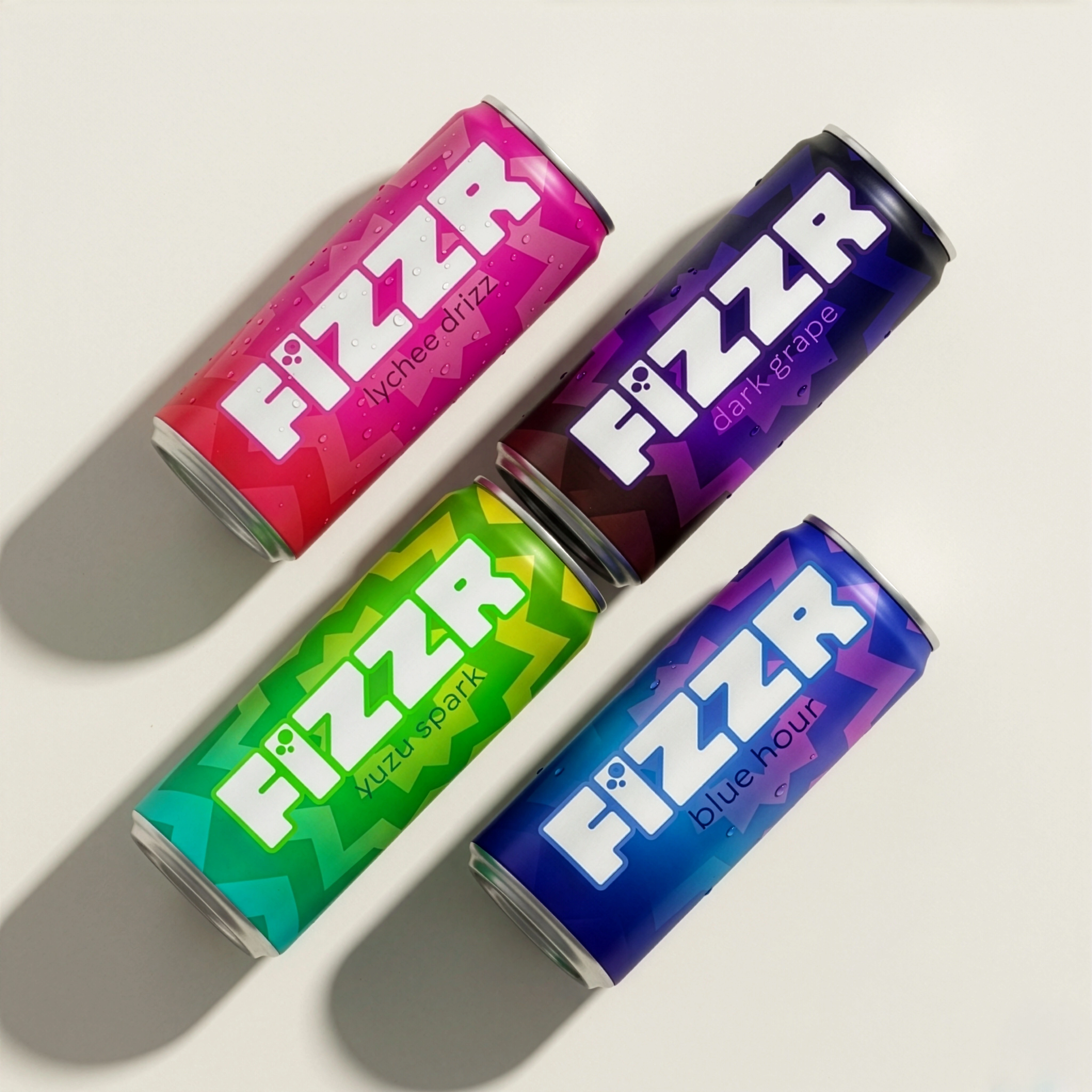
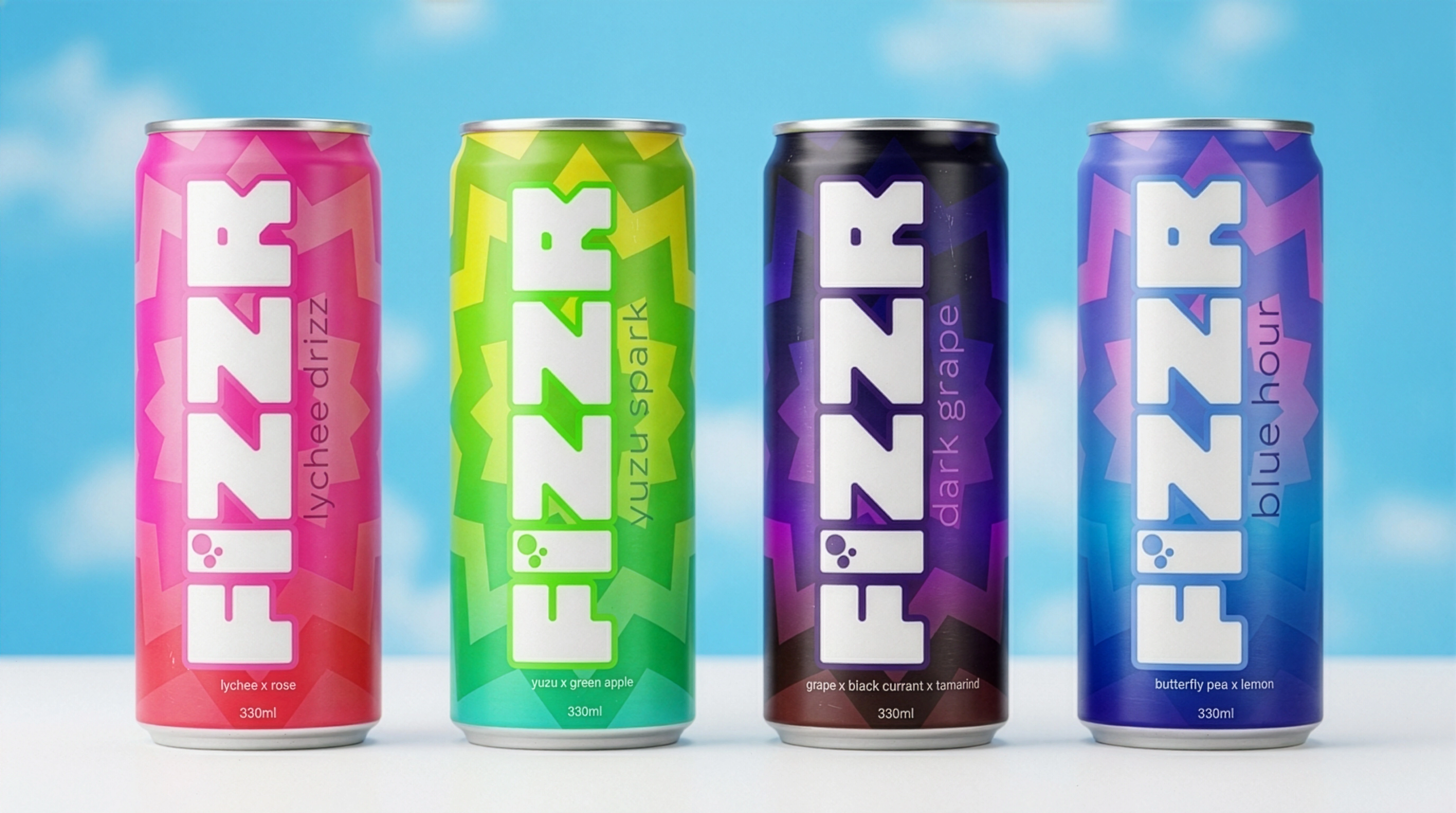
Colour strategy - "Each SKU gets its own saturated gradient world, but all share the same framework. The cohesiveness makes the neons electric rather than chaotic."
For more details check the link below
Like this project
Posted Mar 29, 2026
Designed a brand personality with a bold visual yet minimal tonal approach.
Likes
2
Views
13
Timeline
Mar 1, 2026 - Mar 10, 2026