DEWA Homepage Redesign for Accessibility
Saleh Bazuhair
This is a task given to me by a UAE company to complete in a couple of days, showcasing how to improve the design while considering accessibility options for all user types.
The Requirement
Please redesign the DEWA website homepage using the provided link, ensuring it aligns with the latest UI trends and maintains accessibility considerations. https://www.dewa.gov.ae/
I have worked on this task in three Parts:-
PART 1: Research on user problems and Heuristic Evaluation
PART 2: Competitive Analysis, Ideation, and accessibility improvement
PART 3: User interface designs
“First of all, I want to say that the homepage design is excellent, clean, and well-aligned. I had to really explore how to improve a perfect page.”
To make the redesign user-centered and deliver good results, it has to be based on solving user problems or achieving business goals. I have sent some questions to be answered to make a solution that addresses user problems. Since no data has been shared with me for now, I had to identify user problems and evaluate the current design's experience.
In my opinion, creating a new and improved experience involves a process, to create a design that is closely aligned with the existing one. Based on my experience, many users fear change unless it genuinely addresses their concerns or enhances their experience.
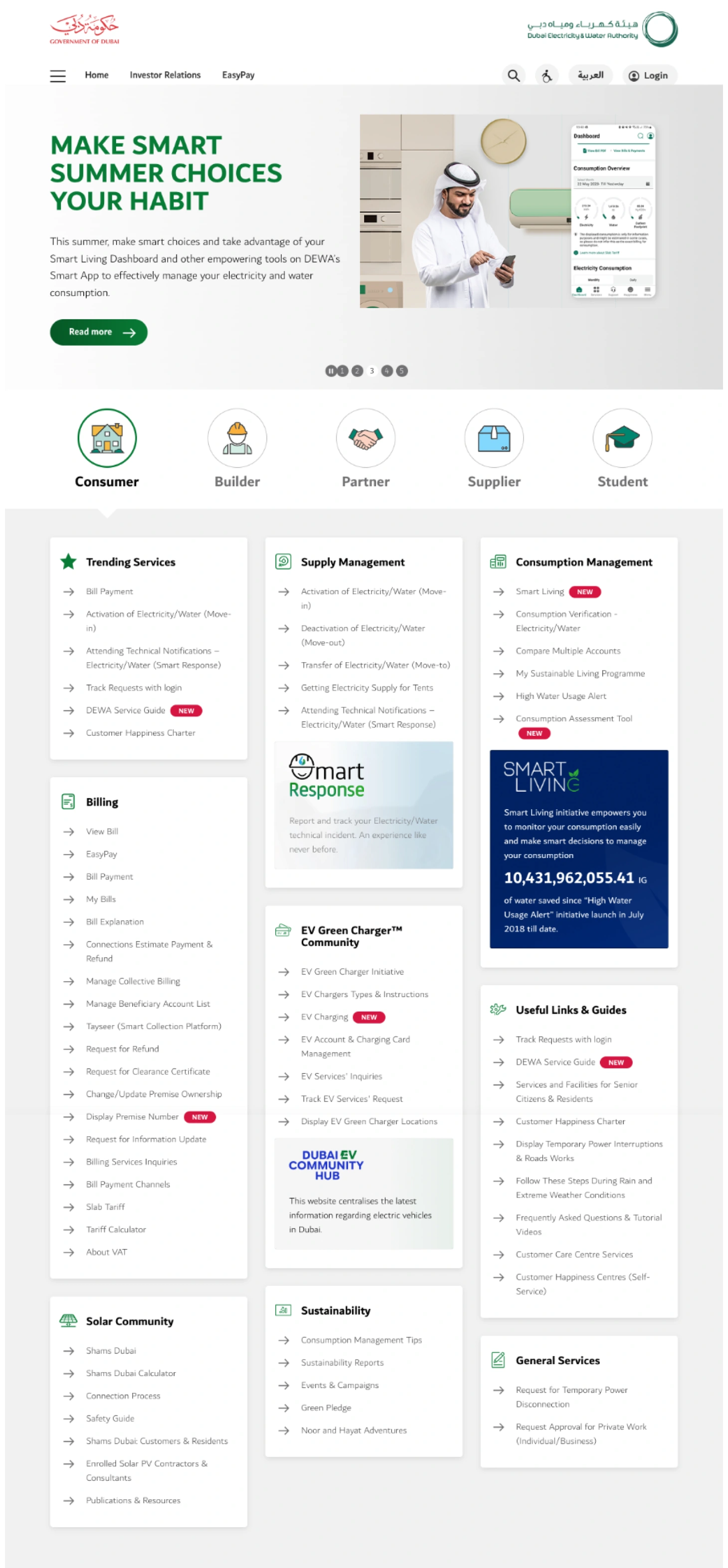
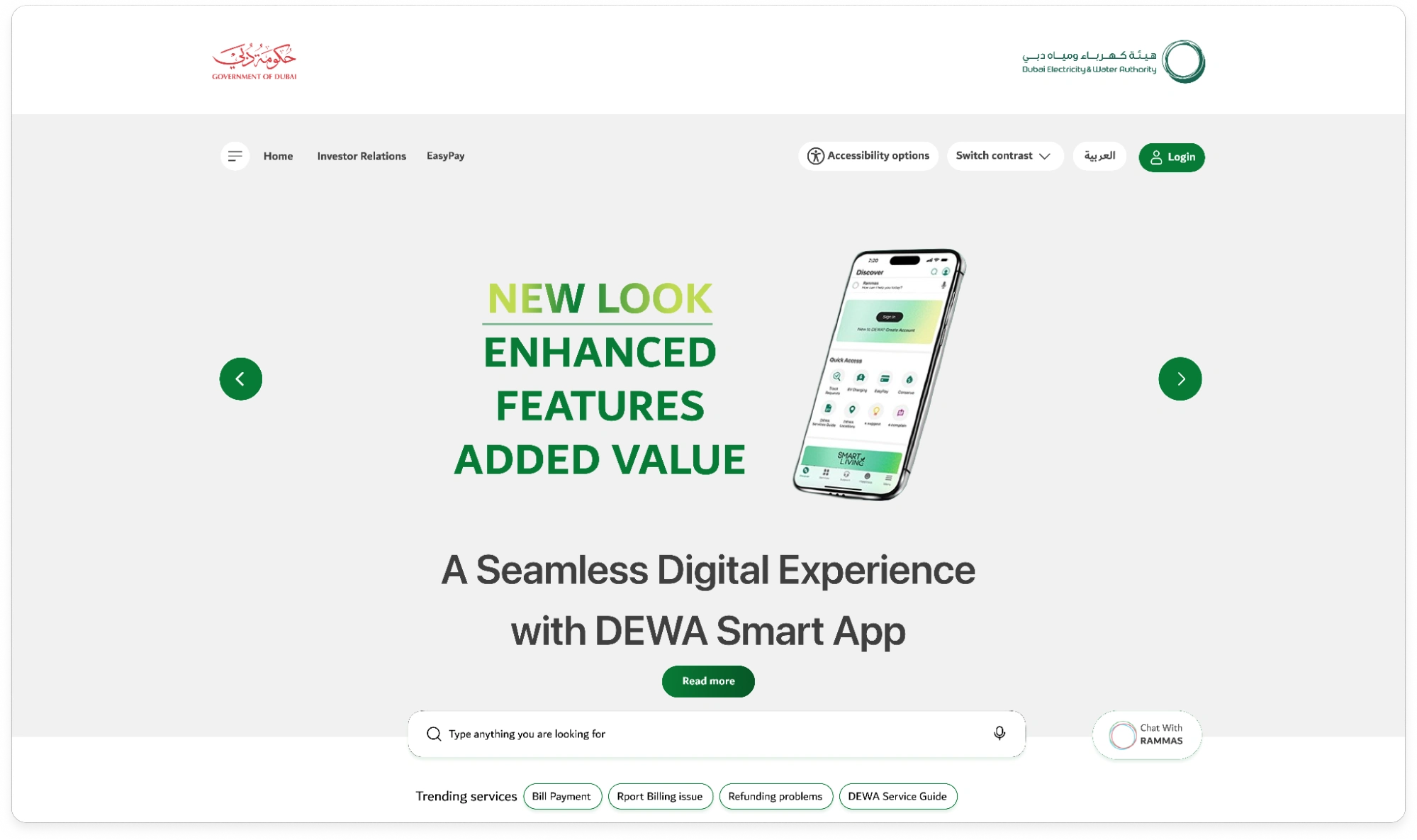
Current view
PART 1: Research and Heuristic Evaluation
Trustpilot reviews
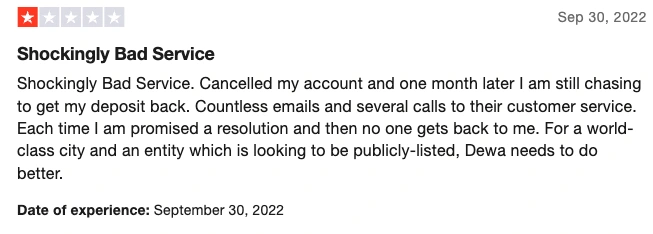
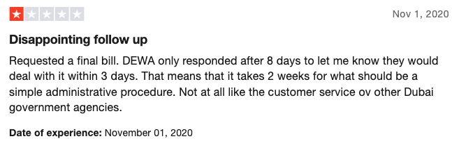
These are some samples from the Trustpilot website, which you can view here
The summary of most of these reviews is that they report refund problems and not follow up.
Heuristic Evaluation & UX Laws
Error prevention
There are multiple ways to submit a problem or give suggestions, and contact us provided on the website. These 4 buttons share similar ways to either raise a problem, propose an idea, or seek an answer. As a user, I might struggle to choose the right button.
I think having fewer calls to action to report and chat with user support, even just through RAMMAS, would be better. According to Hick’s law, “ the time it takes for a person to decide as a result of the possible choices: increasing the number of choices will increase the decision time logarithmically.”
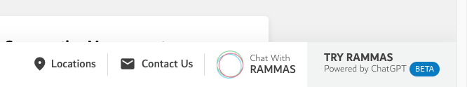
Also, these two buttons are doing the same thing, which I think is a bit confusing
Help and Documentation
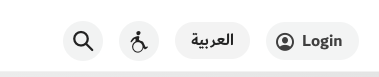
I think the wheelchair icon isn't giving the correct information about changing view settings and accessibility options. As a user, I thought this button was just for people with wheelchairs.
Also, I think it would be nice if a voice search was added inside or beside the type field, which would enhance the experience and improve accessibility for users.
PART 2: Competitive Analysis and Ideation
Competitive Analysis
I searched for competitors and similar websites and analyzed their behavior on the first fold to identify their strengths and weaknesses. I found that most of these websites offered a quick shortcut to popular services and highlighted them on the first fold.
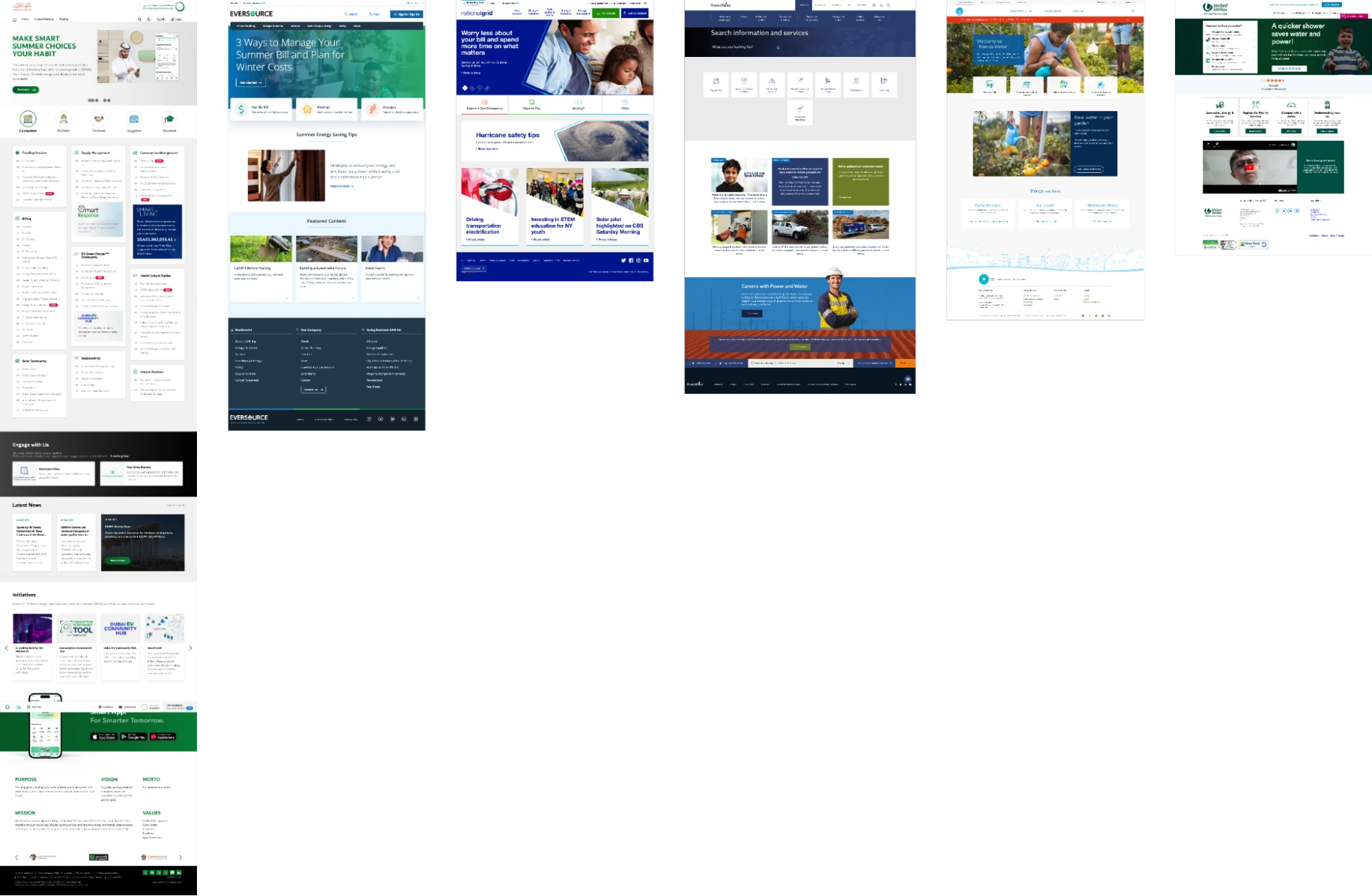
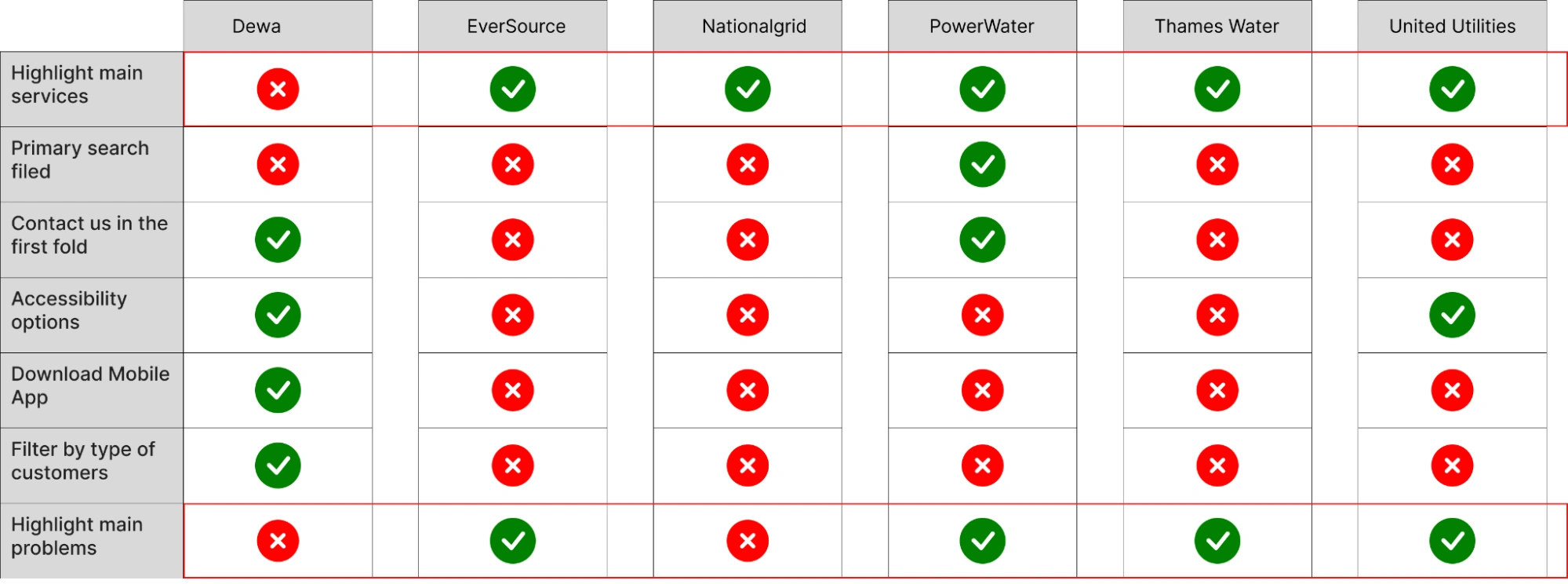
The websites are:-
User Stories
Based on the research I conducted, along with hypotheses that can be validated through 3 to 5 user interviews and quantitative data from UX analytics applications, I have created user stories to address users’ problems.
As a user, I want to quickly and easily find the services I am looking for.
As a user, I want to report my problems to user support and find a follow-up.
As a user, I want to quickly change the viewing and reading options for my accessibility.
Ideation and empathy
Adding a central search bar combined with search by voice makes it easy for users to pronounce the word and generate results, and this also improves accessibility for users and can be used on any device.
Reporting problems with a voice message is a quick and easy way to describe an issue; the users just want someone to listen to them, and replying also with a voice message might make the user feel heard.
Displaying the most trending services directly in the first website section.
Designing the look and feel of the website in a minimalist way.
Design with people with disabilities in mind, having multi-contrast switches,
Adding a text magnifier and adding a text description to any unclear icon.
Adding a text description to any unclear icon.
(I have added some of these options to the UI design, and some will be added after discussing with the Data team.)
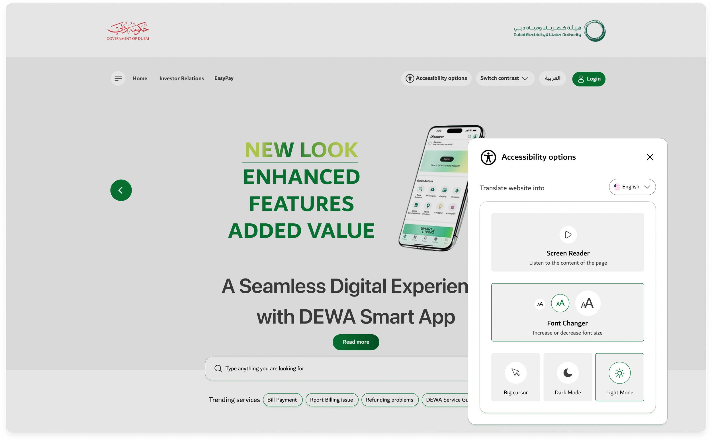
Accessibility Improvement
There are many ways to add Accessibility. I think the website provides excellent options. I have seen many options already, and I thought about how to take this even further.
I have worked on:-
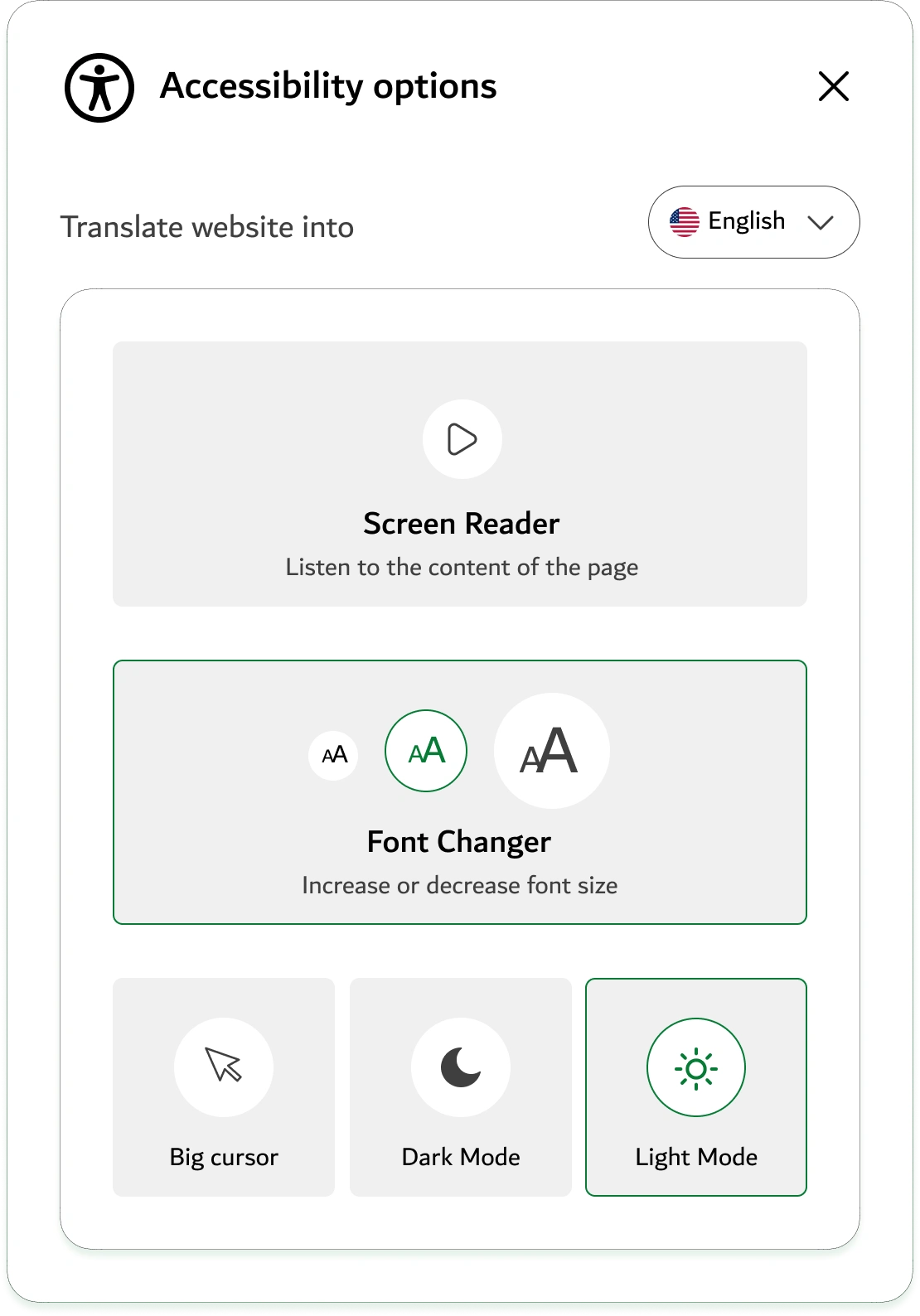
1. The accessibility icon is not the known icon used for Accessibility. In the user's mental model, I replaced it with the known icon and added a text label beside it.
2. Adding a shortcut button to switch site contrast directly inside the homepage, I think most users need an indication to know that this website is providing accessibility options, by providing at least one option, the users will understand and if they want more they can click on the full accessibility button.

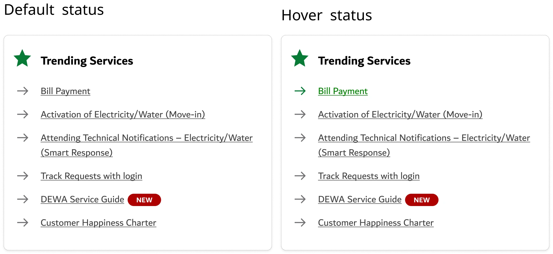
3. Adding underlining to each of the list items since all of these items are links, providing underlining before hovering on any of them will give the user the indication that these are links and I should hover on them and click.
4. Adding Accessibility options:-
Auto-translating website into different languages.
Screen reader
Increase or decrease the font size.
Increase cursor size for people who can’t see well.
Choosing dark mode for bright sensitivity or light mode.
Conclusion and moving forward
In this article, I have outlined my design process and offered user-oriented suggestions for improvement.
I hope that I have provided you with an understanding of my thinking and design process.
Please note that the work I shared with you is only a part of my whole workflow, and I mainly focused on the first part of the page.
We can later work on:-
Interviewing users across different categories and gathering their feedback on the current design and the ideas we have.
Monitoring how the current view is doing from Hotjar or Google Analytics. And understanding the data.
Defining clear goals for the redesign and collecting all the user pain points we already know.
Explore accessibility options with people with disabilities and view their reactions to the new design.
Like this project
Posted Dec 22, 2025
Redesign DEWA homepage to enhance UI and accessibility.
Likes
0
Views
1