Built with Framer
NexLevel Content | Sales Landing Page

Arian Cordoba


NexLevel Content — Framer Design & Development
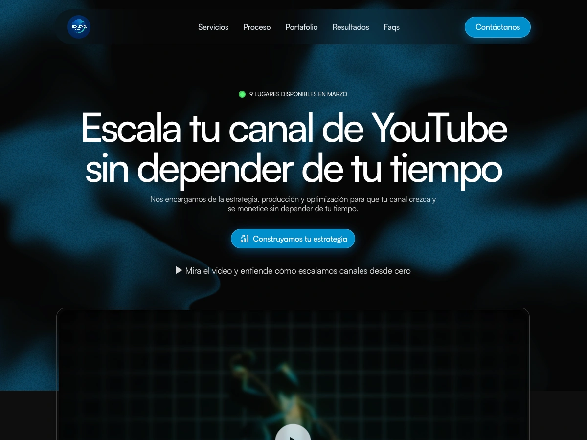
High-converting sales landing page for a YouTube growth agency — rebuilt from scratch in Framer with a dark, premium aesthetic and a full funnel structure.
Overview
NexLevel Content is a YouTube channel growth agency offering end-to-end production and strategy services — from niche selection to full channel management — with subscription plans ranging from €297 to €1,997/month.
The client had an existing Framer site that wasn't doing the job: poor visual hierarchy, weak aesthetic, inconsistent spacing, and UX issues that were actively hurting conversions. The goal was a complete rebuild — a sales-focused landing page that could carry high-ticket pricing with confidence and convert visitors into booked calls.
My Role
I redesigned and rebuilt the entire site in Framer. Starting from scratch, I defined the visual direction, structured the full sales funnel, and built every section from hero to footer. The focus was on conversion: every design decision — layout, hierarchy, copy structure, CTA placement — was made to move the visitor toward booking a call.
What Was Built
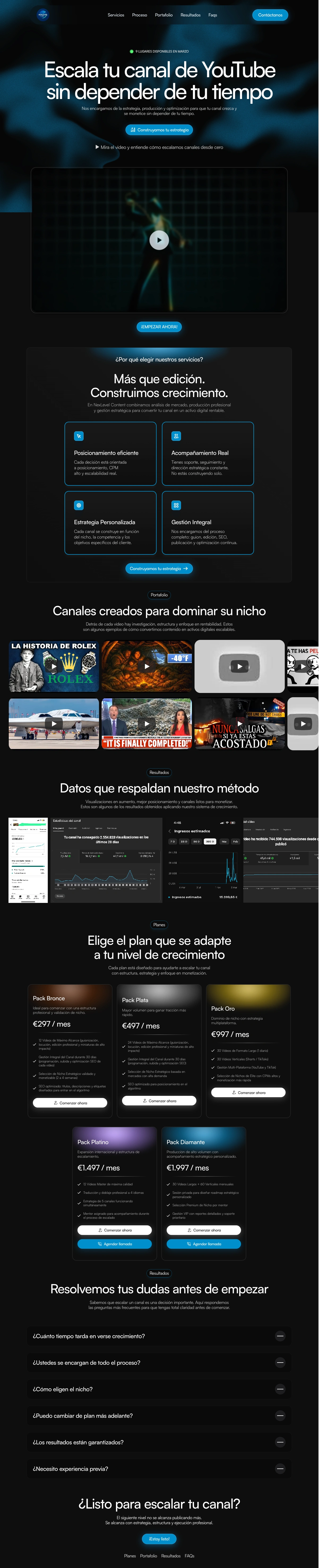
Full sales landing page redesigned and rebuilt from scratch in Framer
Dark, high-contrast visual identity — cinematic aesthetic aligned with the YouTube content world
Hero with urgency trigger ("9 spots available"), headline, subheadline, primary CTA, and embedded video
Services section with 4 feature cards highlighting the agency's core differentiators
Portfolio section with embedded YouTube videos — real proof of work inline
Results section with screenshot gallery showing channel growth and monetization data
5-tier pricing section (Bronce / Plata / Oro / Platino / Diamante) with clear feature breakdowns and dual CTAs per plan
FAQ accordion section addressing objections before the close
Final CTA band with closing copy and conversion button
Fully responsive for desktop and mobile
Design Direction
The site uses a near-black background with electric blue and white accents — a visual language that feels native to the YouTube and digital marketing world without falling into generic SaaS clichés. The layout is structured as a pure sales funnel: problem → solution → proof → offer → close. Every section has one job, and nothing is decorative.
Conversion Focus
Urgency trigger in the hero ("9 spots available in March") to drive early action
Social proof via embedded YouTube videos and real analytics screenshots — not mockups
FAQ section placed immediately before the final CTA to handle last objections
Multiple CTA entry points across the page, all pointing to the same booking flow
Pricing structured with 5 tiers to anchor value and guide self-selection
Need a high-converting landing page built in Framer? Let's talk.
Like this project
Posted May 30, 2026
Rebuilt a high-ticket sales landing page in Framer for a YouTube growth agency — dark premium design, full funnel structure, and conversion-focused copy.
Likes
0
Views
15
Timeline
Feb 9, 2026 - Mar 2, 2026