Built with Framer
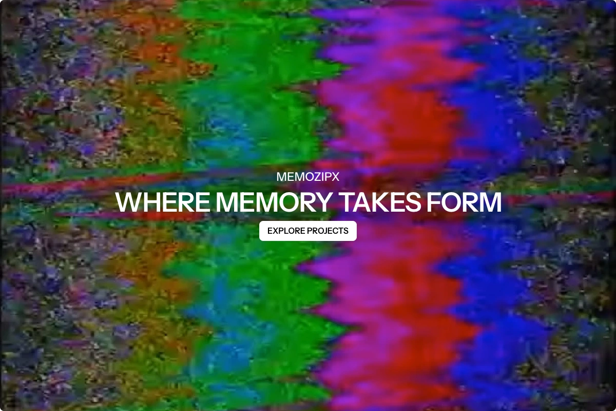
Memozipx Visual Archive Website
Arian Cordoba
Overview
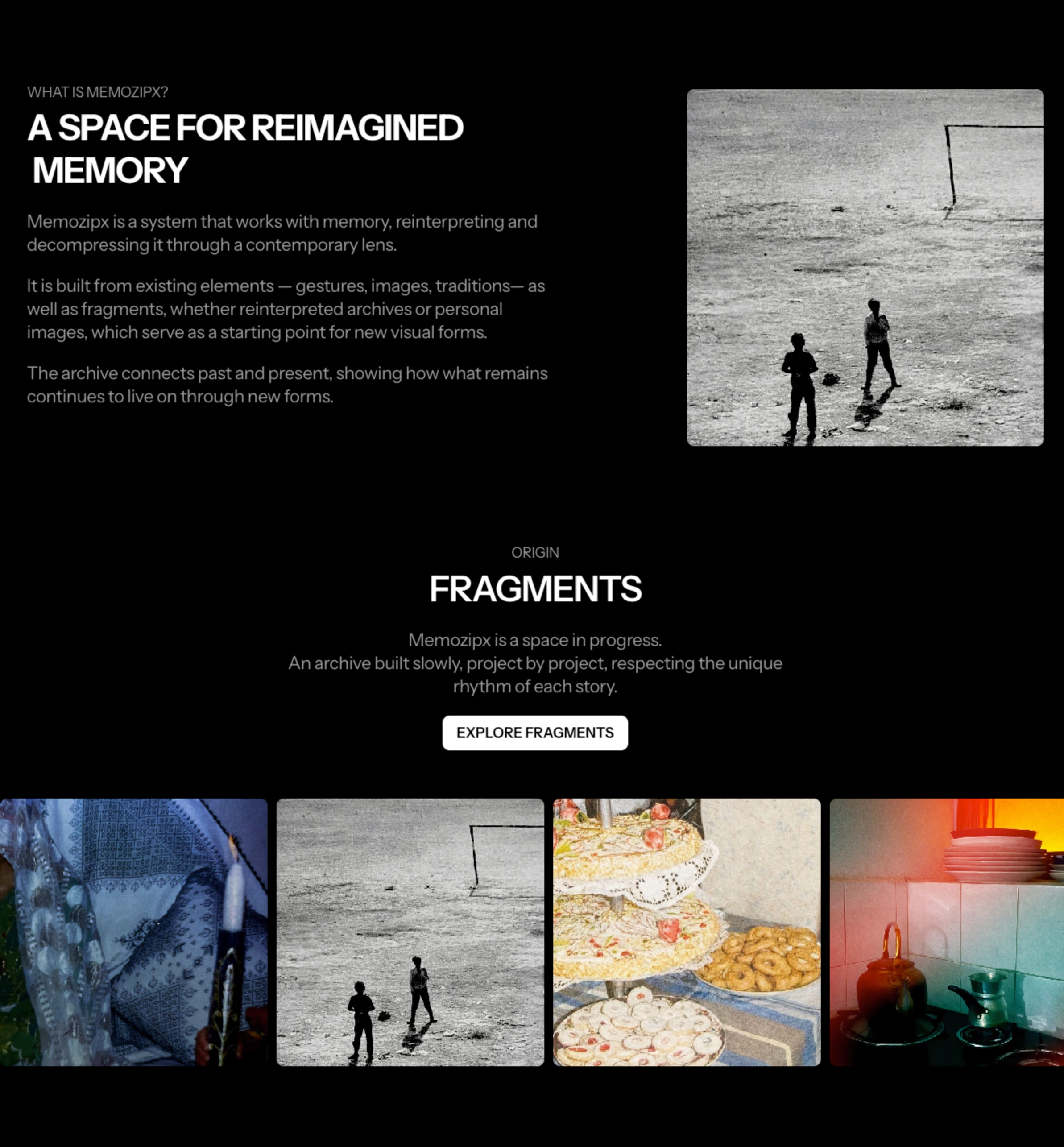
Memozipx is an evolving visual archive that works with memory — reinterpreting it through a contemporary lens. The project is built from fragments: gestures, personal images, and cultural traditions that become starting points for new visual forms.
The client needed a web presence that could hold this concept without overexplaining it. The challenge was to build something minimal enough to let the work breathe, while providing a clear structure for an archive that grows project by project.
My Role
I handled the full design and development of the site using Framer. This included art direction, typography system, layout structure, CMS configuration for the Projects section, and all animations and interactions. The entire site was built in Framer with no external integrations.
What Was Built
Full website designed and developed in Framer
Editorial homepage with full-screen video background and minimal typography
About section with two-column layout combining copy and photography
Fragments gallery — horizontal scroll showcasing photographic archive material
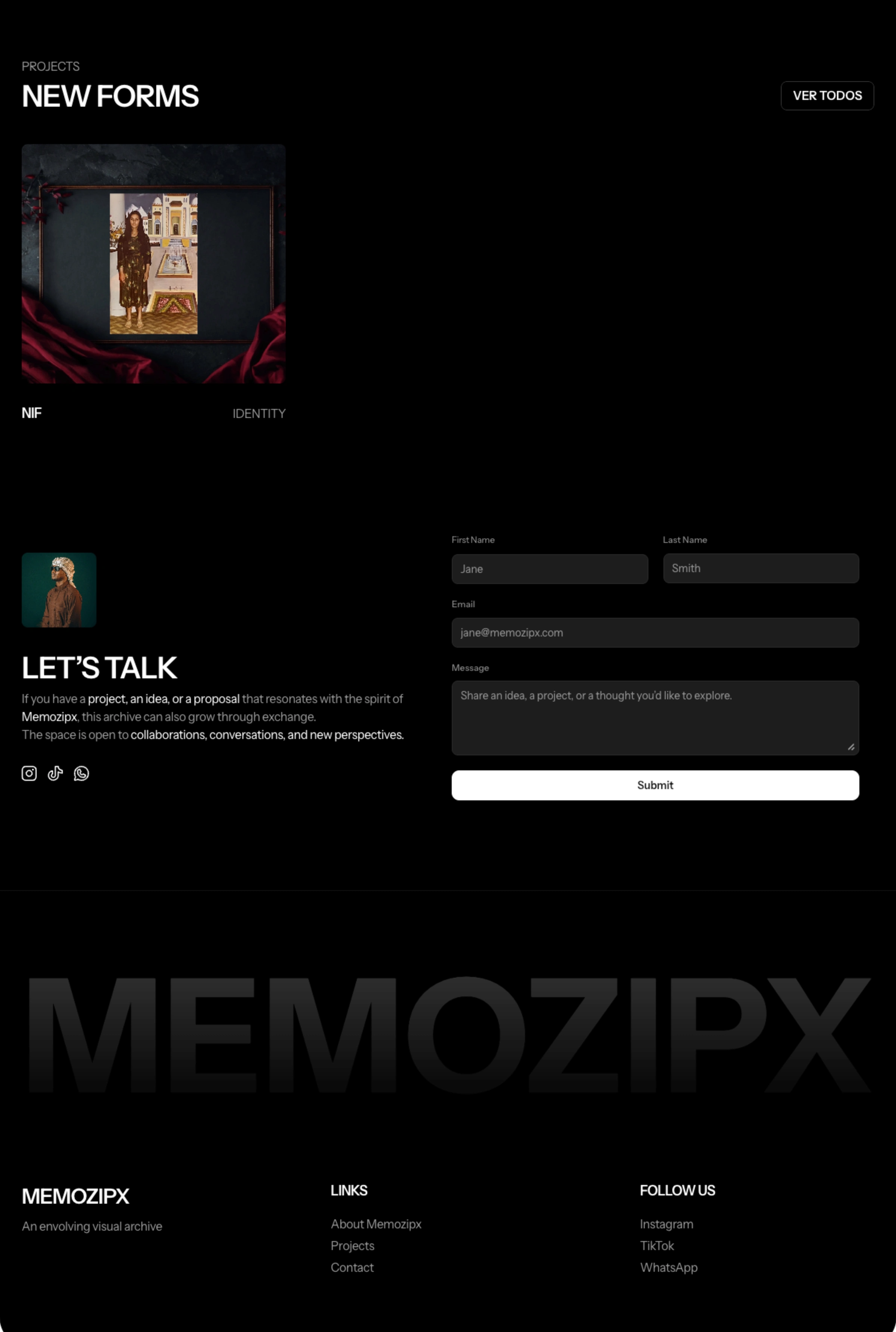
Projects section powered by Framer CMS — client can add new projects independently
Contact page with a clean form and editorial full-bleed image
Smooth animations and page transitions throughout
Fully responsive design for desktop and mobile
Design Direction
The site uses a strict dark palette — near-black backgrounds, white typography, and high-contrast photography — to create an archive that feels institutional but alive. The typography is set in all-caps for labels and headings, creating a deliberate tension with the organic, textured imagery. The result is a site that communicates seriousness without coldness.
Interested in building a visual-first website with Framer? Let's talk.
Like this project
Posted May 4, 2026
Designed and developed a responsive website for Memozipx using Framer.
Likes
0
Views
8
Timeline
Feb 4, 2026 - Feb 24, 2026