Built with Jitter
A dental website shouldn’t feel
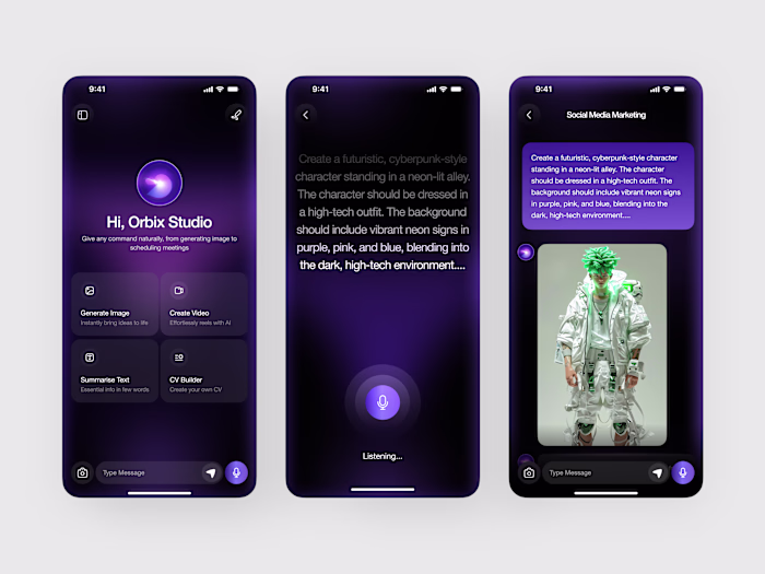
Orbix Studio
A dental website shouldn’t feel clinical in a way that creates distance. It should feel reassuring, clear, and easy to act on.
Dentora was designed to shift the experience from purely informational to emotionally supportive helping patients feel comfortable enough to take the next step without second-guessing.
The Problem:
Many dental websites create friction instead of reducing it. Common issues include:
- Overloaded pages with too much text
- Appointment actions that are hard to find
Generic, impersonal visuals
- Navigation that makes treatments difficult to explore
These patterns slow users down at the exact moment they should feel confident.
Design Approach:
The goal was to create a smoother, more human-centered experience.
The interface uses soft visual layering, clear service grouping (such as checkups, cleaning, and fillings), and integrated social proof to make the experience feel both professional and approachable.
Instead of treating booking as a secondary action, it becomes the central focus of the layout visible, accessible, and easy to complete.
Experience Strategy:
Every element is designed to support a simple flow:
Understand the service → Build trust → Book with confidence
Visual clarity and structure guide users naturally, without forcing them to search or think too much.
Outcome:
A modern dental website that feels calm, trustworthy, and conversion-ready helping clinics present their services clearly while making patients feel comfortable enough to take action.
Like this project
Posted Apr 17, 2026
A dental website shouldn’t feel clinical in a way that creates distance. It should feel reassuring, clear, and easy to act on. Dentora was designed to shift ...
Likes
0
Views
0