Built with Framer
Strategic UX Redesign for Ward Specialty Pharmacy

View completed workwarddrug.com
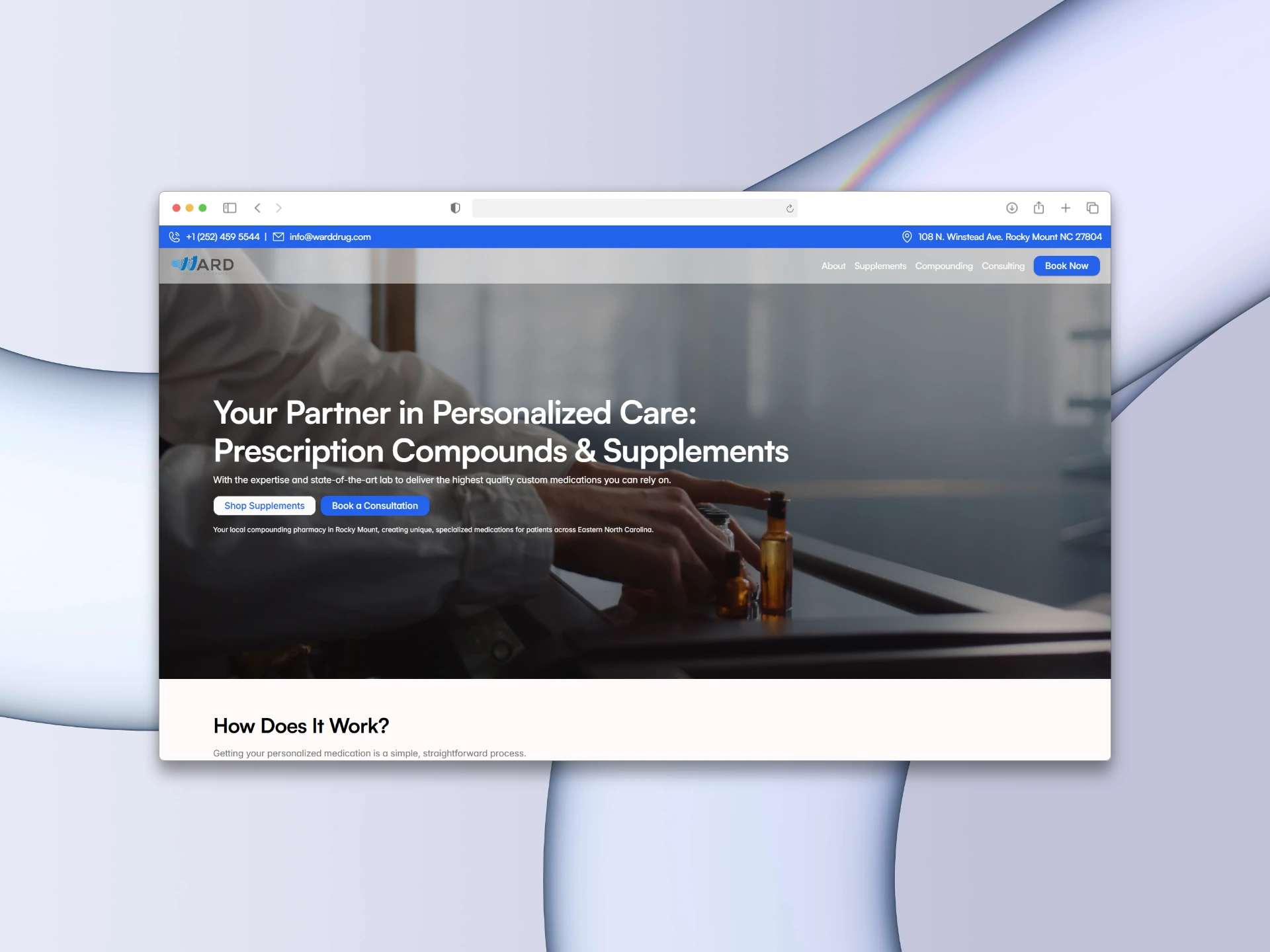
From Digital Brochure to Conversion Engine: A Strategic UX Redesign for a Premium Specialty Pharmacy
Roles/Services:
UI/UX Design, Conversion Strategy, Copywriting, Web Design
Tools Used:
Framer, Figma
The Overview
Ward Specialty Pharmacy is a cornerstone of healthcare in Eastern North Carolina, specializing in custom compounding and pharmaceutical-grade supplements. Despite their deep expertise and 80+ year community history, their digital presence felt like a generic, sterile brochure. It lacked a clear user journey, buried their highest-value services, and failed to communicate the warmth and authority of their expert team.
The client needed a complete strategic overhaul to transform the site into an active lead-generation tool—specifically to drive $150 premium health consultations and streamline prescription submissions from local doctors.
The Challenge
Mixed Audiences: The website needed to speak to two entirely different users—everyday patients seeking wellness solutions, and busy healthcare providers needing to submit complex prescriptions.
The E-Commerce Constraint: The pharmacy carried high-end, restricted supplements (Metagenics, Xymogen) but did not have the backend capacity for a full e-commerce store.
The "Sterile" Trap: As a compounding lab, previous designs leaned too heavily into a cold, clinical look, losing the "community care" aspect the founders were known for.
The Strategy & Execution
1. The "Modern Classic" Rebrand
To solve the "sterile" problem, I introduced a "Modern Classic" visual language. I replaced the stark white backgrounds with a warm, subtle off-white (#FAF9F6) and paired highly legible sans-serif body fonts with authoritative Serif headlines. Combined with authentic photography of the diverse pharmacy team, the site instantly bridged the gap between "high-tech medical lab" and "trusted neighborhood experts."
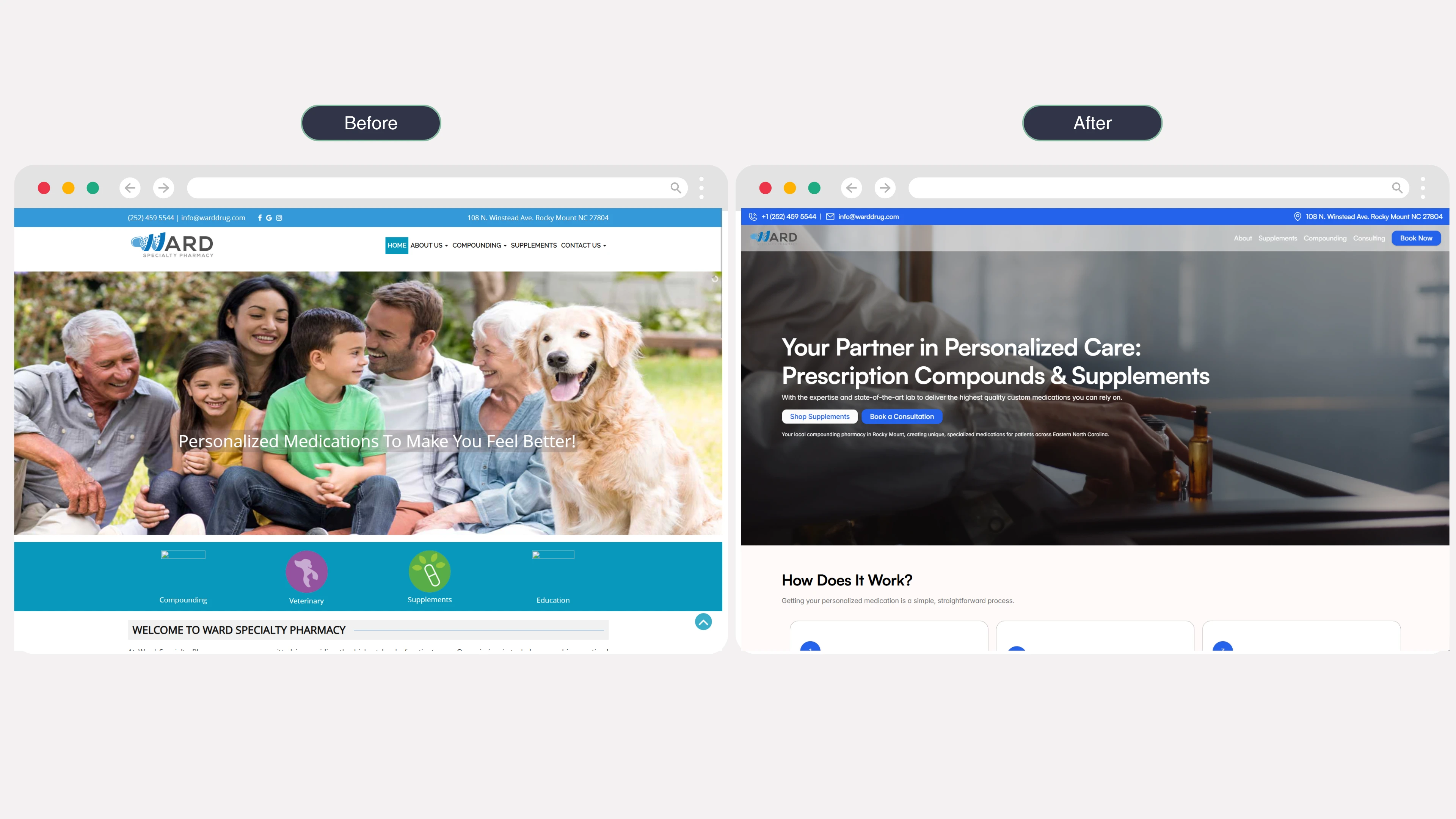
Old vs New Homepage
2. Dual-Funnel Architecture (Patients vs. Providers)
To eliminate user confusion, I architected distinct user journeys right from the homepage.
For Patients: I created a low-friction "1-2-3 How It Works" guide, demystifying the compounding process, leading them to a high-converting "Book a Consultation" sales page.
For Providers: I designed a dedicated, visually distinct B2B portal that highlighted turnaround times and compliance standards, ending with a direct "Submit a Prescription" CTA.
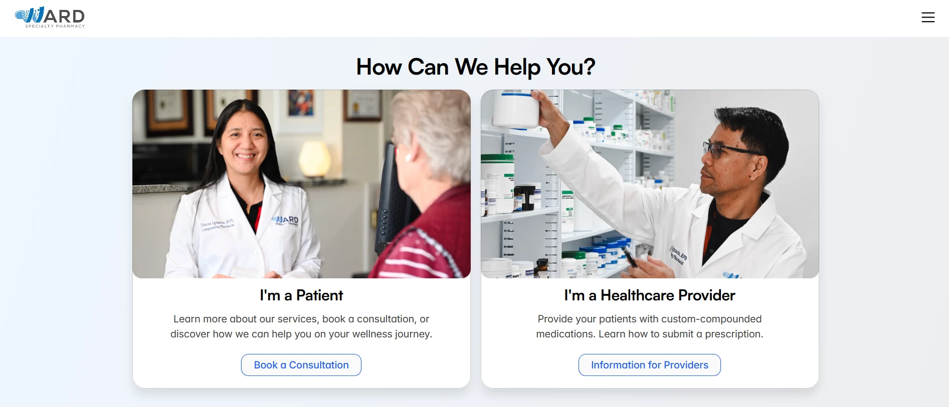
Service Section
3. The UX Workaround: The "Access Portal" Strategy
Since we couldn't build a direct checkout for the premium supplements, I transformed the Supplements page from a "dead-end storefront" into a "Guidance Tool."
I designed a tiered access portal:
The Fast Lane: Direct, external links for partners with easy sign-ups (Fullscript).
The Clinical Lane: A custom lead-capture form where users request access to restricted medical-grade brands (Xymogen/Metagenics). This allowed the client to capture patient data and provide high-touch service without needing a complex e-commerce backend.
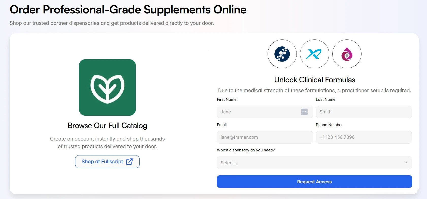
Online Supplement Form
4. Copywriting as Design
I overhauled the brand narrative, shifting the focus from "Me" (the owner) to "We" (the team). I rewrote generic calls-to-action (changing "Contact Us" to "Book Your Wellness Blueprint") to drive high-intent actions, ensuring every word served the ultimate conversion goal.
The Results
The new Ward Specialty Pharmacy website is no longer just a digital business card. It is a strategically engineered platform that:
Establishes absolute regional authority in Eastern North Carolina.
Seamlessly filters traffic, creating frictionless paths for both B2B and B2C audiences.
Drives direct revenue through a clear, persuasive consultation booking funnel.
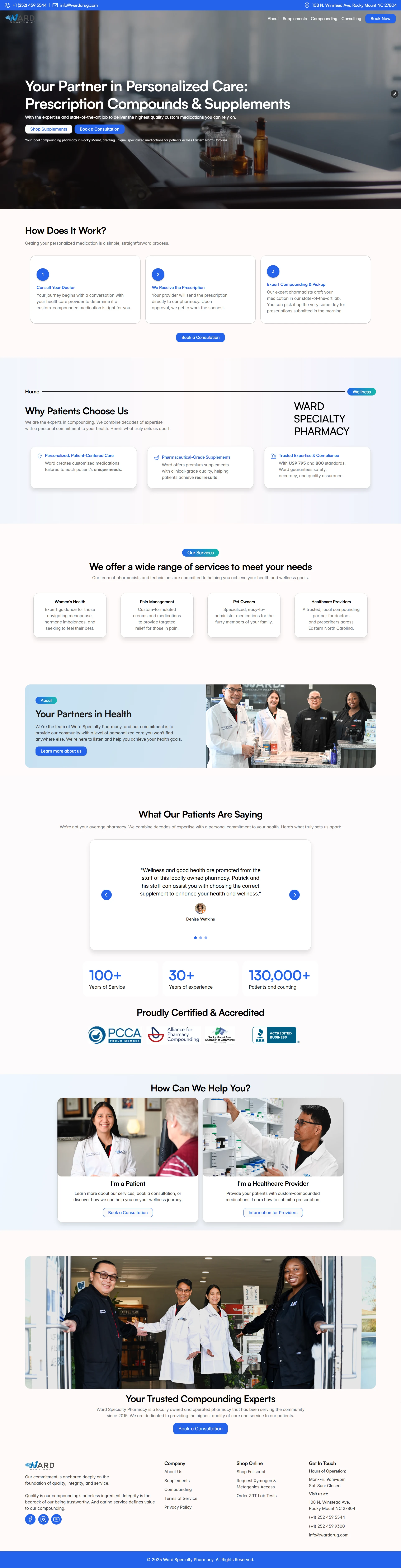
Full Page Preview
1 like · 12 views · May 13, 2026
Redesigned Ward Specialty Pharmacy's website to enhance conversion and user engagement.
Timeline
Nov 27, 2025 - Ongoing