Nevada DMV - Website & Mobile Redesign
"A driver reaches a destination by driving on that road, not by laying back to enjoy the view." Nabil N. Jamal
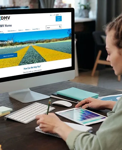
The Nevada DMV site looks old and has a lot of information without logical order. The information is not accessible to the typical user, and it takes too long to find the information needed to accomplish necessary tasks.
The Solution
Redesign the site's Information Architecture to help users achieve goals faster.
Change the site layout to be cleaner
sites change the site's navigation system based on users' common goals
Update the site's UI to be more accessible and user-friendly by indicating the user path better
Tools: Figma, Miro, Google Sheets, Canva, USWDS, Zoom, Usability Hub, Web-Wave
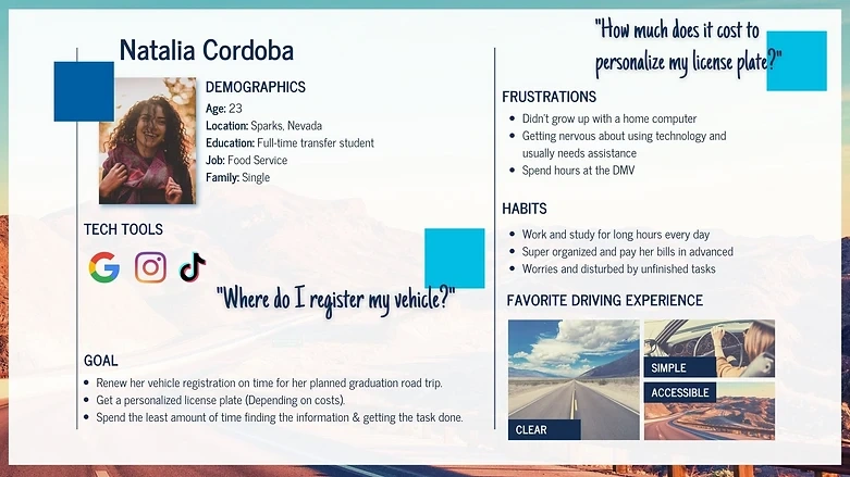
User Persona
User Path
A typical user would visit the Nevada DMV site to personalize a license plate.
Home page
License Plates
Personalized Plate Search & Ordering
Enter plate no. (7 characters)
Find out if your choice is available
Rules of the Road
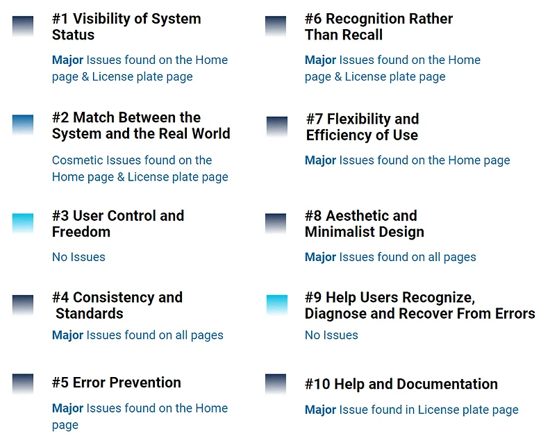
Heuristic Evaluation
The evaluation made for all pages at the user path, based on Jakob Nielsen's ten general principles for interaction design
Accessibility Evaluation
The website was checked using the Wave-Web Accessibility evaluation tool.
Color Accessibility
The website's colors were checked and passed AA with a 5.92 contrast ratio
The new colors chosen for the website were also checked for color accessibility and color blindness.
Hands-on the Wheel
Usability Testing Plan
The primary goal of this testing plan was to find out if the user can navigate easily and accomplish common tasks
Five users took the test to accomplish three common tasks:
Can the user find out how to apply for a personalized plate?
Can the user customize the plate design?
Can the user find specific information?
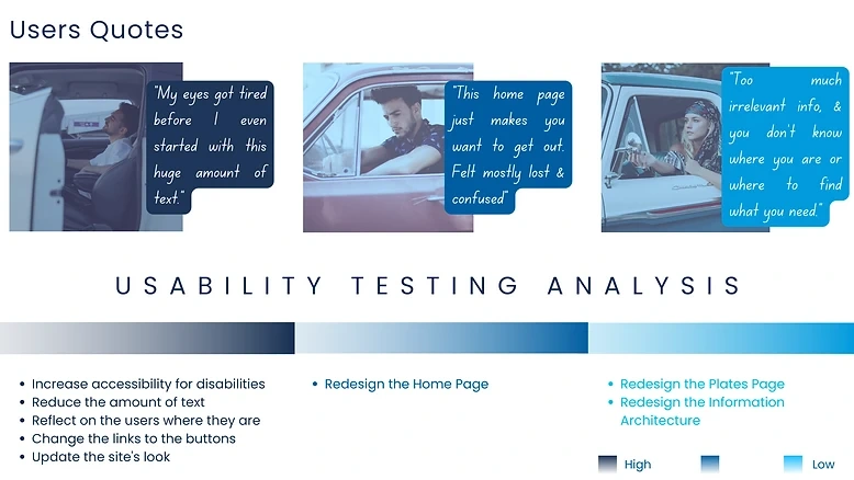
Right of Way - Usability Testing Analysis
Navigation Usability Testing
Desktop
Users had to open and read through multiple drop-down menus on the top navigation to find what they were searching for. Users were overwhelmed with the number of items in the top navigation bar and the amount of text and options on every page.
"Users were confused with the category “Registration" (Rename- Vehicle Registration)
Mobile
Users can't see the navigation bar clearly
Users were struggling to click the links at the navigation bar.
It was hard for users to read the text.
Information Architecture- Card Sorting for Navigation
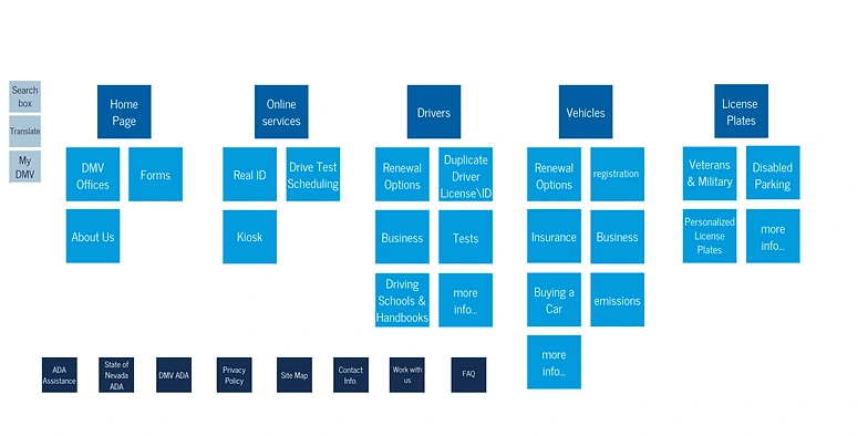
Making a U-turn
Redesign complete site information architecture to reach any destination in A fast, easy & safe way.
Mood Board - Help the traffic flow
Five-Second User Test
Eight participants answered two questions after viewing the homepage screen for five seconds.
Question 1: What is this website for?
100% of the participants knew what this site was for
Question 2: What words or sentences do you recall?
80% of the participants could recall words that refer to DMV
Conclusions
We are delighted with the feedback. All users were clear on the purpose of this page.
UI Style Tile
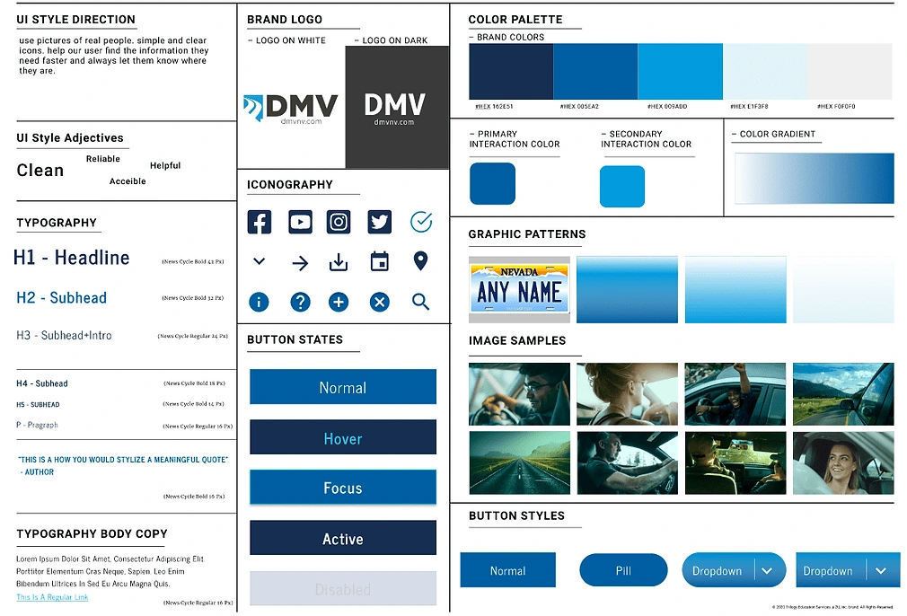
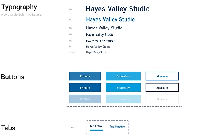
UI Style Guide
High-Fidelity Prototype
Mobile Usability Testing
4 Users participated in the testing and accomplished the task with 100% success and no difficulties.
Changes made after testing:
Added option to go back
Added a filter selection for less scrolling (there are over 60 different options for license plates design)
Desktop AB Testing
At this 2 AB testing, option B was chosen by most of the users.
Parking Zone
The Drivers
If I had to drive this road again, I would look for people with a broader profile (older ages, tech-challenged populations, occupational diversity like truck drivers) for the usability tests at all stages.
In real-world conditions, I would love to see the site's Google Analytics data to understand better the traffic flow, what the users are looking for, and how they get there.
The Road
The road was tough, but two decisions made it worth it. The first was to give up the new color palette and mood board (I had no idea what to do with so many colors) and stay with the site's current colors. The second was redesigning the site's Information Architecture because that's the only way to get an accurate picture and make it simple for any user to get where they need.
The Destination
I solved all the problems that arose in the usability tests.
In addition, I redesigned two types of critical pages for the users (with the help of the USWDS Design System).
In the old design, you couldn't get any task done online, and there was a lot of important information for the user, so the new design for Form Downloads and FAQ was critical.
The path is now fast, simple, and straightforward.
"A driver reaches a destination by driving on that road, not by laying back to enjoy the view." Nabil N. Jamal

Like this project
Posted May 23, 2023
Redesign the website to be more accessible and simple to navigate by changing the Information Architecture and Sitemap. Keren Levi-Faran | UX Designer
Likes
0
Views
3


