
TrueConnect is a connection platform for Africans across the continent and in the diaspora. For this challenge, I had full freedom to define a target audience, choose my own visual direction, and decide which screens best showed my thinking, rather than redesign the entire app.
Visual Direction
I kept gold as the main action color and changed what black does. Instead of a mostly dark page, I went light and warm: cream backgrounds, near-black ink, and terracotta as an accent. A mostly dark page reads as a security product, and this is a product about human connection. Dark is reserved for three places: AI Matching, where dark is the convention for tech; Elite Concierge, where dark signals exclusivity; and the footer. Gold means clickable, terracotta means emphasis. Headlines use Fraunces for warmth, with an italic accent word, while body text stays in a clear, neutral sans-serif.
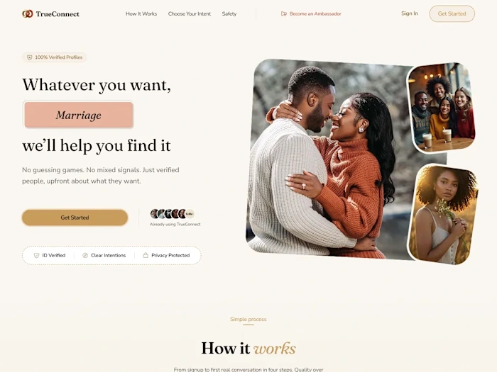
Hero section
What I Looked At, and What I Found
Repetition - Four sections explained the same “we verify you” promise. Repeating a message does not strengthen it, it just makes the page longer.
Unsourced numbers - Figures like 9.8K visitors, “90% of frustration,” and “85% match satisfaction” appeared with no visible source. I removed them in favor of content that builds trust without relying on unverified claims.
Fear-first framing - A safety feature named “Anti-Blackmail Tech” led with the threat before the reassurance.
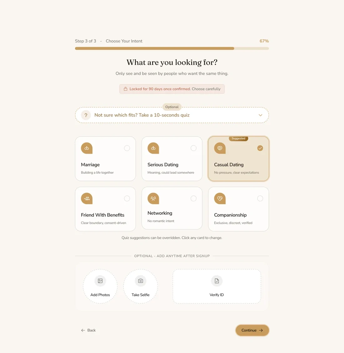
Buried lock - The 90-day lock was sold on the landing page but sat inside an “optional” onboarding step.
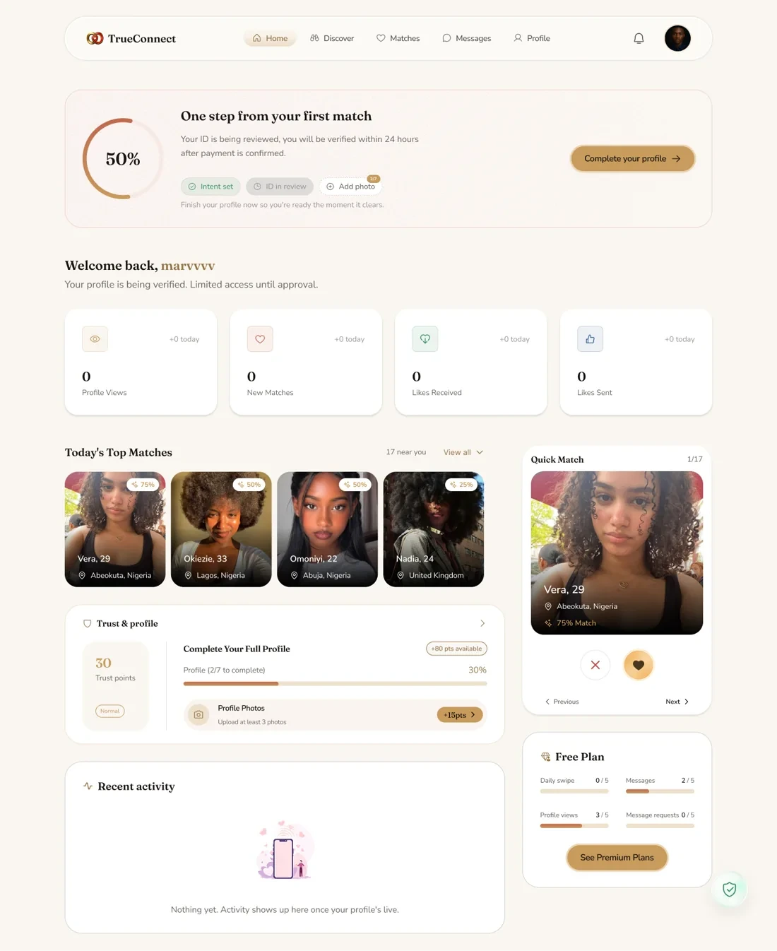
Dashboard clutter - Profile completion was tracked in three places with three different percentages, two match-browsing areas, and two warning banners over all-zero stats.
Deliberate cuts - I cut the testimonials section, the 0-100 trust score, the badges grid, and the standalone compliance section to remove noise and keep attention on the core promise.
Key Decisions
One adaptive next-action module - The dashboard had competing banners telling users different things at once. I replaced them with a single slot that always tells you the one next thing to do: “finish your profile” while pending verification, “start discovering” once verified. I also merged three separate completion trackers into one checklist with one number. This fixed the “I don’t know what to do first” feeling.
Intent Lock, reframed - I first tried visualizing the 90-day lock as a countdown, diagrams of time, orbits, locked and unlocked states. Then I realized the copy was never about a countdown, it was about filtering who you see. So the visual became a pool narrowing down to one intent.
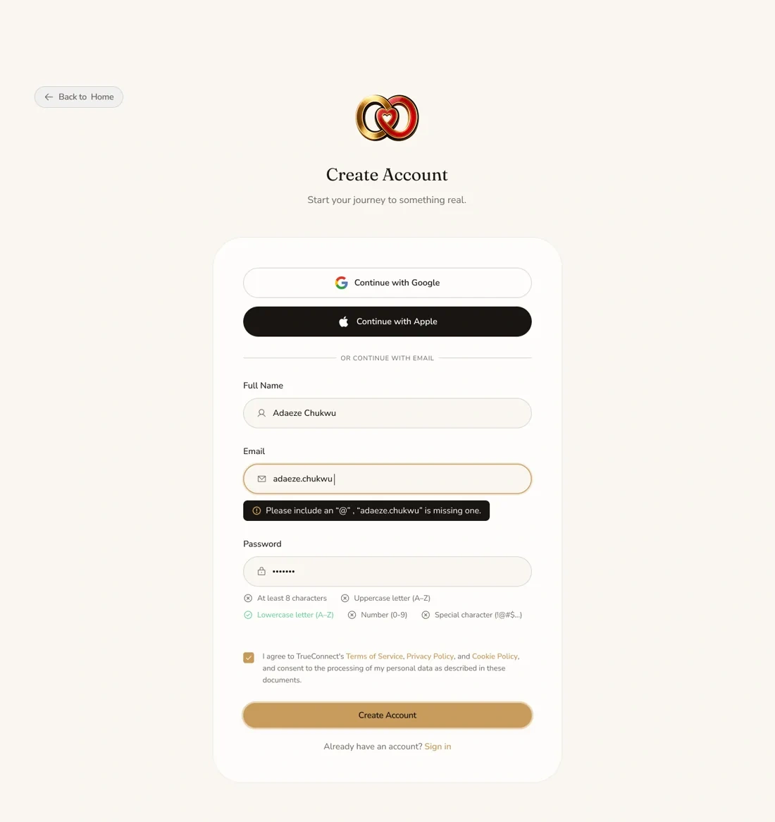
1 like · 1 view · Nov 4, 2026
TrueConnect is a connection platform for Africans across the continent and in the diaspora.
