Zeta Markets: brand & trading UI through product change

Jon Li


Zeta Markets
Overview
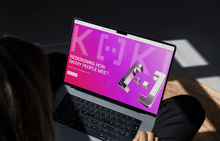
Zeta Markets, a Solana derivatives exchange backed by Jump Capital and Electric Capital (now Bullet.xyz), came in with foundational design and a product about to change shape, from options into spot and perps. The brand had to hold through that shift, sit cleanly next to partner protocols in collabs, and stay simple enough for the team to run day to day without a designer on every post. Freeze the look too early and the trading UI would be wrong for what they were selling next.
Duration: ~10 months.
Category: DeFi exchange, Solana.
Scope: Branding, UX/UI, Website.
Zeta Markets
Zeta Markets
Zeta Markets
Approach
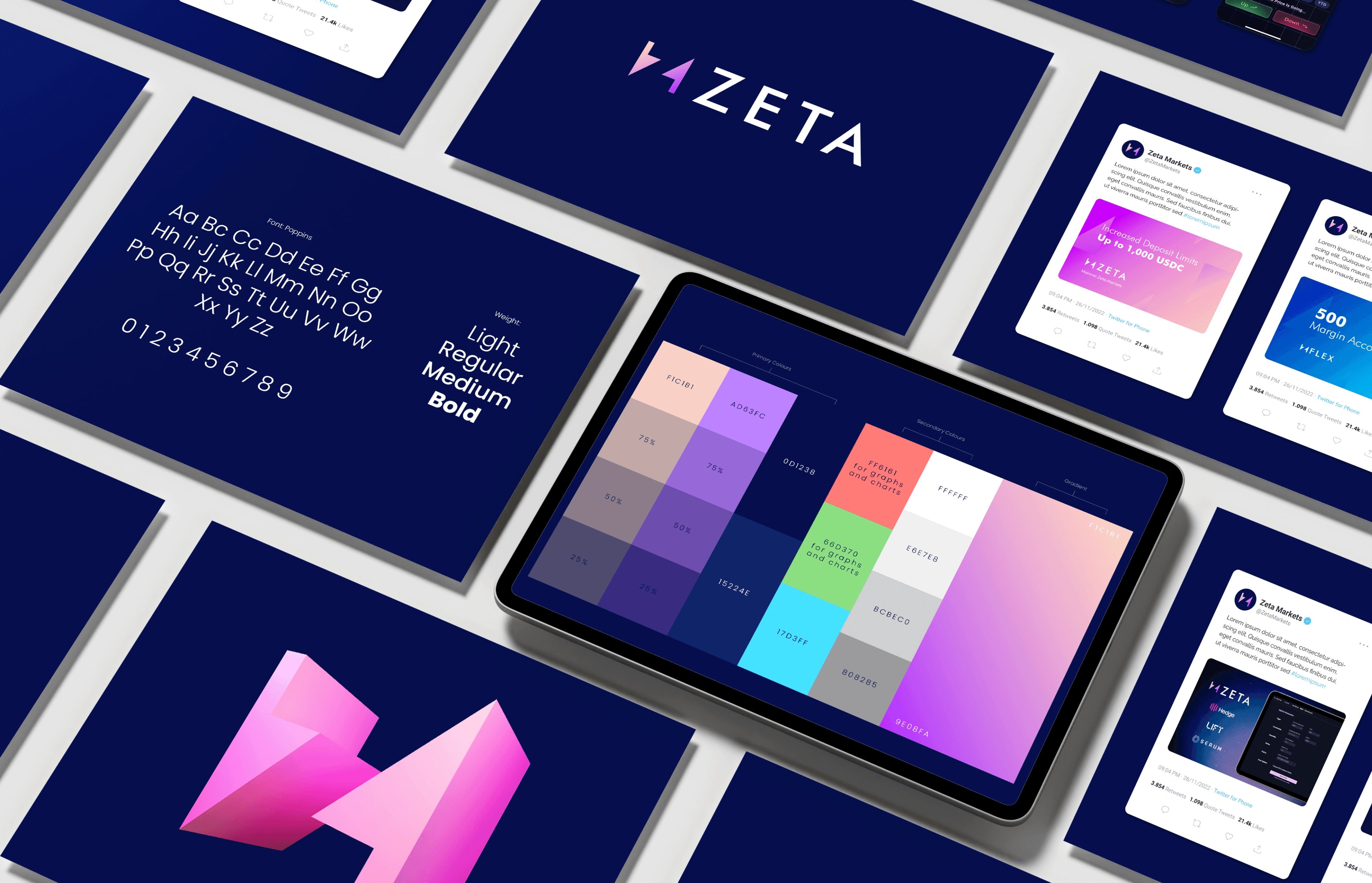
Set a brand strategy the team could execute themselves in daily communications
Built it to sit alongside partner protocols in collaborations
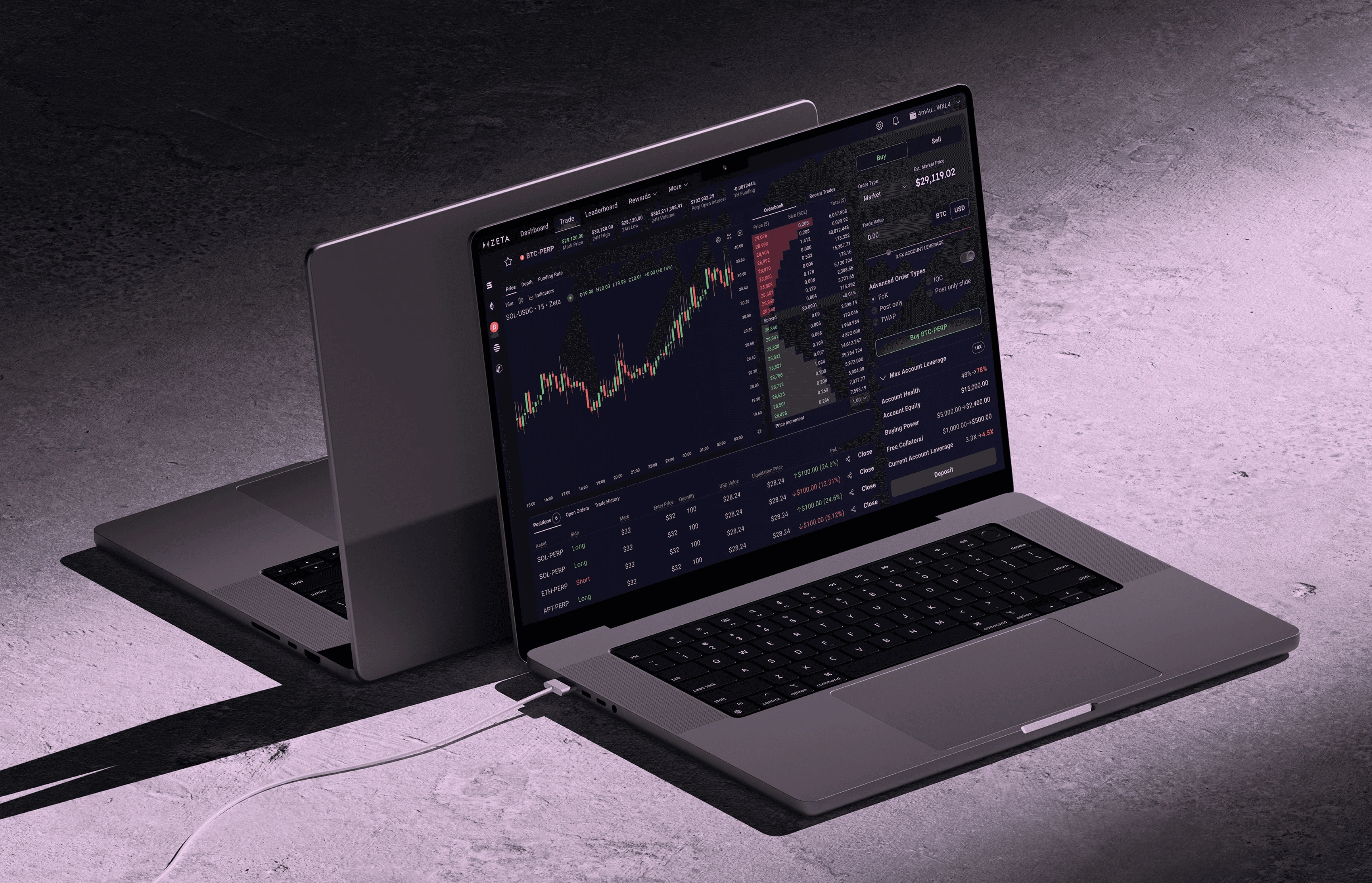
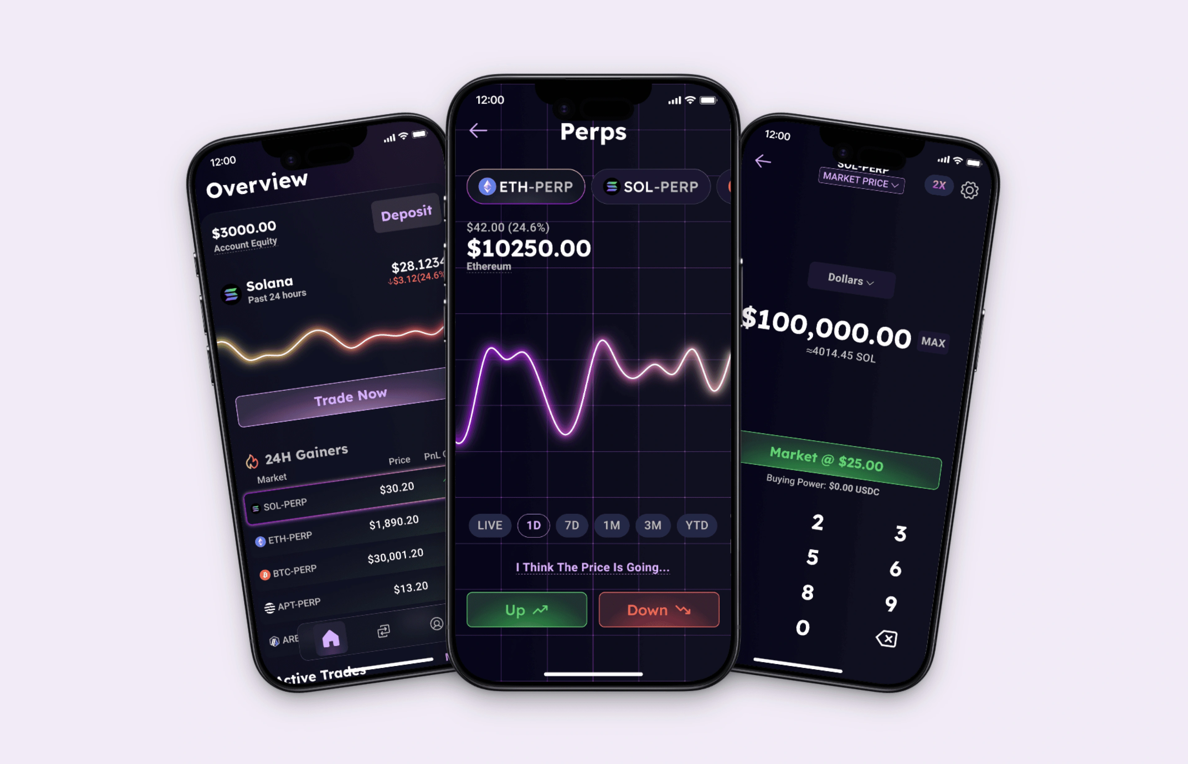
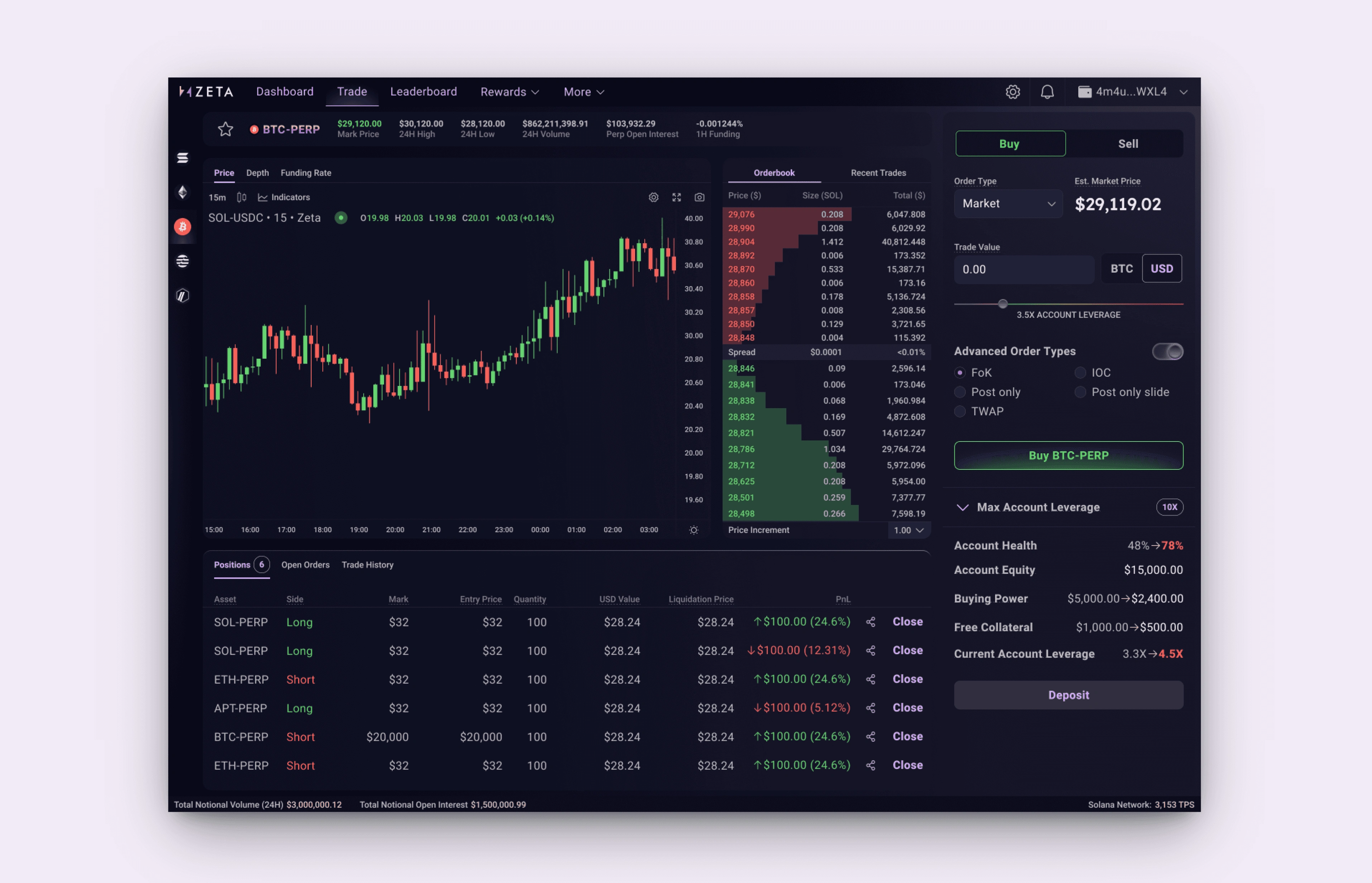
Refreshed the trading UI twice as the product moved from options to spot and perps
Kept iterating the UX across the engagement, including hierarchy, type and action clarity on high-stakes screens
Stepped back when they hired in-house, which was the healthy end of the subscription
Zeta Markets
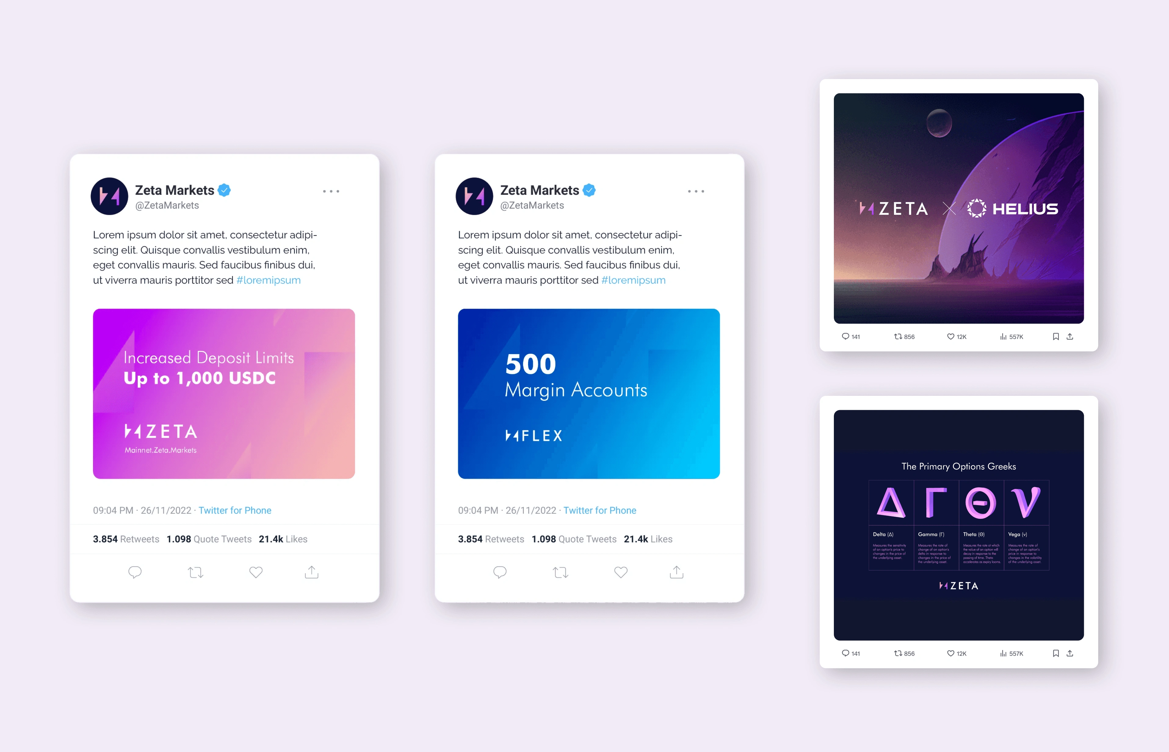
Zeta Markets
"This looks pretty beautiful… somehow the shine, the colours and the font just look way more harmonious, it feels very sleek. The white on the headline metric font colour really makes those stats pop. You've really hit the nail on the head with font choice, rounding of the box edges and the purple sheen on the action buttons. It's so clear to me the balance and the withdraw action. My eye barely has to scan or interpret anything. It just feels natural. The new nav system looks way way better."
Tristan, CEO, Zeta Markets (now Bullet.xyz), backed by Jump Capital and Electric Capital
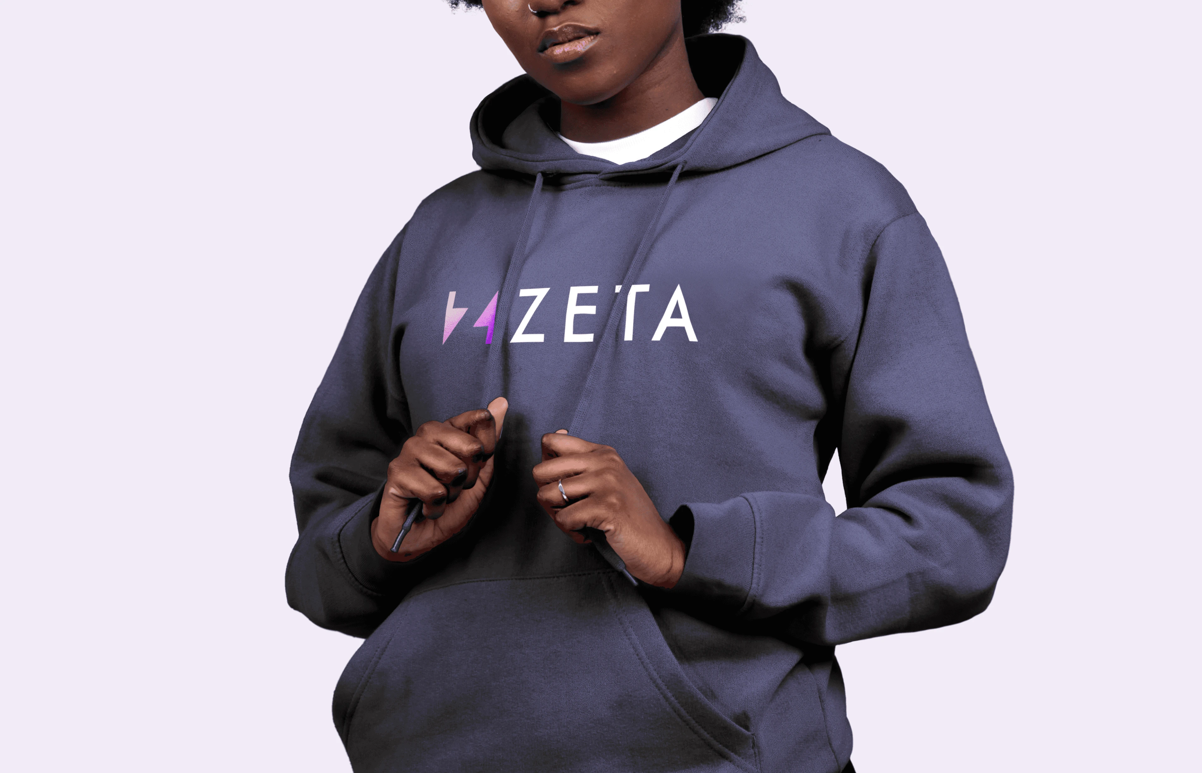
Zeta Markets
The Call
A competent studio would lock one trading UI and wait for the product to settle before redesigning again.
That was wrong here. Zeta was changing what it sold, from options into spot and perps. Holding one interface would have meant shipping a look built for yesterday's product into tomorrow's order book.
We refreshed the trading UI twice as the product moved, and held the brand stable enough that the team could still run daily communications and partner collabs without starting over each time.
The cost is more design cycles and a harder story to tell in a portfolio. Two refreshes look less "finished" than one definitive ship, even when that's what the product needed.
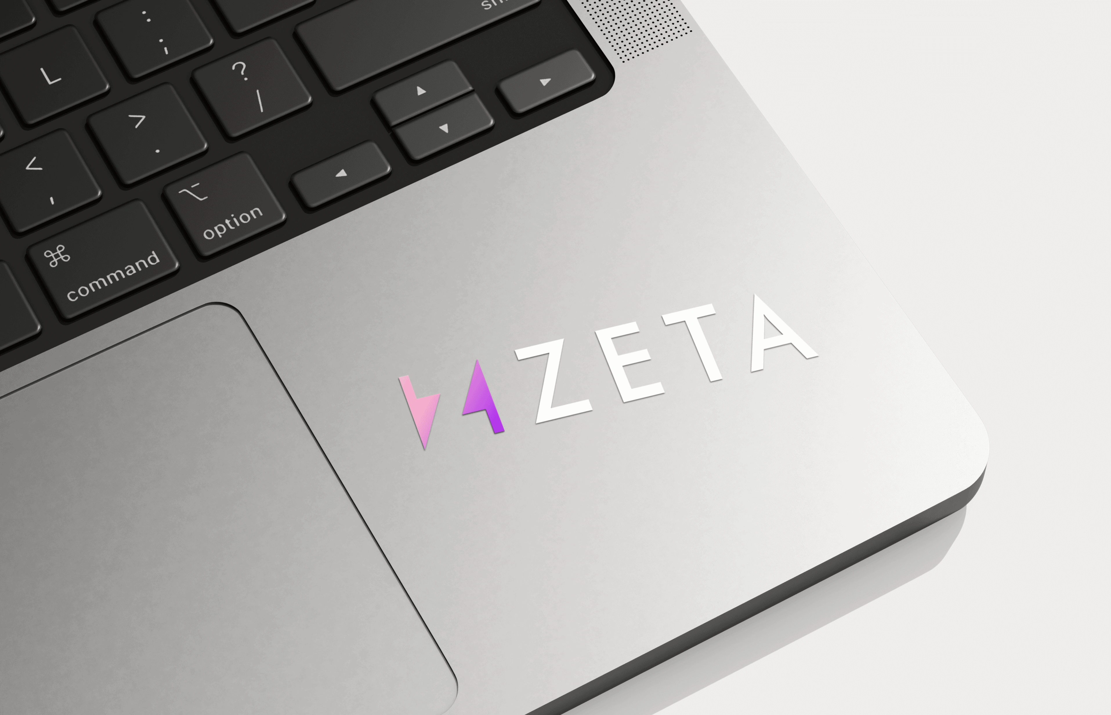
Zeta Markets
Outcomes
Across roughly ten months and two UI refreshes, the brand held while the product moved from options to spot and perps. The team ran day-to-day brand work themselves. The engagement ended when Zeta hired in-house, which was the right call at that scale.
Like this project
Posted Nov 1, 2026
Product kept changing what it sold. Brand held through two UI refreshes, and the team ran it themselves.
Likes
0
Views
0
Clients
Zeta Markets (now Bullet)