Logo and Visual Identity Design - Burn Fitness
Murtaza Jivanjee
Burn Fitness is a state-of-the-art fitness facility that spans over 20,000 square feet on two floors, designed to motivate athletes to achieve their fitness goals and celebrate their health and well-being.
Client - Burn Fitness
Scope - Visual Identity
Industry - Fitness
Designer
Murtaza Jivanjee
Brief:
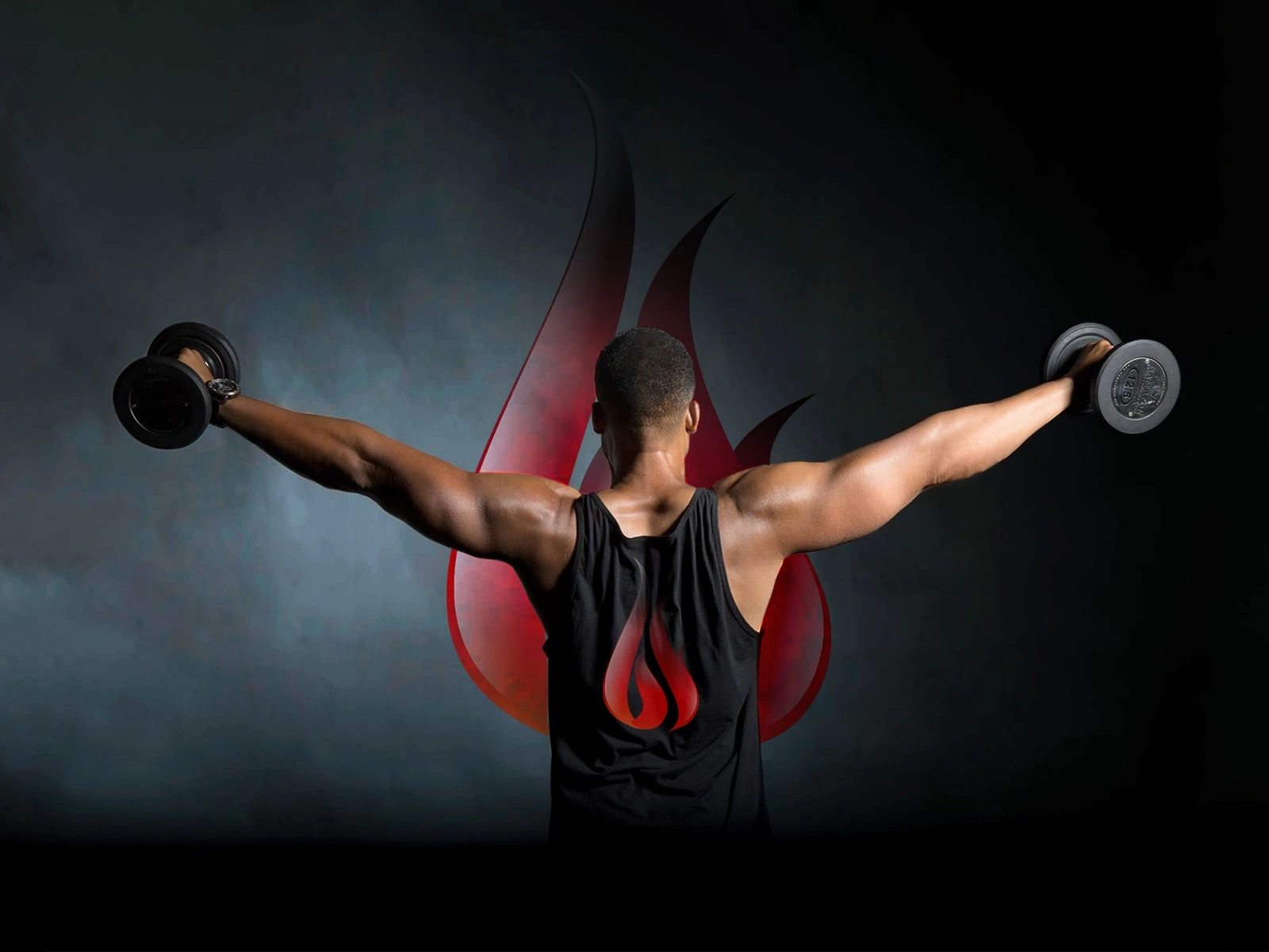
Seeking to craft a logo/symbol for a fitness gym catering to cross-fitters, bodybuilders, and fitness enthusiasts. Our physical gym is diversifying into online coaching and consulting, providing top-notch facilities for amateurs and professionals. Exploring expansion into a clothing line, envisioning logo embroidery on t-shirts.
Solution:
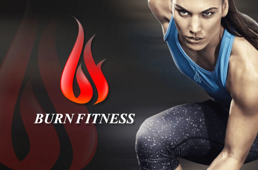
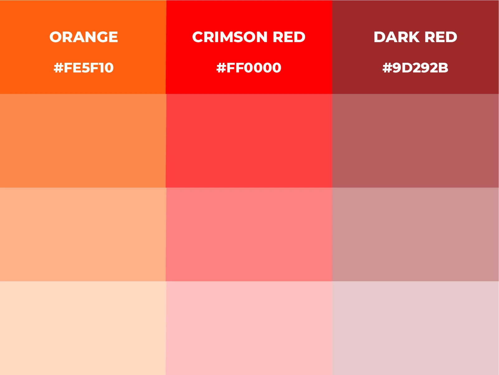
Crafting a flame-inspired symbol embodying calorie burn and physical exertion. Employing a palette of crimson and dark shades to convey intensity and ruggedness. This emblem resonates with training fitness enthusiasts, encapsulating the fervor and dynamism of workouts, symbolizing the commitment to rigorous fitness endeavors.
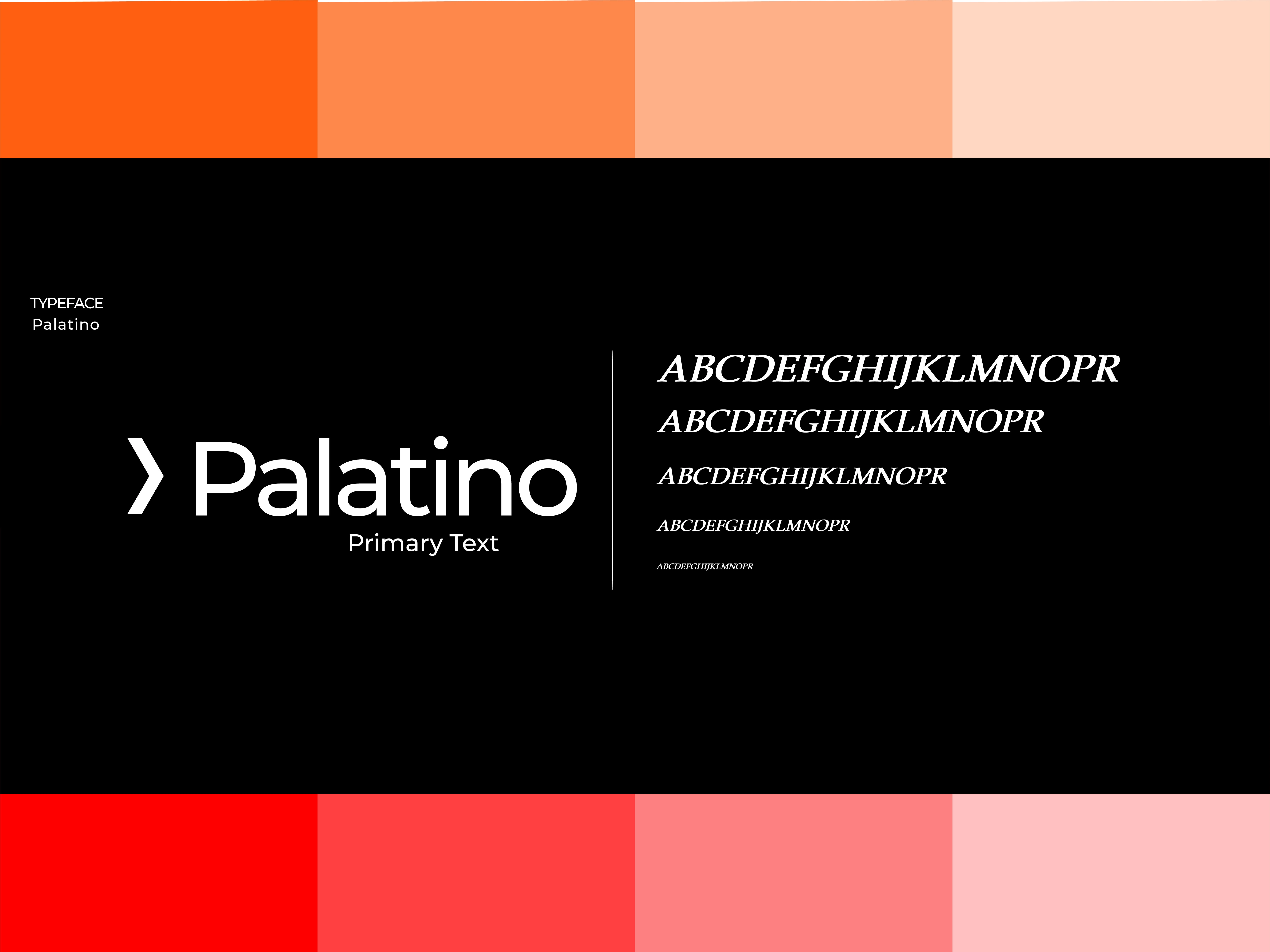
Typography and Colors
The emblem, crafted with a flame/fire motif, signifies the calorie burn and intensity of physical workouts. A carefully chosen color palette of crimson and dark tones communicates the heat and rugged ambience. This symbol resonates specifically with training fitness enthusiasts, cross-fitters, and bodybuilders encapsulating robustness. Serif letter typography radiates a modern yet mature essence in its design and presentation.

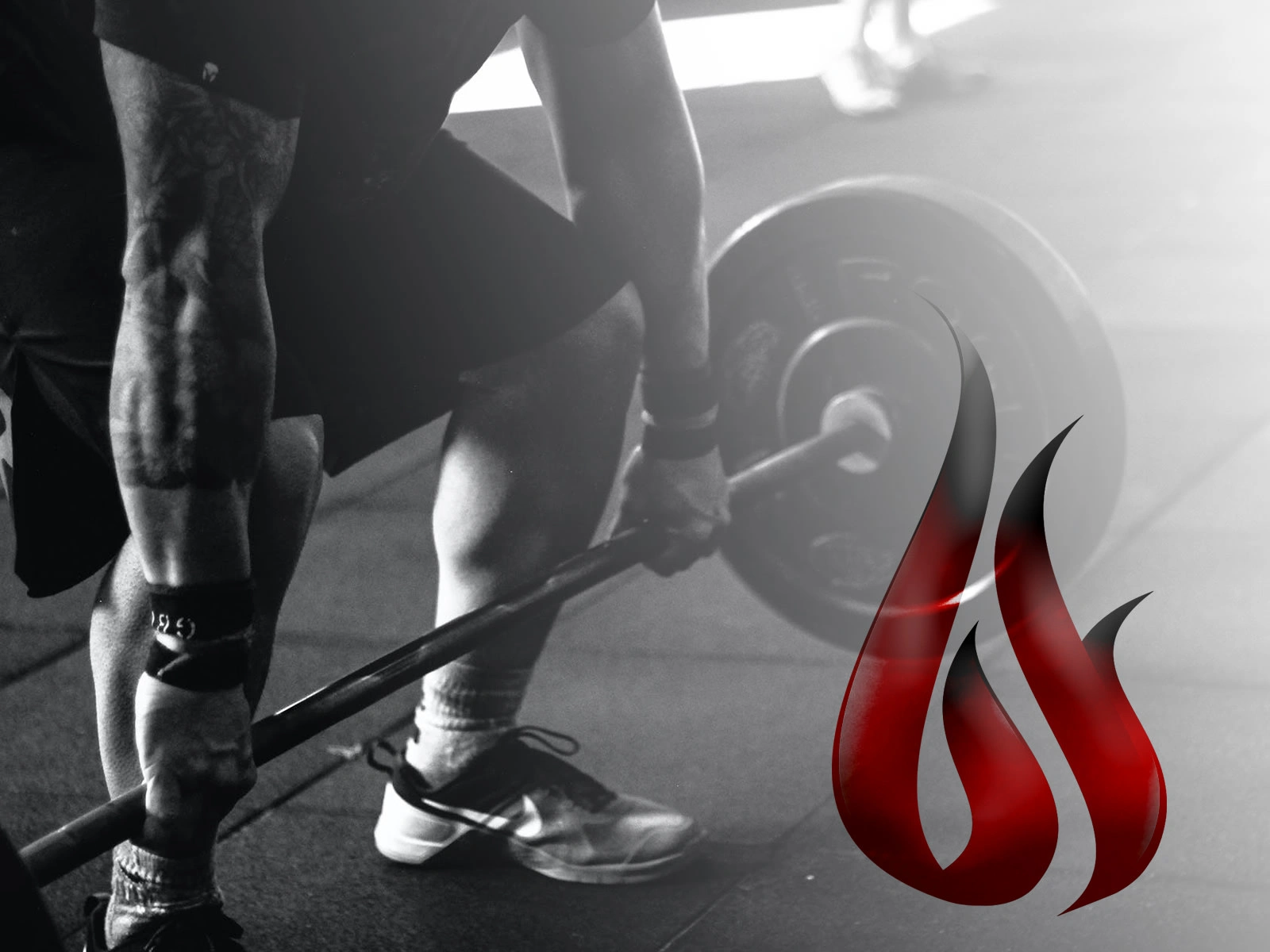
Logo Applications

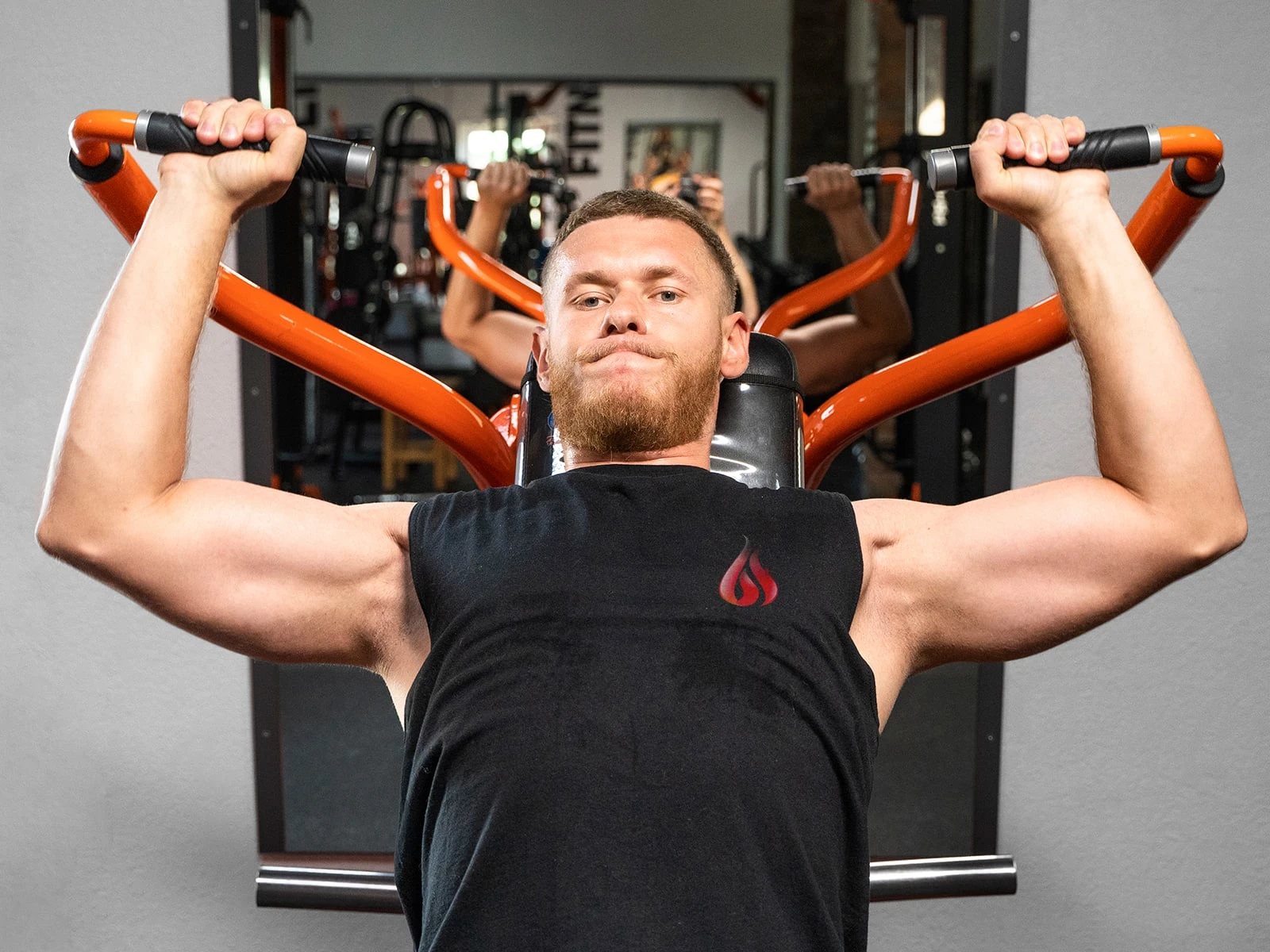
Photo Courtesy Burn Fitness Gym
Like this project
Posted Dec 1, 2023
Designed Logo and Visual Identity for Burn Fitness. An effective centre for fitness, health and well-being, with breathtaking views of Pacific.
Likes
0
Views
5