Healthcare Automation Web & UI/UX Design

Noah Wainwright


At a Glance:
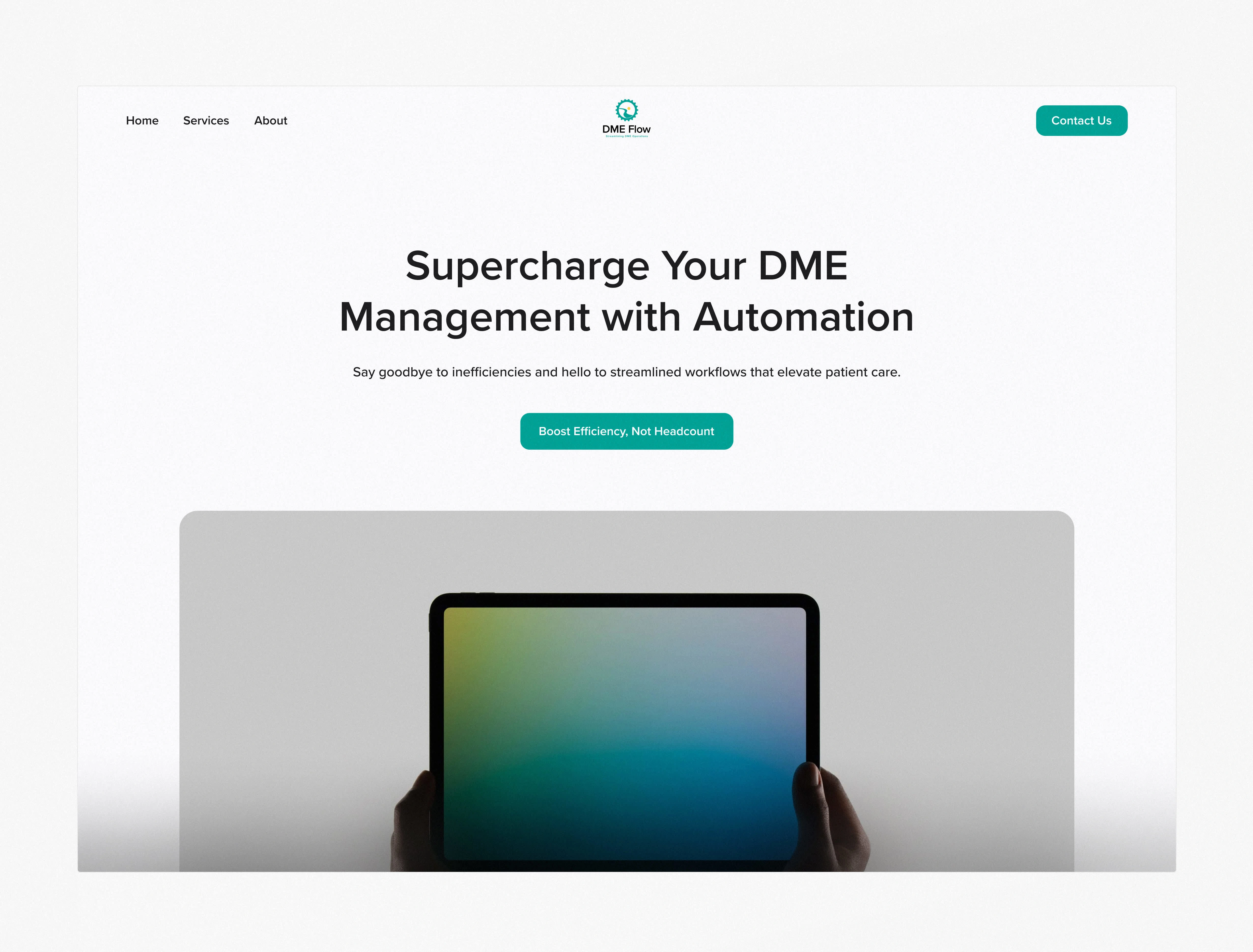
DME Flow is a workflow automation platform for durable medical equipment providers. While the backend was powerful, the original interface created friction, delayed time-to-value, and slowed adoption. After a full product design, DME Flow now converts faster, reduces support overhead, and doubles automation throughput.
2× Faster Automation Setup → Users build workflows in minutes, not hours
+82% Workflow Completion Rate → More claims filed = more revenue per provider
37% Fewer Support Tickets → Lower overhead and faster onboarding
Simplified Workflow Processes → Reduced user frustration, increased retention
Clearer IA & Microcopy → Helped new users activate without assistance
The Challenge: A Complex Interface Blocking Growth
Despite the product’s power, the interface was hurting adoption and slowing revenue growth due to three core issues:
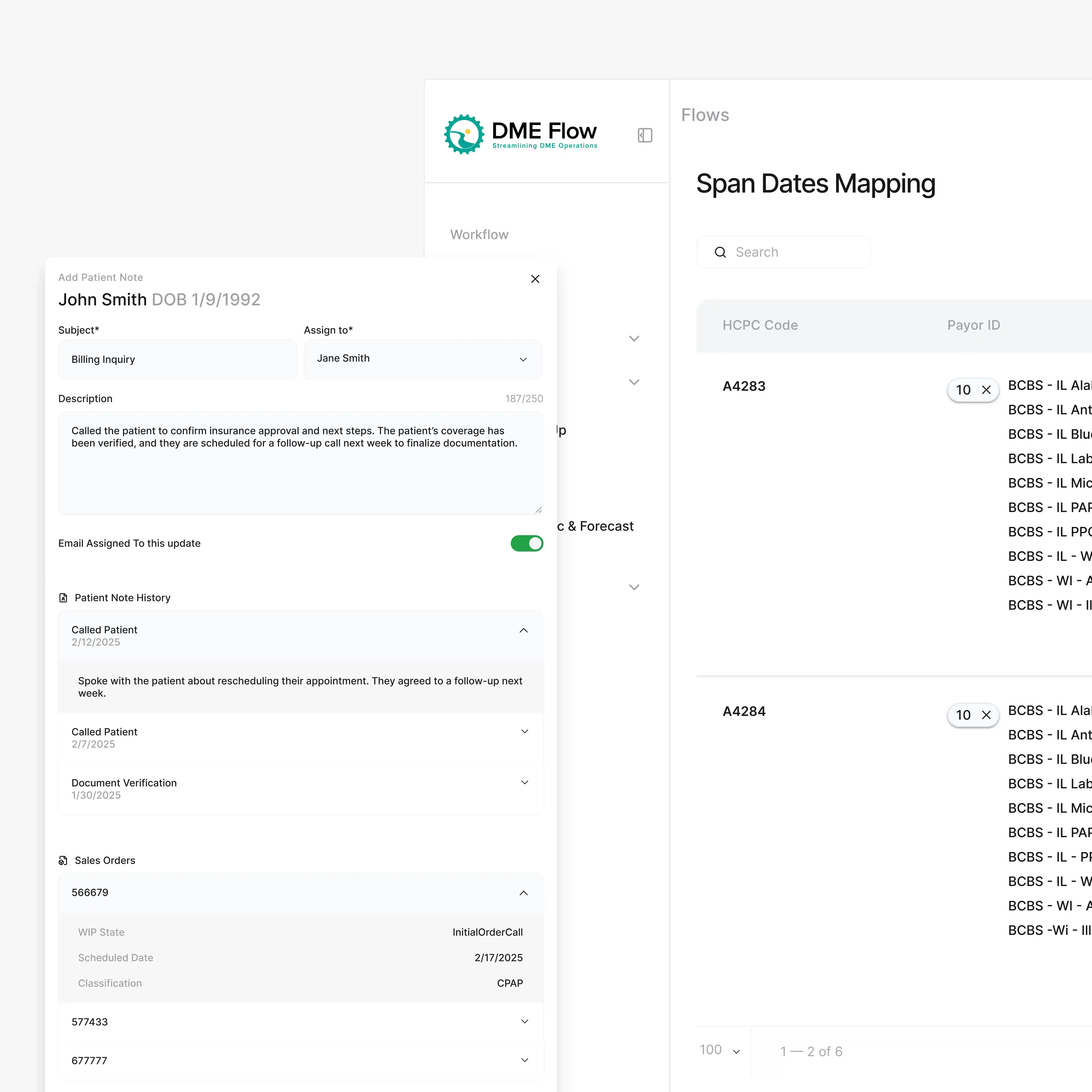
1. Overwhelming Workflow Complexity
The original interface exposed too many steps, logic conditions, and edge cases—leaving users overwhelmed and frustrated.
Admin teams needed hours to onboard and weeks to fully adopt the product.
2. Time-to-Value Was Too Long
With inefficient UX, it took too long for users to complete their first automations—slowing billing cycles and hurting client retention.
Missed automation setups meant missed reimbursements and lost revenue.
3. No Clear Differentiation
The platform didn’t visually or functionally communicate its advantage over legacy systems or other DME solutions.
It looked like just another form-filler—when in reality, it was the first no-code automation tool built specifically for DME businesses.
The Approach: A UX Overhaul That Doubled Throughput
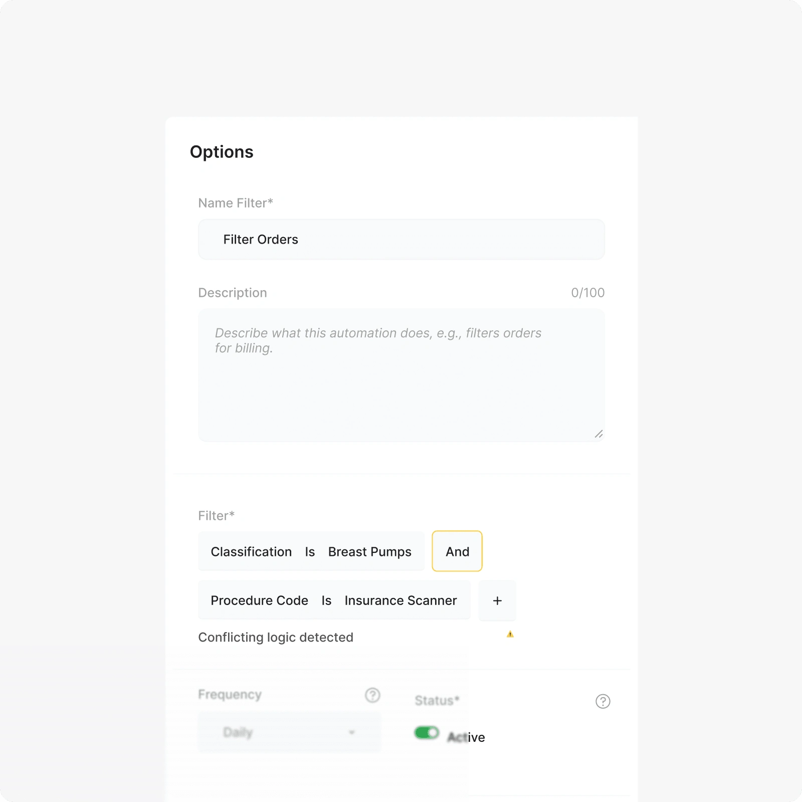
1. Simplified Workflows for Faster Setup
We redesigned the automation builder to reduce steps and make conditional logic visual and intuitive—users could now build billing flows in minutes, not hours.
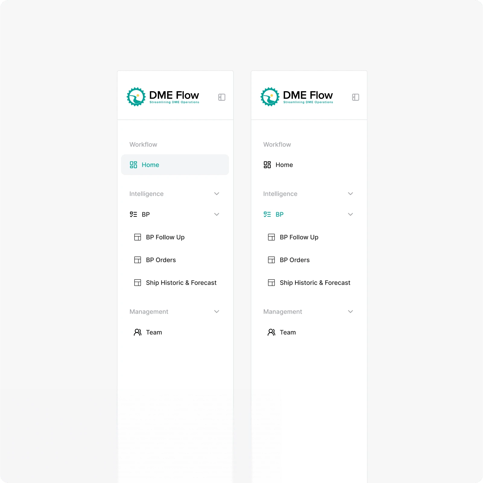
2. Clearer Navigation and IA
The new layout separated workflows, analytics, and shipping logic into focused zones—cutting user confusion and time spent hunting for features.
3. User-Centric Copy & Contextual Help
We added microcopy and help tooltips to remove guesswork from field inputs—reducing support tickets and helping staff complete their first automation without outside help.
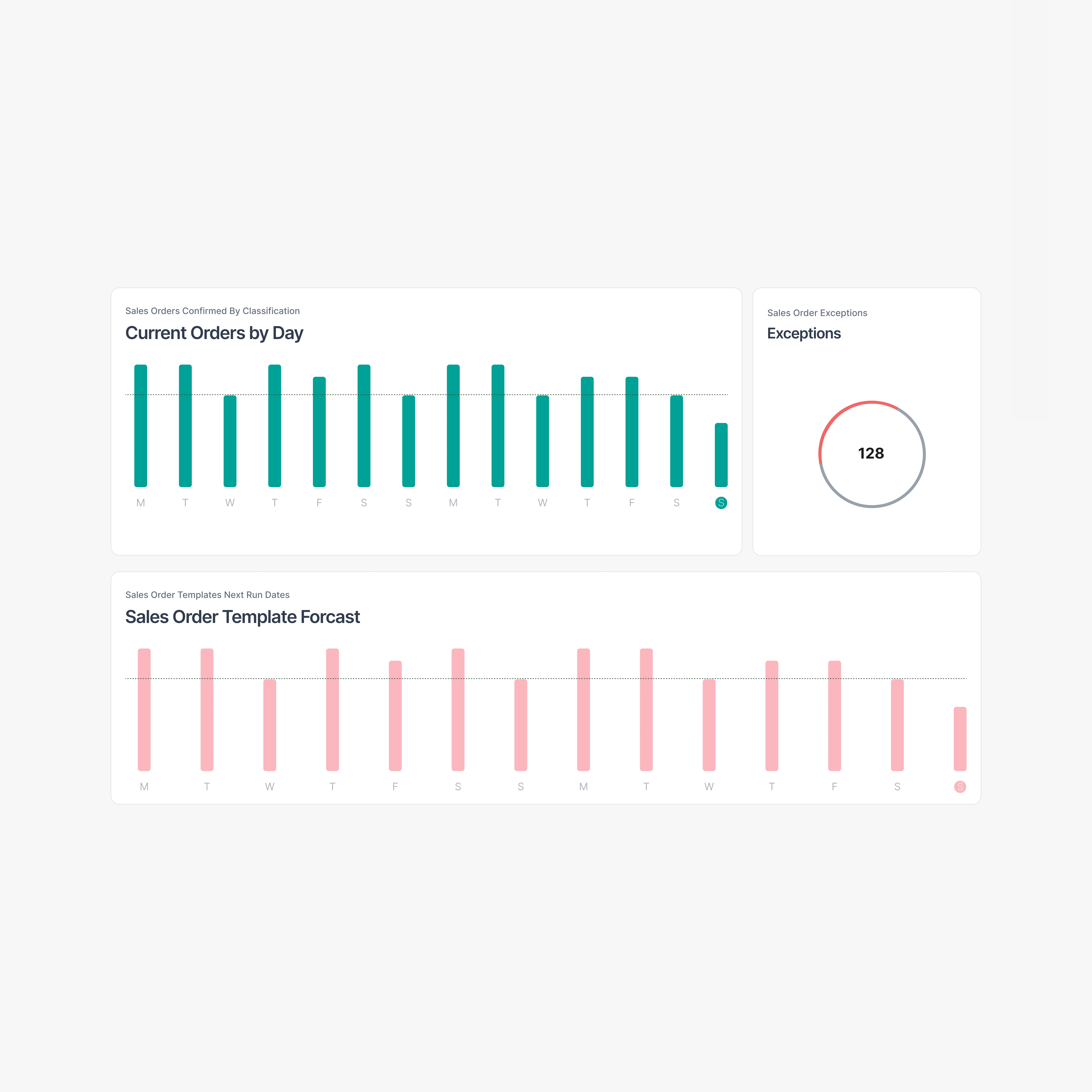
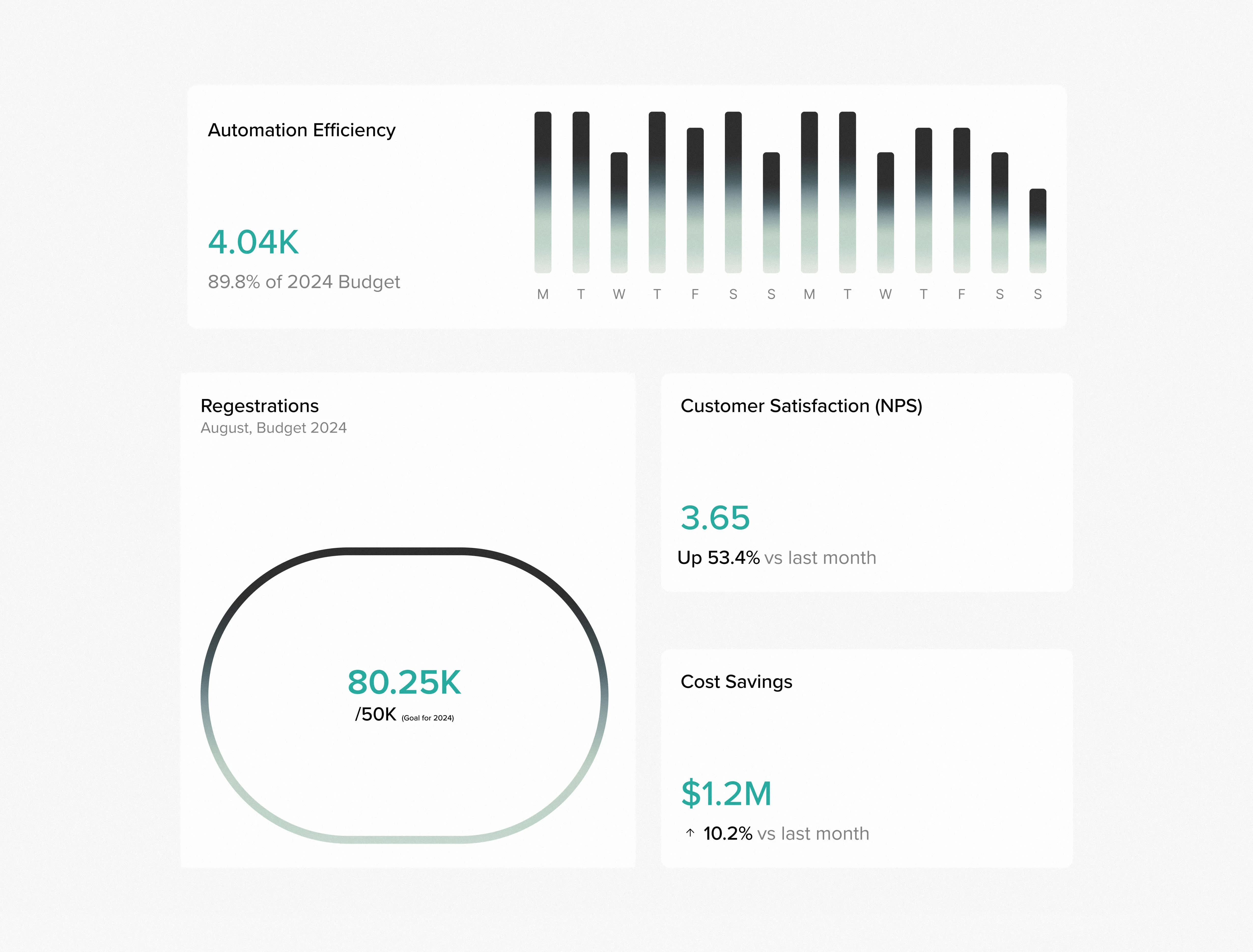
The Results: More Revenue, Less Overhead
2x faster automation setup → reduced admin time, faster reimbursements
80% workflow completion rate → more claims filed, more revenue per use
30% drop in user support tickets → lower costs and smoother onboarding
Why It Worked: Key Takeaways
1. Clear UX Drives Faster Time-to-Value
When users can get value within minutes, they stay longer and upgrade faster.
2. Simplicity Wins in Complex Markets
We translated 20+ touchpoints into an interface that felt like 5 steps—turning chaos into clarity.
3. The Product Became the Pitch
A redesigned UI positioned DME Flow as the modern replacement for bloated legacy systems—without saying a word.
If you’re building in healthcare, AI, or B2B SaaS and your product isn’t converting, I’ll help you fix it.
Like this project
Posted Apr 9, 2025
Designed the core interface of a medical automation platform to simplify complex workflows, reduce onboarding friction, and increase claim processing speed.


Sales Automation Website & UI/UX Design
Sales Execution Platform – UX That Speeds Up Revenue
WealthTech Platform – UX That Builds Trust and Converts
Investor-Ready Dashboard Design for Fashion Tech SaaS