Your Attention Please — Breast Health Campaign Redesign
Caro Bursell
End-to-end concept redesign of a breast health awareness campaign into a more sustainable, accessible, and approachable resource with one clear action.
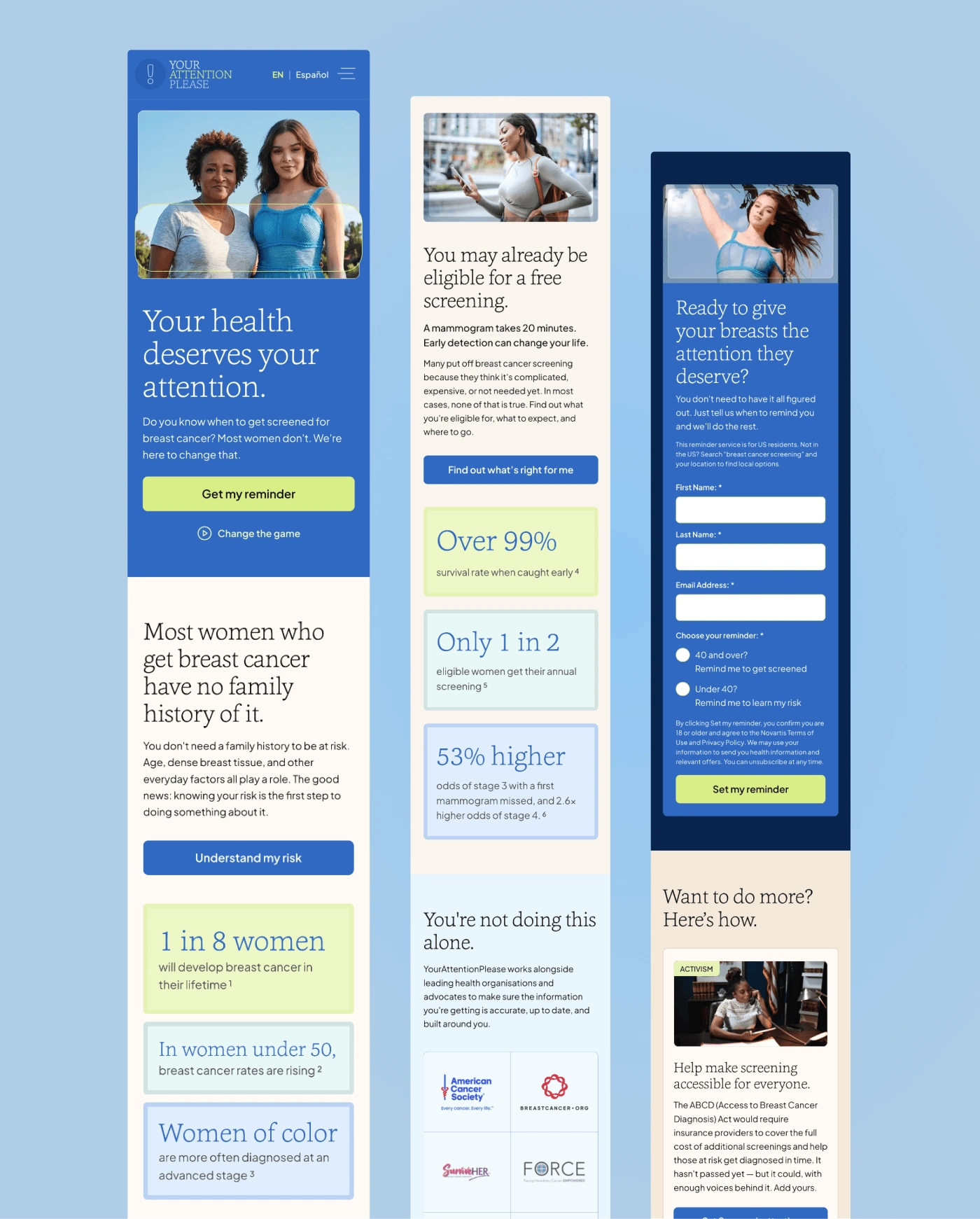
The Your Attention Please campaign launched at Super Bowl LIX to encourage breast cancer screenings, but the digital experience felt built for temporary ad traffic rather than long-term organic discovery. I wanted to bridge that gap, repositioning a high-profile marketing moment into a permanent, accessible resource that turns cultural attention into life-saving action.
Self-initiated speculative work not affiliated with, commissioned by, or endorsed by Novartis. All brand assets belong to their respective owners.
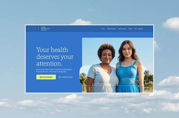
I've always been a fan of actress Hailee Steinfeld (Edge of Seventeen, anyone?), so when she became an advocate for the Your Attention Please breast health awareness campaign, it reached me through social media - at YourAttentionPlease.com I found genuinely valuable information, but also audience barriers I felt could be addressed.
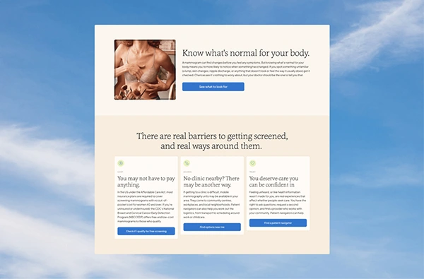
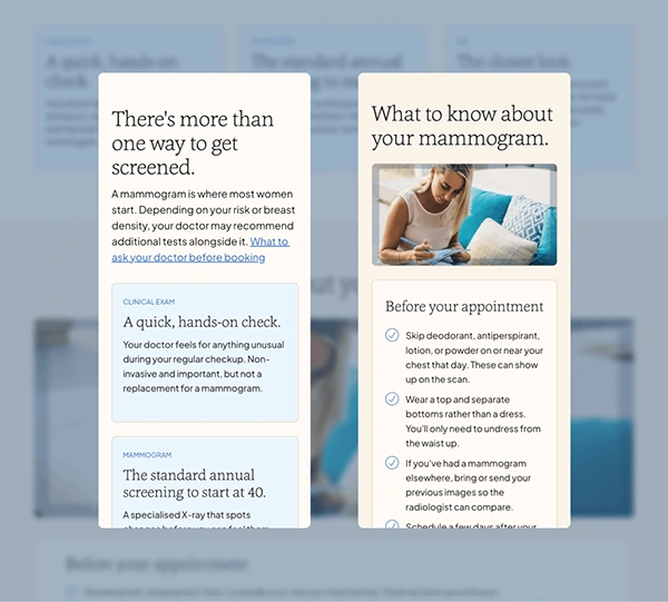
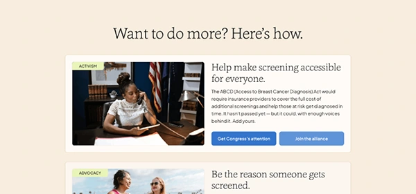
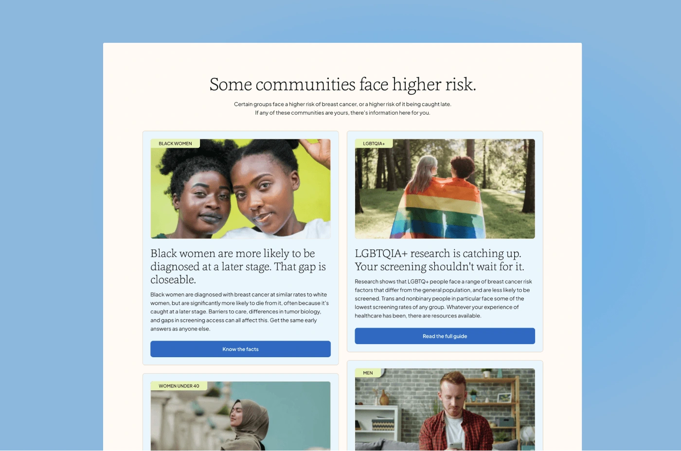
I defined two primary personas: the Unaware, and the Informed but Idle. Analysing related sites revealed a potential gap: calm authority. A trusted friend who also happens to be a doctor. I avoided a pink-dominant palette (which can tip into the language of fighting disease rather than preventing it), building instead around natural imagery, warm cream surfaces, optimistic 'sky blue's, their lime accent, and editorial serif type with a humanist rounded sans-serif. The goal was to modernise/lighten the existing campaign's strengths rather than totally disconnect from them.
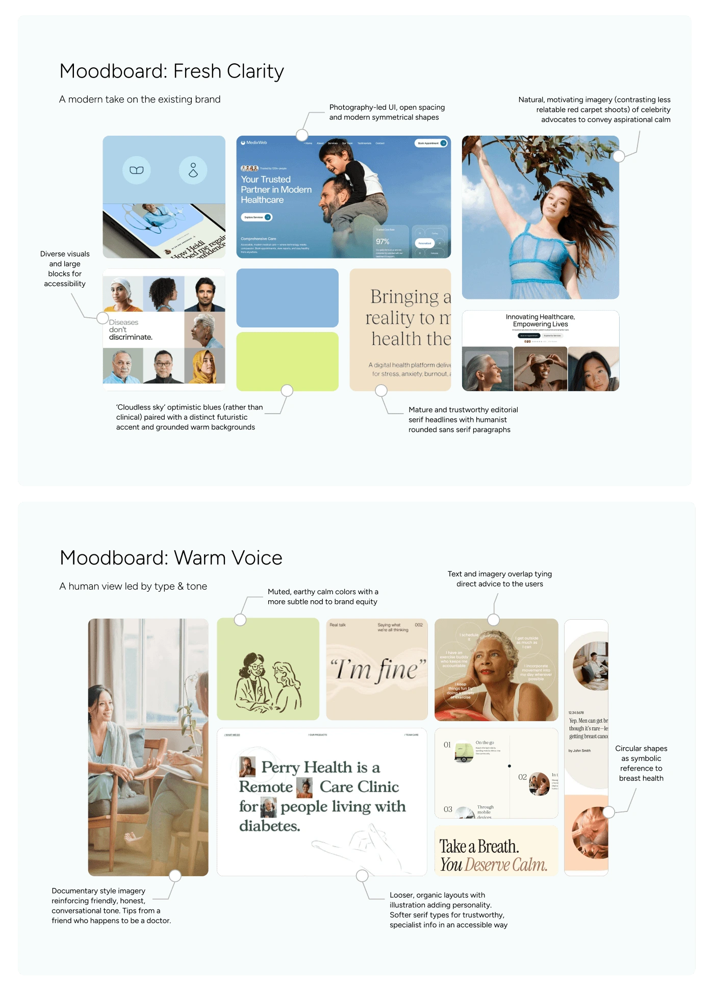
Early inspiration moodboards
Accessibility and sustainability as standard
Both were baseline requirements throughout (as on every project), not afterthoughts. Some platform constraints in Framer meant not every environmental choice was possible, but I reduced energy use wherever I had control.
✅ 44px minimum tap targets on all interactive elements
✅ WCAG 2.2 AA colour contrast across every combination
✅ Lightweight media and minimal unjustified decoration
✅ A language selector, so the site doesn't exclude large user groups
What I'd do differently
This project’s sensitive content required particular care and I struggled to iterate messaging based on research alone, so I’d dedicate more time in any future work with similar subjects to speak to communities directly, so that conversational copy doesn’t just sound respectful but earns it. It reconfirmed the need for copy sign-off before design begins: visual design can prop up words that aren't quite working yet, and the result is stronger when the bare script is honest and effective on its own. I’d also build in more scope for proper sourcing (and tricky accessibility-compliant footnotes), and push further on layout to make text-heavy sections more visually engaging.
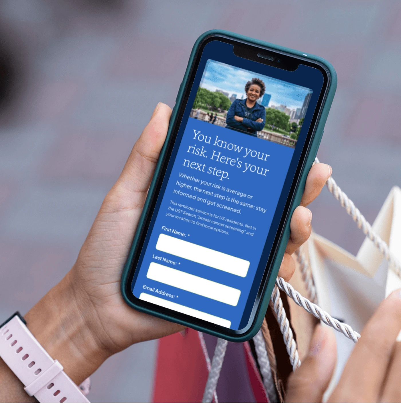
The concept redesign turns a high-profile campaign moment into a friendlier resource that keeps working: tighter sitemap, first-person CTAs, and WCAG 2.2 AA compliance throughout. Going through the process personally meant I left with a screening reminder booked. That felt like the right outcome to test against.
If you liked this, let me know. And if you're looking to create sustainable & accessible websites, let's chat!
✽ carobursell.com ✽
Like this project
Posted May 1, 2026
End-to-end redesign concept of a breast health awareness campaign into a more sustainable, accessible, and approachable resource with one clear action.
Likes
0
Views
2