NotJustTrash | Brand Identity and Logo Design
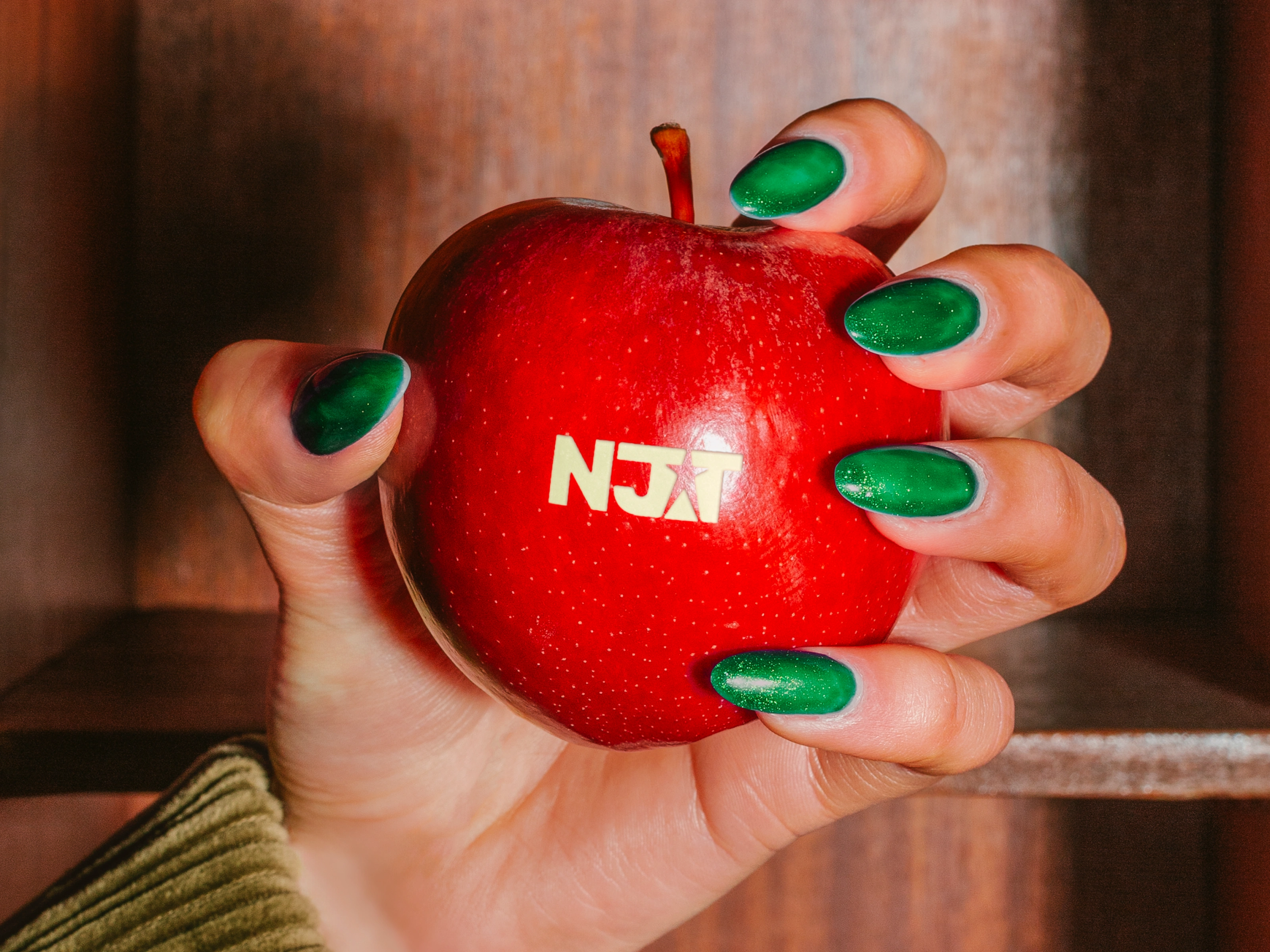
A brand built for its community
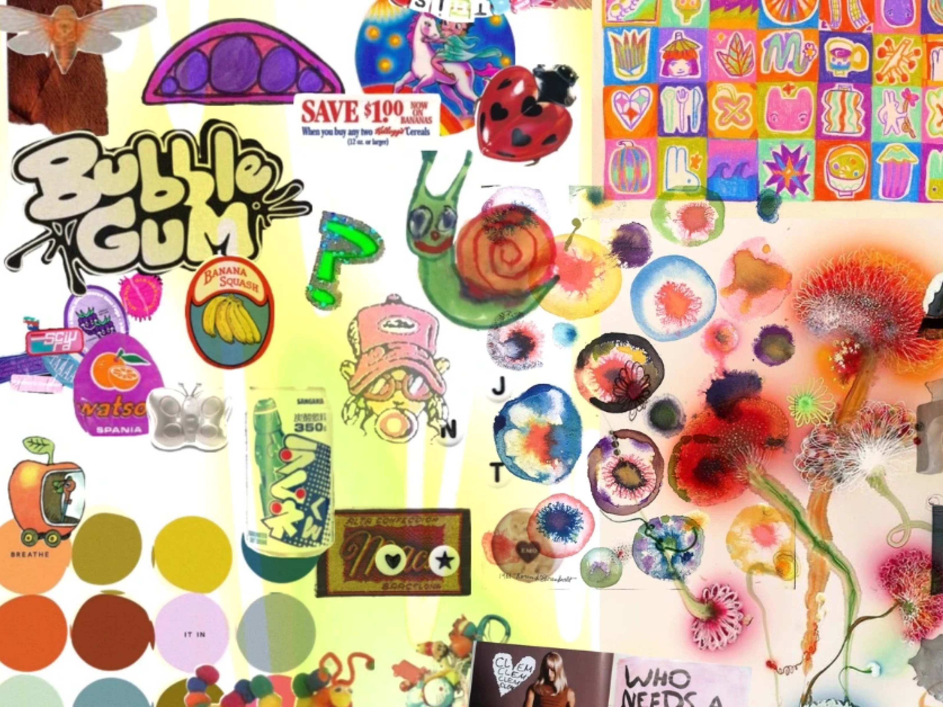
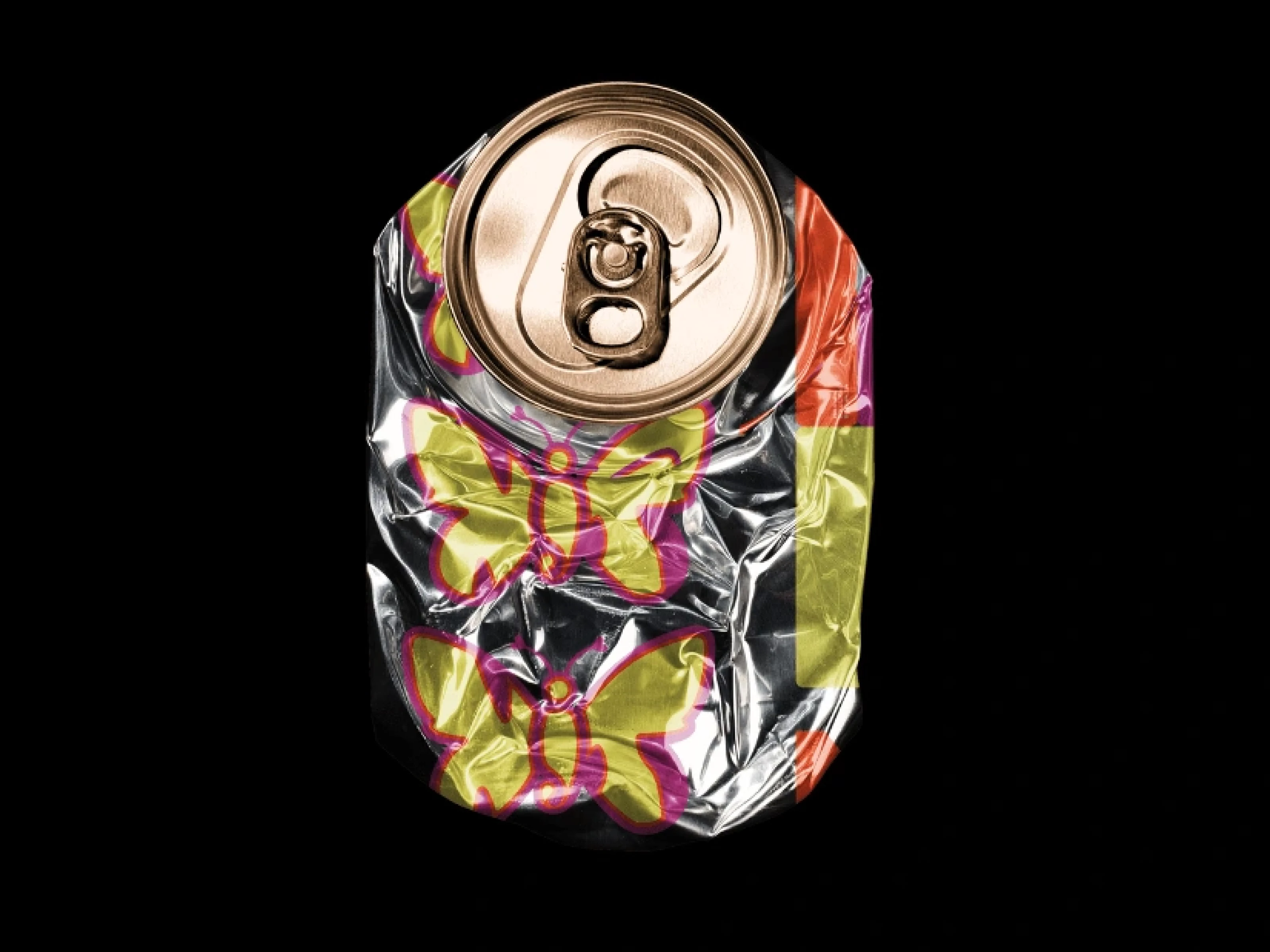
NotJustTrash are a sustainable fashion brand with a strong Depop following. The identity needed to feel nostalgic, inclusive, and recognisable: fitting for a brand built on individuality and second-hand culture.
Accessibility and colour
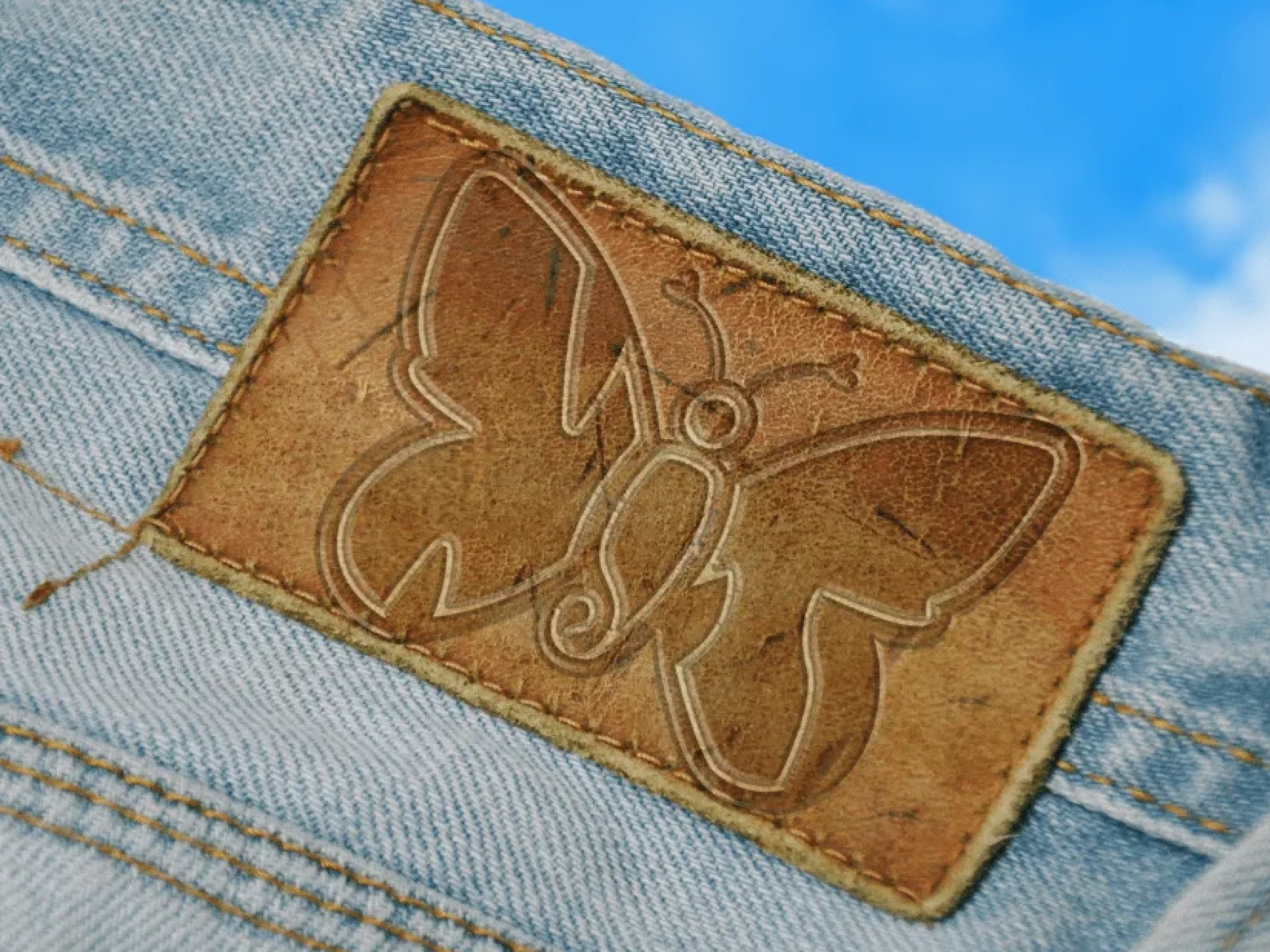
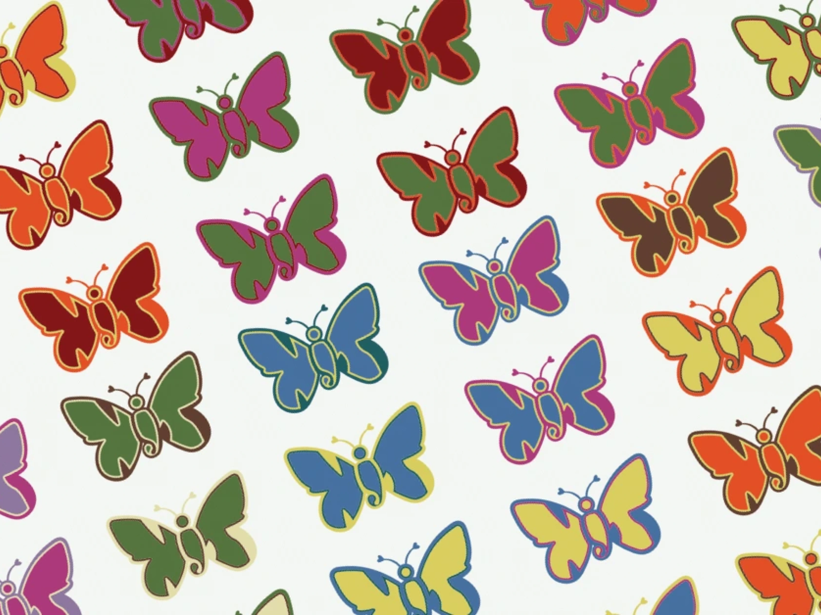
Accessible typography was prioritised alongside the custom logo. A palette this size only works if the colour relationships, contrast ratios, and combinations have been thought through carefully.
Like this project
Posted Jun 26, 2024
Brand identity and logo design for DTC sustainable, second-hand fashion brand with a cult Depop following.
Likes
5
Views
136
Clients
NJT


