Landing page for a personal development course

Ahmed Alsayed

Landing page for a personal development course

Landing page hero
The Challenge
A personal development brand needed a landing page for their specialized leadership course. The page had to do two things at once: establish credibility with professionals browsing skeptically, and convert that trust into course sign-ups.
The Approach
I built the layout around restraint. A muted, tonal color palette (shades and tints of a single hue) keeps the page feeling calm and authoritative, which matters when you're selling self-improvement to busy people who've seen too many loud, overpromising course pages.
Generous whitespace separates each content block, giving the eye clear paths through the page hierarchy: headline, value proposition, course breakdown, social proof, and CTA. Nothing competes for attention. Every section earns the scroll to the next one.
The typography and spacing were tuned for readability first. The goal was a page that feels like a conversation, not a sales pitch.
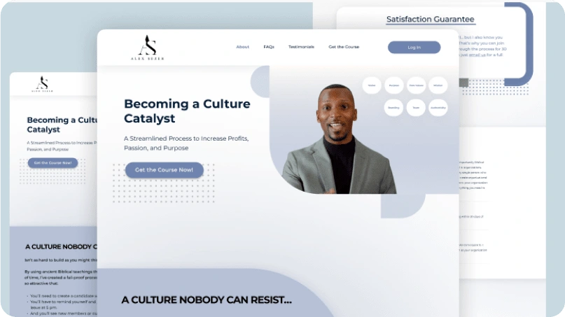
Course section detail
Key Design Decisions
Minimalist layout that lets the course content speak for itself
Tonal color system using shades of a single color for depth without visual noise
Strategic whitespace to improve focus, readability, and perceived quality
Clear conversion flow guiding visitors from curiosity to sign-up with minimal friction
The Result
A landing page that balances professionalism with approachability, designed to convert visitors who value substance over hype.
Like this project
Posted Aug 30, 2023
Designed a conversion-focused landing page for a leadership-oriented personal development course, using a clean minimalist layout, muted color palette, and strategic whitespace to build trust and drive sign-ups.
Likes
0
Views
68