
Role
Brand direction, copywriting, UX, web design for desktop and mobile
Founder's statement:)
For a long time our website said what every studio says. We wanted it to sound like us, two people who care about the fast + efficient work and like talking to founders directly. An extended team, doing the job. So we showed our prices, wrote the copy ourselves and kept the contact form one click away on every page. The people who reach out now are a better fit, & our first calls feel like the start of a project instead of a sales pitch:) - Stefan Hendrickx, Ziva Valentincic | Studio /03
Overview
Studio /03 is a two person boutique design studio from Ljubljana. Stefan and I design brands, websites and products for tech teams in the EU, UK and US. We needed a website that brings in serious international clients and answers their questions before the first call, so we spend our calls talking about the project instead of explaining how we work.
The challenge
We all know that the hardest design project is the designer's own:) Most studio websites look the same. A big statement, a grid of logos and a contact button. Founders who hire for design have seen hundreds of them, so they skim fast and leave if they can’t tell what you do, how much it costs and whether you’re the right fit.
We had three goals. Show that two people can handle the work of a full team. Be open about pricing, which most studios hide. And make getting in touch so easy that a founder can do it in a minute.
What we did
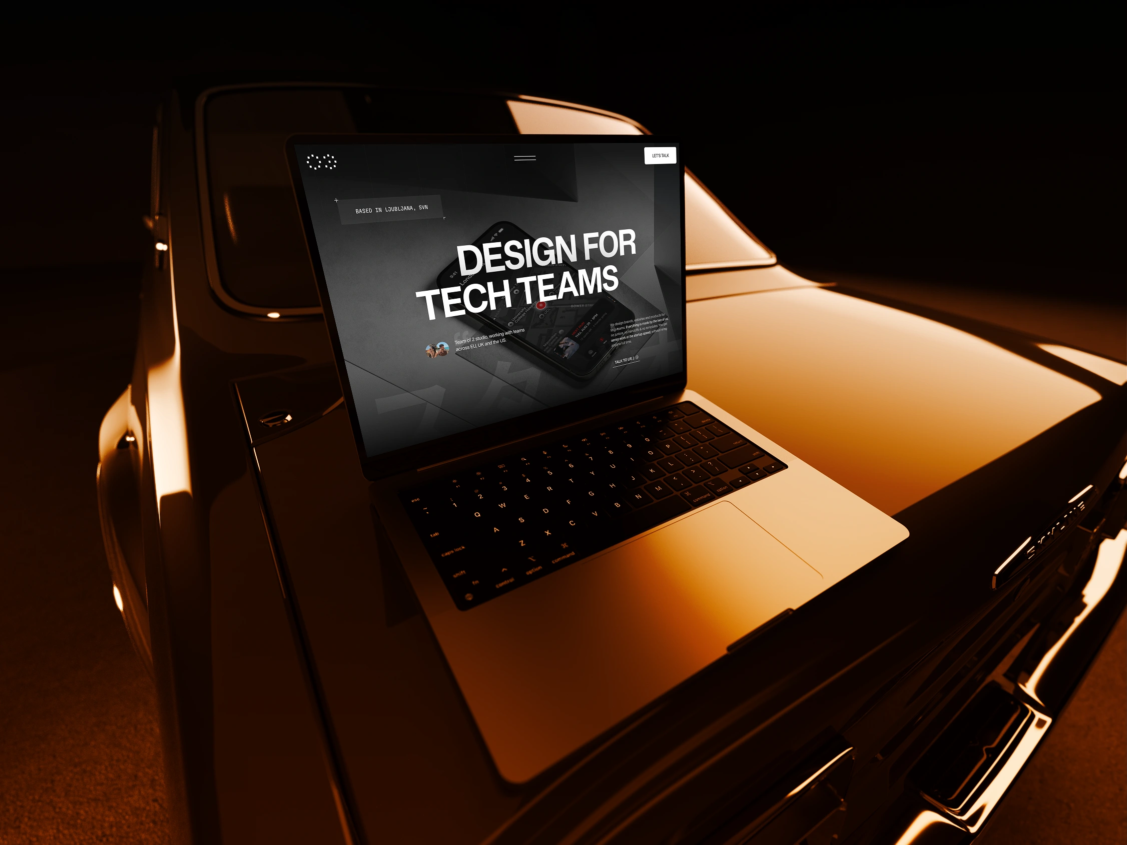
Built a dark visual direction with warm orange accents, bold uppercase headings and lots of space, so the work stands out and the site feels confident without shouting
Wrote all the copy ourselves in a direct, human voice, with small playful details like a “:)” and a Japanese "studio" word in the hero
Put the work first, with eight case studies right after the intro, each leading to a quick inquiry
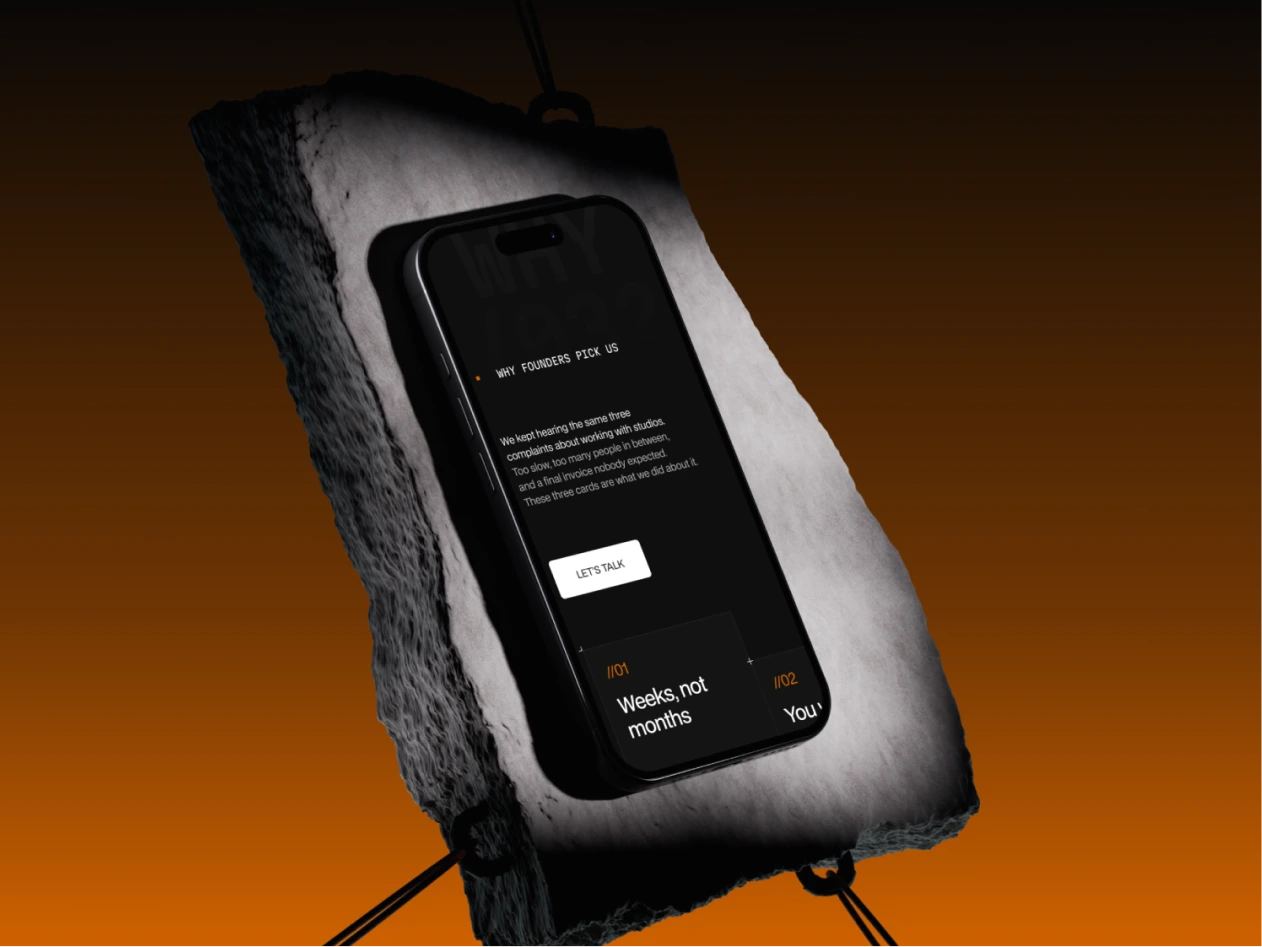
Placed short quotes between the projects that explain why we take only two or three clients at a time
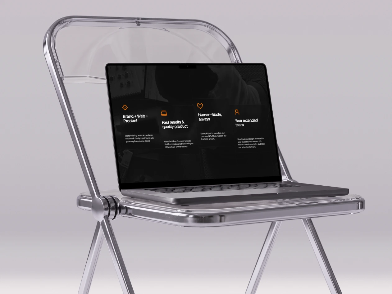
Designed a services section where each service has its own call button, so visitors can book for one piece or the full design side
Listed real prices for brand identity, web design, product design and monthly retainers
Mapped our process in seven clear steps, from the first call to after care
Created a contact drawer that slides in from any page and asks for project type, timeline, budget and how people found us
Designed every page for desktop and mobile with the same rhythm on both
Key decision
We show prices up front. Hiding prices means more calls with people who can’t afford you and fewer with people who can. Public prices filter leads before they reach us, and the founders who book already know what to expect.
The contact form never takes you away from the page. A drawer keeps visitors where they are, so they can read a case study, open the form, ask a question and go back. It also asks for budget and timeline, so we can reply with a real answer within the hour.
We talk about being small. Instead of pretending to be a big agency, we explain why two people and a short client list means faster work and no handoffs. That’s the main reason founders choose us:)
How fast can we take you to best in class?😎
Živa, Studio /03
0 likes · 1 view · Nov 14, 2026
Studio /03 is our own design studio, and we designed its website to unslop the internet. Founders now know how we work, what it costs and how to reach us:)


