Tekniska - Branding & UX/UI
Everything connects
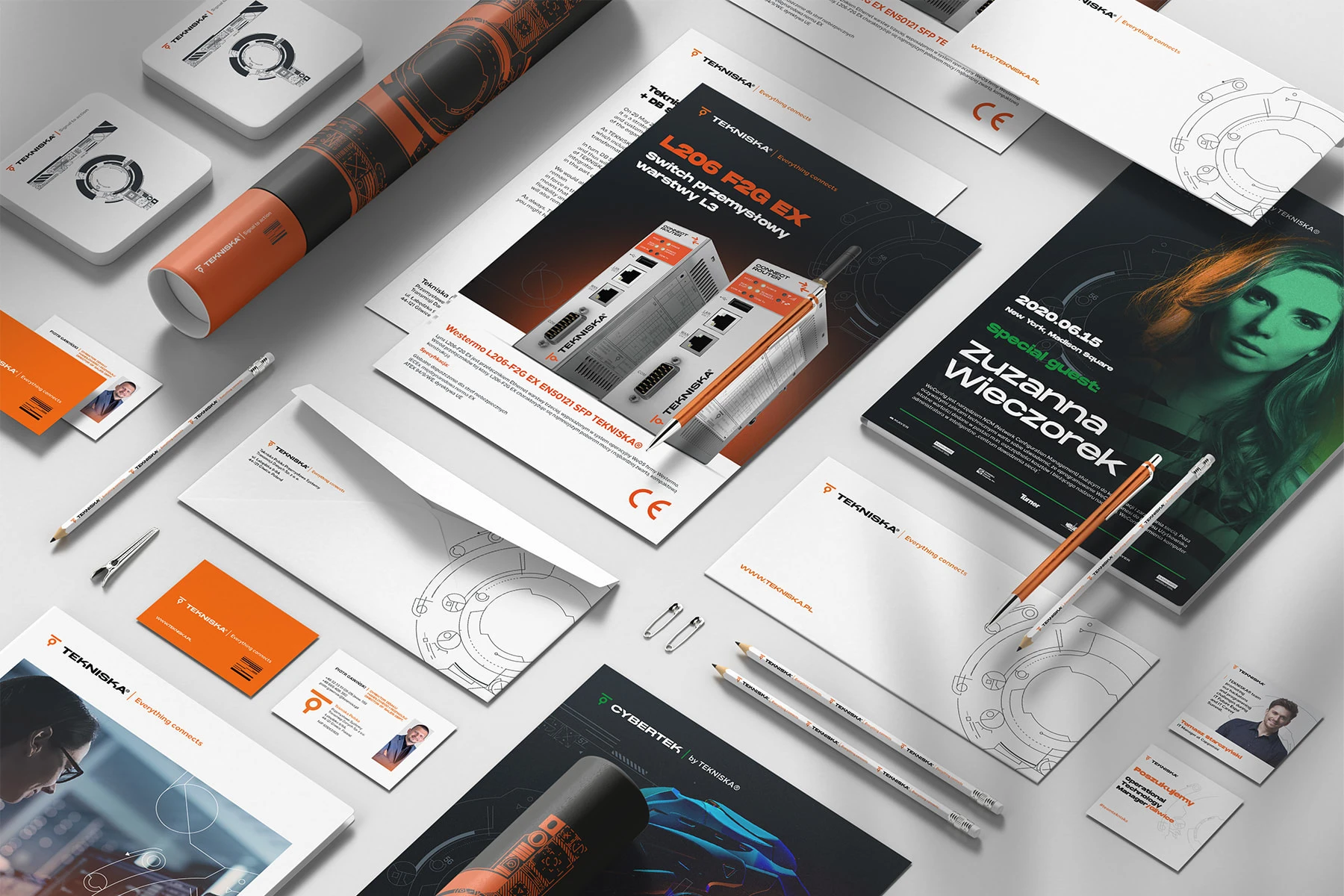
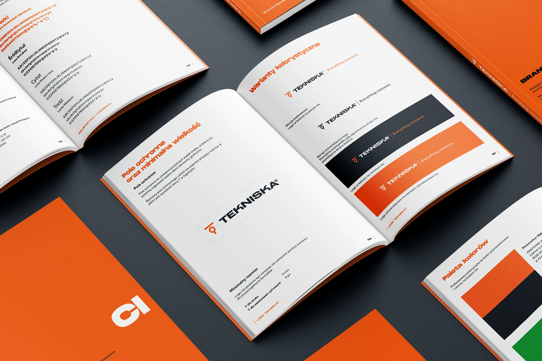
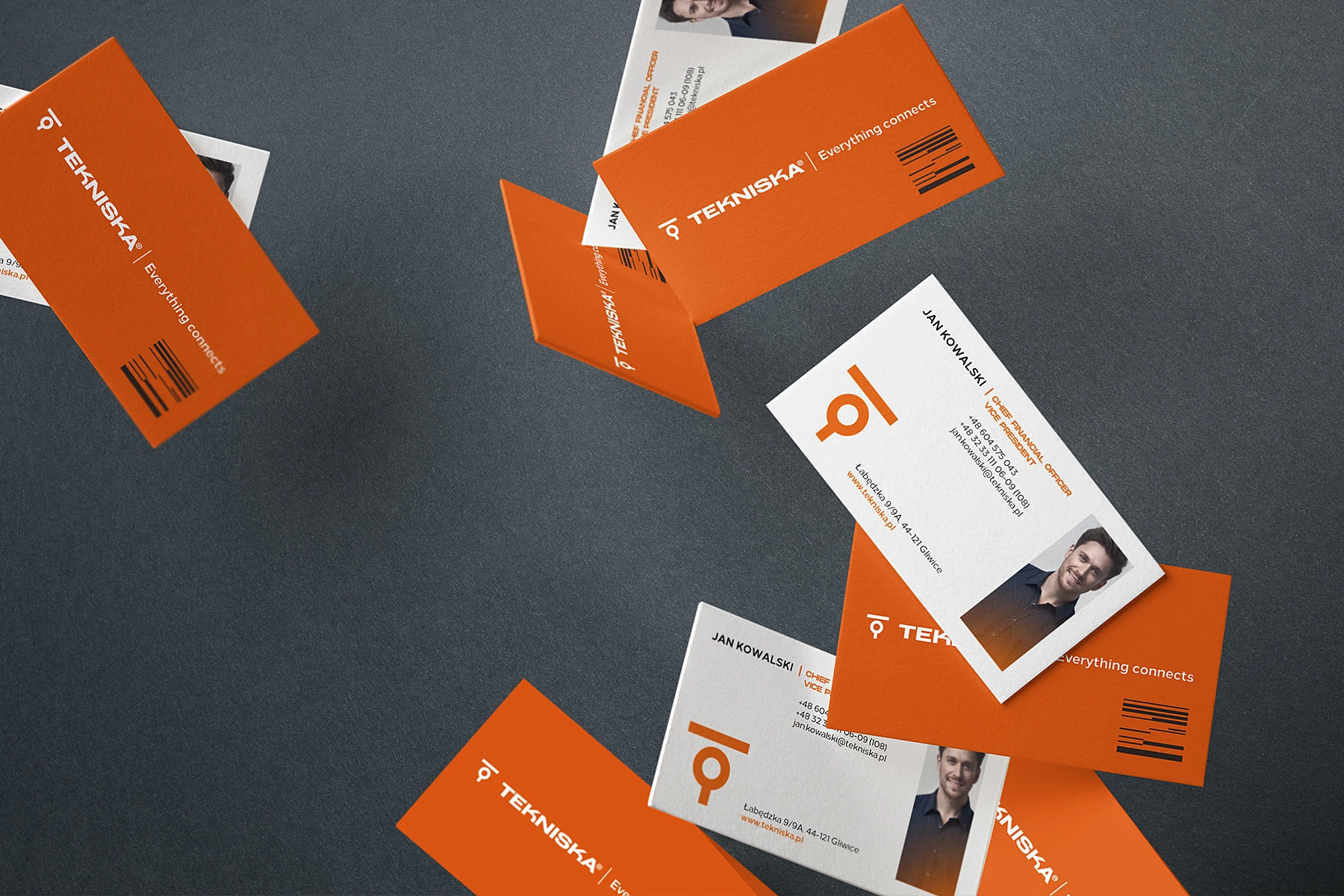
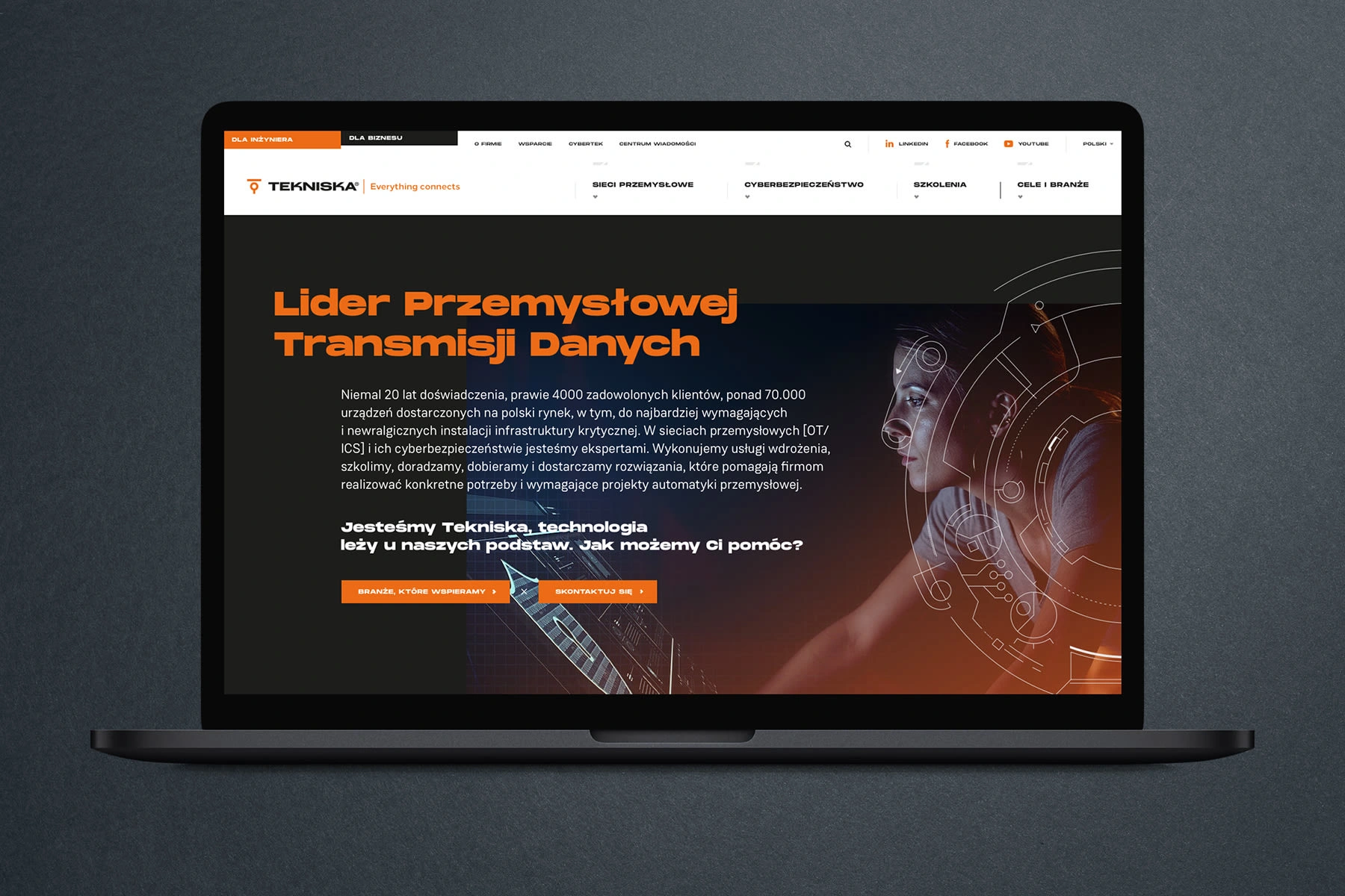
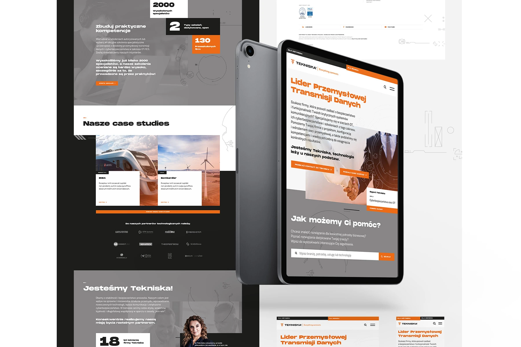
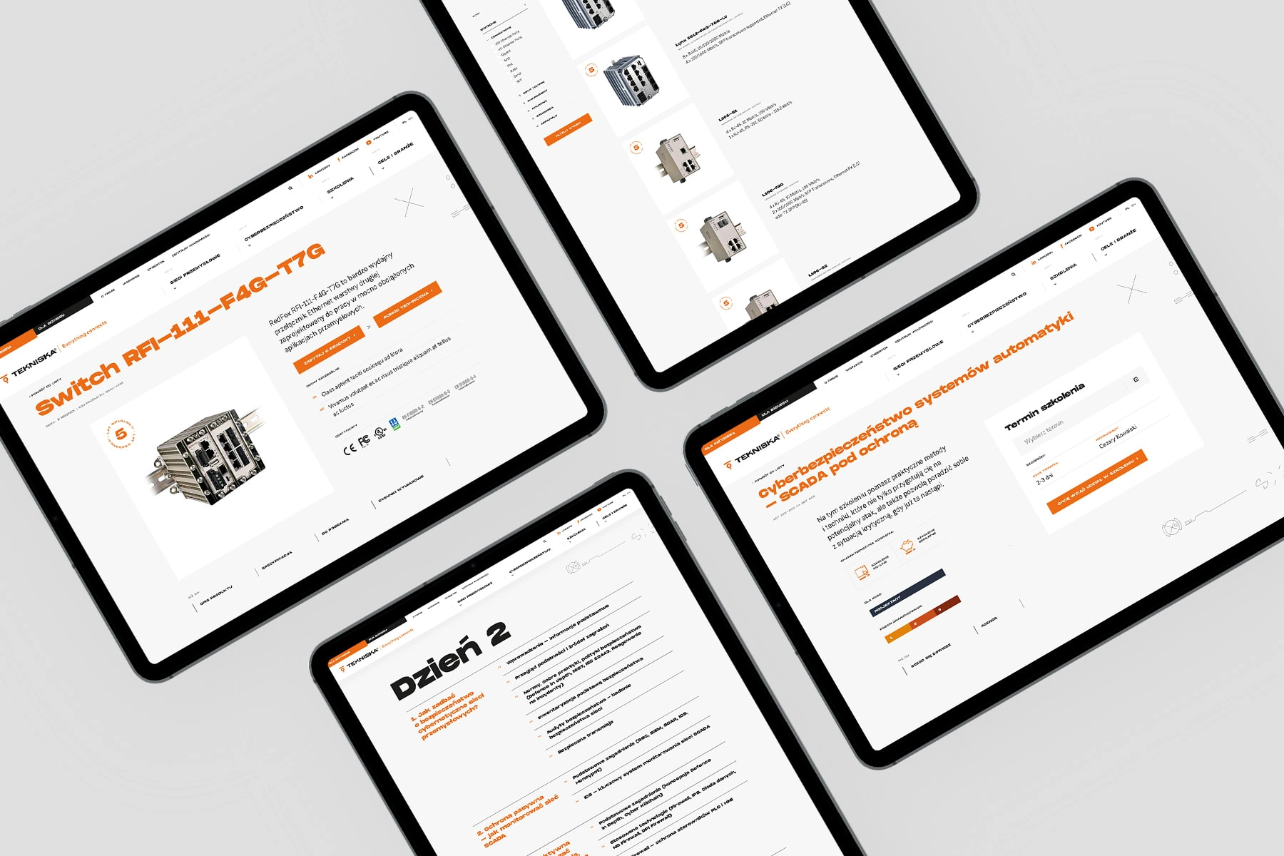
Tekniska has contacted CHALLENGE with a clear aim to build a new website. Yet after short time, we came to the conclusion that building business and marketing strategy is necessary, and it should be the first step towards a full rebranding of the company. I. Lifting logo Evolution, not revolution. The changed typography made the logo more clear, serious and solid. The characteristic sign with letter T has been transferred to the new logo, but the oval square has been discarded. We improved the proportions of the sign and made the overall colors more contrasting and modern.


Like this project
Posted Apr 11, 2024
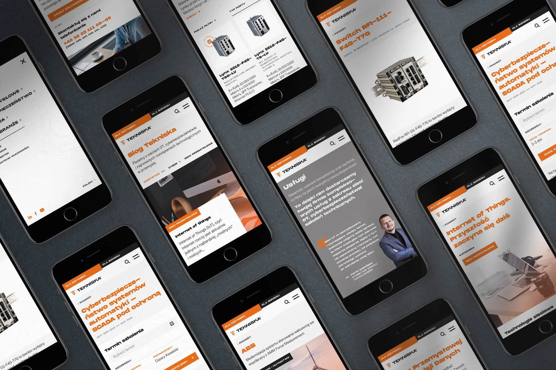
Tekniska has contacted CHALLENGE with a clear aim to build a new website.
Likes
0
Views
3

