Fangofood(website redesign)
Introduction:
Embarking on a mission to bring the finest meats to your table, Fango Food realized the need for a digital overhaul. The redesign of FangoFood.com aimed to align our online presence with the exceptional quality of our products and the expectations of our valued customers.
Old Design Analysis:
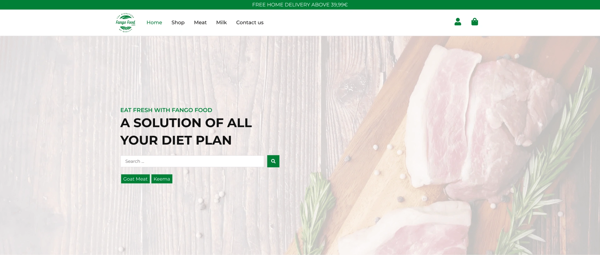
The original Fango Food website, though functional, presented challenges with outdated visuals and a less-than-optimal user journey. The need for a visually appealing, user-friendly, and modern online butcher shop was apparent.
Navigation Bar:
The redesigned website introduces a significantly cleaner navigation bar, providing a more organized and modern aesthetic. The streamlined design enhances the user experience, making it easier for visitors to navigate through the website seamlessly.
Hero Section:
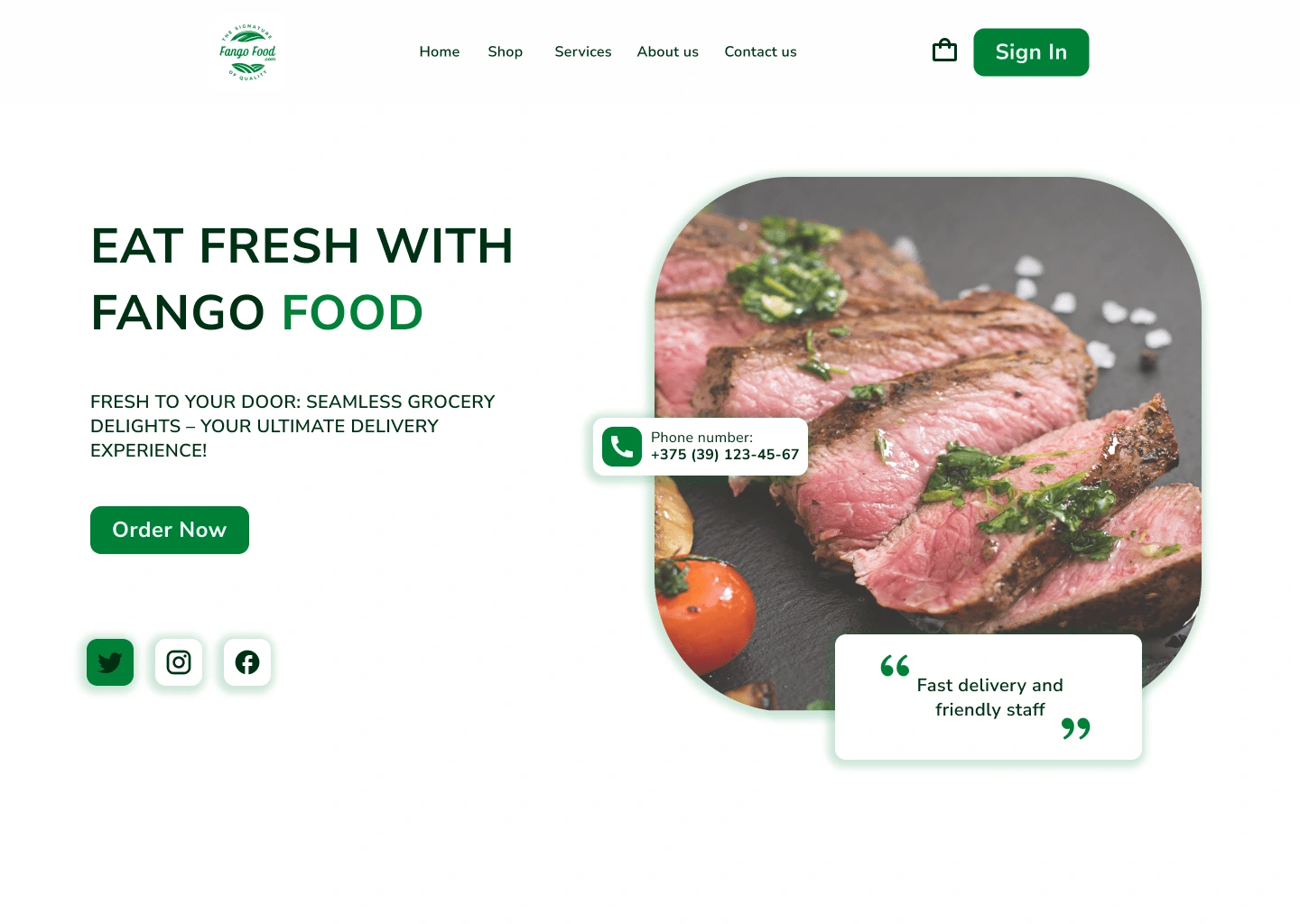
In the revamped hero section, notable changes have been implemented to elevate the overall visual appeal and user engagement. The meat image, now positioned on the right side, creates a balanced and aesthetically pleasing composition. On the left, a carefully crafted title and subtitle adhere to a well-considered visual hierarchy, utilizing bold text and regular font weight with precise spacing for optimal readability.
Additional Elements:
Mobile Number Info: The addition of mobile number information on the right side enhances accessibility, providing users with direct contact details.
Customer Review: A strategically placed customer review emphasizes our commitment to delivering the best quality meat, instilling trust and confidence in our products.
CTA Optimization:
The number of calls-to-action in the hero section has been refined for a more focused user interaction. Instead of two CTAs, the new design presents a single, compelling call-to-action, guiding users efficiently.
Social Platform Integration:
Acknowledging the significance of social connectivity, links to our Instagram and Facebook profiles have been seamlessly integrated. This addition fosters a stronger online presence and facilitates user engagement across multiple platforms.
New design:
Our Service Section:
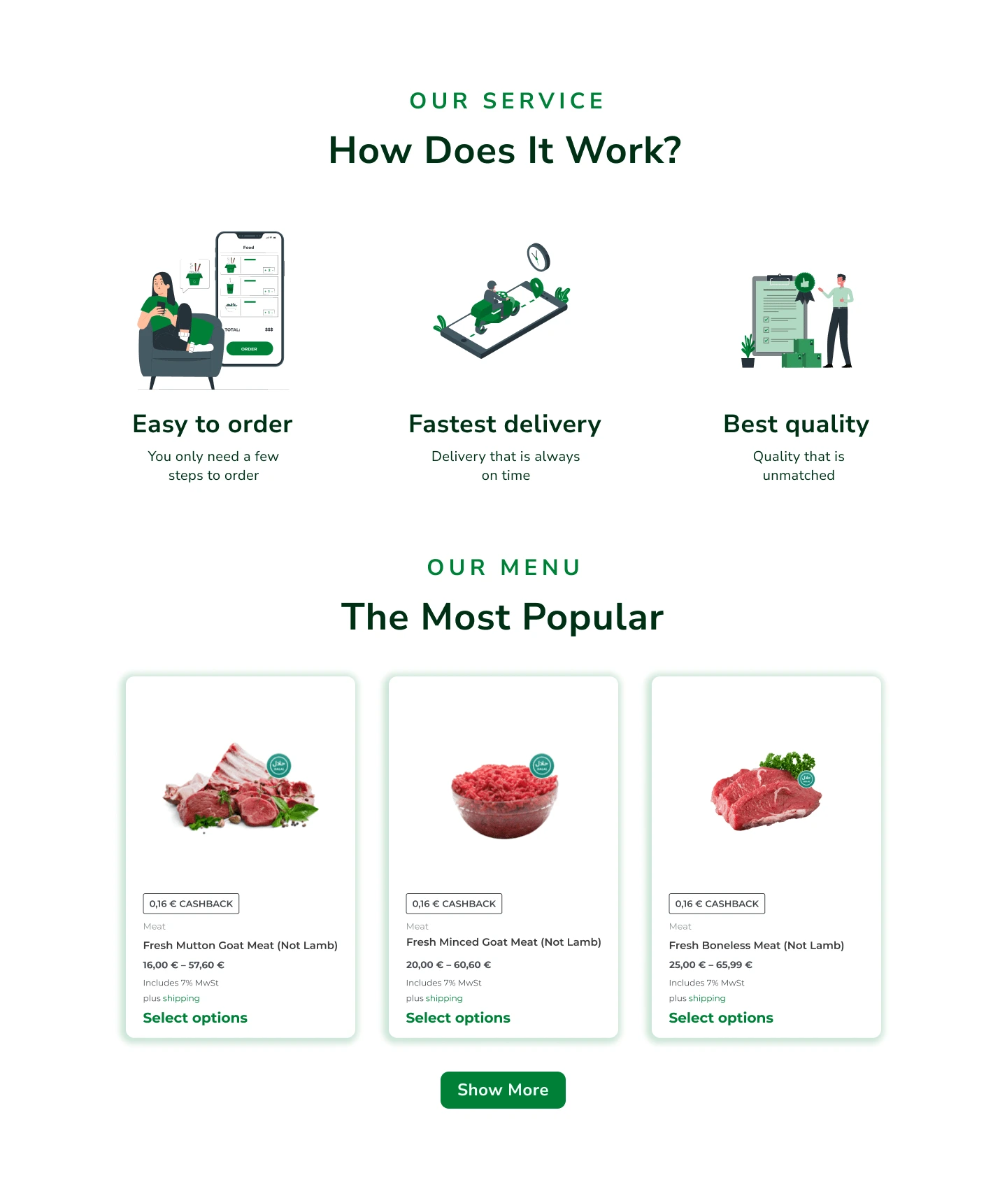
Introducing the "Our Service" section, we've enhanced the user experience by providing valuable insights into how our products work. This section features three compelling illustrations, each accompanied by a title and subtitle. Emphasizing the pillars of our service—easy ordering, fastest delivery, and best quality—this addition serves as a clear and engaging introduction to the functionality of our app.
Best Selling Products Section:
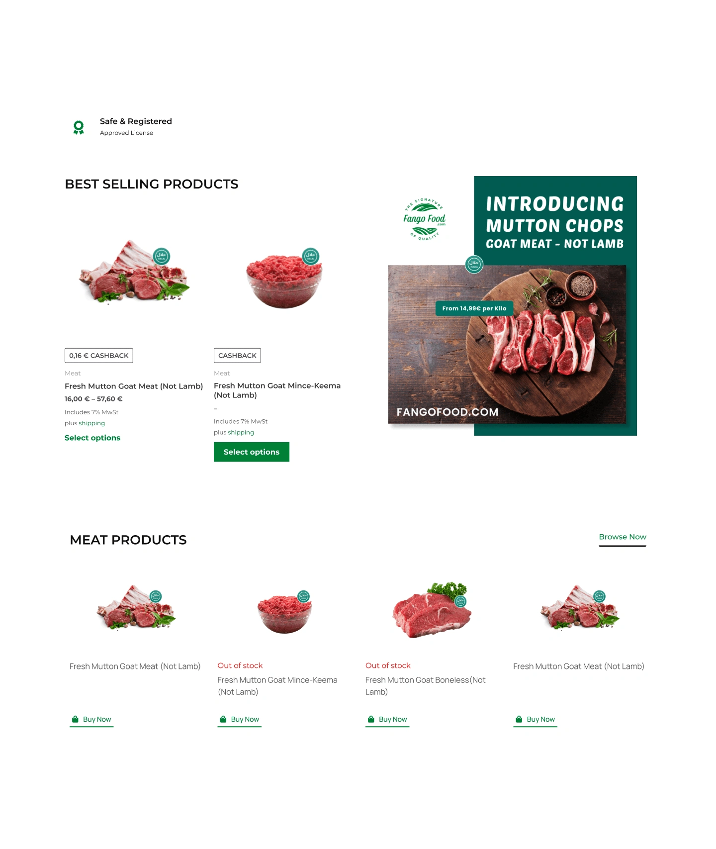
The revamped "Best Selling Products" section focuses on a concise display of our top-performing items. With three carefully curated product cards, this section offers a visually appealing snapshot of our most sought-after products. The streamlined design promotes a user-friendly browsing experience, encouraging visitors to explore and make informed purchase decisions.
Meat Products Section:
In the redesigned "Meat Products" section, we've optimized the display for improved engagement. A series of meticulously designed product cards showcases our diverse range of meat offerings. The refined layout provides users with a visually appealing and organized presentation, making it easier to browse and discover our premium meat selections.
Visual Impact:
These changes contribute to a more visually impactful and informative layout, guiding users through the app's functionalities, highlighting best sellers, and showcasing our extensive range of meat products. The addition of the "Our Service" section enhances transparency and sets clear expectations for users.
New design:

Our Reviews Section:
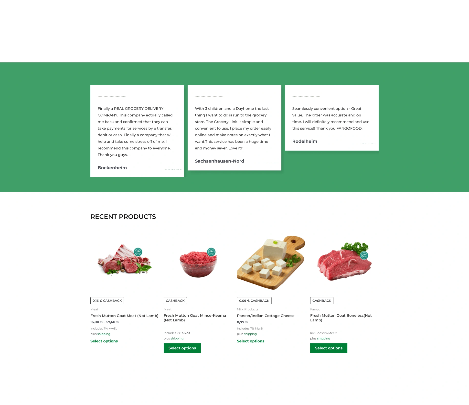
Elevating the user experience, we introduced the "Our Reviews" section with a dedicated title. On the left side, an engaging illustration enhances visual appeal, setting the stage for customer testimonials. Each review is now accompanied by an image of the customer, their name, the star rating they gave, and a quote encapsulated within double quotes. This thoughtful presentation adds authenticity and depth to our customer feedback.
Most Recent Products Section:
In the refined "Most Recent Products" section, we've optimized the display for a more engaging showcase. Four meticulously designed product cards now present the most recent purchases, offering users a snapshot of our latest offerings. The updated layout ensures a visually appealing and organized presentation of our freshest products.
Newsletter Subscription:
A new addition to our website is the "Newsletter Subscription" box. Positioned strategically to keep our customers informed, this feature allows them to stay updated on new product launches, special offers, and the availability of specific products. The subscription box enhances our communication channels, fostering a stronger connection with our audience.
Visual Impact:
These changes contribute to a more visually impactful and user-friendly design. The addition of the "Our Reviews" section with enhanced visual elements and the "Newsletter Subscription" box aims to create a more engaging and informative experience for our users.
Old design:
New design:

Unified Footer Design:
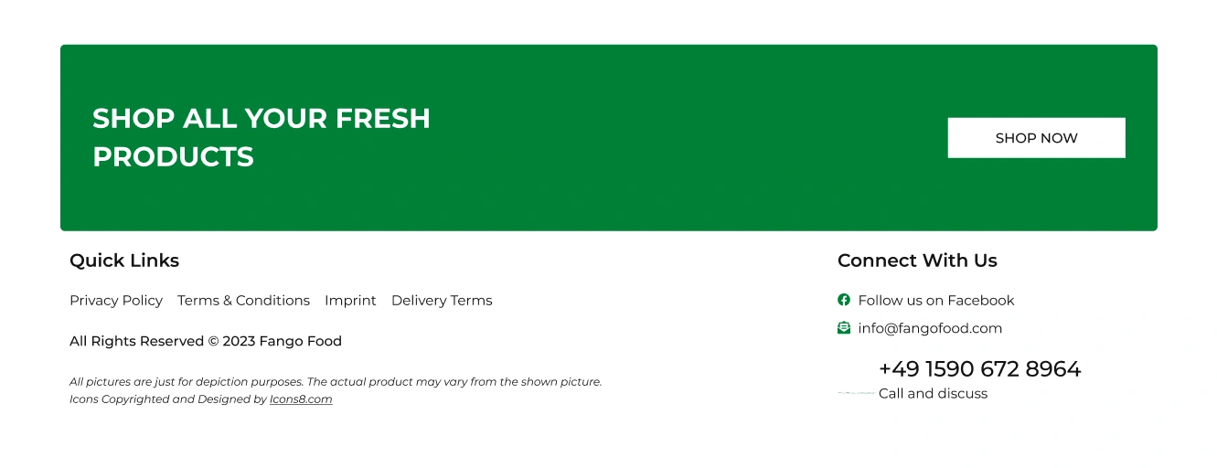
In the redesign, we've streamlined and consolidated the footer to provide a more cohesive and user-friendly experience. The old design featured two separate footers—one in green and another in white. We have seamlessly combined the relevant information from both into a single, unified footer, enhancing accessibility and visual harmony.
Shop All Your Fresh Products:
The heading "Shop All Your Fresh Products" takes center stage in the redesigned footer. This clear and concise call-to-action invites users to explore our diverse range of fresh offerings. The familiar "Shop Now" button, in a visually cohesive design, ensures a seamless transition for users ready to make a purchase.
Quick Links and Connect With Us:
In the unified footer, we've integrated the menu from the white footer, now labeled as "Quick Links." This section provides quick access to essential pages, facilitating easy navigation for users. Additionally, the "Connect With Us" section ensures that users can effortlessly stay connected via social platforms and contact us for any inquiries.
Contact Information:
To maintain accessibility, we've included the phone number in the footer, ensuring that users can reach out for support or inquiries conveniently.
Visual Cohesion:
This consolidation not only optimizes the use of space but also creates a more visually cohesive and aesthetically pleasing design. The unified footer contributes to a seamless browsing experience, presenting essential information in a structured and accessible manner.
Goals and Objectives:
Our primary objectives included:
Elevating User Experience: Creating a seamless customer journey from browsing to checkout.
Showcasing Quality: Communicating the superior quality of our meat products through compelling visuals and informative content.
Optimizing for Mobile: Ensuring a smooth experience across all devices, with a specific focus on mobile users.
Design Process:
Our redesign process involved collaborative brainstorming, wireframing, and extensive usability testing. We iterated on designs based on valuable user feedback, ensuring a user-centric approach in every decision made.
Changes Made:
Usability Improvements:
Intuitive Navigation: Simplified menu structures for easy product discovery.
Efficient Checkout: A one-click checkout process for a faster and more convenient shopping experience.
Visual Enhancements:
High-Quality Imagery: Updated visuals showcasing our premium meats in their finest form, enhancing the overall aesthetic.
Modern Design Elements: A refreshed color palette and typography to convey a contemporary and trustworthy image.
Conclusion:
The Fango Food website redesign not only addressed the challenges of the old design but also elevated the entire shopping experience for our customers. The visually enticing and user-friendly platform now perfectly mirrors the premium quality of our meats, fostering a stronger connection with our audience.
Like this project
Posted Apr 22, 2024
A website redesign assignment from one of the companies.
Likes
0
Views
5


