Luxury Event & Concierge Website
Oladotun Olayinka
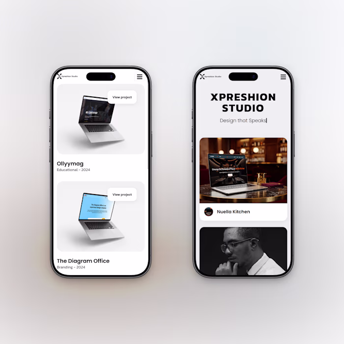
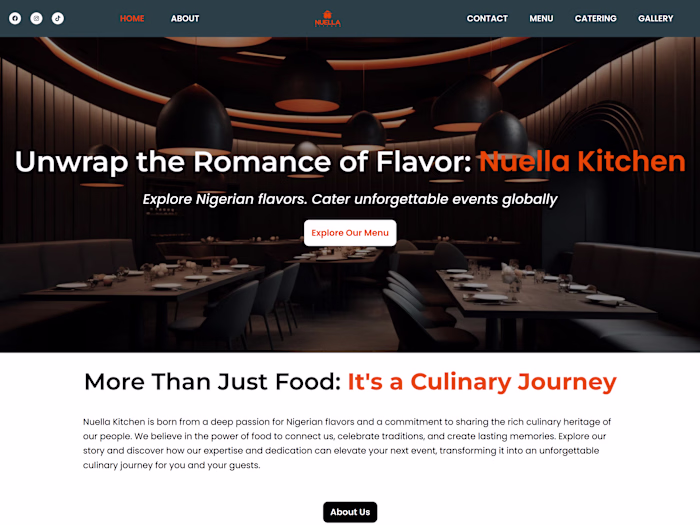
Luxury Event & Concierge Website (Web + Mobile):
Designed a premium, minimalist website for a luxury events brand focused on trust, clarity, and restraint.
Goal: help visitors understand services fast and move into enquiry without visual noise.
Approach: built a simple visual system (type, spacing, palette) and designed mobile-first pages with clear hierarchy and clean CTAs.
Key decisions: dark neutrals with warm accents, generous whitespace, strong typography, minimal UI patterns.
Result: an elegant, conversion-ready site that feels high-end without being flashy and can scale as the brand grows.
Like this project
Posted Feb 6, 2026
Luxury Event & Concierge Website (Web + Mobile): Designed a premium, minimalist website for a luxury events brand focused on trust, clarity, and restraint. ...
Likes
0
Views
1