The mobile version was engineered

View completed workwww.behance.net
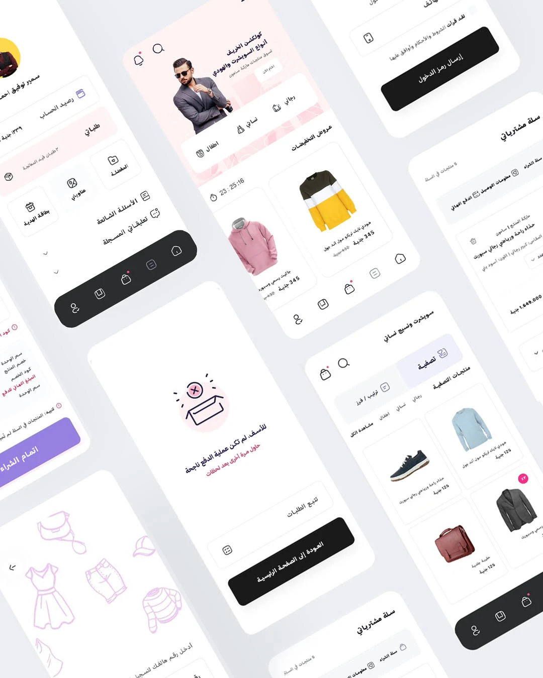
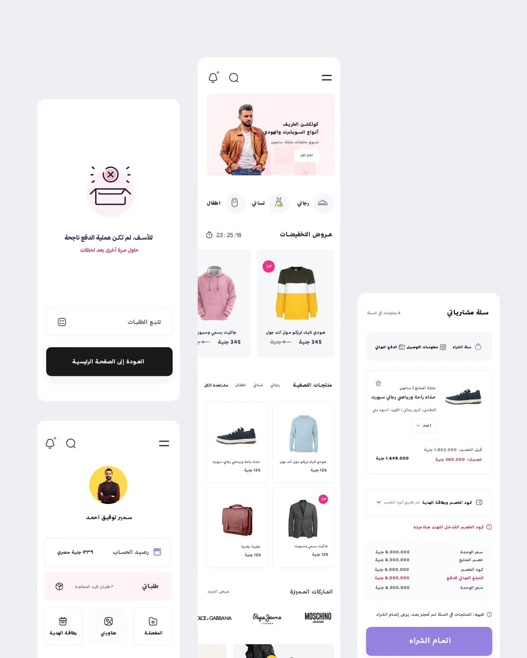
The mobile version was engineered as a web app following a rigorous Mobile-First methodology. In this context, screen real estate constraints didn't lead to feature reduction; instead, they drove intelligent content prioritization. The primary objective was to architect a swift, frictionless shopping flow optimized for on-the-go users.
Crucially, the mobile UX was not merely a downscaled version of the desktop interface. By implementing a persistent Bottom Navigation, streamlined interaction patterns, and optimized category access alongside strategic Micro-Interactions we delivered a lightweight, high-performance web experience that closely mimics the fluidity and responsiveness of a native application.
تم تصميم النسخة الخاصة بالهواتف المحمولة كتطبيق ويب وفق منهجية Mobile-First صارمة. وفي هذا السياق، لم تؤدِّ محدودية مساحة الشاشة إلى تقليل الميزات، بل كانت دافعًا لاعتماد أسلوب ذكي في ترتيب أولويات المحتوى وعرضه. وكان الهدف الأساسي هو بناء تجربة تسوق سريعة وسلسة وخالية من التعقيدات، ومصممة خصيصًا للمستخدمين أثناء التنقل.
والأهم من ذلك، أن تجربة المستخدم على الهاتف لم تكن مجرد نسخة مصغّرة من واجهة سطح المكتب. فمن خلال تطبيق شريط تنقل سفلي ثابت (Bottom Navigation)، وأنماط تفاعل مبسطة، ووصول أسرع إلى الفئات والأقسام، إلى جانب استخدام تفاعلات دقيقة ومدروسة (Micro-Interactions)، تمكّنا من تقديم تجربة ويب خفيفة وعالية الأداء تحاكي بشكل كبير سلاسة واستجابة التطبيقات الأصلية (Native Apps).
0 likes · 0 views · Jun 13, 2026
The mobile version was engineered as a web app following a rigorous Mobile-First methodology. In this context, screen real estate constraints didn't lead to ...