
Khalid Abukotsh
UI/UX Designer | Framer & Wordpress Developer
New to Contra
Khalid is ready for their next project!
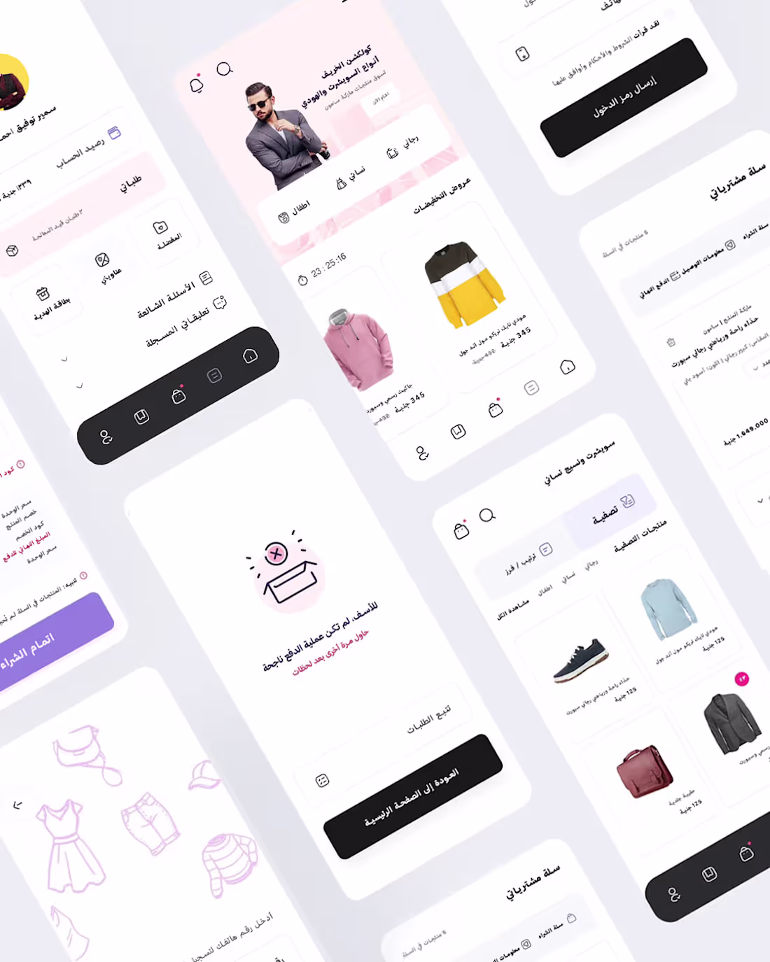
The mobile version was engineered as a web app following a rigorous Mobile-First methodology. In this context, screen real estate constraints didn't lead to feature reduction; instead, they drove intelligent content prioritization. The primary objective was to architect a swift, frictionless shopping flow optimized for on-the-go users.
Crucially, the mobile UX was not merely a downscaled version of the desktop interface. By implementing a persistent Bottom Navigation, streamlined interaction patterns, and optimized category access alongside strategic Micro-Interactions we delivered a lightweight, high-performance web experience that closely mimics the fluidity and responsiveness of a native application.
تم تصميم النسخة الخاصة بالهواتف المحمولة كتطبيق ويب وفق منهجية Mobile-First صارمة. وفي هذا السياق، لم تؤدِّ محدودية مساحة الشاشة إلى تقليل الميزات، بل كانت دافعًا لاعتماد أسلوب ذكي في ترتيب أولويات المحتوى وعرضه. وكان الهدف الأساسي هو بناء تجربة تسوق سريعة وسلسة وخالية من التعقيدات، ومصممة خصيصًا للمستخدمين أثناء التنقل.
والأهم من ذلك، أن تجربة المستخدم على الهاتف لم تكن مجرد نسخة مصغّرة من واجهة سطح المكتب. فمن خلال تطبيق شريط تنقل سفلي ثابت (Bottom Navigation)، وأنماط تفاعل مبسطة، ووصول أسرع إلى الفئات والأقسام، إلى جانب استخدام تفاعلات دقيقة ومدروسة (Micro-Interactions)، تمكّنا من تقديم تجربة ويب خفيفة وعالية الأداء تحاكي بشكل كبير سلاسة واستجابة التطبيقات الأصلية (Native Apps).
1
8
Hey, I'm Khalid.
I design custom social media content for businesses across all industries — gyms, food brands, dental clinics, and more.
What I'll deliver:
— Custom design in Photoshop & Illustrator — Not a template. Made from scratch. — 2 size variations per post — Source file on request — Fast communication & delivery
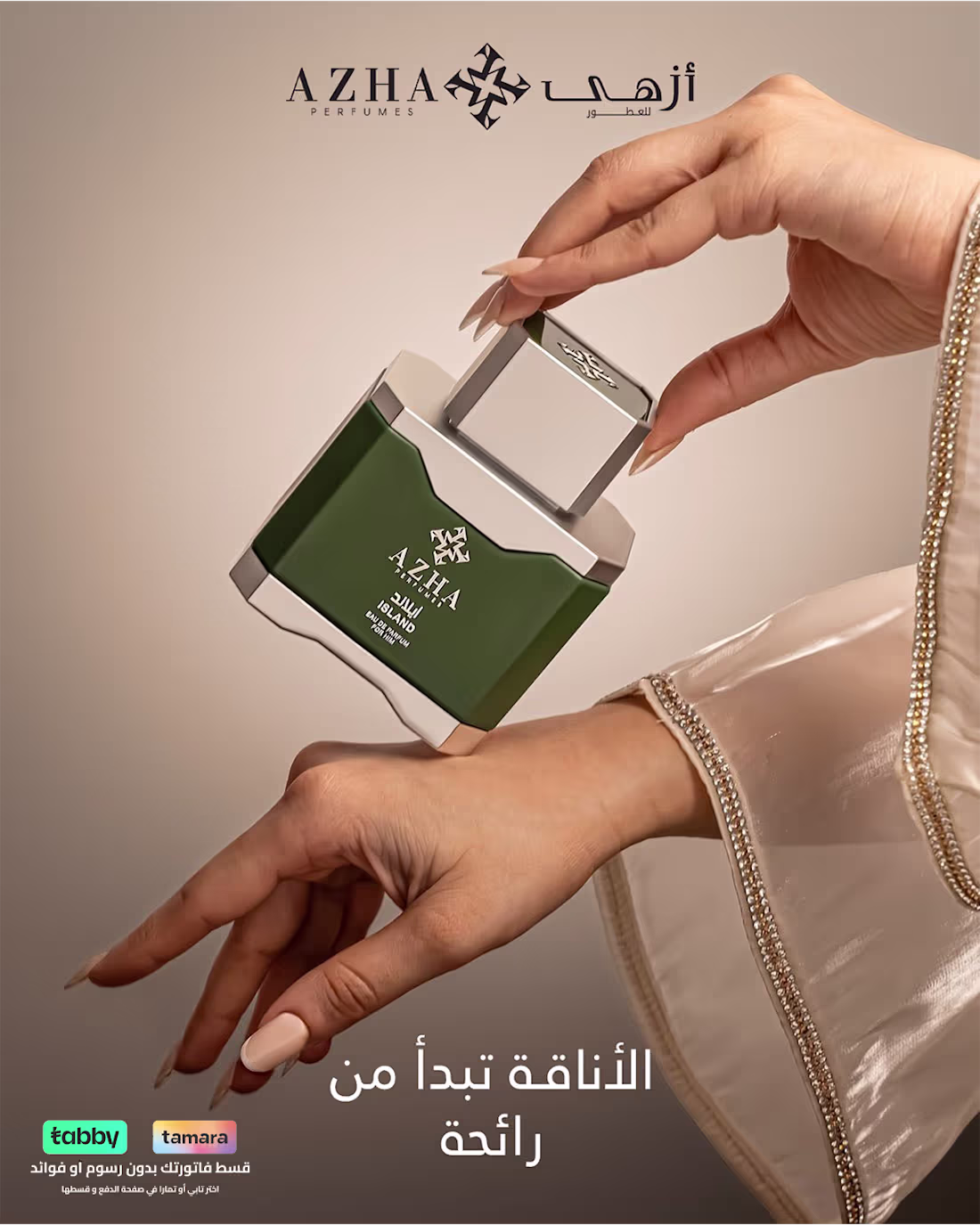
Check my Last work here (https://www.behance.net/gallery/250820379/Social-Media-for-AZHA)
You share your brand, I handle the rest.
Message me before ordering.
— Khalid 😊
0
14
شات جبت
0
5
Araamis
0
19
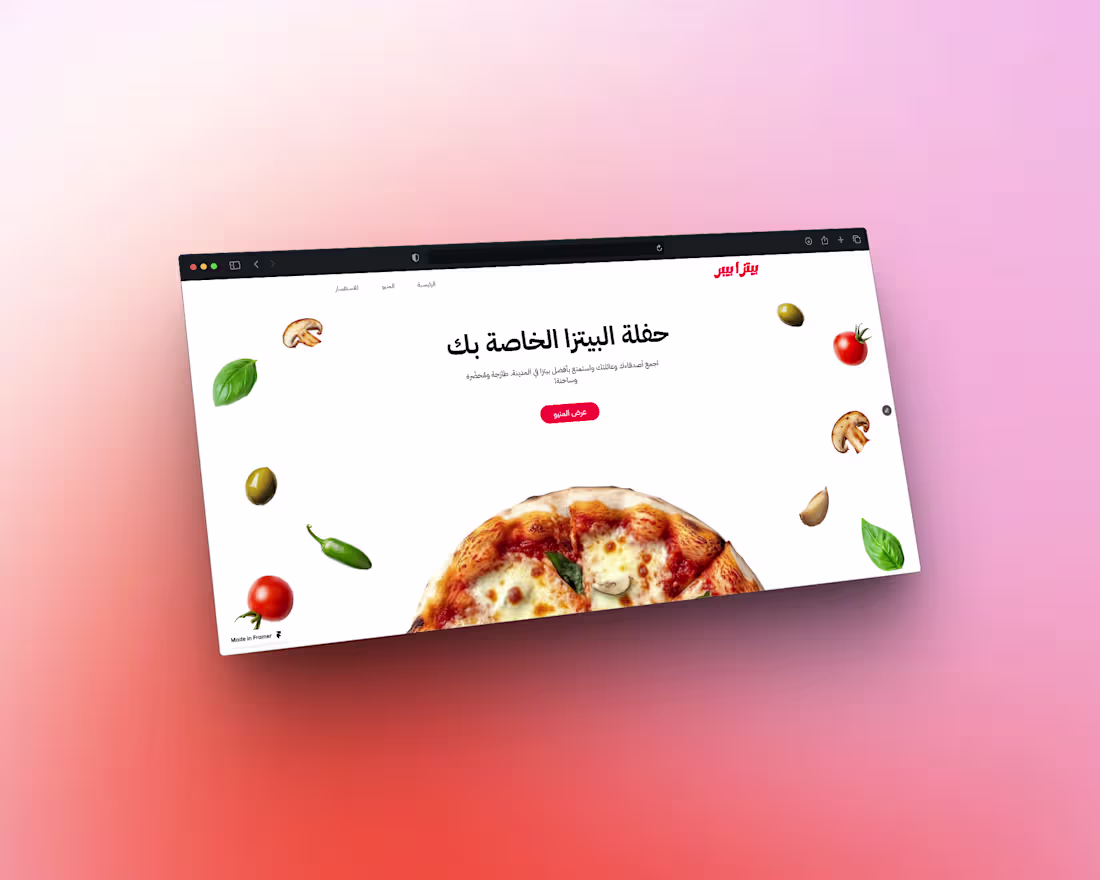
Piza Pepper
0
23
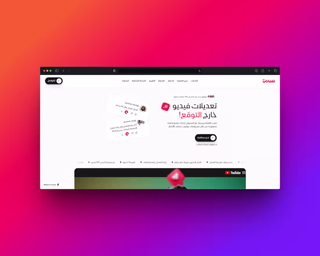
Filmati
0
22
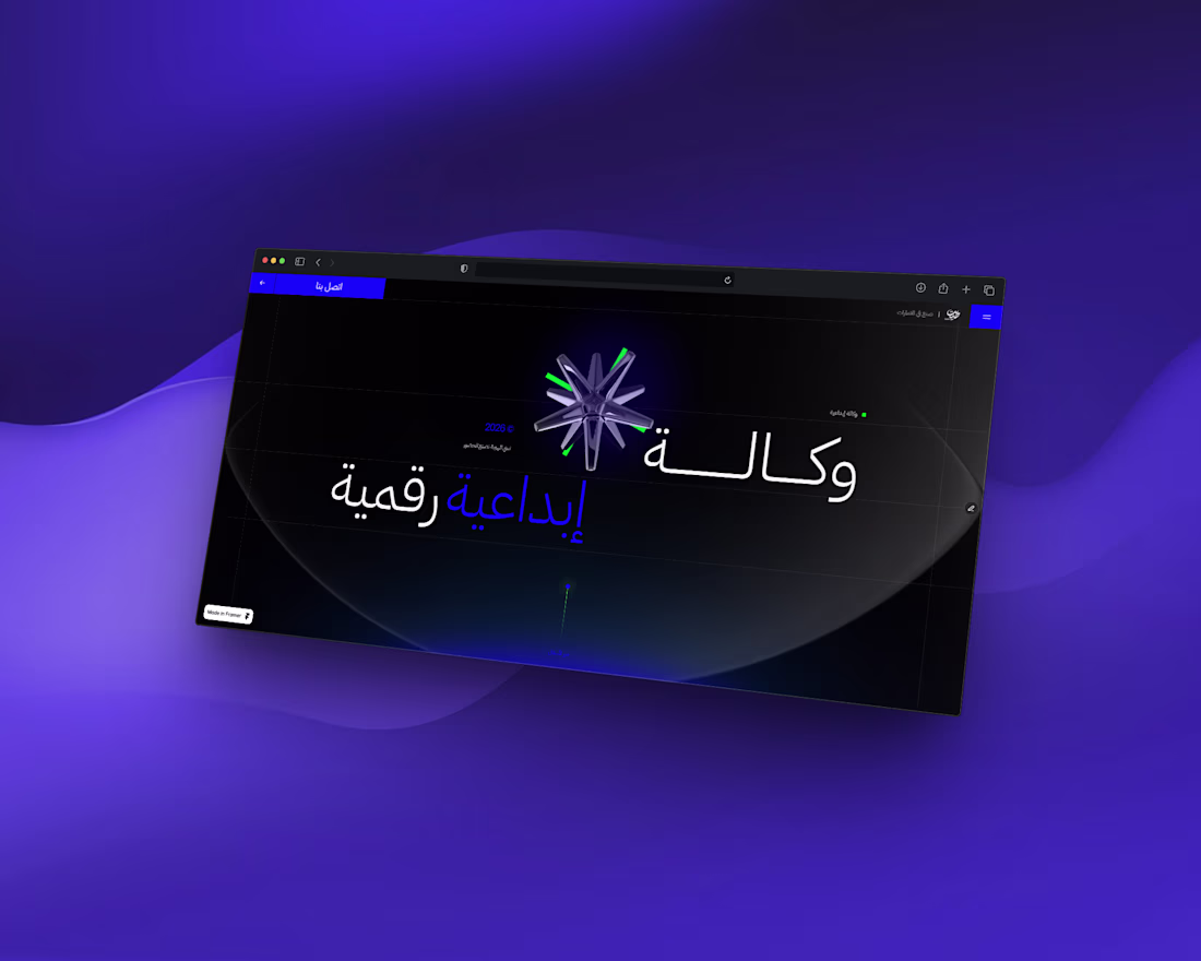
That Seet - Creative Advertising Agency
0
28