Multi-Data Point View Design for Ecoation
Michelle Walstra
Client Overview
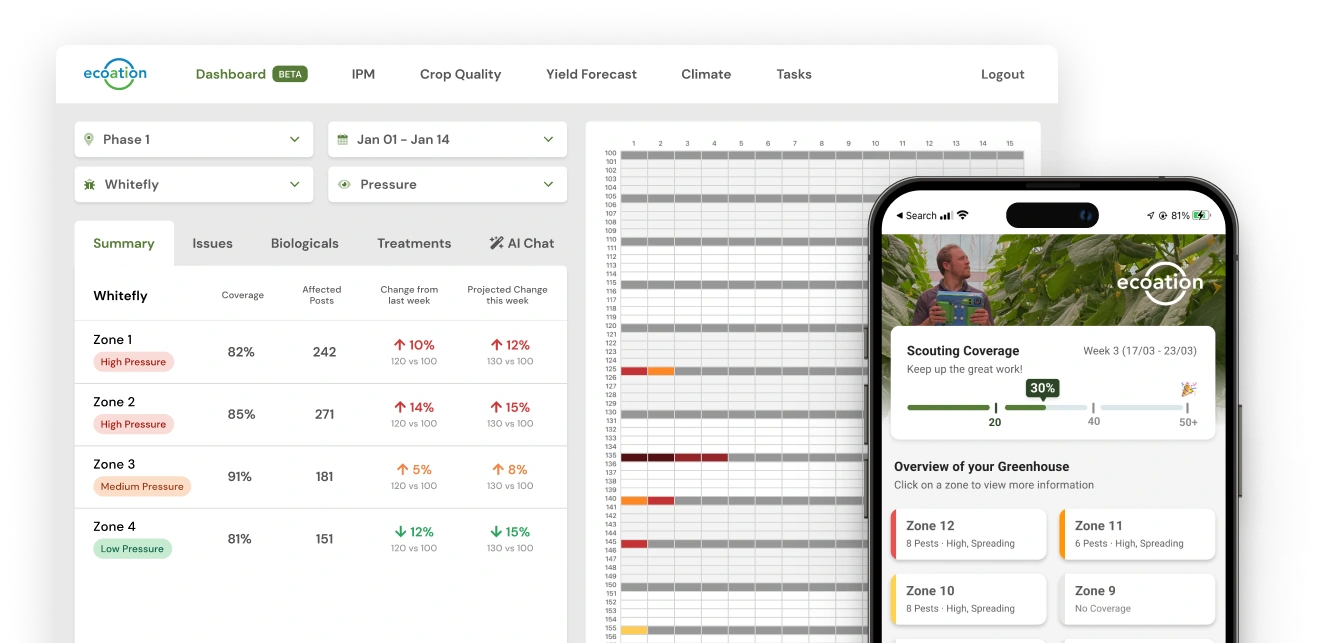
Ecoation, a Canadian agritech startup, offers a web and mobile platform that allows users to add, manage and view their greenhouse data.
Users want to view multiple data points on a single map so that they can make better decisions.
This project is scheduled for production launch in Q3 2024. Our goals are to enhance 90-day user retention, increase engagement frequency, and reduce time to value for new customers.
77% of our customers had requested the feature when engaging with our Customer Support team, and after interviewing a subset to explore the problem space, we were able to get clarity on the user pain points.
Growers aren’t able to compare multiple data points, which prevents them from gaining a holistic understanding of their greenhouse.
Our research enabled us to effectively capture and articulate the 'why' through the user stories outlined below. These stories functioned as valuable customer artefacts, providing a reference point throughout the design phase.
I want to overlay a pest and virus so I can gain insights into their transmission dynamics.
I want to view multiple pests at once, so that I understand the relationship between pests and treatments.
Bio Consultant
I want to compare outbreaks with temperatures, so that I can understand the impact of climate on pests.
My design process began by examining competitors within the AgriTech sector and exploring other industries or applications that implemented a similar overarching principle of displaying multiple data points in a single view.
One application of ChatGPT in a designer's toolkit is its ability to provide examples of applications or companies that utilize niche UX patterns, offering visual references for design inspiration.
Visual Reference Examples
In this project, beyond visual design and layout, our primary focus was to determine the value of the data presentation.
Should we display cumulative values for multiple data points at the same location, or merely indicate the presence or absence of data?
If we use cumulative displays, how should we visually represent these— through colours or gradients? Does this visualization support additional overlays, such as treatments applied?
How should we handle positive versus negative data points, such as pests versus biological treatments? Are these data points directly comparable, or should they be normalized to account for their differing relationships?
Here is a before-and-after comparison of our refined design solution, following extensive research and testing.
We expanded the grid’s vertical space by removing unnecessary components and adjusting the layout to emphasize the areas where users spend most of their time.
We consolidating multiple overlay options behind a single button. This approach preserved valuable screen real estate and maintained accessibility to optional features without cluttering the UI.
We replaced the generic 'Add' button at the top right with specific 'Add' buttons within each relevant tab (issues, treatments, biologicals) to provide clear context.
Previously limited to viewing only one type of data at a time, users were now able to simultaneously select and display multiple data categories on the grid.
Ensured QA team was in the loop so that they have a holistic understanding
To Be Continued...
This project is currently under development and is scheduled for release in Q3 2024. Stay tuned for more updates in the upcoming months.
Like this project
Posted Aug 6, 2025
Designed a multi-data point view for Ecoation's platform to enhance user decision-making.
Likes
0
Views
3