VisEmpro Visual Identity Guidelines
Nyekachi Wihioka

Visual Identity Guidelines
These guidelines were created to shape and clarify VisEmpro's brand identity - how we present ourselves visually, tonally and emotionally to our audience.
This document details the correct usage of our logos, fonts, color palette and other design elements. It also includes the core principles that guide how we communicate with and engage our audience.
Why Visual Identity Guidelines?
Visual identity guidelines are essential for maintaining a consistent and cohesive identity. From our distinctive logos to the language we use, every element forms part of VisEmpro's overall brand presence. Following these guidelines ensures that our visual identity remains intact, enhances brand recognition, protects our logo assets, and delivers clear and impactful messaging across all platforms.
Brand roles
VisEmpro is a user-friendly HR management designed to streamline employee and visitor tracking. From attendance to staff monitoring VisEmpro simplifies HR processes, helping businesses boost efficiency and focus on growth.


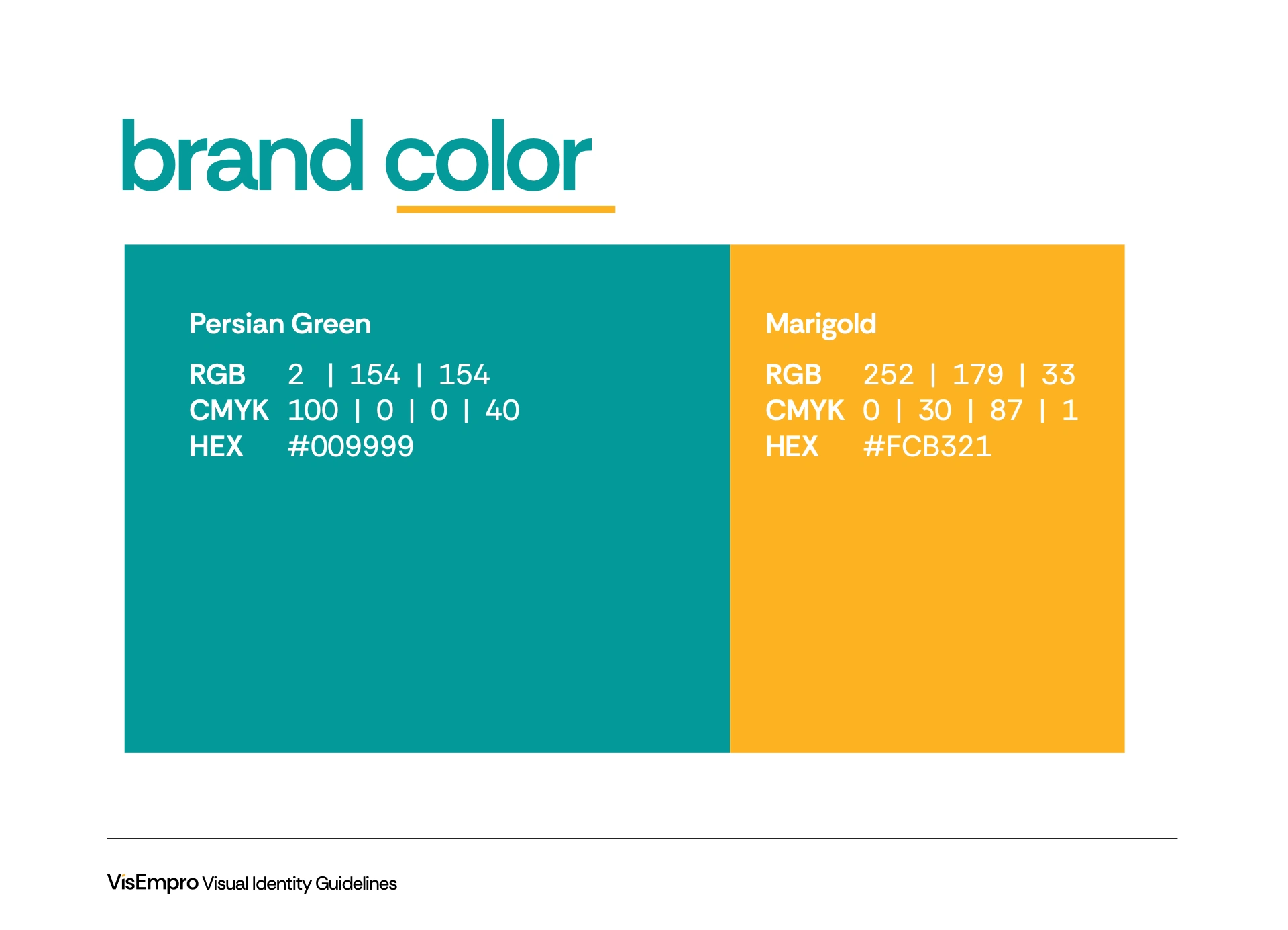
Brand color
Our main color palette informs you on how we chose to express ourselve, the VisEmpro way!
Below are few rules we lean heavily towards when it comes to our brand colors.
Persian Green remains our brand 60% color.
No other color should use up to 60% in our logo color scheme.
Monochromatic colors (black and white) can be replace our Persian Green.


Like this project
Posted Nov 3, 2025
From attendance to staff monitoring VisEmpro simplifies HR processes, helping businesses boost efficiency and focus on growth.