Purity: Spa Branding
Purity is a small local spa business that offers treatments such as massages, manicures/pedicures and facials. They’re expanding their business so they need a rebrand.
They are looking for a luxurious expensive brand design that aligns with their goals and ethos. They need a logo design as well as collaterals such as business cards, bags and merchandise. Brief by: Brand Brief

1. Visual Identity

While designing Purity brand, I focused on their core values – wholeness, vitality, and completion – concepts symbolized by the circle – base shape of the logo.
The concept for Purity was centered around the idea of relaxation, rejuvenation, and overall wellness. I represented this concept through a simplified shape of a person laying on a massage table, which is a symbol commonly associated with spa treatments and relaxation.

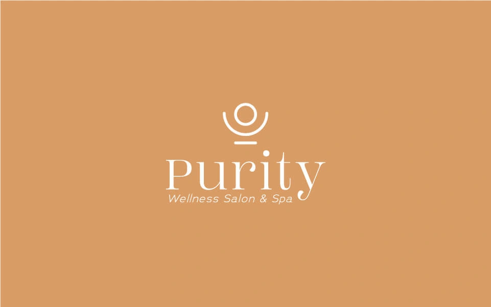
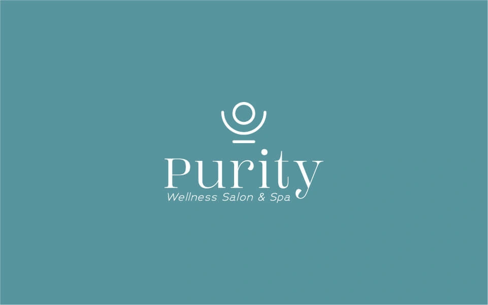
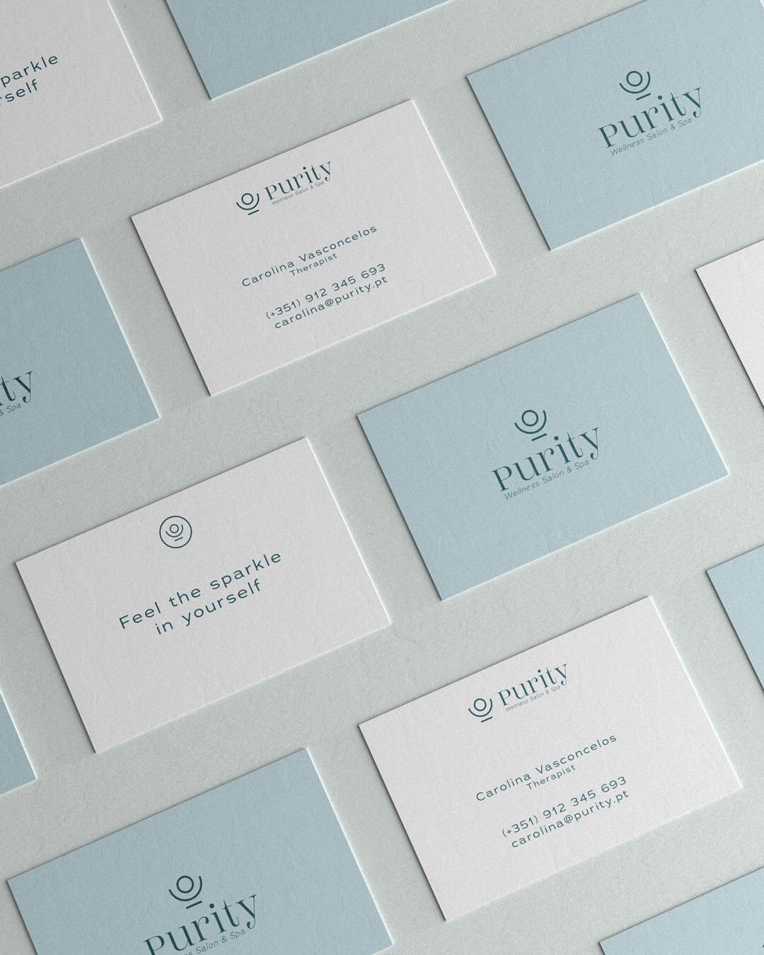
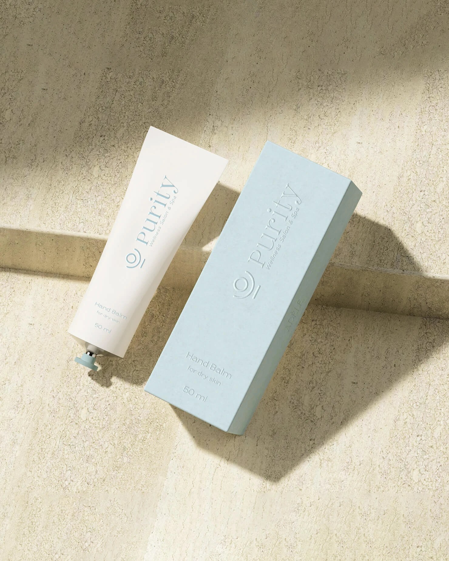
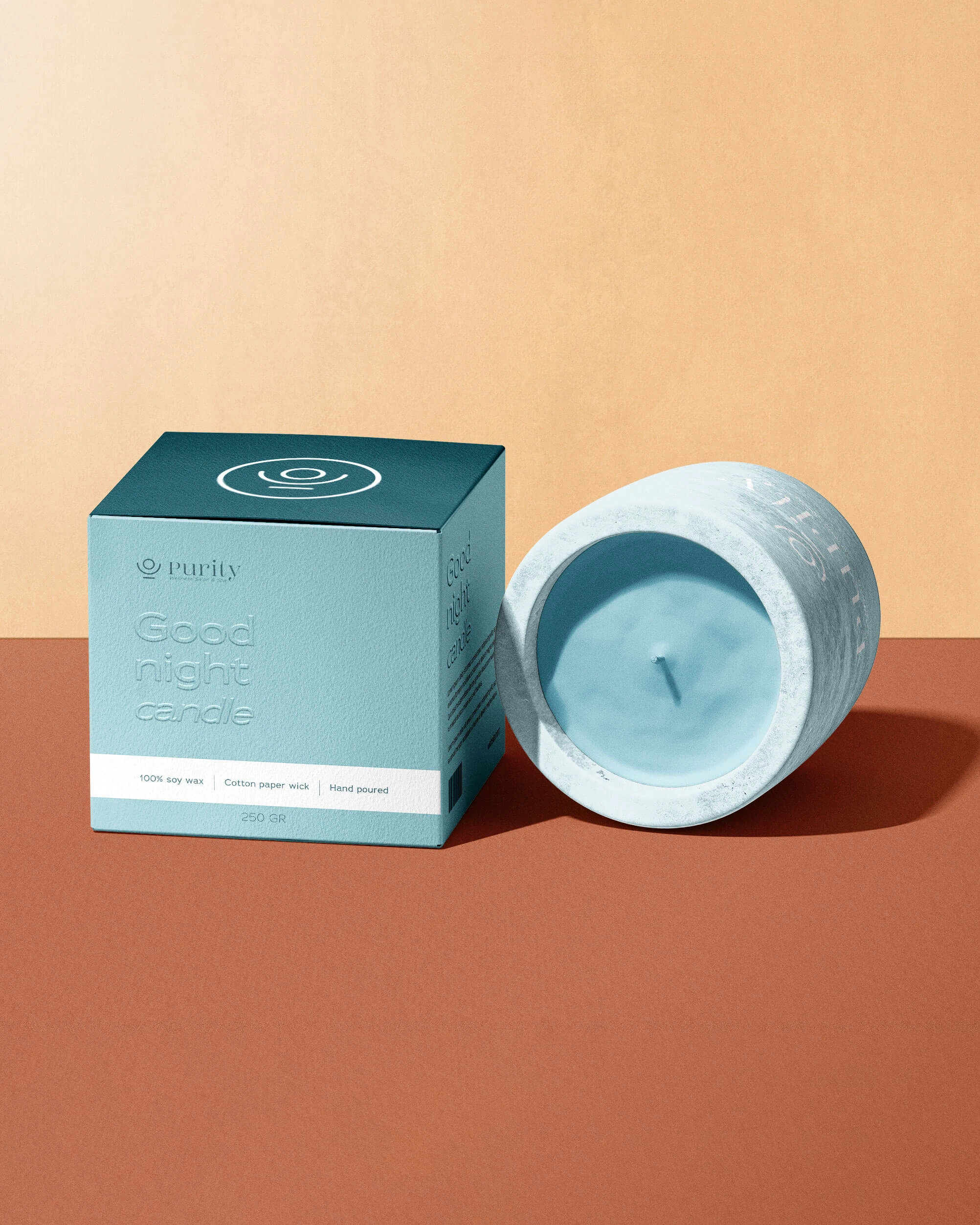
The design of the logo is clean and minimalist, which adds to its elegance and luxury feel. The simple design allows the brand to easily incorporate the logo into various marketing materials, such as business cards, tote bags, and merchandise.
The logo is easily recognizable and memorable, making it an effective representation of the Purity brand.

The blue tones used in the palette add a sense of calm and stability, helping to create a peaceful and relaxing atmosphere. Blue is often associated with calmness, serenity, and trust, making it an ideal color choice for a spa brand.
The combination of neutral browns and calming blues creates a sophisticated and luxurious look that is well suited to the spa environment.
2. Indoor signage
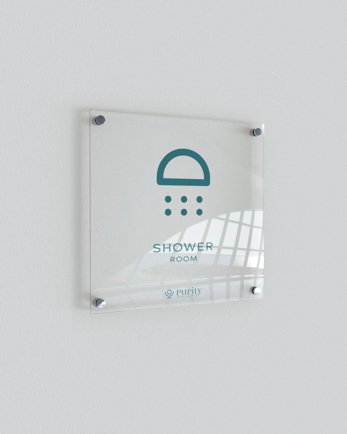
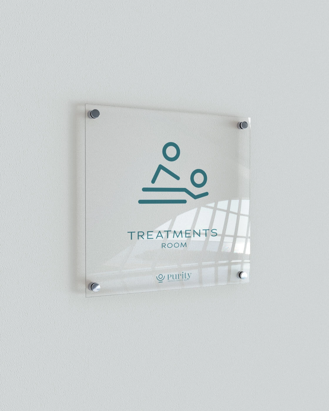
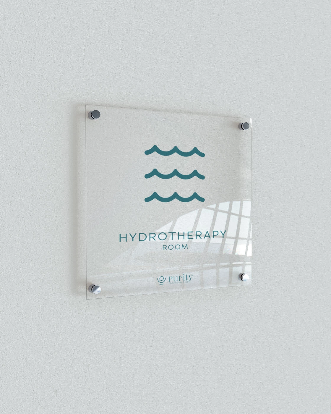
The indoor signage created for Purity spa was designed with a luxurious and elegant aesthetic in mind. I aimed to create cohesive throughout all their materials.
The signage was designed to be simple yet sophisticated, with clear, easy-to-read typography and an eye-catching design.
The use of clean lines and a neutral color palette helps the signage blend seamlessly into the spa’s overall aesthetic, while the luxurious font choice adds to the spa’s high-end feel.
The signage was created to be practical and functional, while also contributing to the spa’s overall luxury feel.
By designing simple, yet luxurious indoor signage, I was able to create a seamless and cohesive visual experience for clients, while also effectively communicating the various areas and treatments available at Purity spa. The signage serves not only a functional purpose, but also reinforces the brand’s commitment to providing clients with a relaxing and rejuvenating spa experience

Like this project
Posted Jun 6, 2023
Purity is a small local spa business that offers treatments such as massages, manicures/pedicures and facials. They’re expanding their business so they need a r


