Robin dos Bosques: Branding and Webdesign
Robin dos Bosques mission is to provide high quality information through their wide range of services including professional training, technical book publications, health counseling, and tailored consulting for gyms and health clubs. Robin dos Bosques embodies the spirit of Robin Hood by making knowledge accessible and beneficial to all.
Just like the legendary Robin Hood, known for taking from the rich and giving to the poor, Robin dos Bosques follows a similar philosophy of “stealing knowledge from the rich and passing it on to the poor.”
Accional were engaged and my role was to develop both the visual identity and Robin dos Bosques’s website design.
1. Visual Identity
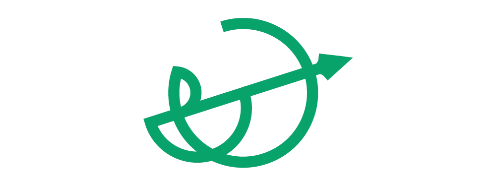
The logo is a visual representation of Robin dos Bosques’ brand identity and ethos, encapsulating its unique combination of conscientiousness and rebellion against the system.
The use of clean simplified shapes reinforces their commitment to simplicity and authenticity. The man with the spear is a represents taking action against injustice while the spear itself is a symbol of knowledge as a powerful tool for change.
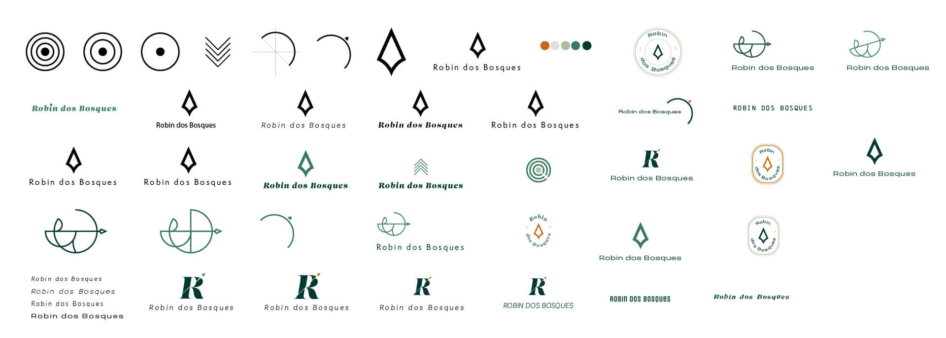
Some of the sketches i did during the brainstorming phase of Robin dos Bosques logo
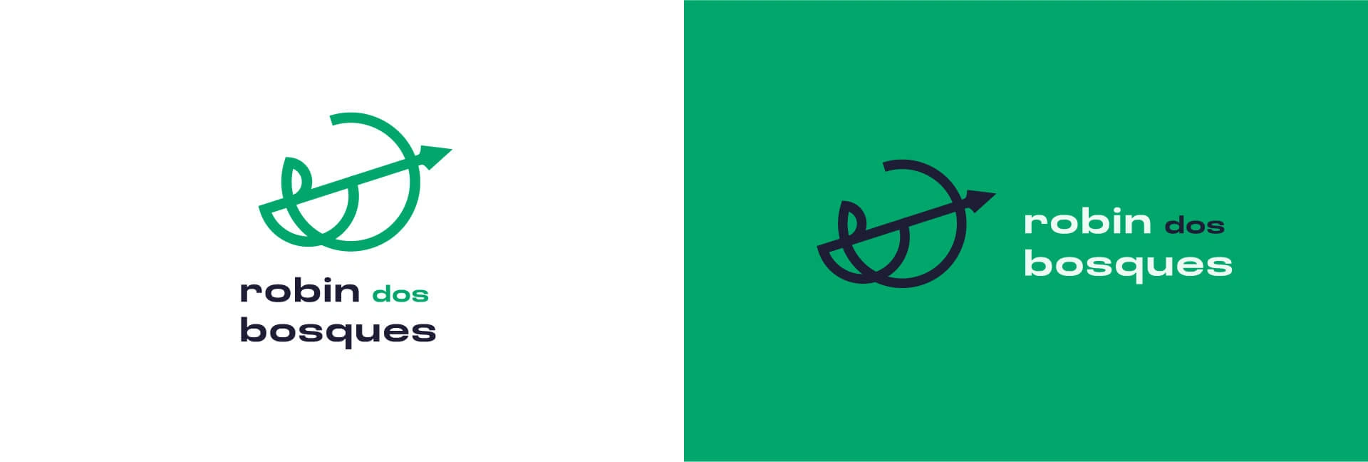

The color palette for Robin dos Bosques is earthy. Inspired by nature, it reflects their commitment to the natural. The main color is green, symbolizing growth, vitality, and the natural world. Balancing that out, I used the orange as the accent color representing energy, enthusiasm, and action. It reflects Robin dos Bosques’ approach towards making a positive impact in the fitness and well-being industry.
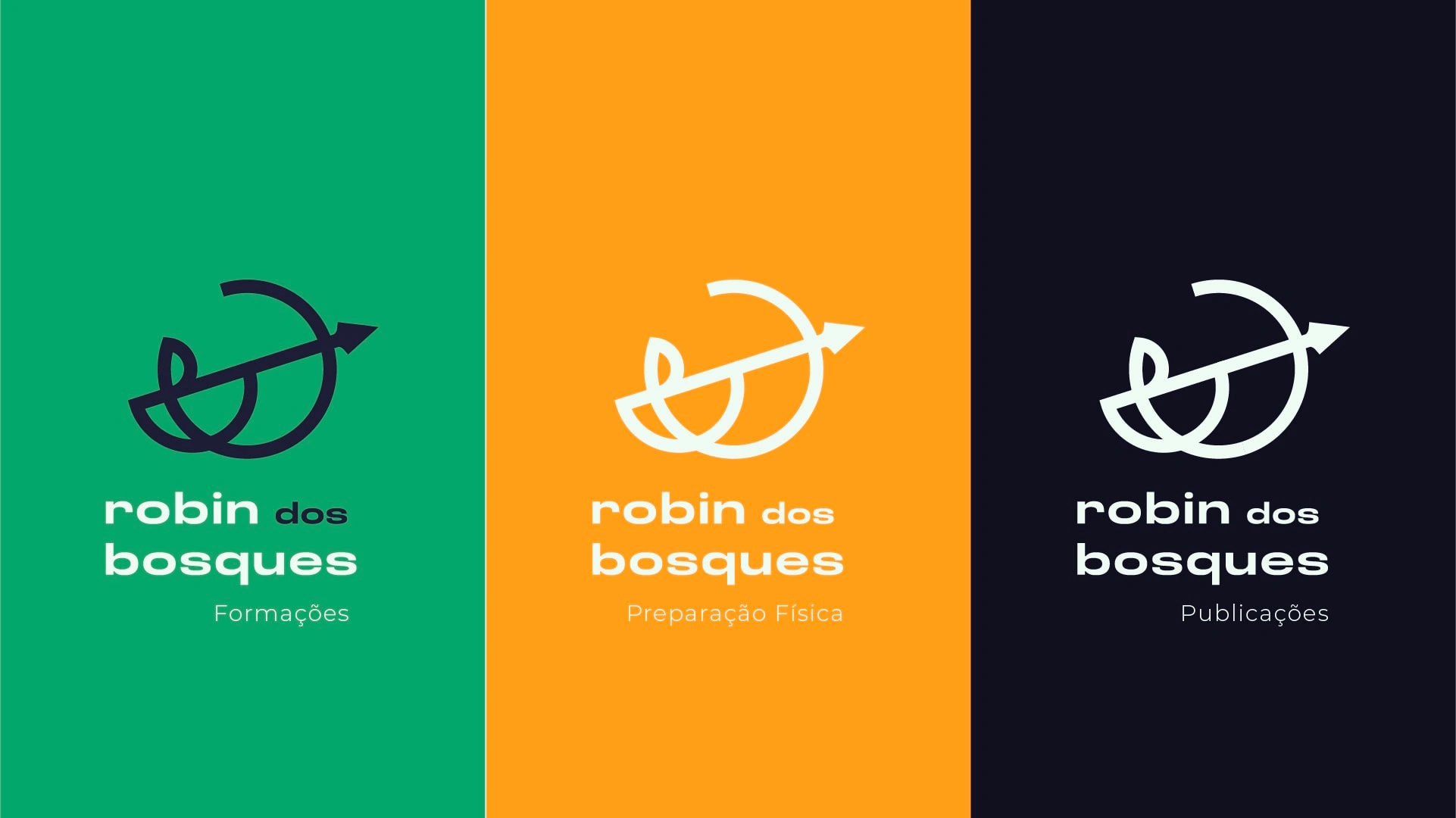
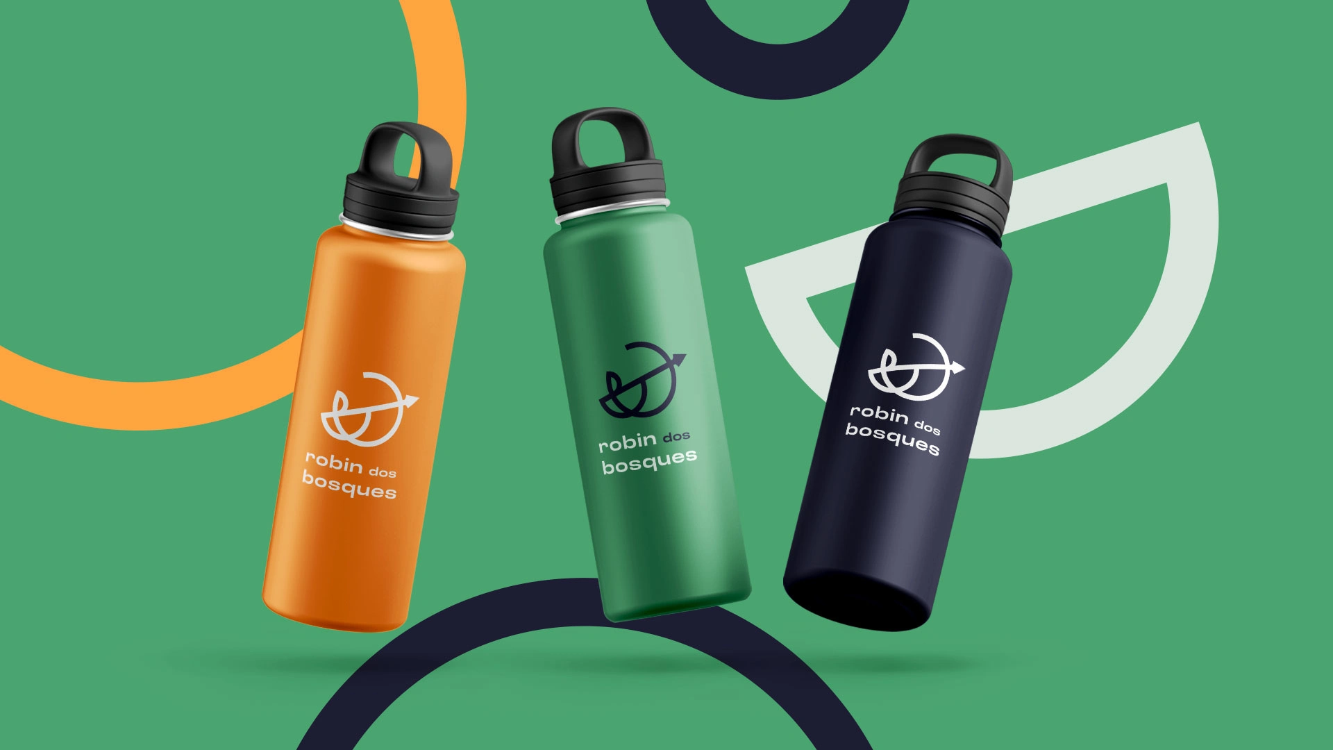
Robin dos Bosques provides services in 3 different branches: Education, Physical Preparation, and Publishing. Because of the variety of Robin dos Bosques offering, it was important to separate them in branches and have kind of a different identity to which one, so each one of them is associated to a specific color that embodies the brand’s core values and principles.
The Education branch, symbolized by the vibrant color green, represents Robin dos Bosques’ unwavering commitment to providing top-quality education and training for fitness specialists and healthcare professionals. The color green reflects the brand’s focus on growth and learning, as well as its dedication to making knowledge accessible and beneficial to all.
The Physical Preparation branch, represented by the energetic color orange, embodies Robin dos Bosques’ dynamic and action-oriented approach to physical fitness. The color orange transmits a sense of energy, enthusiasm and a proactive attitude towards achieving physical health and performance.
The Publishing branch, depicted by a deep blue color, reflects Robin dos Bosques’ authoritative publications, such as technical books. The dark blue color conveys trustworthiness, reliability, and expertise, reflecting Robin dos Bosques’ commitment to delivering high-quality content that enhances the knowledge and skills of its audience.

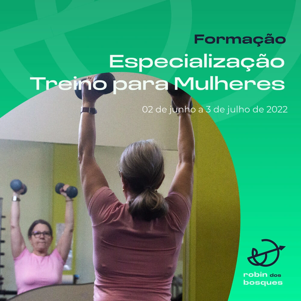
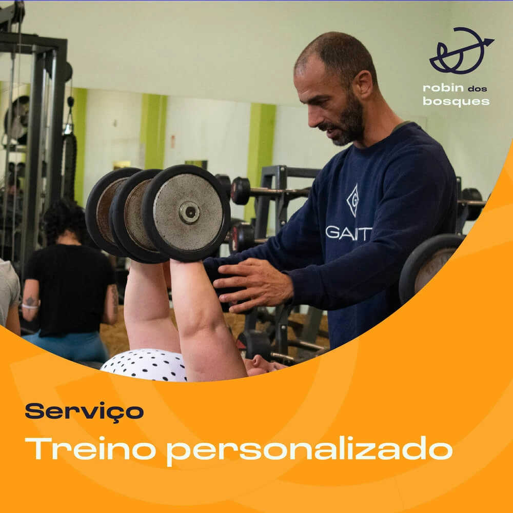
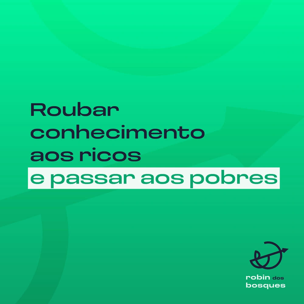
I also designed a few social media post templates that could be used to promote coming up events, their services, new books or even only share a quote or a piece of knowledge.
2. Web Design
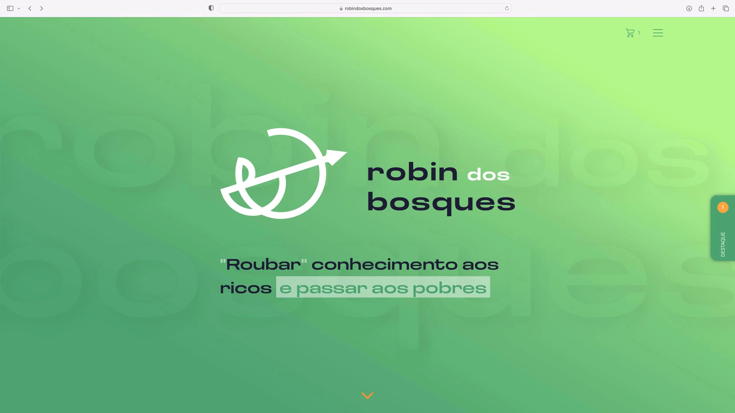
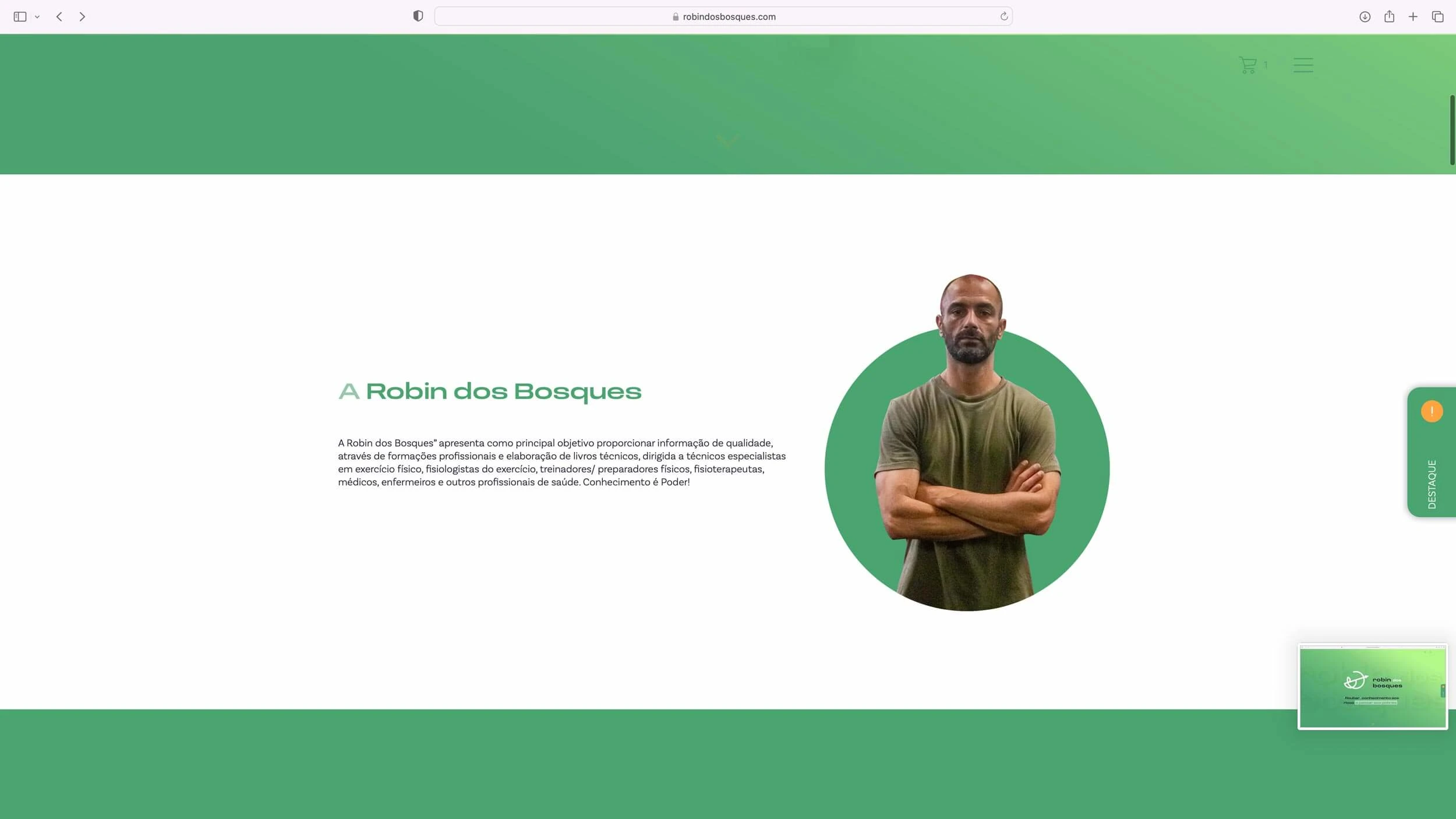
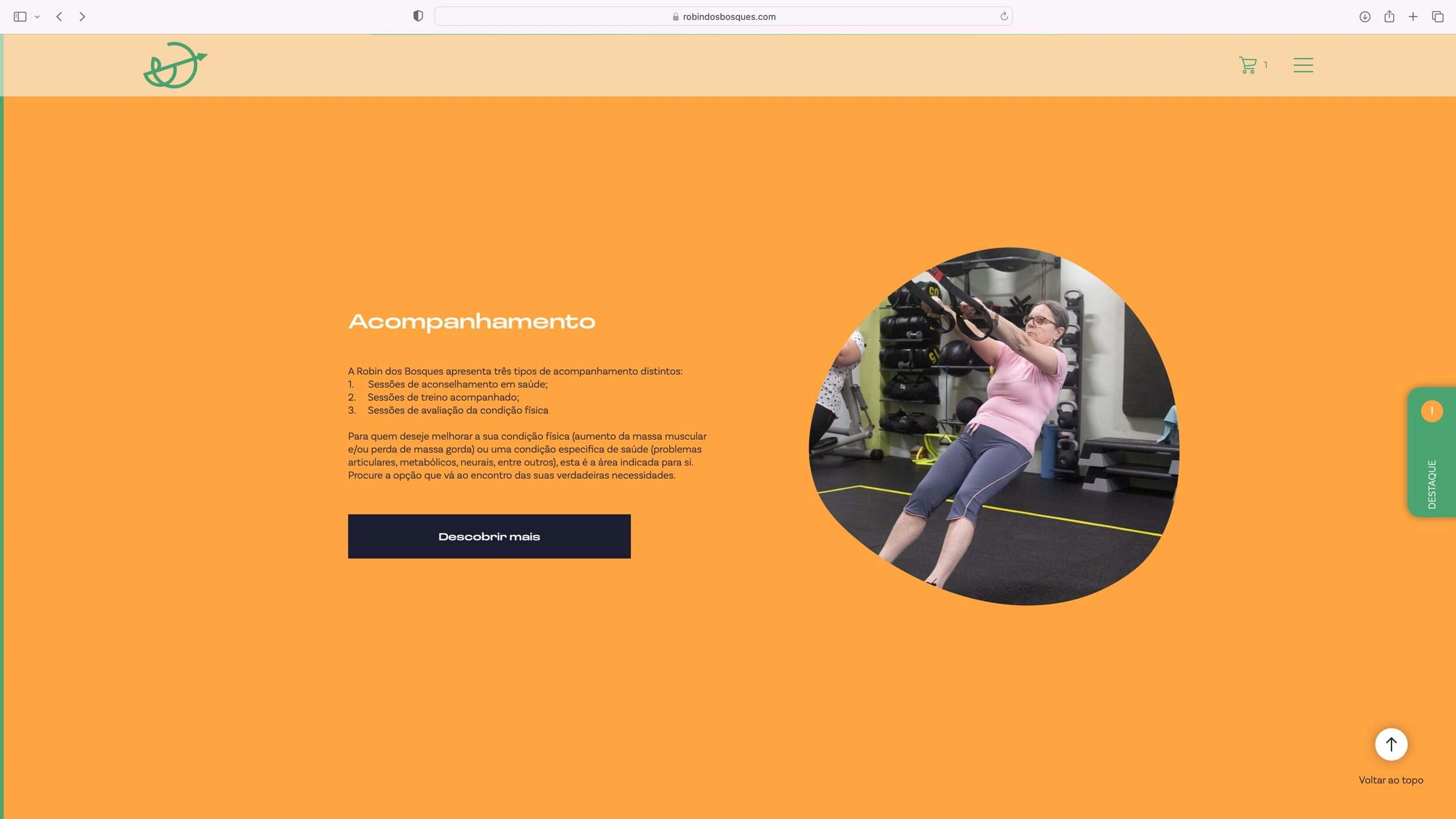
Robin dos Bosques also needed a website to help him gain exposure and showcase all his services in one place.
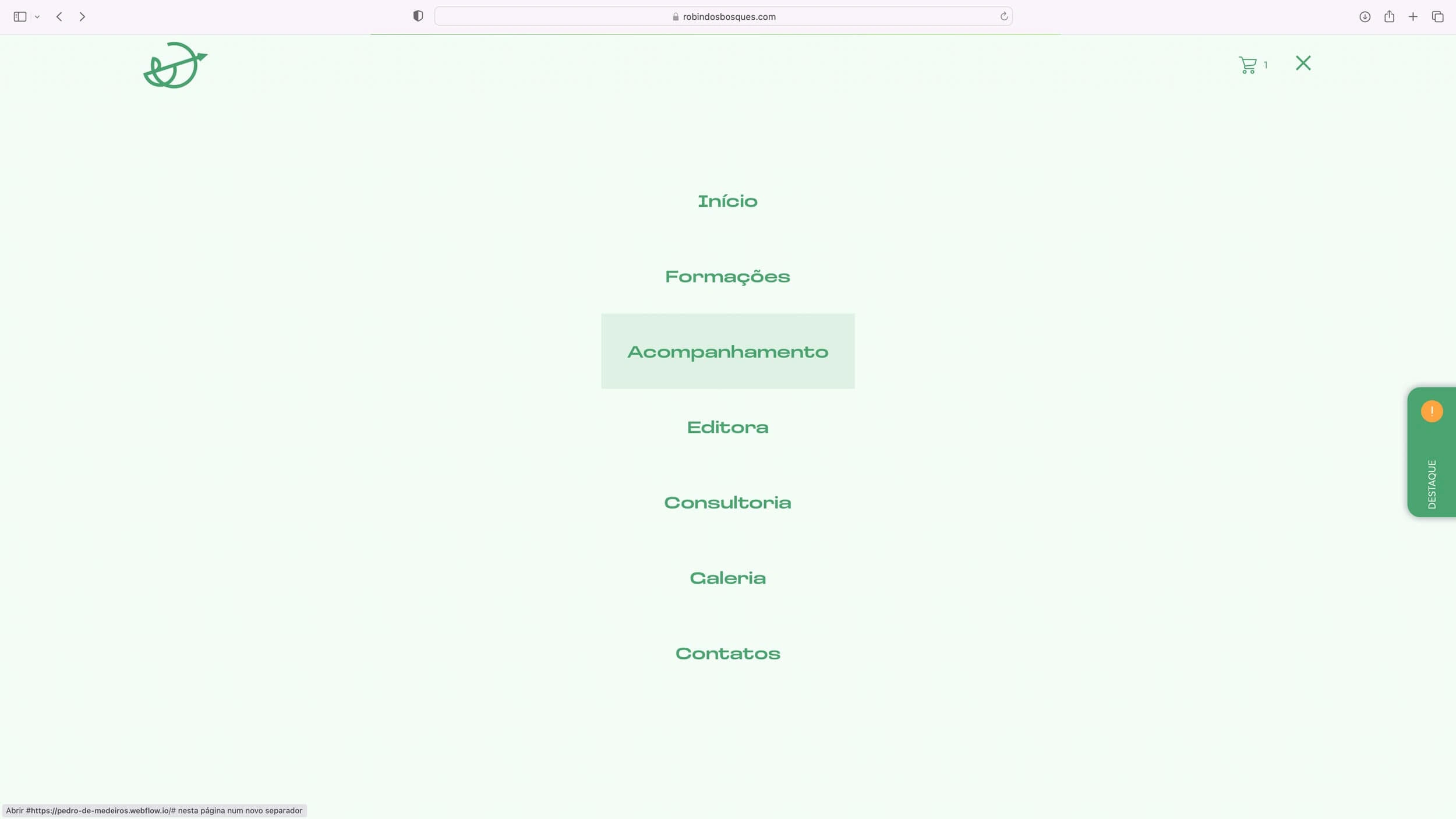
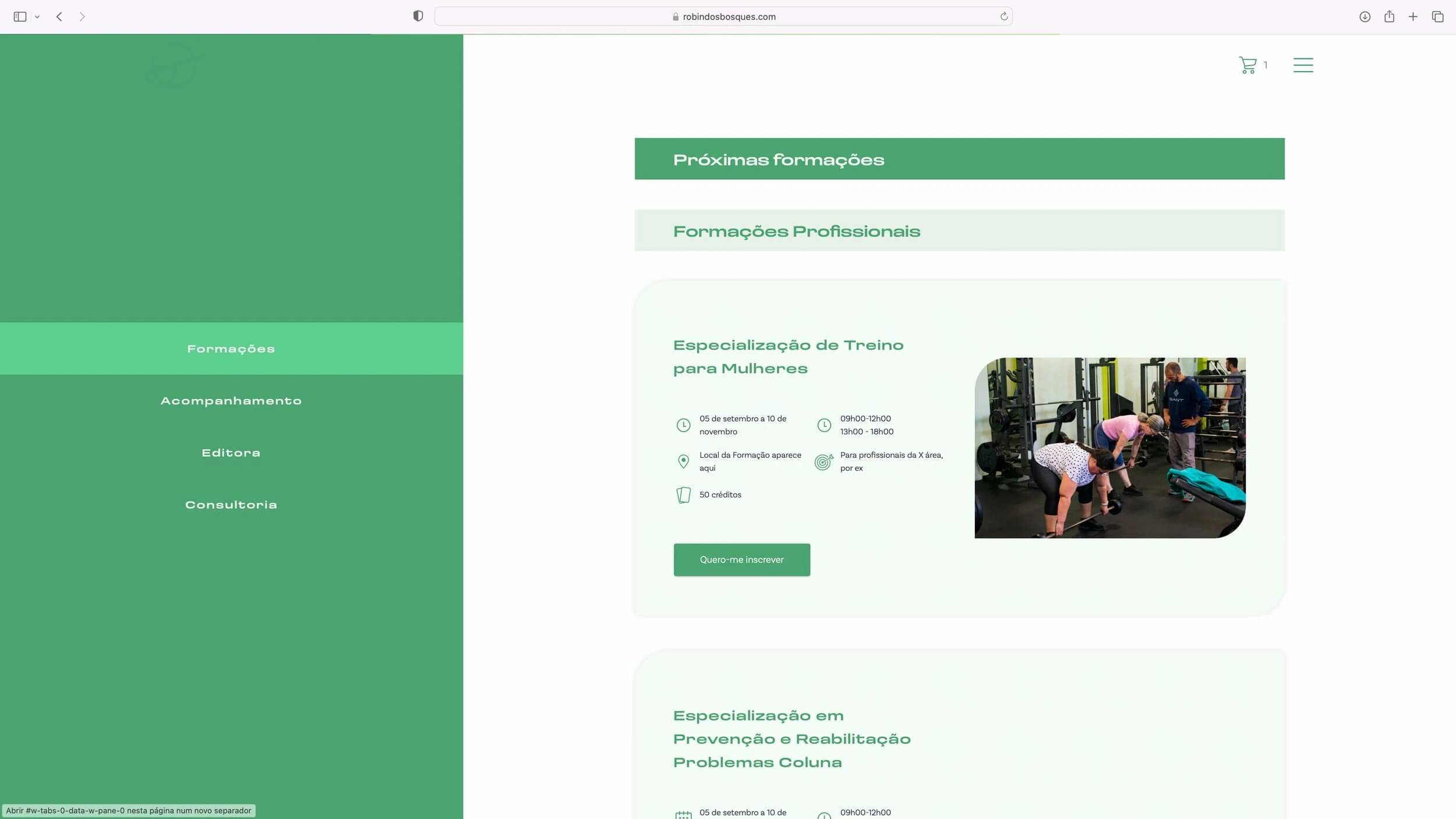
In developing the Robin dos Bosques website, I focused on creating a platform that was intuitive, easy to navigate and aesthetically pleasing.
The end result is a website that aligns with the brand’s values and vision. The main focus of the website is to let people know the big range of services that they offer.
Like this project
Posted Jun 6, 2023
Robin dos Bosques mission is to provide high quality information through their wide range of services including professional training, technical book publicati…
