Django Debug Toolbar
Robin Beechey
Django Debug Toolbar Visual Identity
Context
Django Debug Toolbar is a long-running open source developer tool used to inspect request data, SQL queries, and performance information while developing Django applications.
The project has been maintained by a small team of contributors for years and is widely used in the Django ecosystem. Despite its popularity, the project has never had a formal visual identity.
The goal of this exploration was to experiment with a visual system that could represent what the tool actually does: exposing information that normally stays hidden inside an application.
The Design Challenge
Developer tools usually fall into predictable visual patterns. Some lean heavily into futuristic infrastructure aesthetics with glowing dashboards and dense UI graphics. Others go extremely minimal and almost invisible.
Django Debug Toolbar sits in a different space. It is a practical inspection tool used during development. It surfaces information that developers already understand, but organizes it in a way that makes debugging faster and clearer.
The visual identity needed to reflect that function. It had to feel technical and precise, but also approachable and simple enough to work in small contexts like browser panels, documentation, and repository assets.
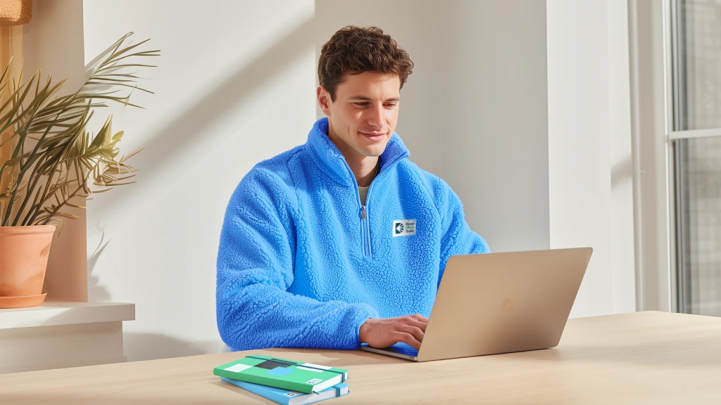
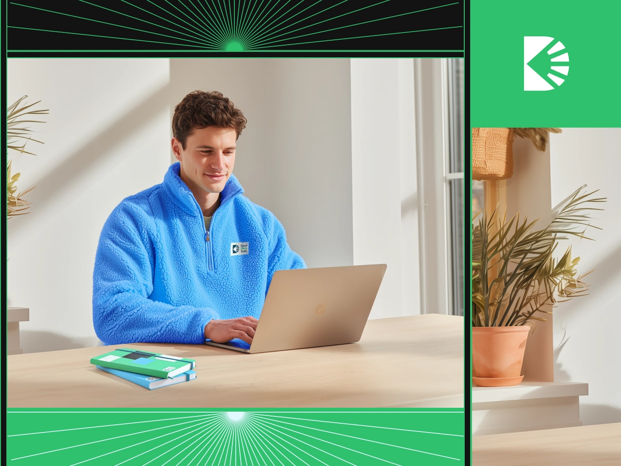
Cozy Sherpa Mockup
The Core Idea
The visual direction centers on visibility and awareness.
The toolbar exists to reveal what is happening inside a Django application while it runs. The identity reflects that idea through simple visual metaphors of exposure and inspection.
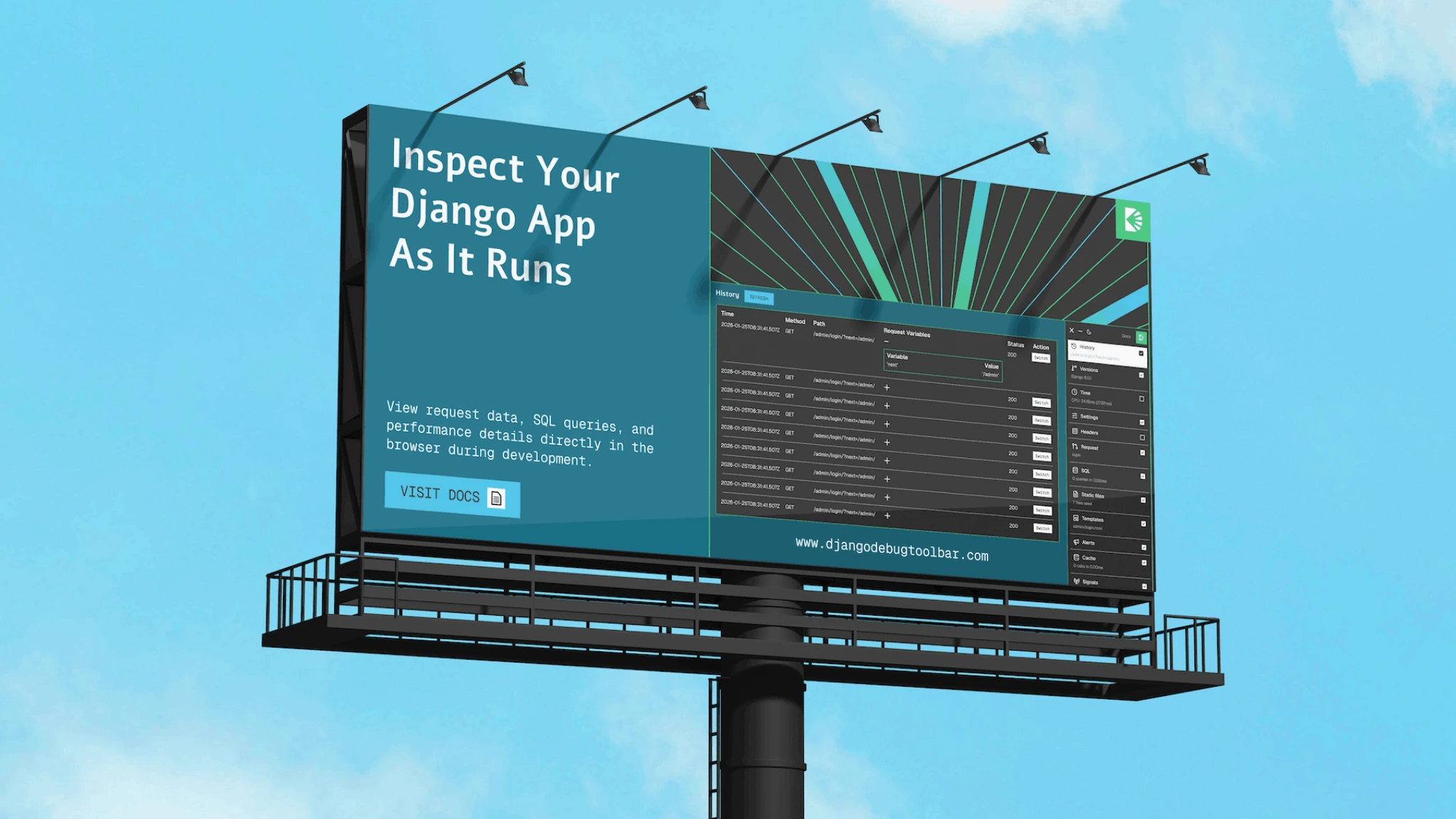
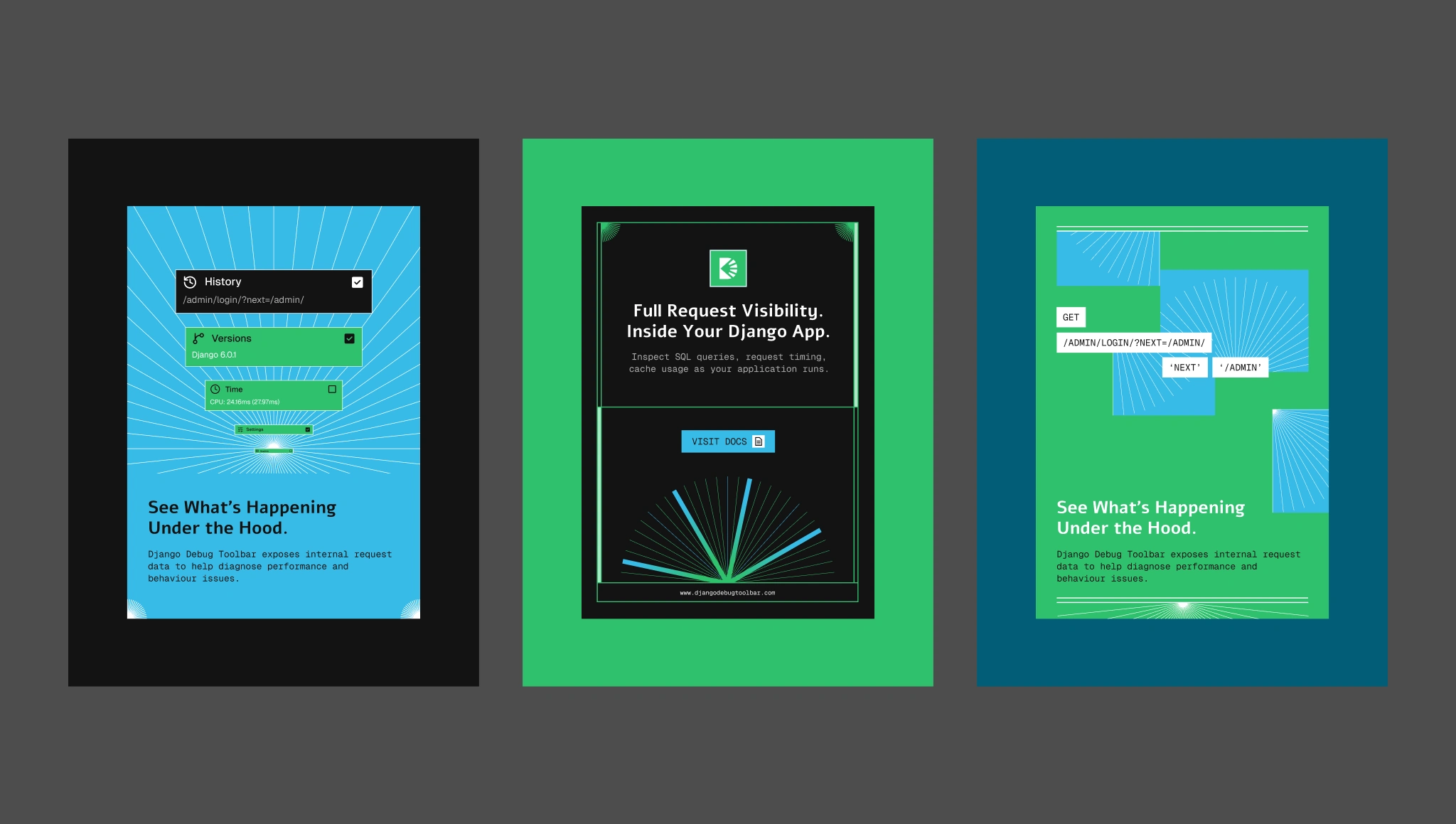
Graphic elements such as radial rays, borders, and structured layouts represent signals radiating outward from a central source. The imagery suggests information being surfaced and made observable.
Instead of leaning into dramatic motion or complex visual effects, the system focuses on clarity. The forms remain geometric, flat, and minimal so they remain recognizable even at small scales.
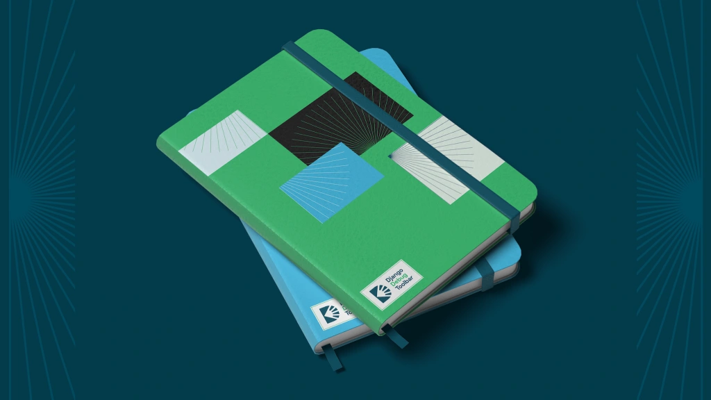
Notebook Mockup
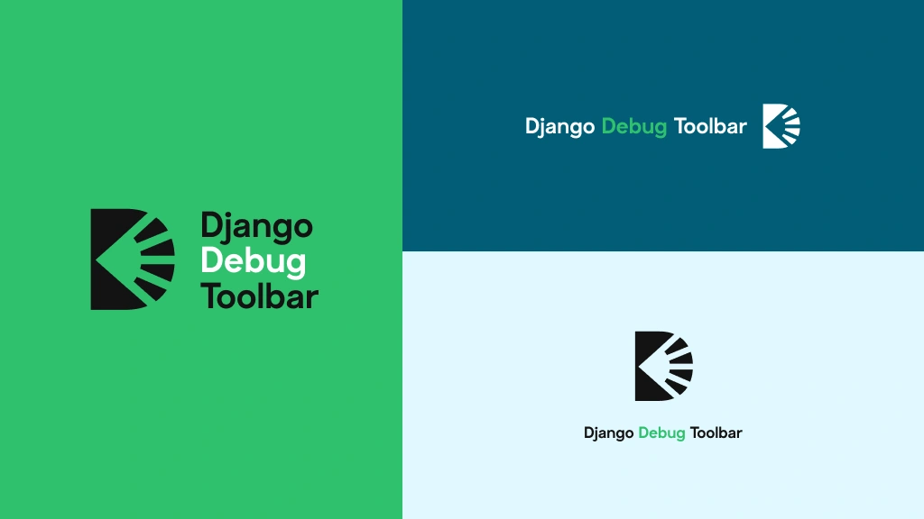
The Identity System
Typography: Clean sans-serif typography keeps the system grounded in developer tools rather than marketing aesthetics. Text is structured and functional, similar to documentation layouts.
Graphic language: The core visual motif uses rays and radial structures to represent signals, awareness, and system insight. Borders and framing elements reinforce the idea of isolating and examining pieces of information.
Layouts: Structured grid layouts allow the system to work across multiple contexts. The same elements can appear in documentation headers, banners, or social media posts without losing coherence.
Brand surfaces: Although the project primarily lives in code repositories and documentation, the system was also explored through posters, social graphics, and banners to test how the identity could scale beyond the product itself.
Social Media/Posters
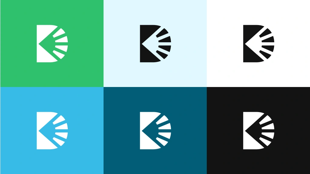
Logo and Colours
Reflection
Open source projects often focus almost entirely on functionality. Visual identity is rarely a priority, even for tools used by thousands of developers.
This exploration was an opportunity to experiment with how design language can support a tool’s purpose without adding noise. The goal was not to decorate the project, but to reflect its role: making systems more visible and understandable.
Django Debug Toolbar already provides that clarity inside the browser. The visual system simply echoes the same idea.
Like this project
Posted Mar 9, 2026
Developed brand identity for the Django Debug Toolbar, focusing on illumination and precision.
Likes
0
Views
6